Posts filed under Graphics (394)

August 31, 2015

Graph of the day

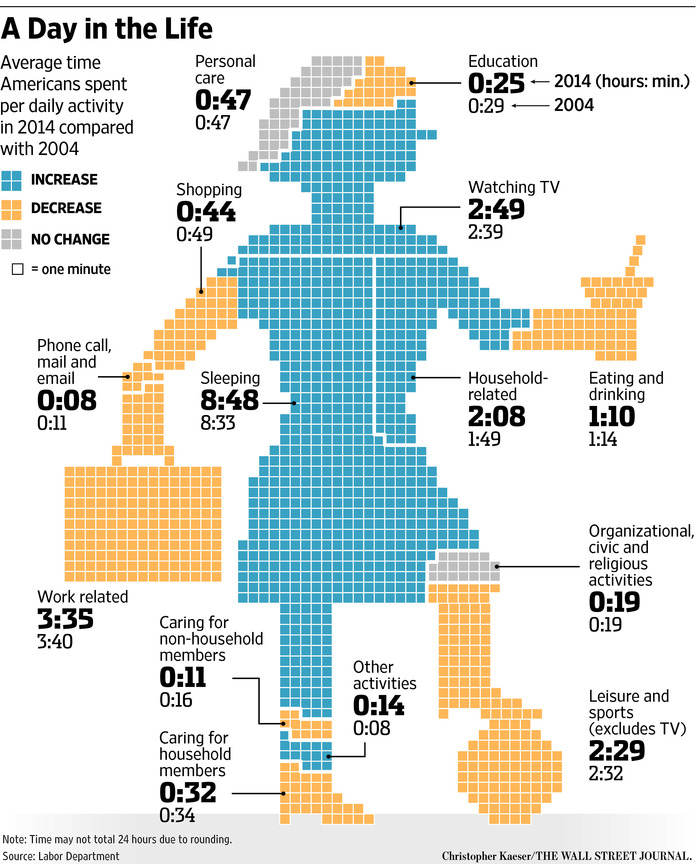
Literally, this time. I got this from Andrew Gelman, but it’s too good not to share. It’s originally from the Wall Street Journal

image001

Apart from the attempts to make the body part representative of the activity, the unwisdom of playing soccer in high heels, and the mystery of what it actually is that she’s eating or drinking (a martini? an icecream?), there are some generalisable graphical points.

First, comparison of area between different shapes is hard, and so isn’t a good way to display data: it’s not immediately clear whether the Knee of Religion is larger than the Forehead of Education or the Shoe of Caring.

Second, trying to code the direction of change with colour means you can’t use colour (consistently) to distinguish categories.

Third, some of the figures aren’t very helpful because they average over everyone: only about 60% of the adult population is in paid employment, and only a small proportion are in education. For people who work or study the time spent is a lot more than the average, for everyone else it’s zero.

And finally, if you have to write all the numbers on the graph, the graph isn’t doing its job.
August 25, 2015

Computation and art

fishiness

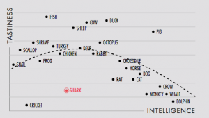
Normally I wouldn’t be linking favourably to this scatterplot, which has an ill-defined sampling scheme, and where at least the y-axis data are objectively wrong.  On the other hand, normally the scatterplot would be there to convey information.  In this case it’s just an index to some beautiful animated triangular art

shark

The point, and the relevance to this blog, is the way Matt Daniels has written software to make these pictures (relatively) easy to create.


Incidentally, before anyone starts complaining that sharks and fish are separate, that bit is exactly correct.  Fish (typical fish with bones, such as the swordfish in the animation) have a more recent common ancestor with sheep than with sharks.

August 23, 2015

Barcharts with delusions of grandeur

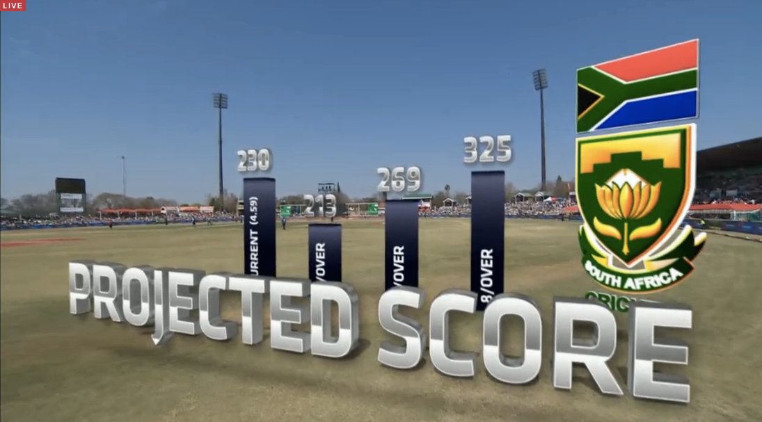
The cricket graphics system now allows 3-d barcharts projected over the playing field, and casting actual virtual shadows.

chartjunk1

Yeah, nah.

August 19, 2015

Stereotype and caricature

I’ve posted a few times about the maps, word clouds, and so on that show the most distinctive words by gender or state — sometimes they are even mislabelled as the “most common” words.  As I explained, these are often very rare words; it’s just that they are slightly less rare in one group than in the others.

An old post from the XKCD blog gives a really good example. Randall Munroe set up a survey to show people colours and ask for the colour name. He got five million responses, from over 200,000 sessions, and came up with nearly 1000 reasonably well-characterised colours.  You can download the complete data, if you care.

The survey asked participants about their chromosomal sex, because two of the colour receptor genes are on the X-chromosome and this is linked to colour blindness (and possibly to tetrachromatic vision). It turned out that the basic colour names were very similar between male and female respondents, though women were slightly more likely to use modifiers (“lime green” vs “green”).

However, Munroe also looked at the responses that differed most in frequency between men and women. These were all uncommon responses, but all from multiple people, and after extensive spam filtering.

You can probably guess which group is which:

  1. Dusty Teal
  2. Blush Pink
  3. Dusty Lavender
  4. Butter Yellow
  5. Dusky Rose


  1. Penis
  2. Gay
  3. WTF
  4. Dunno
  5. Baige

(Presumably this is a gender effect, not an X-linked language defect.)


August 17, 2015

More diversity pie-charts

These ones are from the Seattle Times, since that’s where I was last week.

IMAG0103

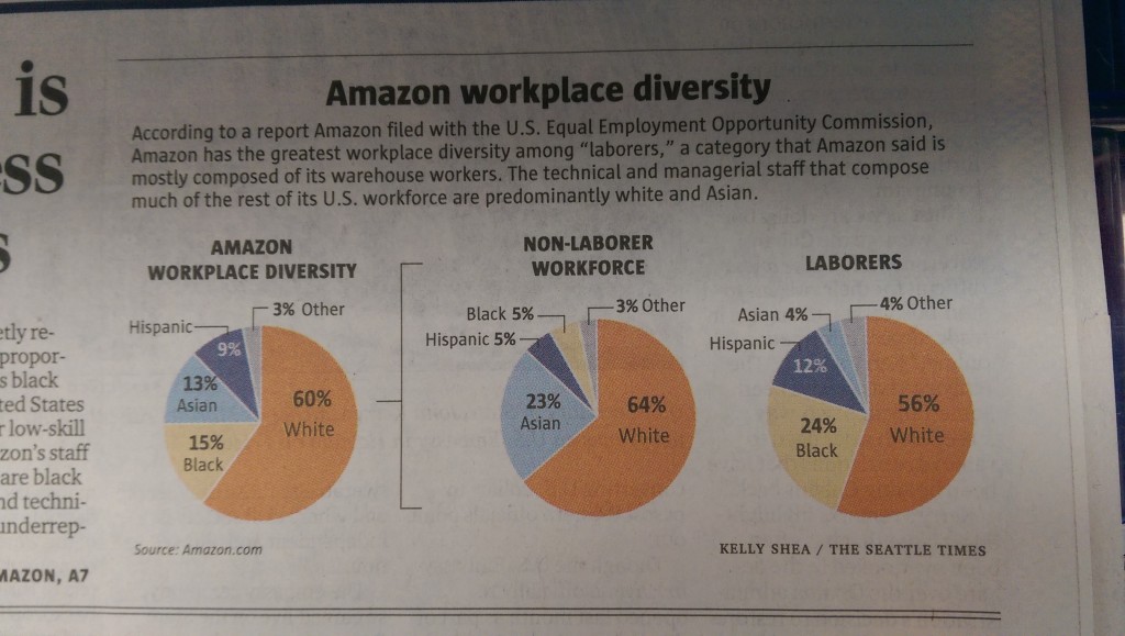
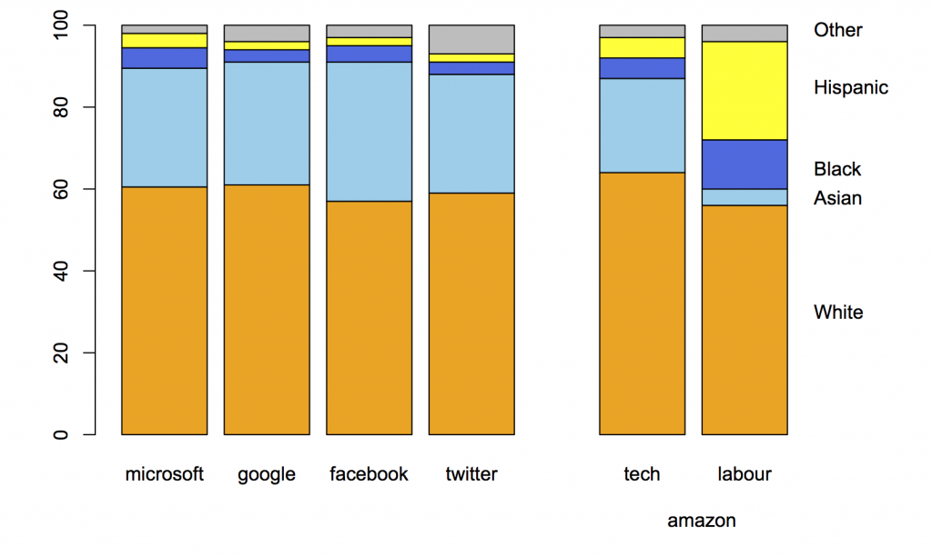
Amazon.com, like many other tech companies, had been persuaded to release figures on gender and ethnicity for its employees. On the original figures, Amazon looked  different from the other companies, but Amazon is unusual in being a shipping-things-around company as well as a tech company. Recently, they released separate figures for the ‘labourers and helpers’ vs the technical and managerial staff.  The pie chart shows how the breakdown makes a difference.

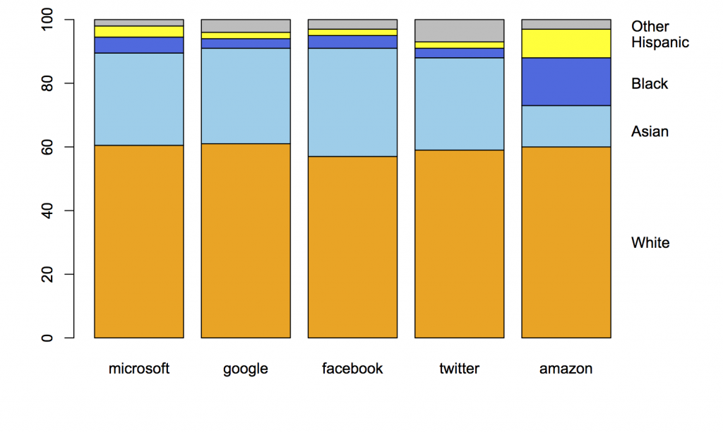
In contrast to Kirsty Johnson’s pie charts last week, where subtlety would have been wasted  given the data and the point she was making, here I think it’s more useful to have the context of the other companies and something that’s better numerically than a pie chart.

This is what the original figures looked like:

amazon-1

Here’s the same thing with the breakdown of Amazon employees into two groups:

amazon-2

When you compare the tech-company half of Amazon to other large tech companies, it blends in smoothly.

As a final point, “diversity” is really the wrong word here. The racial/ethnic diversity of the tech companies is pretty close to that of the US labour force, if you measure in any of the standard ways used in ecology or data mining, such as entropy or Simpson’s index.   The issue isn’t diversity but equal opportunity; the campaigners, led by Jesse Jackson, are clear on this point, but the tech companies and often the media prefer to talk about diversity.


August 14, 2015

Sometimes a pie chart is enough

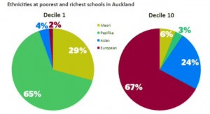
From Kirsty Johnson, in the Herald, ethnicity in the highest and lowest decile schools in Auckland.

CMUU_JjUYAAsWbG

Statisticians don’t like pie charts because they are inefficient; they communicate numerical information less effectively than other forms, and don’t show subtle differences well.  Sometimes the differences are sufficiently unsubtle that a pie chart works.

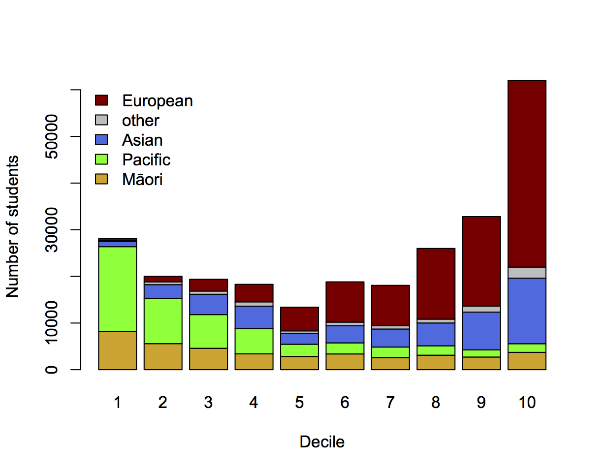
It’s still usually not ideal to show just the two extreme ends of a spectrum, just as it’s usually a bad idea to show just two points in a time series. Here’s the full spectrum, with data from EducationCounts

ethdec


[The Herald has shown the detailed school ethnicity data before in other contexts, eg the decile drift story and graphics from Nicholas Jones and Harkanwal Singh last year]

I’ve used counts rather than percentages to emphasise the variation in student numbers between deciles. The pattern of Māori and Pacific representation is clearly different in this graph: the numbers of Pacific students fall off dramatically as you move up the ranking, but the numbers of Māori students stabilise. There are almost half as many Māori students in decile 10 as in decile 1, but only a tenth as many Pacific students.

If you’re interested in school diversity, the percentages are the right format, but if you’re interested in social stratification, you probably want to know how students of different ethnicities are distributed across deciles, so the absolute numbers are relevant.


August 6, 2015

Graph legends: ordering and context

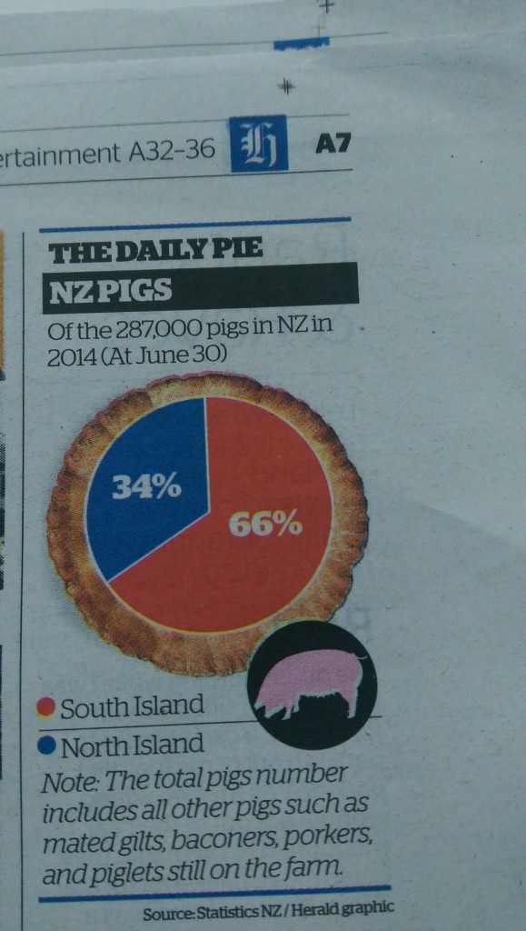
I’m not going to make a regular habit of criticising the Herald’s Daily Pie — for a start, it only appears in the print version, which I don’t see.  Today’s one, though, illustrates a couple of issues in graph legends

IMAG0098

The first issue is ordering. That’s almost trivial with just two values, but I actually found it distracting to have “South Island” at the top of the legend, especially when the corresponding red wedge is higher on the page than the blue wedge. I had to look twice to work out which wedge was which.  Reordering with “North Island” at the top would have helped, as would putting the labels on the pie (instead of the numbers).

Second, there’s the Note:

The total pigs number includes all other pigs such as mated gilts, baconers, porkers, and piglets still on the farm.

which comes directly from the StatsNZ table (of data from the Agricultural Production Survey). I know that, because these tables are the only place Google can find even the sub-phrase “such as mated gilts”.  In the context of the table, the note says that the “at June 30” columns for total pigs include the “Breeding sows (1-year-old and over)” given in earlier columns of the table, plus other categories that someone interested in the data would probably be familiar with. Without the earlier columns, the reaction should be “other than what?”.

Looking at the StatsNZ table you also learn the reason why “At June 30” in the title is important. The total “includes piglets still on the farm”, but not the much larger number of ex-piglets that have become part of the pork products industry: there were over 600,000 piglets weaned on NZ farms during the year, but only 287,000 pigs still on farms as of June 30.

August 2, 2015

Pie chart of the week

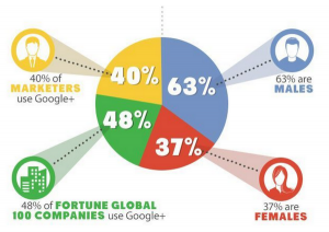
A year-old pie chart describing Google+ users. On the right are two slices that would make up a valid but pointless pie chart: their denominator is Google+ users. On the left, two slices that have completely different denominators: all marketers and all Fortune Global 100 companies.

On top of that, it’s unlikely that the yellow slice is correct, since it’s not clear what the relevant denominator even is. And, of course, though most of the marketers probably identify as male or female, it’s not clear how the Fortune Global 100 Companies would report their gender.

CLW5t4PWUAAvPNp

From @NoahSlater, via @LewSOS, originally from kwikturnmedia about 18 months ago.

August 1, 2015

NZ electoral demographics

Two more visualisations:

Kieran Healy has graphs of the male:female ratio by age for each electorate. Here are the four with the highest female proportion,  rather dramatically starting in the late teen years.

healy-electorates


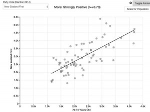
Andrew Chen has a lovely interactive scatterplot of vote for each party against demographic characteristics. For example (via Harkanwal Singh),  number of votes for NZ First vs median age

CLSSKS8UMAETS7_


July 29, 2015

Hadley Wickham

Dan Kopf from Priceonomics has written a nice article about one of Auckland’s famous graduates, Hadley Wickham. The article can be found Hadley Wickham.