Posts filed under Graphics (394)

March 25, 2014

On a scale of 1 to 10

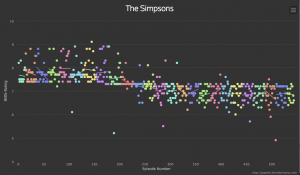
Via @neil_, an interactive graph of ratings for episodes of The Simpsons

simpsons


This comes from graphtv, which lets you do this for all sorts of shows (eg, Breaking Bad, which strikingly gets better ratings as the season progresses, then resets)

The reason the Simpsons graph has extra relevance to StatsChat is the distinctive horizontal line.  For the first ten seasons an episode basically couldn’t get rated below 7.5, after that it basically couldn’t rated above 7.5.   In the beginning there were ‘typical’ episodes and ‘good’ episodes; now there are ‘typical’ episodes and ‘bad’ episodes.

This could be a real change in quality, but it doesn’t match up neatly with the changes in personnel and style.  It could be a change in the people giving the ratings, or in the interpretation of the scale over time. How could we tell? One clue is that (based on checking just a handful of points) in the early years the high-rating episodes were rated by more people, and this difference has vanished or even reversed.
March 18, 2014

Seven sigma?

The cosmologists are excited today, and there is data visualisation all over my Twitter feed

That’s a nice display of uncertainty at different levels of evidence, before (red) and after (blue) adding new data.  To get some idea of what is greater than zero and why they care, read the post by our upstairs neighbour Richard Easther (head of the Physics department)

March 15, 2014

A data visualisation style guide

The Sunlight Foundation has released its internal data visualisation style guidelines (via)

Some of it is just one organisation’s house style, but it’s an attractive style. Some of it is generally useful advice. The main thing they are missing is any advice on representing uncertainty.

March 5, 2014

Planes and buses

Maps from James Davenport

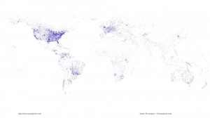
First, the world’s airport runways (go to his site for all the  details)

airports


You can see which bits of central Australia have farms or mines. Another interesting feature is the chain of evenly-spaced runways across far northern Canada — the DEW line.

He also has a video showing locations of all the buses in Seattle, over a 24-hour period. Like Auckland, Seattle has a real-time bus location system. Unlike Auckland’s system it produces openly-accessible data.

February 26, 2014

Caricatures in music space

There’s a map going around Twitter, being described as the most popular band in each US state


It’s a bit surprising that every state has a different favourite band, so I looked at the site listed on the map as the source.  In fact, the listed bands are not the most popular ones in any of the states. They are something more interesting.

Paul Lamere used Spotify (and perhaps other social music-streaming services) to get music listening preferences for 200000 people. He then looked at which artist in the top 100 for a state had the worst ranking over the US as a whole. He forced the result to be different for every state by bumping the less-populous state to its next choice when there was a tie. So, as the title on the map actually says, these are the most distinctive bands for a state, not the most popular.  They are caricatures, not photographs.

Since he had data based on postal code (ZIP code), it’s a pity he grouped these all the way up to the state level.  It would have been interesting to see urban vs suburban vs rural differences, and the major geographical trends across states such as Texas.

Graphics choices depend on audience

From BBC News,in what’s actually a very good story, a picture of radiation from Fukushima spreading across the Pacific.

_73203536_73203535

It’s actually a picture of a model prediction — the story is about using measurements of radiation from Fukushima to decide between two models that give predictions disagreeing by a factor of more than ten. That’s important not for the current plume, but in case there’s serious radiation release into the ocean from some reactor at some time in the future.

My point, though, is about colour scales. The yellow-green colour looks to be about halfway between reassuring non-irradiated dark blue and OMG WE’RE ALL GOING TO DIE!1!11!! dark red.  It isn’t.  The colour is on a logarithmic scale, so the maximum predicted concentration is about 30 becquerels per cubic metre, and the dark red is 10,000 becquerels per cubic metre.  That sounds like a lot, but becquerels are very small — enough radioactive material to have one atom decaying per second. A banana contains about 15 becquerels of potassium-40.

In fact, the story says that 10,000 Bq/m3 , the dark red end of the scale, is the Canadian safety threshold for radiation in drinking water (ie, about 1.5 litres of water per banana of radiation), so the yellow colour on the map is about one third of one percent of the official safety threshold for drinking water.

There’s a good reason the graphic uses a log scale and a very low limit — on a scale that corresponded to risk the predicted Fukushima plume would be completely invisible. For scientific presentation, the graphic and its scaling are completely appropriate. For the top of a story on a mass-media website, perhaps not so much.

(via @zentree)

February 22, 2014

Internal and external

There’s an interesting story in the Herald with interactive graphics comparing internal and external NCEA assessments for different subjects, levels, and decile of schools, over time.  The main thing I might change about the graphic is to display over deciles rather than over years, since that’s where the action is.

The general picture is fairly consistent: in low-decile schools, the students get substantially better grades on internal assessment than external. The difference is progressively smaller as you move up the decile scale, in some cases vanishing.  Interpreting the results is more difficult.

The lead says that students do better away from the pressure of exams, which is one explanation. Another, given by Professor Carnegie from VUW, is that the internal assessment is not very reliable. There are many alternatives views given in the story, and even some who says the differences over decile are reasonable and appropriate.


February 20, 2014

Three maps

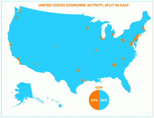
US GDP, measured by locations of businesses, from Reddit user atrubetskoy

usgdp


Now, GDP isn’t really well-defined at that sort of spatial scale — employees and businesses and customers need not all live in the same small census area — and the data are old, but it still looks striking.

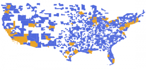
However, in this map, the orange areas have 50% of the US population

uspop


and since I used whole cities/counties as units, the orange areas could be made a lot smaller with a bit of effort, giving a better approximation to the GDP map.

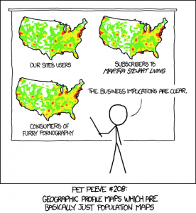
From XKCD 

heatmap

February 14, 2014

Manipulating official statistics

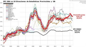
This is what it looks like when a country does manipulate its official statistics (from Ezequiel Tortorolli, via Tom Pepinsky and Xavier Marquez).

inflation


The black line is Argentina’s official federal inflation rate. The red line is the average of the rates for the 18 provinces, which are the fainter wiggly lines.


[Update: Argentina has just announced a new inflation index that’s supposed to be non-bogus. It will take a while to convince people.]

February 13, 2014

Commuting costs are housing costs

There’s an interesting story in the Herald about research on the combined cost of commuting and housing in Auckland.

“If you just look at housing costs alone, outlying areas appear really affordable and it initially seems to make sense to say, hey, let’s open up greenfield sites on the urban periphery and develop here,” Mr Mattingly said. “But when you include these broader costs, they are not as affordable as they seem.”

This is the sort of conclusion I like to see, as a non-driver, so I looked at the research paper (there wasn’t a link, but the Herald did give the researchers’ names and journal name). I was disappointed that the impact of commuting costs wasn’t higher, at least until you got out to Pukekohe or Warkworth.

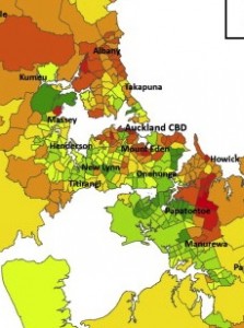
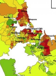
Since the journal is published by a company known for its dedication to preventing knowledge being disseminated for free, I won’t show any whole maps, but here are the central chunks of the cost maps with and without commuting costs. Or perhaps the other way around.