Posts filed under Graphics (394)

July 25, 2014

Storytelling with data: genre and shared language

A talk from this year’s Tapestry conference, taking the idea of storytelling with data seriously by looking at genre

Genres create a shared language, but they can also become formulaic. 

Here’s one example to get you going: what do love stories have to do with taxi maps?

Watch the video

(via Alberto Cairo)


Briefly

Graphics edition

July 24, 2014

Weak evidence but a good story

An example from Stuff, this time

Sah and her colleagues found that this internal clock also affects our ability to behave ethically at different times of day. To make a long research paper short, when we’re tired we tend to fudge things and cut corners.

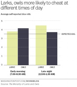
Sah measured this by finding out the chronotypes of 140 people via a standard self-assessment questionnaire, and then asking them to complete a task in which they rolled dice to win raffle tickets – higher rolls, more tickets.

Participants were randomly assigned to either early morning or late evening sessions. Crucially, the participants self-reported their dice rolls.

You’d expect the dice rolls to average out to around 3.5. So the extent to which a group’s average exceeds this number is a measure of their collective result-fudging.

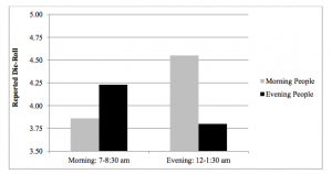
“Morning people tended to report higher die-roll numbers in the evening than the morning, but evening people tended to report higher numbers in the morning than the evening,” Sah and her co-authors wrote.

The research paper is here.  The Washington Post, where the story was taken from, has a graph of the results, and they match the story. Note that this is one of the very few cases where starting a bar chart at zero is a bad idea. It’s hard to roll zero on a standard die.
larks-owls-wapost


The research paper also has a graph of the results, which makes the effect look bigger, but in this case is defensible as 3.5 really is “zero” for the purposes of the effect they are studying
lark-owl


Unfortunately,neither graph has any indication of uncertainty. The evidence of an effect is not negligible, but it is fairly weak (p-value of 0.04 from 142 people). It’s easy to imagine someone might do an experiment like this and not publish it if they didn’t see the effect they expected, and it’s pretty certain that you wouldn’t be reading about the results if they didn’t see the effect they expected, so it makes sense to be a bit skeptical.

The story goes on to say

These findings have pretty big implications for the workplace. For one, they suggest that the one-size-fits-all 9-to-5 schedule is practically an invitation to ethical lapses.

Even assuming that the effect is real and that lying about a die roll in a psychological experiment translates into unethical behaviour in real life, the findings don’t say much about the ‘9-to-5’ schedule. For a start, none of the testing was conducted between 9am and 5pm.


Infographic of the month

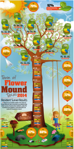
Alberto Cairo and wtfviz.net pointed me to the infographic on the left, a summary of a residents’ survey from the town of Flower Mound, Texas (near Dallas/Fort Worth airport). The highlight of the infographic is the 3-D piecharts nesting in the tree, ready to hatch out into full-fledged misinformation.

At least, they look like 3-D pie charts at first glance.  When you look more closely, the data are three-year trends in approval ratings for a variety of topics, so pie charts would be even more inappropriate than usual as a display method.  When you look even more closely, you see that that’s ok, because the 3-D ellipses are all just divided into three equal wedges — the data aren’t involved at all.

flower_mound 2014 Citizen Survey Infographic_201407151504422733

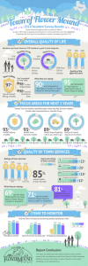
The infographic on the right comes from the town government.  It’s much better, especially by the standards of infographics.

If you follow the link, you can read the full survey results, and see that the web page giving survey highlights actually describes how the survey was done — and it was done well.  They sent questionnaires to a random sample of households, got a 35% response rate (not bad, for this sort of thing) and reweighted it based on age, gender, and housing tenure (ie rent, own, etc) to make it more representative.  That’s a better description (and a better survey) than a lot of the ones reported in the NZ media.


[update: probably original, higher resolution version, via Dave Bremer.]

July 23, 2014

Average and variation

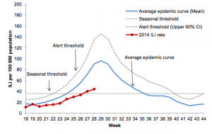
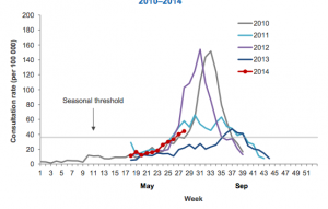
Two graphs from the NZ influenza surveillance weekly update (PDF, via Mark Hanna)

flu-averageflu-varying

Both show that the seasonal epidemic has started.  I think the second graph is more helpful in comparing this year to the past; showing the actual history for a range of years, rather than an average.  This sort of graph could handle a larger number of past years if they were all or mostly in, eg, thin grey lines, perhaps with this year, last year, and the worst recent year in colour.

The other news in the surveillance update is that the flu viruses that have been examined have overwhelming been H1N1 or H3N2, and both these groups are covered in this year’s vaccine.

July 13, 2014

Age/period/cohort voting

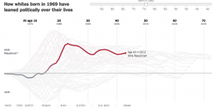
From the New York Times, an interactive graph showing how political leanings at different ages have changed over time

vote

Yes, voting preferences for kids are problematic. Read the story (and this link) to find out how they inferred them. There’s more at Andrew Gelman’s blog.

June 15, 2014

A thousand words

Compare these two stories:

The second story actually gives more context and explanation, but the first one is (to me) more effective.  It also shows something surprising: the size distribution splits into separate modes in recent years, perhaps reflecting specialisation in playing positions.

The second story actually argues that there isn’t a similar divergence in builds of rugby players, so I went to look at the data (which involved scraping it off the NZ Rugby Museum website).  The pattern over time I get is (click to embiggen)

rugby


which suggests that rugby players aren’t just getting bigger, they are showing a little of the same separation into big and very big seen in the NFL players


June 11, 2014

But did he ever return?

An excellent visualisation of very detailed data from the Boston subway system:

Boston’s Massachusetts Bay Transit Authority (MBTA) operates the 4th busiest subway system in the U.S. after New York, Washington, and Chicago. If you live in or around the city you have probably ridden on it. The MBTA recently began publishing substantial amount of subway data through its public APIs. They provide the full schedule in General Transit Feed Specification (GTFS) format which powers Google’s transit directions. They also publish realtime train locations for the Red, Orange, and Blue lines (but not Green or Silver lines). The following visualizations use data captured from these feeds for the entire month of February, 2014. Also, working with the MBTA, we were able to acquire per-minute entry and exit counts at each station measured at the turnstiles used for payment.

[No, he never returned]

June 5, 2014

NZ interactive graphic examples


  • From The Wireless, a story with maps of voter turnout and registration rates for younger people (RadioNZ might not be where you expect interactive graphics, but there it is). If I were being picky, I would say the popup labels are too big relative to the size of the map window.
June 3, 2014

Are girl hurricanes less scary?

There’s a new paper out in the journal PNAS claiming that hurricanes with female names cause three times as many deaths as those with male names (because people don’t give girl hurricanes the proper respect). Ed Yong does a good job of explaining why this is probably bogus, but no-one seems to have drawn any graphs, which I think make the situation a lot clearer. (more…)