Posts filed under Graphics (394)

November 7, 2014

Graphics: automate, then individualise

From James Cheshire, a lecturer in geography in London

The majority of graphics we produced for London: The Information Capital required R code in some shape or form. This was used to do anything from simplifying millions of GPS tracks, to creating bubble charts or simply drawing a load of straight lines. We had to produce a graphic every three days to hit the publication deadline so without the efficiencies of copying and pasting old R code, or the flexibility to do almost any kind of plot, the book would not have been possible.  So for those of you out there interested in the process of creating great graphics with R, here are 5 graphics shown from the moment they came out of R to the moment they were printed.

That is, good graphics rely on both soulless automation and creative design flair. Graphic designers shouldn’t need to put the data in by hand; they should be starting with the output of well-designed software and working from there.
November 6, 2014

State lines

Two very geographical graphics:

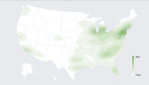
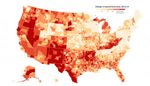
From the New York Times (via Alberto Cairo), a map of percentage increases in number of people with health insurance in the US.

insured-map

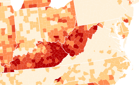
This is a good example of something that needs to be a map, to demonstrate two facts about the impact of Obamacare. First, state policies matter. That’s most dramatic in this region from the right-hand side, about halfway up:

insured-highlight

Kentucky and West Virginia implemented an expansion in Medicaid, the low-income insurance program, and had a big increase in number of people insured. Neighbouring counties in Tennessee and Virginia, which did not implement the Medicaid expansion, had much smaller increases.  The beige rectangle at the top left is Massachusetts, which already had a universal health care law and so didn’t change much. (Ahem. Geography and orientation apparently not my strong points. Massachusetts didn’t change, but that’s Pennsylvania, which only just started Medicaid expansion)

Second, there was a lot of room for improvement in some places — most dramatically, south Texas. The proportion of people with health insurance increased by 10-15 percentage points, but it’s still below 40%.


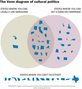
As a contrast, the Washington Post gives us this,

venn

which is, hands-down, the least readable marriage equality map I’ve ever seen.


November 5, 2014

US election graphics

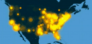
Facebook has a live map of who has mentioned on Facebook that they had voted (via Jason Sundram)

facebook-voted

USA Today showed a video including a Twitter live map

twitter-elections

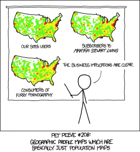
These both have the usual problem with maps of how many people do something: there are more people in some places than others. As usual, XKCD puts it well:

xkcd-elections

Useful statistics is about comparisons, and this comparison basically shows that more people live in New York than in New Underwood.

As usual, the New York Times has informative graphics, including a live set of projections for the interesting seats.


October 18, 2014

When barcharts shouldn’t start at zero

Barcharts should almost always start at zero. Almost always.

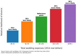
Randal Olson has a very popular post on predictors of divorce, based on research by two economists at Emory University. The post has a lot of barcharts like this one

marriage-stability-wedding-expenses

The estimates in the research report are hazard ratios for dissolution of marriage. A hazard ratio of zero means a factor appears completely protective — it’s not a natural reference point. The natural reference point for hazard ratios is 1: no difference between two groups, so that would be a more natural place to put the axis than at zero.

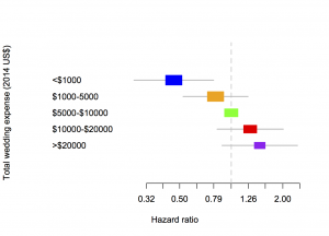
A bar chart is also not good for showing uncertainty. The green bar has no uncertainty, because the others are defined as comparisons to it, but the other bars do. The more usual way to show estimates like these from regression models is with a forest plot:

marriage

The area of each coloured box is proportional to the number of people in that group in the sample, and the line is a 95% confidence interval.  The horizontal scale is logarithmic, so that 0.5 and 2 are the same distance from 1 — otherwise the shape of the graph would depend on which box was taken as the comparison group.

Two more minor notes: first, the hazard ratio measures the relative rate of divorces over time, not the relative probability of divorce, so a hazard ratio of 1.46 doesn’t actually mean 1.46 times more likely to get divorced. Second, the category of people with total wedding expenses over $20,000 was only 11% of the sample — the sample is differently non-representative than the samples that lead to bogus estimates of $30,000 as the average cost of a wedding.

October 13, 2014

Herald data blog starts

The Herald’s Data Editor, Harkanwal Singh,  announces the online site’s new ‘Data Blog’, with the first new post being a map of NZ internet affordability created by Jonathan Brewer.

This has got to be a Good Thing for data literacy in the local media.

October 8, 2014

What are CEOs paid; what should they be paid?

From Harvard Business Review, reporting on recent research

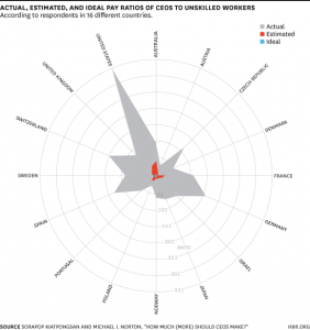
Using data from the International Social Survey Programme (ISSP) from December 2012, in which respondents were asked to both “estimate how much a chairman of a national company (CEO), a cabinet minister in a national government, and an unskilled factory worker actually earn” and how much each person should earn, the researchers calculated the median ratios for the full sample and for 40 countries separately.

The graph:

actualestimated


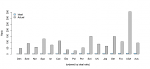
The radial graph exaggerates the differences, but they are already huge. Respondents dramatically underestimated what CEOs are actually paid, and still thought it was too much.  Here’s a barchart of the blue and grey data (the red data seems to only be available in the graph). Ordering by ideal pay ratio (rather than alphabetically) helps with the nearly-invisible blue bars: it’s interesting that Australia has the highest ideal ratio.

ceo

The findings are a contrast to foreign aid budgets, where the desired level of expenditure is less than the estimated level, but more than the actual level.  On the other hand, it’s less clear exactly what the implications are in the CEO case.


October 7, 2014

Marriage equality maps

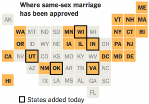
The US Supreme Court declined to review seven same-sex marriage decisions today. The StatsChat-relevant aspect is the flurry of maps this prompted:

I think the New York Times (via Twitter) is my favorite version: the square statebins use geography just as an index to make states easier to find, and (in contrast to the last statebins I linked to) they’ve moved Alaska to the right place

BzS1Q2zIQAAxW3Q


(more…)

October 6, 2014

NZ voting cartograms

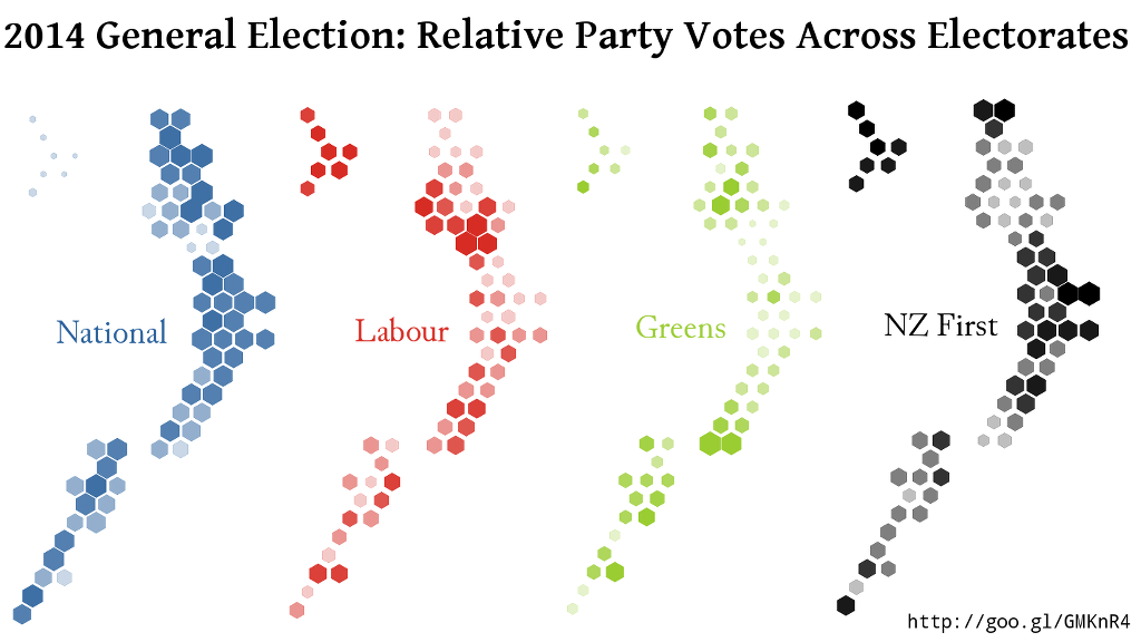
One of the problems with electoral maps is the ‘one cow, one vote’ effect: rural electorates are physically bigger, and so take up more of the map. When you combine that with the winner-take-all impact of simple colour schemes, it can look as though National won basically everything instead of just missing out on a majority.

Using a design by Chris McDowall that I linked earlier this year, David Friggens has mapped out the party votes across the country with equal area given to each electorate.  These maps show where the votes for each major party came from

big4


He also has maps for the minor parties, some of which have very localised support.

October 1, 2014

Climate change and flooding

flooding

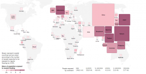
The Upshot blog at the New York Times had this interactive map of the flooding risk from climate change. It lets you see the number affected in each country, and also lets you vary the estimates for how much CO2 will be emitted and how sensitive ocean levels are to CO2.

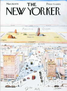
It’s missing something, though: not just New Zealand, but all the Pacific Island countries. We often get maps cut off at about 167 E longitude, and we can just whinge quietly about the New York view of the world

Steinberg_New_Yorker_Cover

but in  this context, where some of these islands will cease to exist if sea levels rise as predicted, leaving them out seems more inappropriate than usual.

September 26, 2014

Small multiples and graphical details

A really great long-form post on graphics and design by Lena Groeger at the ProPublica Nerd Blog

Waldo, and the eternal search for him, can actually tell us quite a lot about design. In many ways, Waldo is a great example of what NOT to do when using wee things in your own work. So with Waldo as our anti-hero, let’s take a look at how people read and interpret small visual forms, why tiny details can be hugely useful, and what principles we can apply to make all these little images and moments work for us as designers.