Posts filed under Graphics (394)

December 12, 2014

Diversity maps

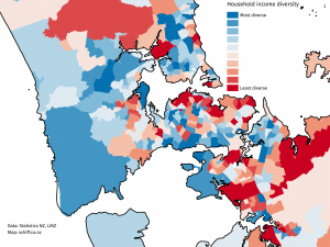
From Aaron Schiff, household income diversity at the census area level, for Auckland

AKL-income-diversity-better

The diversity measure is based on how well the distribution of income groups in the census area unit matches the distribution across the entire Auckland region, so in a sense it’s more a representativeness measure —  an area unit with only very high and very low incomes would have low diversity in this sense (but there aren’t really any). The red areas are low diversity and include the wealthy suburbs on the Waitemātā harbour and the Gulf, and the poor suburbs of south Auckland. This is an example of something that can’t be a dot map: diversity is intrinsically a property of an area, not an individual


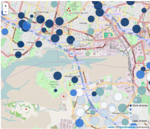
From Luis Apiolaza, ethnic diversity in schools across the country

luis-school-diversity


This screenshot shows an area in south Auckland, and it illustrates that ‘diversity’ really means ‘diversity’, it’s not just a code word for non-white. The low-diversity schools (white circles) in the lower half of the shot include Westmount School (99% Pākehā), but also Te Kura Māori o Ngā Tapuwae (99% Māori), and St Mary MacKillop Catholic School (90% Pasifika).  The high-diversity schools in the top half of the shot don’t have a majority of students from any ethnic group.
December 8, 2014

Political opinion: winning the right battles

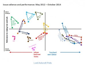
From Lord Ashcroft (UK, Conservative) via Alex Harroway (UK, decidedly not Conservative), an examination of trends in UK opinion on a bunch of issues, graphed by whether they favour Labour or the Conservatives, and how important they are to respondents. It’s an important combination of information, and a good way to display it (or it would be if it weren’t a low-quality JPEG)

Ashcroft-Chart


Ashcroft says

The higher up the issue, the more important it is; the further to the right, the bigger the Conservative lead on that issue. The Tories, then, need as many of these things as possible to be in the top right quadrant.

Two things are immediately apparent. One is that the golden quadrant is pretty sparsely populated. There is currently only one measure – being a party who will do what they say (in yellow, near the centre) – on which the Conservatives are ahead of Labour and which is of above average importance in people’s choice of party.

and Alex expands

When you campaign, you’re trying to do two things: convince, and mobilise. You need to win the argument, but you also need to make people think it was worth having the argument. The Tories are paying for the success of pouring abuse on Miliband with the people turned away by the undignified bully yelling. This goes, quite clearly, for the personalisation strategy in general.

December 2, 2014

Known and unknown unkowns

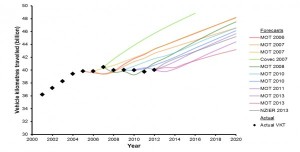
This graph is from the Ministry of Transport Strategic Policy Programme, looking at forecasts of demand for transport infrastructure.

ResizedImage600304-FutureDemand-Diagram1

The coloured lines show forecasts of driving (billion vehicle-km) made in the past; the black diamonds show actual driving. It’s clear that actual driving flattened out about ten years ago and the forecasts didn’t. What’s not clear is the implication. It could be that the old models need to be thrown out and that increases in driving are a twentieth-century phase we’ve grown out of. Or, it could be that growth in driving will restart soon. Or something else entirely.

The MoT report very sensibly accepts that we don’t really know what’s going on, and emphasises the importance of flexibility: if you aren’t confident about the future, you should be willing to accept extra costs to avoid premature lock-in, and you should also be prepared to pay for research to get better information.


December 1, 2014

Drug graphs

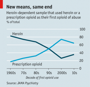
The Economist has a story on the changes in heroin abuse in the US (via @nzdrug).  It’s interesting to read, but I want to comment on the graphs.  The first one, and the one in the tweet, was this:

20141122_USC323

The source (if you use the clues in the story to search at JAMA Psychiatry) is here; the format of the graph is the same in the research paper.  I really don’t like this style with two lines for one proportion. At first glance it looks as though there’s information in the way one line mirrors the other, with the total staying approximately constant over time. Then you see that the total is exactly constant over time. It’s 100%.

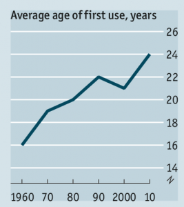
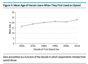
The other interesting graph is different in the research paper and the story. The data are the same, but the visual impression is different.

drug-nozero drug-zero

The graph on the left, from The Economist, has no zero. The graph on the right has a zero, making the change in mean age look a lot smaller.  In this case I think I’m with The Economist when it comes to the design, though I’d argue for a slightly wider and flatter graph. Barcharts must start at zero (defined appropriately for the data), but lines don’t have to, and an increase in mean age of first use from 16.5 to 22.9 is a pretty big change.

Where I’m not with The Economist is the numbers. The research paper, as I said, gives the numbers as 16.5 in the 1960s and 22.9 in the 2010s. The graph from the story is definitely too high at the maximum and probably too low at the minimum.


National income map

From the Herald’s data blog again, an interactive map of household incomes across the country, by Chris McDowall.

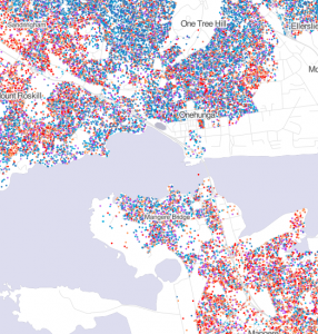
This is a dot map, with one dot for each household. The locations aren’t exact, since that sort of information isn’t publicly available; they are placed randomly within the Census meshblock (which presumably explains the household in the middle of the old Mangere Bridge in the example below).

income-map

Dot maps handle varying population density much better than shaded maps: if you zoom out, you can see that typical household income is not even a thing in most of the geographical area of NZ, but if you zoom in on a city, like Auckland, or a small town, like Raetihi or Ohakune, you can see the patterns of income.

You can’t do everything with dots, though.  Firstly, they only work where there really is a location for each number. If you wanted to map air pollution or land value, the reality is spread out, not localised.

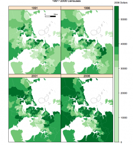
More interesting, though, is the comparison with this map from StatsNZ over household income over time in Auckland

census-income

A single household income is localised at a single point, but a change between two censuses isn’t.  If you used different dot locations for the four census times, some of the visual change would just be noise from the dot locations, but if you used the same dot locations you’d be implying that those specific households had those specific income changes.


November 28, 2014

Speed, crashes, and tolerances

The police think the speed tolerance change last year worked

Last year’s Safer Summer campaign introduced a speed tolerance of 4km/h above the speed limit for all of December and January, rather than just over the Christmas and New Year period. Police reported a 36 per cent decrease in drivers exceeding the speed limit by 1-10km/h and a 45 per cent decrease for speeding in excess of 10km/h.

Fatal crashes decreased by 22 per cent over the summer campaign. Serious injury crashes decreased by 8 per cent.

According to data from the NZTA Crash Analysis System, ‘driving too fast for the conditions’ was one of the contributing factors in about 20% of serious injury crashes and 30% of fatal crashes over the past seven years. The reductions in crashes seem more than you’d expect from those reductions in speeding.

So, I decided to look at the reduction in crashes where speed was a contributing factor, according to the Crash Analysis System data.

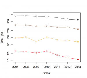
Here’s the trend for December and January, with the four lines showing all crashes where speed was a factor, those with any injury, those with a severe or fatal injury, and those with a fatality. The reduced-tolerance campaign was active for the last time period, December 2013 and January 2014. It looks as though the trend over years is pretty consistent.

during


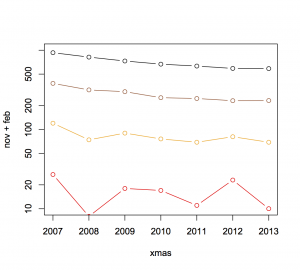
For comparison, here’s the trend in November and February, when there wasn’t a campaign running, again showing crashes where speed was listed in the database as a contributing cause, and with the four lines giving all, injury, severe or fatal, and fatal.

notduring

There really isn’t much sign that the trend was different last summer from recent years, or that the decrease was bigger in the months that had the campaign.  The trend of fewer crashes and fewer deaths has been going on for some time. Decreases in speeding are part of it, and the police have surely played an important role. That’s the context for assessing any new campaign: unless you have some reason to think last year was especially bad and the decrease would have stopped without the zero-tolerance policy, there isn’t much sign of an impact in the data.

The zero tolerance could be a permanent part of road policing, Mr Bush said.

“We’ll assess that at the end of the campaign, but I can’t see us changing our approach on that.”

No, I can’t either.

November 26, 2014

What doesn’t get into the papers

I complain a lot about the publicity-based surveys of varying quality that make it into the NZ media, but there’s a lot more that gets filtered out.

A journalist (who I’m not sure if I should name) sent me an example from Mitre 10

The research surveyed more than 1,500 New Zealanders on their connection to the quarter-acre dream and asked their opinions on the size of back yards and what they were doing to make the most of them.

An overwhelming 84 per cent of respondents agreed that they liked the idea of the traditional Kiwi quarter-acre paradise – a large plot of land with a standalone house on it, with plenty of room outdoors, and almost all said they would rather live on the traditional quarter-acre section than in high-density housing with reduced outdoor living spaces.

Over half of respondents felt that their outdoor living space is smaller now than what they had growing up (53%). Fifty percent of respondents attributed this to sections of land getting smaller, while 35 per cent believe houses are getting bigger, so there’s less room on a section for an outdoor living space.

The press release is a well-crafted example, with supporting evidence from QV that house sizes are increasing and quotes from a Massey University researcher — not about the survey, but about the general topic.

The survey, on the other hand, was fairly bogus. It was online, and most of the respondents got there through the Mitre 10 Facebook page.  You’d expect (and the Mitre 10 CEO has said) that the Facebook page attracts Mitre 10 customers, not necessarily a representative sample.  The report confirms this, with 88% of respondents being born in NZ, compared to about 75% of the population as a whole.

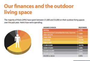
To make matters worse, here’s the reported data for the paragraphs quoted above. “Houses are bigger” and “sections are smaller” were alternative responses to the same question. You couldn’t answer that both were true — the correct answer, and the position that the report itself is pushing.

Untitled


One more finding I can’t resist quoting: “The majority of Kiwis (24%) have spent between $1,000 and $5,000 on their outdoor living spaces over the past year. “

Untitled 2

November 20, 2014

Round numbers

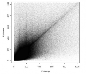
Nature doesn’t care about round numbers in base 10, but people do.  From @rcweir, via Amy Hogan, this is Twitter data of the number of people followed and following (truncated at 1000 to be readable). The number of people you follow is under your control, and there are clear peaks at multiples of 100 (and perhaps at multiples of 10 below 100). The number following you isn’t under your control, and there aren’t any similar patterns.

twit


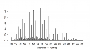
For a medical example, here are self-reported weights from the US National Health Interview Survey

nhis-wt

The same thing happens with measured variables that are subject to operator error: blood pressure, for example, shows fairly strong digit preference unless a lot of care is taken in the measurement.

November 14, 2014

Motion and context in graphics

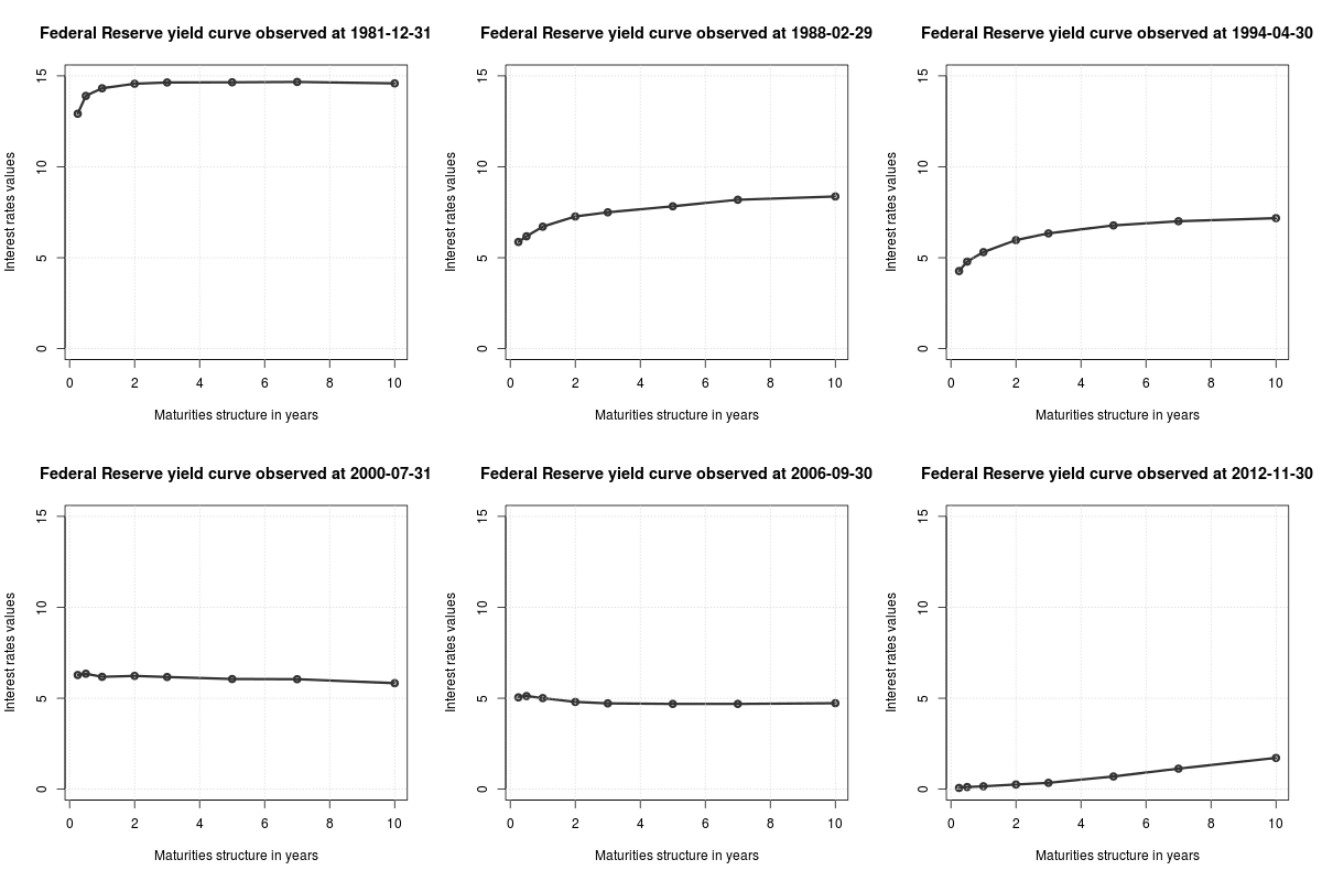
Via Michael Toth  I found this animated GIF from isomorphismes, showing the ‘yield curve‘ for Federal Reserve bonds

tumblr_na17r44bUx1qc38e9o1_400

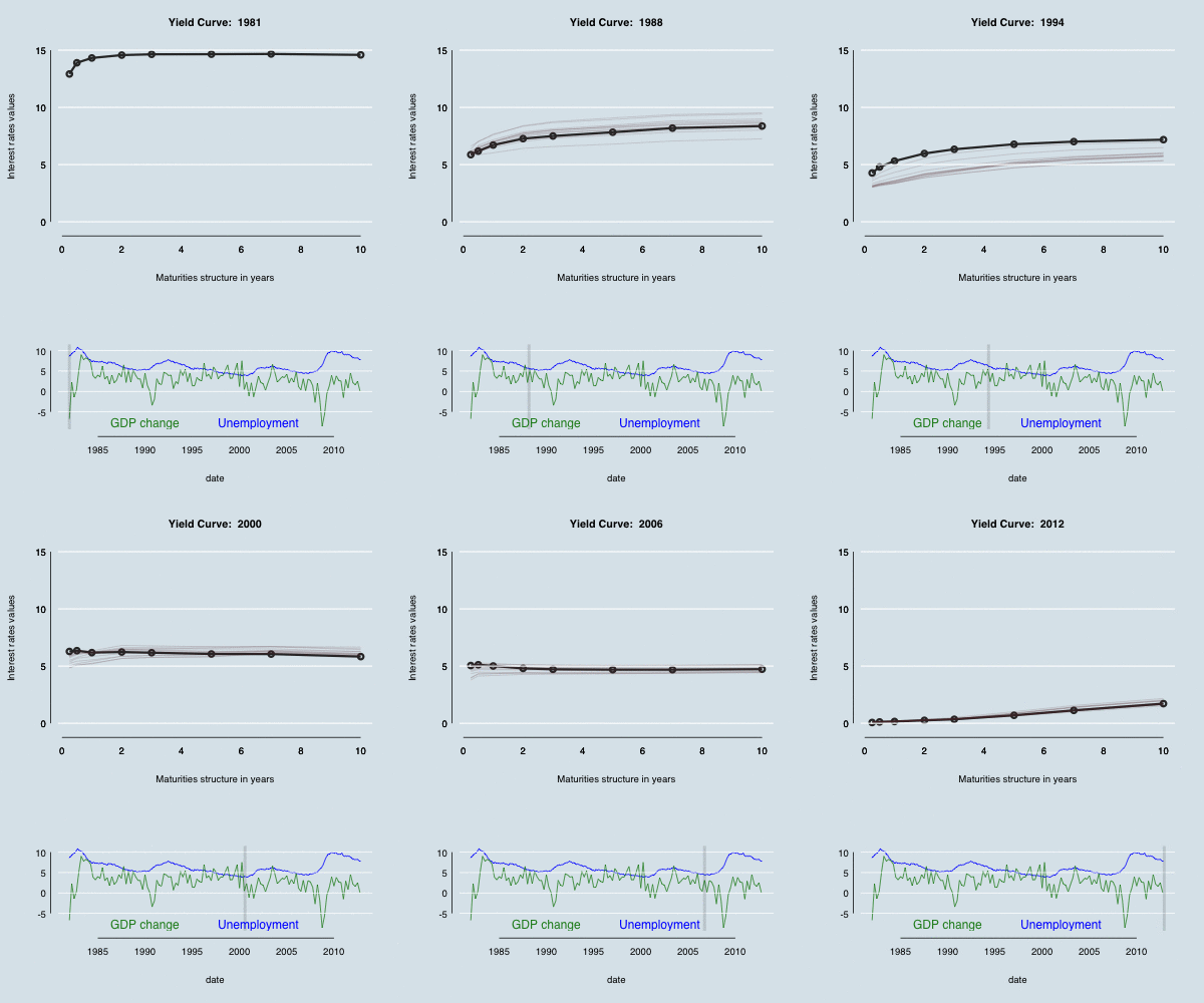
Michael modified the curve to make it prettier — alternatively, more similar to the style of The Economist.  In both cases, though, I felt the time context was missing.  Using animation rather than multiple plots lets you get a lot more on a page, but you can’t see what’s happening as clearly.

One possibility is to make a separate graphic that shows where you are in time; another is to keep some history by letting the graph leave shadows. In the graph below (based on both the linked examples), there are 12 months worth of shadow lines trailing the solid line, and a grey indicator bar showing where we are in history, with GDP growth and unemployment as context.

yield curve evolution

Even better (though not embeddable in WordPress) would be to make the time axis able to both autoplay and be controllable by the user, as in this example from the R animint package.


(update: the code)

November 12, 2014

Africa? Can you be more precise?

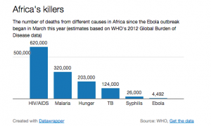
From the Telegraph (via many people on Twitter)

ebola


Seeing this at the same time as hearing about Bob Geldof’s Band-Aid reboot really emphasises the point that Africa isn’t a single place. The first Band-Aid recording was intended to help people in Ethiopia; the new one is for the Ebola-stricken regions of West Africa. The distance from Freetown to Addis Ababa is about the same as Auckland to Dili in East Timor, or Los Angeles to Bogota (or Addis Ababa to Prague).

On the other hand, the graph does make an important point. Syphilis, starvation, and TB are all very inexpensively treatable. Malaria and HIV are largely preventable, also at low cost. An effective treatment for Ebola will help, especially for medical personnel who are otherwise at very high risk, but in the long run it isn’t going to be enough. If we can’t deliver penicillin effectively, we won’t be able to deliver Ebola drugs. To make a real difference, we need a vaccine that’s good enough to prevent outbreaks.