Posts filed under Graphics (394)

February 4, 2015

Meet Statistics summer scholar Christopher Pearce

Chris PearceEvery year, the Department of Statistics offers summer scholarships to a number of students so they can work with staff on real-world projects. Christopher, right, is working on the OpenAPI project with Associate Professor Paul Murrell. Chris explains:

“Government data is becoming increasingly available. However, this does not mean it is readable – few individuals possess the knowledge and skills to make use of these data by themselves.

“In an ideal world, the code used by fellow statisticians would be available to everyone. It would be even more ideal if it were transferable. Sites like Wiki New Zealand  are doing a remarkable job of displaying some of New Zealand’s trends, but with no source code it can sometimes be impossible to recreate.

“The OpenAPI project is developing a flow-based framework that is primarily aimed at lowering the barriers to use of open data by the general public. My project is about creating an architecture for programmers and statisticians of all levels. Our goal is for anyone interested to have the ability to perform analyses on open government data. The idea is that there are publicly available snippets of code from fellow statisticians that can be easily linked in a meaningful way. The less expertise required by the end user, the better.

“My job is to come up with questions I am interested in answering, then figuring out how a potential lay observer would solve them. So far it has yielded some interesting results.

“I’m a third-year student at the University of Auckland, studying a Bachelor of Laws/Bachelor of Science conjoint. My skills lie in statistics and computer science, but I need the literal side to keep a balanced life.

“I got hooked on statistics when I discovered the Poisson distribution. There’s something about statistics that never seems to get old, and I’m discovering new things every day. It’s nice knowing I can actually attempt an answer to the curiosities in my head.”

February 3, 2015

Meet Statistics summer scholar Daniel van Vorsselen

Every year, the Department of Statistics offers summer scholarships to a number of students so they can work with staff on real-world projects. Daniel, right, is working on a project called Working with data from conservation monitoring schemes with Associate Professor Rachel Fewster. Daniel explains:

Daniel Profile Picture“The university is involved in a project called CatchIT, an online system that aims to help community conservation schemes by proving users with a place where they can input and store their data for reference. The project also produces maps and graphics so that users can assess the effectiveness of their conservation schemes and identify areas where changes can be made.

“My role in the project is to help analyse the data that users put into the project. This involves correctly formatting and cleaning the data so that it is usable. I assist users in the technical aspects relating to their data and help them communicate their data in a meaningful way.

“It’s important to maintain and preserve the wildlife and plant species we have in New Zealand so that future generations have the opportunity to experience them as we have. Our environments are a defining factor of our culture and lifestyles as New Zealanders and we have a large amount of native species in New Zealand. It would be a shame to see them eradicated.

“I am currently studying a BCom/BA conjoint, majoring in Statistics, Economics and Finance. I’m hoping to do Honours in statistics and I am looking at a career in banking.

“Over summer, I hope to enjoy the nice weather, whether out on the boat fishing, at the beach or going for a run.”


January 29, 2015

Absolute risk/benefit calculators

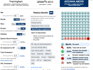
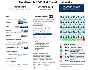
An interesting interactive calculator for heart disease/stroke risk, from the University of Nottingham. It lets you put in basic, unchangeable factors (age,race,sex), modifiable factors (smoking, diabetes, blood pressure, cholesterol), and then one of a set of interventions

Here’s the risk for an imaginary unhealthy 50-year old taking blood pressure medications

bp

The faces at the right indicate 10-year risk: without the unhealthy risk factors, if you had 100 people like this, one would have a heart attack, stroke, or heart disease death over ten years, with the risk factors and treatment four  would have an event (the pink and red faces).  The treatment would prevent five events in 100 people, represented by the five green faces.

There’s a long list of possible treatments in the middle of the page, with the distinctive feature that most of them don’t appear to reduce risk, from the best evidence available. For example, you might ask what this guy’s risk would be if he took vitamin and fish oil supplements. Based on the best available evidence, it would look like this:

vitamin


The main limitation of the app is that it can’t handle more than one treatment at a time: you can’t look at blood pressure meds and vitamins, just at one or the other.

(via @vincristine)

January 8, 2015

Climate trends

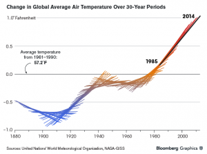
From an interview with Robert Simmons, a data visualisation designer specialising in environmental data, this graph was created by Chloe Whiteaker (at Bloomberg) working with NASA’s Gavin Schmidt. It shows a thirty-year global temperature trend centered around each year.

iop06mGoMi3Q1

If you just plotted the central point of each line segment you’d have a ‘local linear smoother’, one of the standard ways of drawing a smooth curve through a set of data. Plotting the whole line segment makes it clearer how the curve is computed.

(via Alberto Cairo)


January 3, 2015

Cancer isn’t just bad luck

From Stuff

Bad luck is responsible for two-thirds of adult cancer while the remaining cases are due to environmental risk factors and inherited genes, researchers from the Johns Hopkins Kimmel Cancer Center found.

The idea is that some, perhaps many, cancers come from simple copying errors in DNA replication. Although DNA copying and editing is impressively accurate, there’s about one error for every three cell divisions, even when nothing is wrong. Since the DNA error rate is basically constant, but other risk factors will be different for different cancers, it should be possible to separate them out.

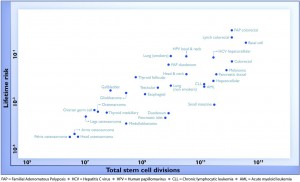
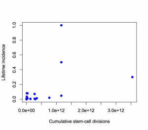
For a change, this actually is important research, but it has still been oversold, for two reasons. Here’s the graph from the paper showing the ‘2/3’ figure: the correlation in this graph is about 0.8, so the proportion of variation explained is the square of that, about two-thirds.  (click to embiggen)

cancer-logrisk

There are two things to notice about this graph. First, there are labels such as “Lung (smokers)” and “Lung (non-smokers)”, so it’s not as simple as ‘bad luck’.  Some risk factors have been taken into account. It’s not obvious whether this makes the correlation higher or lower.

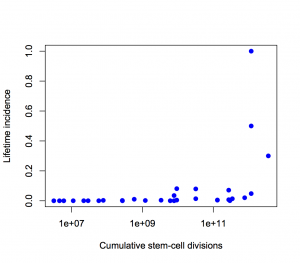
Second, the y-axis is on a log scale, so the straight line fit isn’t to cancer incidence and the proportion of variation explained isn’t a proportion of cancer risk.  Using a log scale for incidence is absolutely right when showing the biological relationship, but you can’t read proportions of incidence explained off that graph.  This is what the graph looks like when the y-axis is incidence, either with the x-axis still on a logarithmic scale

semilog

or with neither axis on a logarithmic scale

nolog

The proportion of variation explained is 18% and 28% respectively.

It’s ok to transform the x-axis as much as we like, so I looked at a square root transformation on the x-axis (based on the slope of the log-log graph). This gets the proportion of incidence explained up to about one third. Not two-thirds.

Using the log scale gives a lot more weight to the very rare cancers in the lower left corner, which turn out not to have important modifiable risk factors. Using an untransformed y-axis gives equal weight to all cancers, which is what you want from a medical or public health point of view.

Except, even that isn’t quite right. If you look at my two graphs it’s clear that the correlation will be driven by the top three points. Two of those are familial colorectal cancers, and the incidence quoted is the incidence in people with the relevant mutations; the third is basal cell carcinoma, which barely counts as cancer from a medical or public health viewpoint

If we leave out the familial cancers and basal cell carcinoma, the proportion explained drops to about 10%.

If we leave out put back basal cell carcinoma as well, something statistically interesting happens. The correlation shoots back up again, but only because it’s being driven by a single point. A more honest correlation estimate, predicting each point based on the other points and not based on itself, is much lower.

So, in summary: the “two-thirds of cancers explained” is Just Wrong. Doing a mathematically correct calculation gives about one third. Doing a calculation that’s actually relevant to cancer in the population gives even smaller values. (update) That’s not to say that DNA replication errors are unimportant — the paper makes it clear that they are important.

December 27, 2014

The Lesser Spotted Hutt Man Drought

From the Christmas Eve edition of the Upper Hutt Leader, which you can read online:

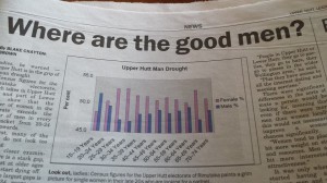
Ladies, be warned — Upper Hutt is in  the grip of a man drought

Here’s the graph to prove it (via Richard Law, on Twitter)

 upperhuttleader


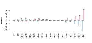
As the graph clearly indicates, women outnumber men hugely in the 25-35 age range, and (of course) at the oldest ages. The problem is, the y-axis starts at 45%. For lines or points that’s fine, but for bar charts it isn’t — because the bars connect the points to the x-axis.

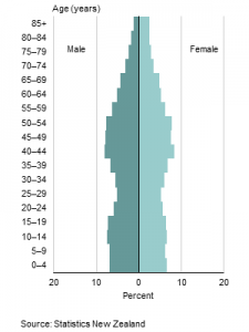
This is Stats New Zealand’s version of the graph, in standard ‘population pyramid’ form. It’s much less dramatic.

dbimages

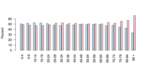
We could try a barchart with axis at zero

huttzero

It’s still much less dramatic — and you can see why the paper chopped the ages off at 75, since using the full range available in the data wouldn’t have fit on their axes.  The y-axis wasn’t just trimmed to fit the data; it was trimmed beyond the data.

You could make a case that ‘zero’ in this example is actual 50%: we (well, not we, but journalists who have to fill space) care about the deficiency or surplus of members of the appropriate sex.

hutt50

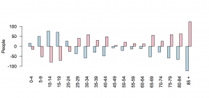
Or, you could look at deficiency or surplus of individuals, rather than percentages

huttdiff

Using individuals makes the younger age groups look more important, which helps the story, but on the other hand shows that the scale of this natural disaster isn’t all that devastating.

That’s basically what the expert quoted in the story says. Prof Garth Fletcher, from VUW, says

“People in Upper Hutt or Lower Hutt, they go to parties, they go to bars, they go to places in the wider Wellington area.”

It was only when you started having a gap between men and women of more than 5 or 10 percent that there would be real world implications, he said.


[Update: My data and graphs are for Upper Hutt (city). That’s about 2/3 of the Rimutaka electorate, which is where the paper’s data are for]

December 20, 2014

Not enough pie

From James Lee Gilbert on Twitter, a pie chart from WXII News (Winston-Salem, North Carolina)

pie

This is from a (respectable, if pointless) poll conducted in North Carolina. As you can clearly see, half of the state favours the local team. Or, as you can clearly see from the numbers, one-third of the state does.

If you’re going to use a pie chart (which you usually shouldn’t), remember that the ‘slices of pie’ metaphor is the whole point of the design. If the slices only add up to 70%, you need to either add the “Other”/”Don’t Know”/”Refused” category, or choose a different graph.

If your graph makes it easy to confuse 1/3 and 1/2, it’s not doing its job.

December 15, 2014

Interactive city statistics from UK

From the Centre for Advanced Spatial Analysis, at University College London, beautiful and informative maps:

LuminoCity3D.org is a mapping platform designed to explore the performance and dynamics of cities in Great Britain. The site brings together a wide range of key city indicators, including population, growth, housing, travel behaviour, employment, business location and energy use. These indicators are mapped using a new 3D approach that highlights the size and density of urban centres, and allows relationships between urban form and city performance to be analysed.

The credits are also interesting:

Maps created using TileMill opensource software by Mapbox. Website design uses the following javascript libraries- leaflet.js, mapbox.js and dimple.js (based on d3.js).

Source data Crown © Office for National Statistics, National Records of Scotland, DEFRA, Land Registry, DfT and Ordnance Survey 2014.

All the datasets used are government open data. Websites such as LuminoCity would not be possible without recent open data initiatives and the release of considerable government data into the public domain. Links to the specific datasets used in each map are provided to the bottom right of the page under “Source Data”.

The proliferation of interesting interactive graphics relies very heavily on open-source software (so designers don’t have to be expert programmers) and open data (to give something to display).

December 14, 2014

Statistics about the media: Lorde edition

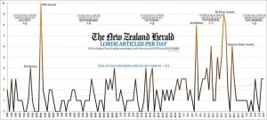
From @andrewbprice on Twitter: number of articles in the NZ Herald each day about the musician Lorde

lorde

The scampi industry, which brings in similar export earnings (via Matt Nippert), doesn’t get anything like the coverage (and fair enough).

More surprisingly, Lorde seems to get more coverage than the mother of our next head of state but two.  It may seem that the royal couple is always in the paper, but actually whole weeks can sometimes go past without a Will & Kate story.

December 13, 2014

Barchart of the week

Venezuelan-election-chart-e1418319765834

Via SkepChick, this chart from Venezolana de Televisión (Venezuelan national TV) during the 2013 elections almost makes Fox News look good.