Election donation maps
There are probably some StatChat readers who don’t read the NZ Herald, so I’ll point out that I have a post on the data blog about election donations.
There are probably some StatChat readers who don’t read the NZ Herald, so I’ll point out that I have a post on the data blog about election donations.
A lot of statistical reporting focuses on means, or other summaries of where a distribution lies. Often, though, variation is important. Vox.com has a story about variation in costs of lab tests at California hospitals, based on a paper in BMJ Open. Vox says
The charge for a lipid panel ranged from $10 to $10,169. Hospital prices for a basic metabolic panel (which doctors use to measure the body’s metabolism) were $35 at one facility — and $7,303 at another
These are basically standard lab tests, so there’s no sane reason for this sort of huge variation. You’d expect some variation with volume of tests and with location, but nothing like what is seen.
What’s not clear is how much this is really just variation in how costs are attributed. A hospital needs a blood lab, which has a lot of fixed costs. Somehow these costs have to be spread over individual tests, but there’s no unique way to do this. It would be interesting to know if the labs with high charges for one test tend to have high charges for others, but the research paper doesn’t look at relationships between costs.
The Vox story also illustrates a point about reporting, with this graph
If you look carefully, there’s something strange about the graph. The brown box second from the right is ‘lipid panel’, and it goes up to a bit short of $600, not to $10169. Similarly, the ‘metabolic panel’, the right-most box, goes up to $1000 on the graph and $7303 in the story.
The graph is taken from the research paper. In the research paper it had a caption explaining that the ‘whiskers’ in the box plot go to the 5th and 95th percentiles (a non-standard but reasonable choice). This caption fell off on the way to Vox.com, and no-one seems to have noticed.
The Herald is running a project to crowdsource data entry and annotation for NZ political donations and expenses: it’s something that’s hard to automate and where local knowledge is useful. Today, they have an interactive graph for 2014 election donations and have made the data available
We’ve written before about Wiki New Zealand, which aims to ‘democractise data’. WNZ has revamped its website to make things clearer and cleaner, and you can browse here.
As I’m a postgraduate scarfie this year, the table on domestic students in tertiary education interested me – it shows that women (grey) are enrolled in greater numbers than men at every single level. Click the graph to embiggen.
Founder Lillian Grace talks about the genesis of Wiki New Zealand here, and for those who love the techy side, here’s a video about the backend.
or What I Did At Open Data Day.
The government monitoring data on petrol prices go back to 2004, and while they show their data as time series, there are other ways to look at it.
The horizontal axis is the estimated cost of imported petrol plus all the taxes and levies. The vertical axis is the rest of the petrol price: it covers the cost hauling the stuff around the country, the cost of running petrol stations, and profit for both petrol stations and companies.
There’s an obvious change in 2012. From 2005 to 2012, the importer margin varied around 15c/litre, more or less independent of the costs. From 2012, the importer margin started rising, without any big changes in costs.
Very recently, things changed again: the price of crude oil fell, with the importer margin staying roughly constant and the savings being passed on to consumers. Then the New Zealand dollar fell, and the importer margin has fallen — either the increased costs from the lower dollar are being absorbed by the vendors, or they have been hedged somehow.
From time to time I like to remind people about the national petrol price monitoring program. For example, when there’s a call for a review of fuel prices.
The Ministry of Business, Innovation & Employment (Economic Development Information) carries out weekly monitoring of “importer margins” for regular petrol and automotive diesel. The weekly oil prices monitoring report is reissued each week with the previous week’s data.
The importer margin is the amount available to retailers to cover domestic transportation, distribution and retailing costs, and profit margins.
The purpose of this monitoring is to promote transparency in retail petrol and diesel pricing and is a key recommendation from the New Zealand Petrol Review
The importer margin for petrol over the past three years looks like this:
The wiggly blue line is the week-by-week estimated margin; the shaded area is centered around the red trend line and covers 50% of the data. The margin had been going up; the calls for a review came just after it plummeted.
At the same site, but updated only quarterly, is an international comparison of the cost of fuel broken down into tax and everything else.
A lot of surprisingly popular accounts on Twitter just tweet pictures, without giving any sources,and often with captions that misleading or just wrong. One from yesterday had a picture of a picnic on a highway in the Netherlands in 1973 and described it as being from the US.
Here’s one that came from @AmazingMaps, today, captioned “Most popular word used in online dating profiles by state”
Could it really be true that ‘NASCAR’ is the most popular word in Indiana dating profiles? Or that ‘oil’ is the most popular word in Texas? Have the standard personal-ad clichés become completely outdated? Aren’t Americans easy-going any more? Doesn’t anyone care about romance or honesty or humour?
We’ve seen this sort of analysis before on StatsChat. It’s designed to produce a caricature, though not necessarily in a bad way. This one comes from Mashable, based on analysis by Match.com. The original post says
Essentially, they broke down which words are used with relative frequency in certain states, as compared to relative infrequency in the rest of the country.
That is, the map has ‘oil’ for Texas and ‘NASCAR’ for Indiana not because these words were used very often in those states, but because they were used much less often in other states. Most Indiana dating profiles probably don’t mention NASCAR, but a much higher proportion do than in, say, New York or Oregon. Most Texas dating profiles don’t talk about oil, but it’s more common in Texas than in Maine or Tennessee. It’s not that everyone in Oregon or Idaho kayaks, but a lot more do than in Iowa or Kansas.
When this map first came out, in November, there were lots of stories about it, typically getting things wrong (eg an NBC motor sports site had the headline “NASCAR” is most frequently used word among Indiana online dating profiles”). That’s still bad, but most of these sites had links or at least mentioned the source of the map, so that people who care could find out what the facts are. @AmazingMaps seems confident none of its followers care.
Harkanwal Singh, at the Herald, has a very nice animation of known meteorite locations around the world and over time, as part of the report on Wednesday night’s fireball. Here’s a still of the last frame: click to expand.
This is basically a map of sampling bias. That is, meteorites hit the Earth uniformly by longitude and over time, though with a preference for the tropics over the poles. The bias towards the tropics is fairly slight by real area, but the Mercator projection will amplify it. From a 1964 paper by Ian Halliday:
That’s not what the map looks like.
The first part of the sampling bias is that a meteorite basically has to hit land to be counted: if it hits ocean it will sink without a trace.
It’s easier to find meteorites in places where they don’t bury themselves in soil or get eroded, so we see lots of them in desert or in ice. You don’t get many found in the Amazon, but there are lots just to the west in the Atacama desert of Chile.
In non-ideal circumstances it helps if there’s a fairly dense population of observers and scientists: meteorites in the modern US have a reasonable chance of being found even in non-ideal countryside. And finally, some places are easier to search than others. There’s a sharp drop off in meteorite finds between Oman and Yemen. This isn’t due to a dramatic geological or weather boundary; it has the same causes as the 13-year difference in life expectancy.
If a brain imaging study finds greater activation in the asymmetric diplodocus region or increased thinning in the posterior homiletic, what does that mean?
There are two main possibilities. Some studies look at groups who are different and try to understand why. Other studies try to use brain imaging as an alternative to measuring actual behaviour. The story in the Herald (from the Washington Post), “Benefit of kids’ music lessons revealed – study” is the second type.
The researchers looked at 334 MRI brain images from 232 young people (so mostly one each, some with two or three), and compared the age differences in young people who did or didn’t play a musical instrument. A set of changes that happens as you grow up happened faster for those who played a musical instrument.
“What we found was the more a child trained on an instrument,” said James Hudziak, a professor of psychiatry at the University of Vermont and director of the Vermont Center for Children, Youth and Families, “it accelerated cortical organisation in attention skill, anxiety management and emotional control.
An obvious possibility is that kids who play a musical instrument have different environments in other ways, too. The researchers point this out in the research paper, if not in the story. There’s a more subtle issue, though. If you want to measure attention skill, anxiety management, or emotional control, why wouldn’t you measure them directly instead of measuring brain changes that are thought to correlate with them?
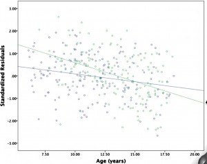
Finally, the effect (if it is an effect) on emotional and behavioural maturation (if it is on emotional and behavioural maturation) is very small. Here’s a graph from the paper

The green dots are the people who played a musical instrument; the blue dots are those who didn’t. There isn’t any dramatic separation or anything — and to the extent that the summary lines show a difference it looks more as if the musicians started off behind and caught up.
Thousand words edition:


