Posts filed under Evidence (90)

January 15, 2014

Fancy packaging of plain packaging impact

The Sydney Morning Herald has a story on the impact of plain packaging for cigarettes in Australia.  Cancer researchers in Sydney found a big spike in calls to Quitline after the packaging change, and interpreted this as evidence it was working

The researchers said although the volume of calls to Quitline was an ”indirect” measure of people’s quitting intentions and behaviour, it was more objective than community surveys where people can answer questions in a socially desirable and biased way.

On the other side, tobacco companies say there hasn’t been any actual fall in smoking.

”In November 2013, a study by London Economics found that since the introduction of plain packaging in Australia there has been no change in smoking prevalence … What matters is whether fewer people are smoking as a result of these policies – and the data is clear that overall tobacco consumption and smoking prevalence has not gone down,” he said.

In this setting you might reasonably be concerned that either side is putting their results in fancy packaging. So what should you believe?

In fact, the claims are consistent with each other and don’t say much either way about the success of the program.  If you look at the research paper, they found an increase peaking at about 300 calls per week and then falling off by about 14% per week. That works out to be a total of roughly 2000 extra calls attributed to the packaging change, ie, just over half a percent of all smokers in Australia, or perhaps a 10% increase in the annual Quitline volume. If the number of people actively trying to quit by methods other than Quitline also goes up by 10%, you still wouldn’t expect to see much impact on total tobacco sales after one year.

The main selling point for the plain packaging (eg) was that it would prevent young people from starting to smoke. That’s what really needs to be evaluated, and it’s probably too early to tell.


[Update: Of course, other countries that were independently considering changing their policies shouldn’t wait for years just because Australia started first. That would be silly.]

[Update: the Quitline data are just for NSW; so perhaps 1.5% of smokers]

December 23, 2013

Meet Callum Gray, Statistics Summer Scholar 2013-2014

Every year, the Department of Statistics at the University of Auckland offers summer scholarships to a number of students so they can work with our staff on real-world projects. We’ll be profiling the 2013-2014 summer scholars on Stats Chat. Callum is working with Dr Ian Tuck on a project titled Probability of encountering a bus.  

Callum (right) explains:

“If you encounter a bus on a journey, you are likely to be exposed to higher levels of pollution. I am trying to find the probability of encountering a bus and how many you will encounter when you travel from place A to place B, taking into account variables such as the time of day and mode of transport.

???????????????????????????????

“This research is useful because it will give us more of an understanding about the impact that buses have on our daily exposure to pollution. we can use this information to plan journeys and learn more about an issue that is becoming more and more apparent.

“I was born in Auckland and have lived here my whole life. I just finished my third year of a Bachelor of Commerce/Bachelor of Science conjoint majoring in Accounting, Finance, and Statistics, which I will finish at
the end of 2014.

“Statistics appeals to me because it is used everyday in conjunction with many other areas. It is very useful to know in a lot of workplaces, and it is interesting because it has a lot of real-life applications.

“I am going to Napier for Christmas and Rhythm and Vines for New Year. In the rest of my spare time, I will be playing cricket and golf, as well as hanging out with friends.”


December 2, 2013

Don’t be scared of WiFi

From TV One Breakfast this morning “WiFi detrimental to health, study suggests“. (I didn’t see this live; the Science Media Centre contacted me for comment)

The guest, Mr Kasper from Safe Wireless Technology NZ, said

Overseas research has shown that a person who uses a mobile phone for a year increases their chances of getting brain cancer by 70%, according to the SWTNZ.

The ‘overseas research’ appears to be this, a case-control study of acoustic neuroma in Scandinavia. The first thing to note is that “acoustic neuroma” isn’t the same thing as “brain cancer”. Acoustic neuroma is a rare, benign brain tumour (‘benign’ means it doesn’t spread metastatically), which is usually treatable, though often with long-term effects.  The researchers didn’t suggest that their results applied to other brain tumours; in fact, they assumed the opposite and used people with a different brain tumour, meningioma, as one set of controls for their comparisons.

The story  also says

“There’s so much research and there’s so much scientific evidence now that does more than just suggest that there is a real problem, and people are getting these problems,” Mr Kasper said.

The National Cancer Institute has a good summary of the scientific evidence, and they are not at all convinced. It certainly isn’t the case that there’s a strong association with brain cancer overall.

The new research appears to be better conducted than a lot of the past claims of associations between radio waves and health. It’s working against a strong burden of proof both from animal studies and from the fact that radio waves can’t damage DNA. I don’t think it manages that level of proof, but I think reasonable people could disagree. However, even if we assume that the association specifically with acoustic neuroma is real and causal, it doesn’t really support any concern over WiFi. Cellphones are pressed up against the ear, and so provide higher dose of radio-frequency energy to that ear. WiFi transmitters are typically not pressed up against the ear, and each doubling of the distance reduces the energy by a factor of four. And, since they don’t have to reach as far, WiFi signals are less powerful to begin with.

The story ends with

“We do want the Government to put some money into some independent research.”

I’m generally in favour of the Government putting money into research, but on this particular topic  there’s no real advantage to the research being done in New Zealand, and we have too small a population to contribute much. There are large international studies ongoing; we don’t need a small local one.

If you are worried about cellphones and acoustic neuroma, use headphones with your cellphone. If you are worried about WiFi and brain cancer, then relax.


November 27, 2013

Interpretive tips for understanding science

From David Spiegelhalter, William Sutherland, and Mark Burgman, twenty (mostly statistical) tips for interpreting scientific findings

To this end, we suggest 20 concepts that should be part of the education of civil servants, politicians, policy advisers and journalists — and anyone else who may have to interact with science or scientists. Politicians with a healthy scepticism of scientific advocates might simply prefer to arm themselves with this critical set of knowledge.

A few of the tips, without their detailed explication:

  • Differences and chance cause variation
  • No measurement is exact
  • Bigger is usually better for sample size
  • Controls are important
  • Beware the base-rate fallacy
  • Feelings influence risk perception
November 24, 2013

Measuring the right variable

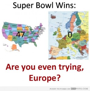
superbowl


And, of course, New Zealand won the Rugby world cup, NZ or Australia will win the League world cup next weekend, and NZ was the only undefeated team in the last soccer World Cup, so Europe’s overall football credentials seem to be on shaky ground.  At least if you set up the comparison very, very carefully.

Generalisations of this approach to unsupported nutritional advertisting, surrogate outcomes in clinical trials, ranking of universities, and the claim that people with incomes below $110,000 collective pay no net income tax provide a lot of the work  for StatsChat.

(via Ben Atkinson on Twitter. I can’t identify the original source, but this version has the best punctuation.)


November 19, 2013

Briefly

  • Animated visualisation of motor vehicle accident rates over the year in Australia. Unfortunately it’s based on just one year of data, which isn’t really enough. And if you’re going the effort of the animation, it would have been nice to use it to illustrate uncertainty/variability in the data
  • Randomised trials outside medicine: the combined results of ten trials of restorative justice conferences. Reoffending over the next two years was reduced, and the victims were happier with the handling of the case. (via @hildabast)
  • How much do @nytimes tweets affect pageviews for their stories?
November 5, 2013

Can we bring out the real numbers now?

So, the decision has been made and the blood alcohol limit will be lowered.  Perhaps now we can start using realistic numbers for the impact.  The story in the Herald today shows the problem, although it’s actually much better than anything I’ve seen in the mainstream media previously:

The changes come after a two-year review of the impact of lowering the legal blood alcohol limit by 30mg suggested 3.4 lives would be saved a year and 64 injury-causing crashes avoided.

It would also save $200 million in social costs over 10 years.

“Alcohol impairment is a major cause of road accidents in New Zealand, with an average of 61 fatalities, 244 serious injuries, and 761 minor injuries every year caused by at-fault drivers who have been drinking,” said Transport Minister Gerry Brownlee.

“The social cost of these injuries and fatalities is $446 million – a huge sum in a country of our size.”

In the first paragraph the estimated benefit based on actual research is quoted. That’s a big step forward. The second paragraph is just wrong: the social costs aren’t in addition to the lives saved and injuries prevented; that’s where the social cost numbers come from. And it’s multiplied by ten years.

In the third and fourth paragraphs Mr Brownlee is quoted as justifying the change by quoting total costs of drink driving. The social cost number in the fourth paragraph is 22 times larger than the actual estimated benefit. You’d think that sort of discrepancy would draw some journalistic comment.

And later in the story we are told about a victim of a drunk driver. A driver whose blood alcohol concentration was 190mg/100ml, more than twice the existing legal limit, and who was duly convicted and sent to prison under the old laws. Not the sort of person whose behaviour is likely to be affected by this change.

October 24, 2013

Burning issue

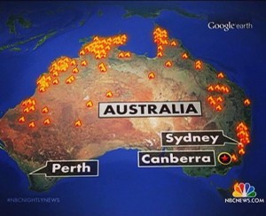
I’m in Sydney at the moment, so this is topical, as well as being an illustration of maps, infographics, and internet fact-checking.

From Paul Rosenzweig on Twitter, allegedly a map of the bushfires shown on NBC News in the US

attributed to NBC News

People in Australia think this map is hilarious/outrageous depending on personality — the current emergency was just in New South Wales.  That was my reaction too. But the NBC News blog gets this right, which is a bit confusing

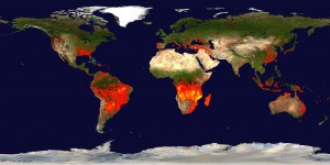
However, @Aus_ScienceWeek, the people who run National Science Week, point out that the map looks rather like the appropriate subsection of NASA’s satellite-based fire map from mid-September

firemap.2013251-2013260.2048x1024


so it might well be correct in the sense that there actually fires in those places, though still wrong as a description of the emergency.


October 22, 2013

Cookies not as addictive as cocaine

Sometimes a scientific claim is obviously unreasonable, like when a physicist tells you “No, really, the same electron goes through both slots in this barrier”. You’re all “Wut? No. Can’t be.” They show you the interference pattern. “But did you think of…?” “Yes”. “Couldn’t it be..” “No, we tried that.” “But…”  “And that.”  “Still, what about…?” “That too.” Eventually you give up and accept that the universe is weird. An electron really can go through two holes at once.

On the other hand, sometimes the claim isn’t backed up that well, like when Stuff tells us “Cookies as addictive as cocaine”. For example, while some rats were given Oreo cookies and others were given cocaine, there weren’t any rates who were offered both, so there wasn’t any direct evaluation of preference, let alone of addiction. The cookies weren’t even compared to the same control as the cocaine — cookies were compared to rice cakes, and cocaine-laced water to plain water.

There’s a more detailed take-down on the Guardian site, by an addiction researcher.

October 3, 2013

People who bought this theory also liked…

An improved version of study that Stuff and StatsChat reported on more than a year ago has now appeared in print. The study found that people who have non-standard beliefs about the moon landings or Princess Diana’s death are also likely to have non-standard beliefs about climate change or health effects of tobacco. It improves on the previous research by using a reasonably representative online survey rather than a sample of visitors to climate debate blogs.

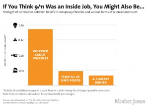
Mother Jones magazine in the US summarised some of the results in this graph of correlations

conspiracies6_2


That’s a horrible graph partly because, contrary to what the footnote says, correlations are not in fact restricted to be between 0 and 1, but between -1 and 1: and in fact the three correlations shown were negative in the research and have been turned around for more convenient display.

The title is misleading: only one of the six `conspiracist ideation’ questions was about 9/11, and it wasn’t a yes/no question, and it wasn’t really about it being an inside job (ie, performed by the government), but about the government allowing it to happen. In the same way, the other three variables aren’t simple yes/no questions, but scores based multiple questions, each on a 5-point scale.

A more-technical point is that correlations, while appropriate in the paper as part of their statistical model, aren’t really a good way to describe the strength of association.  It’s easier to understand the square of the correlation, which gives the proportion of variability in one variable explained by the other.  That is, the conspiracy-theory score explains about 25% of the variation in the vaccine score,  just over 1% of the variation in the GM Foods score, and just under 1% of the variation in the climate change score.

(via @zentree)