Posts filed under Evidence (90)

July 25, 2015

Some evidence-based medicine stories

  • Ben Goldacre has a piece at Buzzfeed, which is nonetheless pretty calm and reasonable, talking about the need for data transparency in clinical trials
  • The Alltrials campaign, which is trying to get regulatory reform to ensure all clinical trials are published, was joined this week by a group of pharmaceutical company investors.  This is only surprising until you think carefully: it’s like reinsurance companies and their interest in global warming — they’d rather the problems would go away, but there’s not profit in just ignoring them.
  • The big potential success story of scanning the genome blindly is a gene called PCSK9: people with a broken version have low cholesterol. Drugs that disable PCSK9 lower cholesterol a lot, but have not (yet) been shown to prevent or postpone heart disease. They’re also roughly 100 times more expensive than the current drugs, and have to be injected. None the less, they will probably go on sale soon.
    A survey of a convenience sample of US cardiologists found that they were hoping to use the drugs in 40% of their patients who have already had a heart attack, and 25% of those who have not yet had one.
July 11, 2015

What’s in a name?

The Herald was, unsurprisingly, unable to resist the temptation of leaked data on house purchases in Auckland.  The basic points are:

  • Data on the names of buyers for one agency, representing 45% fo the market, for three months
  • Based on the names, an estimate that nearly 40% of the buyers were of Chinese ethnicity
  • This is more than the proportion of people of Chinese ethnicity in Auckland
  • Oh Noes! Foreign speculators! (or Oh Noes! Foreign investors!)

So, how much of this is supported by the various data?

First, the surnames.  This should be accurate for overall proportions of Chinese vs non-Chinese ethnicity if it was done carefully. The vast majority of people called, say, “Smith” will not be Chinese; the vast majority of people called, say, “Xu” will be Chinese; people called “Lee” will split in some fairly predictable proportion.  The same is probably true for, say, South Asian names, but Māori vs non-Māori would be less reliable.

So, we have fairly good evidence that people of Chinese ancestry are over-represented as buyers from this particular agency, compared to the Auckland population.

Second: the representativeness of the agency. It would not be at all surprising if migrants, especially those whose first language isn’t English, used real estate agents more than people born in NZ. It also wouldn’t be surprising if they were more likely to use some agencies than others. However, the claim is that these data represent 45% of home sales. If that’s true, people with Chinese names are over-represented compared to the Auckland population no matter how unrepresentative this agency is. Even if every Chinese buyer used this agency, the proportion among all buyers would still be more than 20%.

So, there is fairly good evidence that people of Chinese ethnicity are buying houses in Auckland at a higher rate than their proportion of the population.

The Labour claim extends this by saying that many of the buyers must be foreign. The data say nothing one way or the other about this, and it’s not obvious that it’s true. More precisely, since the existence of foreign investors is not really in doubt, it’s not obvious how far it’s true. The simple numbers don’t imply much, because relatively few people are housing buyers: for example, house buyers named “Wang” in the data set are less than 4% of Auckland residents named “Wang.” There are at least three other competing explanations, and probably more.

First, recent migrants are more likely to buy houses. I bought a house three years ago. I hadn’t previously bought one in Auckland. I bought it because I had moved to Auckland and I wanted somewhere to live. Consistent with this explanation, people with Korean and Indian names, while not over-represented to the same extent are also more likely to be buying than selling houses, by about the same ratio as Chinese.

Second, it could be that (some subset of) Chinese New Zealanders prefer real estate as an investment to, say, stocks (to an even greater extent than Aucklanders in general).  Third, it could easily be that (some subset of) Chinese New Zealanders have a higher savings rate than other New Zealanders, and so have more money to invest in houses.

Personally, I’d guess that all these explanations are true: that Chinese New Zealanders (on average) buy both homes and investment properties more than other New Zealanders, and that there are foreign property investors of Chinese ethnicity. But that’s a guess: these data don’t tell us — as the Herald explicitly points out.

One of the repeated points I  make on StatsChat is that you need to distinguish between what you measured and what you wanted to measure.  Using ‘Chinese’ as a surrogate for ‘foreign’ will capture many New Zealanders and miss out on many foreigners.

The misclassifications aren’t just unavoidable bad luck, either. If you have a measure of ‘foreign real estate ownership’ that includes my next-door neighbours and excludes James Cameron, you’re doing it wrong, and in a way that has a long and reprehensible political history.

But on top of that, if there is substantial foreign investment and if it is driving up prices, that’s only because of the artificial restrictions on the supply of Auckland houses. If Auckland could get its consent and zoning right, so that more money meant more homes, foreign investment wouldn’t be a problem for people trying to find somewhere to live. That’s a real problem, and it’s one that lies within the power of governments to solve.
May 28, 2015

Road deaths up (maybe)

In Australia road deaths are going down but in New Zealand the number has shot up“, says the Herald, giving depressing-looking international comparisons from newly-announced OECD data. The percentage increase was highest in New Zealand The story does go on to point out that the increase reverses a decrease the previous year, suggesting that it might be that 2013 was especially good, and says

An ITF spokesman said New Zealand’s relatively small size made percentage movements more dramatic.”

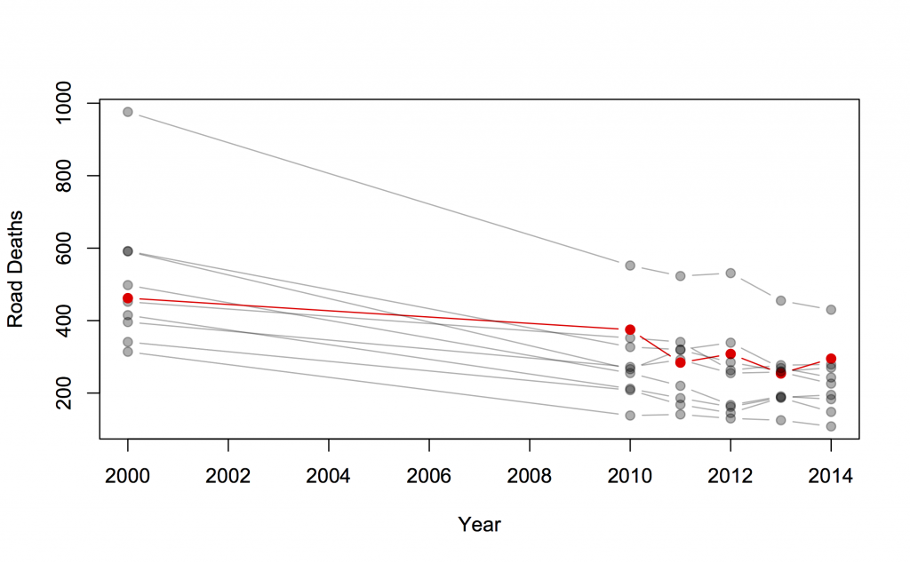
Overall, it’s a good piece. Two things I want to add: first, it’s almost always useful to see more context in a time series if it’s available. I took the International Road Traffic Accident Database and picked out a group of countries with similar road toll to New Zealand in 2000: all those between 200 and 1000. The list is Austria, Denmark, Finland, Ireland, Israel, New Zealand, Norway, Slovenia, Sweden, Switzerland. Here are the data for 2000 and for 2010-2014; New Zealand is in red.

roaddeaths

There’s a general downward trend, but quite a bit of bouncing around due to random variation. As we keep pointing out, there are lots of mistakes made when driving, and it takes bad luck to make one of these fatal, so there is a lot of chance involved. It’s clear from the graph that the increase is not much larger than random variation.

Calculations using the Poisson distribution (the simplest reasonable mathematical model, and the one with the smallest random variation) are, likewise, borderline. There’s only weak evidence that road risk was higher last year than in 2013. The right reference level, though, isn’t ‘no change’, it’s the sort of decrease that other countries are seeing.  The median change in this group of 10 countries was a 5% decrease, and there’s pretty good evidence that New Zealand’s risk did not decrease 5%.  Also, the increase is still present this year, making it more convincing.

What we can’t really do is explain why. As the Herald story says, some of the international decrease is economic: driving costs money, so people do less of it in recessions. Since New Zealand was less badly hit by recession, you’d expect less decrease in driving here, and so less decrease in road deaths. Maybe.

One thing we do know: while it’s tempting and would be poetic justice, it’s not valid to use the increase as evidence that recent road-safety rule changes have been ineffective. That would be just as dishonest as the claims for visible success of the speed tolerance rules in the past.


March 18, 2015

Men sell not such in any town

Q: Did you see diet soda isn’t healthier than the stuff with sugar?

A: What now?

Q: In Stuff: “If you thought diet soft drink was a healthy alternative to the regular, sugar-laden stuff, it might be time to reconsider.”

A: They didn’t compare diet soft drink to ‘the regular, sugar-laden stuff’.

Q: Oh. What did they do?

A: They compared people who drank a lot of diet soft drink to people who drank little or none, and found the people who drank a lot of it gained more weight.

Q: What did the other people drink?

A: The story doesn’t say. Nor does the research paper, except that it wasn’t ‘regular, sugar-laden’ soft drink, because that wasn’t consumed much in their study.

Q: So this is just looking at correlations. Could there have been other differences, on average, between the diet soft drink drinkers and the others?

A: Sure. For a start, there was a gender difference and an ethnicity difference. And BMI differences at the start of the study.

Q: Isn’t that a problem?

A: Up to a point. They tried to adjust these specific differences away, which will work at least to some extent. It’s other potential differences, eg in diet, that might be a problem.

Q: So the headline “What diet drinks do to your waistline” is a bit over the top?

A: Yes. Especially as this is a study only in people over 65, and there weren’t big differences in waistline at the start of the study, so it really doesn’t provide much information for younger people.

Q: Still, there’s some evidence diet soft drink is less healthy than, perhaps, water?

A: Some.

Q: Has anyone even claimed diet soft drink is healthier than water?

A: Yes — what’s more, based on a randomised trial. I think it’s fair to say there’s a degree of skepticism.

Q: Are there any randomised trials of diet vs sugary soft drinks, since that’s what the story claimed to be about?

A: Not quite. There was one trial in teenagers who drank a lot of sugar-based soft drinks. The treatment group got free diet drinks and intensive nagging for a year; the control group were left in peace.

Q: Did it work?

A: A bit. After one year the treatment group  had lower weight gain, by nearly 2kg on average, but the effect wore off after the free drinks + nagging ended. After two years, the two groups were basically the same.

Q: Aren’t dietary randomised trials depressing?

A: Sure are.


February 27, 2015

What are you trying to do?


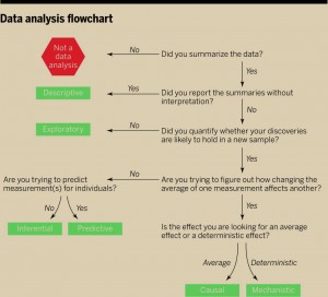
There’s a new ‘perspectives’ piece (paywall) in the journal Science, by Jeff Leek and Roger Peng (of Simply Statistics), arguing that the most common mistake in data analysis is misunderstanding the type of question. Here’s their flowchart

F1.large

The reason this is relevant to StatsChat is that you can use the flowchart on stories in the media. If there’s enough information in the story to follow the flowchart you can see how the claims match up to the type of analysis. If there isn’t enough information in the story, well, you know that.


February 20, 2015

Why we have controlled trials


joc80747f2

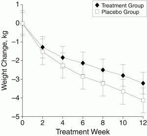
The graph is from a study — a randomised, placebo-controlled trial published in a top medical journal — of a plant-based weight loss treatment, an extract from Garcinia cambogia, as seen on Dr Oz. People taking the real Garcinia cambogia lost weight, an average of 3kg over 12 weeks. That would be at least a little impressive, except that people getting pretend Garcinia cambogia lost an average of more than 4kg over the same time period.  It’s a larger-than-usual placebo response, but it does happen. If just being in a study where there’s 50:50 chance of getting a herbal treatment can lead to 4kg weight loss, being in a study where you know you’re getting it could produce even greater ‘placebo’ benefits.

If you had some other, new, potentially-wonderful natural plant extract that was going to help with weight loss, you might start off with a small safety study. Then you’d go to a short-term, perhaps uncontrolled, study in maybe 100 people over a few weeks to see if there was any sign of weight loss and to see what the common side effects were. Finally, you’d want to do a randomised controlled trial over at least six months to see if people really lost weight and kept it off.

If, after an uncontrolled eight-week study, you report results for only 52 of 100 people enrolled and announce you’ve found “an exciting answer to one of the world’s greatest and fastest growing problems” you perhaps shouldn’t undermine it by also saying “The world is clearly looking for weight-loss products which are proven to work.”


[Update: see comments]

January 31, 2015

Big buts for factoid about lying

At StatsChat, we like big buts, and an easy way to find them is unsourced round numbers in news stories. From the Herald (reprinted from the Telegraph, last November)

But it’s surprising to see the stark figure that we lie, on average, 10 times a week.

It seems that this number comes from an online panel survey in the UK last year (Telegraph, Mail) — it wasn’t based on any sort of diary or other record-keeping, people were just asked to come up with a number. Nearly 10% of them said they had never lied in their entire lives; this wasn’t checked with their mothers.  A similar poll in 2009 came up with much higher numbers: 6/day for men, 3/day for women.

Another study, in the US, came up with an estimate of 11 lies per week: people were randomised to trying not to lie for ten weeks, and the 11/week figure was from the control group.  In this case people really were trying to keep track of how often they lied, but they were a quite non-representative group. The randomised comparison will be fair, but the actual frequency of lying won’t be generalisable.

The averages are almost certainly misleading, because there’s a lot of variation between people. So when the Telegraph says

The average Briton tells more than 10 lies a week,

or the Mail says

the average Briton tells more than ten lies every week,

they probably mean the average number of self-reported lies was more than 10/week, with the median being much lower. The typical person lies much less often than the average.

These figures are all based on self-reported remembered lies, and all broadly agree, but another study, also from the US, shows that things are more complicated

Participants were unaware that the session was being videotaped through a hidden camera. At the end of the session, participants were told they had been videotaped and consent was obtained to use the video-recordings for research.

The students were then asked to watch the video of themselves and identify any inaccuracies in what they had said during the conversation. They were encouraged to identify all lies, no matter how big or small.

The study… found that 60 percent of people lied at least once during a 10-minute conversation and told an average of two to three lies.


January 21, 2015

Meet Statistics summer scholar Alexander van der Voorn

Alex van der VoornEvery year, the Department of Statistics offers summer scholarships to a number of students so they can work with staff on real-world projects. Alexander, right, is undertaking a statistics education research project with Dr Marie Fitch and Dr Stephanie Budgett. Alexander explains:

“Essentially, what this project involves is looking at how bootstrapping and re-randomisation being added into the university’s introductory statistics course have affected students’ understanding of statistical inference, such as interpreting P-values and confidence intervals, and knowing what can and can’t be justifiably claimed based on those statistical results.

“This mainly consists of classifying test and exam questions into several key categories from before and after bootstrapping and re-randomisation were added to the course, and looking at the change (if any) in the number of students who correctly answer these questions over time, and even if any common misconceptions become more or less prominent in students’ answers as well.

“This sort of project is useful as traditionally, introductory statistics education has had a large focus on the normal distribution and using it to develop ideas and understanding of statistical inference from it. This results in a theoretical and mathematical approach, which means students will often be restricted by the complexity of it and will therefore struggle to be able to use it to make clear inference about the data.

“Bootstrapping and re-randomisation are two techniques that can be used in statistical analysis and were added into the introductory statistics course at the university in 2012. They have been around for some time, but have only become prominent and practically useful recently as they require many repetitions of simulations, which obviously is better-suited to a computer rather than a person. Research on this emphasises how using these techniques allow key statistical ideas to be taught and understood without a lot of fuss, such as complicated assumptions and dealing with probability distributions.

“In 2015, I’ll be completing my third year of a BSc in Statistics and Operations Research, and I’ll be looking at doing postgraduate study after that. I’m not sure why statistics appeals to me, I just found it very interesting and enjoyable at university and wanted to do more of it. I always liked maths at school, so it probably stemmed from that.

“I don’t have any plans to go away anywhere so this summer I’ll just relax, enjoy some time off in the sun and spend time around home. I might also focus on some drumming practice, as well as playing with my two dogs.”

January 16, 2015

Women are from Facebook?

A headline on Stuff: “Facebook and Twitter can actually decrease stress — if you’re a woman”

The story is based on analysis of a survey by Pew Research (summary, full report). The researchers said they were surprised by the finding, so you’d want the evidence in favour of it to be stronger than usual. Also, the claim is basically for a difference between men and women, so you’d want to see summaries of the evidence for a difference between men and women.

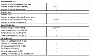
Here’s what we get, from the appendix to the full report. The left-hand column is for women, the right-hand column for men. The numbers compare mean stress score in people with different amounts of social media use.

pew

The first thing you notice is all the little dashes.  That means the estimated difference was less than twice the estimated standard error, so they decided to pretend it was zero.

All the social media measurements have little dashes for men: there wasn’t strong evidence the correlation was non-zero. That’s not we want, though. If we want to conclude that women are different from men we want to know whether the difference between the estimates for men and women is large compared its uncertainty.  As far as we can tell from these results, the correlations could easily be in the same direction in men and women, and could even be just as  strong in men as in women.

This isn’t just a philosophical issue: if you look for differences between two groups by looking separately for a correlation each group rather than actually looking for differences, you’re more likely to find differences when none really exist. Unfortunately, it’s a common error — Ben Goldacre writes about it here.

There’s something much less subtle wrong with the headline, though. Look at the section of the table for Facebook. Do you see the negative numbers there, indicating lower stress for women who use Facebook more? Me either.


[Update: in the comments there is a reply from the Pew Research authors, which I got in email.]

August 2, 2014

When in doubt, randomise

The Cochrane Collaboration, the massive global conspiracy to summarise and make available the results of clinical trials, has developed ‘Plain Language Summaries‘ to make the results easier to understand (they hope).

There’s nothing terribly noticeable about a plain-language initiative; they happen all the time.  What is unusual is that the Cochrane Collaboration tested the plain-language summaries in a randomised comparison to the old format. The abstract of their research paper (not, alas, itself a plain-language summary) says

With the new PLS, more participants understood the benefits and harms and quality of evidence (53% vs. 18%, P < 0.001); more answered each of the five questions correctly (P ≤ 0.001 for four questions); and they answered more questions correctly, median 3 (interquartile range [IQR]: 1–4) vs. 1 (IQR: 0–1), P < 0.001). Better understanding was independent of education level. More participants found information in the new PLS reliable, easy to find, easy to understand, and presented in a way that helped make decisions. Overall, participants preferred the new PLS.

That is, it worked. More importantly, they know it worked.