Posts filed under Estimation (34)

January 23, 2019

Meet Statistics Summer Scholar Xin Qian

Every summer, the Department of Statistics offers scholarships to high-achieving students so they can work with staff on real-world projects. Xin Qian, in the picture, is working with Dr Ben Stevenson, an expert in statistical methods for estimating animal populations.

How can you work out how many creatures inhabit a space when they are elusive, small and have lots of places to hide? Sitting in the bush for months and trying to count what you hear won’t be accurate – and it’s probably not a good use of time.

Another way is to estimate animal abundance is through acoustic surveys, which use microphone arrays to record animal chirps and calls; statistical techniques are then used to estimate the population. This is called spatial capture-recapture (SCR), and at present we have several ways of analysing the data.

That’s where summer student Xin Qian comes in. He is working with SCR expert Dr Ben Stevenson on a simulation project that compares two ways of analysing acoustic data. They are using statistics gathered from surveys of the rare moss frog, which exists only on South Africa’s Cape Peninsula.  

“We want to find out which is the best method for providing an accurate and stable estimation of frog density, factoring in the time each method takes,” says Xin. The existing method, he explains, requires that you go and collect independent data about how often individual frogs chirp in order to estimate animal density, which takes time.

However, the new method, developed by Ben Stevenson’s former MSc student Callum Young, promises to estimate both call rates and therefore animal density from the main survey alone. Says Ben: “This can save time, but may possibly leave you with a less accurate answer. What we are hoping to do is resolve the trade-off. How is the precision of our estimates affected if we switch to the new method? My guess is that it will be worse. Is this sacrifice worth the saving in fieldwork time?”

For this work they are using R, a programming language for statistical computing and graphics developed in the Department of Statistics in the mid-1990s and now used all over the world.

The project is ideal for Xin, a third-year University of Auckland BSc student majoring in Statistics and Information Systems. “It is always interesting to get information from data; it makes me feel like I am having some secret conversation with data that people can’t hear,” he says. “I normally won’t get bored dealing with numbers, and I prefer things having a logic or a reason behind them.”

Xin was born and raised in China, in the small east-coast city of Jiaxing near Shanghai. After finishing secondary school in China, he moved to New Zealand to pursue tertiary studies, starting his degree in 2016.

The University of Auckland appealed to him “because of its good reputation and ranking.” Although education rather than environment drew him to this country, he says that “New Zealand is a beautiful place with splendid natural views, and most people here are nice and welcoming; I have made lots of friends here. I have also became more outgoing and willing to try various outdoor activities that I wouldn’t get a chance to try if staying in my hometown.”  

  • For general information on University of Auckland summer scholarships, click here.
 

May 20, 2016

Depends who you ask

There’s a Herald story about sleep

A University of Michigan study using data from Entrain, a smartphone app aimed at reducing jetlag, found Kiwis on average go to sleep at 10.48pm and wake at 6.54am – an average of 8 hours and 6 minutes sleep.

It quotes me as saying the results might not be all that representative, but it just occurred to me that there are some comparison data sets for the US at least.

  • The Entrain study finds people in the US go to sleep on average just before 11pm and wake up on average between 6:45 and 7am.
  • SleepCycle, another app, reports a bedtime of 11:40 for women and midnight for men, with both men and women waking at about 7:20.
  • The American Time Use Survey is nationally representative, but not that easy to get stuff out of. However, Nathan Yau at Flowing Data has an animation saying that 50% of the population are asleep at 10:30pm and awake at 6:30am
  • And Jawbone, who don’t have to take anyone’s word for whether they’re asleep, have a fascinating map of mean bedtime by county of the US. It looks like the national average is after 11pm, but there’s huge variation, both urban-rural and position within your time zone.

These differences partly come from who is deliberately included and excluded (kids, shift workers, the very old), partly from measurement details, and partly from oversampling of the sort of people who use shiny gadgets.

April 28, 2016

Māori imprisonment statistics: not just age

Jarrod Gilbert had a piece in the Herald about prisons

Fifty per cent of the prison population is Maori. It’s a fact regularly cited in official documents, and from time to time it garners attention in the media. Given they make up 15 per cent of the population, it’s immediately clear that Maori incarceration is highly disproportionate, but it’s not until the numbers are given a greater examination that a more accurate perspective emerges.

The numbers seem dystopian, yet they very much reflect the realities of many Maori families and neighbourhoods.

to know what he was talking about, qualitatively. I mean, this isn’t David Brooks.

It turns out that while you can’t easily get data on ethnicity by age in the prison population, you can get data on age, and that this is enough to get a good idea of what’s going on, using what epidemiologists call “indirect standardisation”.

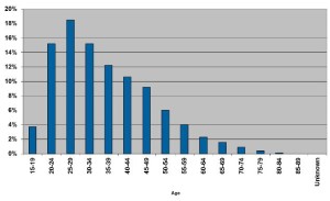
Actually, you can’t even easily get data on age, but you can get a graph of age:
ps_ages_3_16

and I resorted to software that reconstructs the numbers.

Next, I downloaded Māori population estimates by age and total population estimates by age from StatsNZ, for ages 15-84.  The definition of Māori won’t be exactly the same as in Dr Gilbert’s data. Also, the age groups aren’t quite right because we’d really like the age when the offence happened, not the current age.  The data still should be good enough to see how big the age bias is. In these age groups, 13.2% of the population is Māori by the StatsNZ population estimate definition.

We know what proportion of the prison population is in each age group, and we know what the population proportion of Māori is in each age group, so we can combine these to get the expected proportion of Māori in the prison population accounting for age differences. It’s 14.5%.  Now, 14.5% is higher than 13.2%, so the age-adjustment does make a difference, and in the expected direction, just not a very big difference.

We can also see what happens if we use the Māori population proportion from the next-younger five-year group, to allow for offences being committed further in the past. The expected proportion is then 15.3%, which again is higher than 13.2%, but not by very much. Accounting for age, it looks as though Māori are still more than three times as likely to be in prison as non-Māori.

You might then say there are lots of other variables to be looked at. But age is special.  If it turned out that Māori incarceration rates could be explained by poverty, that wouldn’t mean their treatment by society was fair, it would suggest that poverty was how it was unfair. If the rates could be explained by education, that wouldn’t mean their treatment by society was fair; it would suggest education was how it was unfair. But if the rates could be explained by age, that would suggest the system was fair. They can’t be.

April 18, 2016

Being precise

regional1

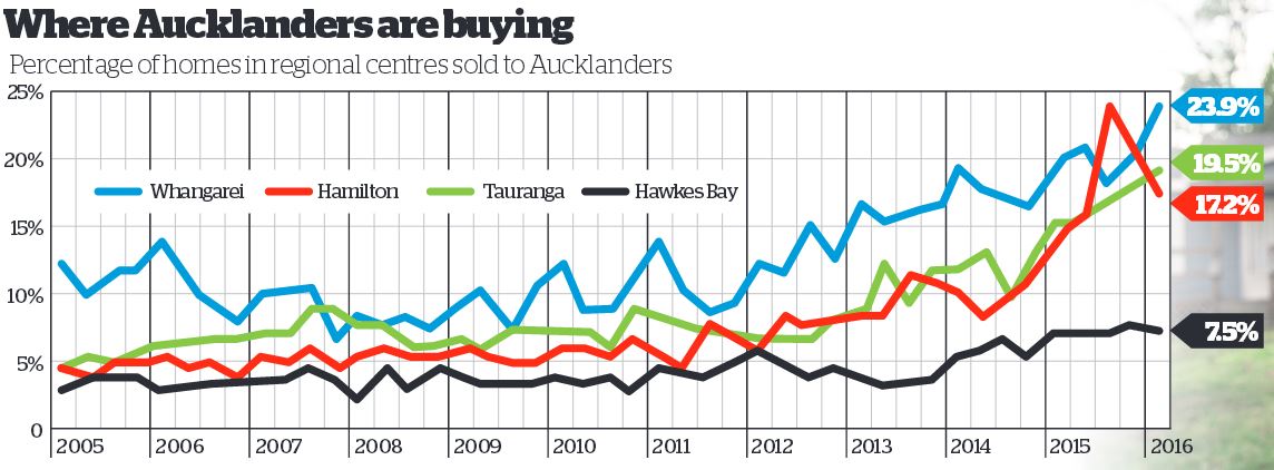
There are stories in the Herald about home buyers being forced out of Auckland by house prices, and about the proportion of homes in other regions being sold to Aucklanders.  As we all know, Auckland house prices are a serious problem and might be hard to fix even if there weren’t motivations for so many people to oppose any solution.  I still think it’s useful to be cautious about the relevance of the numbers.

We don’t learn from the story how CoreLogic works out which home buyers in other regions are JAFAs — we should, but we don’t. My understanding is that they match names in the LINZ title registry.  That means the 19.5% of Auckland buyers in Tauranga last quarter is made up of three groups

  1. Auckland home owners moving to Tauranga
  2. Auckland home owners buying investment property in Tauranga
  3. Homeowners in Tauranga who have the same name as a homeowner in Auckland.

Only the first group is really relevant to the affordability story.  In fact, it’s worse than that. Some of the first group will be moving to Tauranga just because it’s a nice place to live (or so I’m told).  Conversely, as the story says, a lot of the people who are relevant to the affordability problem won’t be included precisely because they couldn’t afford a home in Auckland.

For data from recent years the problem could have been reduced a lot by some calibration to ground truth: contact people living at a random sample of the properties and find out if they had moved from Auckland and why.  You might even be able to find out from renters if their landlord was from Auckland, though that would be less reliable if a property management company had been involved.  You could do the same thing with a sample of homes owned by people without Auckland-sounding names to get information in the other direction.  With calibration, the complete name-linkage data could be very powerful, but on its own it will be pretty approximate.


March 29, 2016

Chocolate probabilities

For those of you from other parts of the world, there has been a small sensation over the weekend here about Cadburys chocolate randomisation. One of their products was a large chocolate egg accompanied by eight miniature chocolate bars, chosen randomly from five varieties.  Public opinion on the desirability of some of these varieties is more polarised that for others.

Stuff reports:

But one family found seven Cherry Ripes out of eight bars and most of those complaining to Cadbury say they found at least six Cherry Ripes out of eight. 

Cadbury claimed that it was just bad luck saying the chocolates are processed randomly and the Cherry Ripe overdose was not intentional. 

Both Stuff and The Guardian got advice on the probabilities. They get different answers: Martin Hazelton says seven out of eight being the same (of any variety) is about 1 in 10,000 and the Guardian’s two advisers say there’s nearly a 1 in 100 chance of getting seven Cherry Ripes out of eight (which is obviously less likely than getting seven of eight the same).

With a hundred-fold difference in the estimates, I think a tie-breaker is in order. Also, I’m going to do this the modern way: by simulation rather than by being clever. It’s much more reliable.

I’m going to trust the Guardian on what the five flavours were (since it doesn’t actually matter, I think this is safe).  I’ve put the code and results for 100,000 simulated packages up here.  The number of packs with seven or more bars the same was 44 out of 100,000. There’s obviously some random uncertainty here, but a 95% confidence interval for the proportion goes from 3 in 10,000 to 6 in 10,000, and so excludes both of the published estimates .  Since computing time is nearly free, and the previous run took only 13 seconds, I tried it on a million simulated packs just to be sure, and also separated out ‘seven or more of anything’ from ‘seven or more Cherry Ripes’.

Out of a million simulated packs, 442 had seven or more of some type of bar, and 83 had seven or more Cherry Ripes.  The probability of seven or more of something is between 4 and 5 out of 10,000 and the probability of seven or more Cherry Ripes is between 0.6 and 1 out of 10,000. It looks as though Professor Hazelton’s estimate of ‘a little less than one in 10,000‘ is correct for Cherry Ripes specifically.  The Guardian figures seem clearly wrong. The Guardian is also wrong about the probability of getting at least one of each type, which this code shows to be about 30%, not the 7% they give.

I said I wasn’t going to do this by maths, but now I know the answer I’m going to go out on a limb here and guess that Martin Hazelton’s probability was, in maths terms, P(Binom(8, o.2)≥7), which is the answer I would have given for Cherry Ripes specifically. With Jack and Andrew in the Guardian I think the issue is that they have counted all 495 possible aggregate outcomes as being equally likely, when it’s actually the 32768 390625 underlying ordered outcomes that are equally likely.

The other aspect of this computation is the alternative hypothesis. It makes no sense that Cadbury would just load up the bags with Cherry Ripes and pretend they hadn’t — especially as the Guardian reports other sorts of complaints as well. We need to ask not just whether the reports would be surprising if the bags were randomised, but whether there’s another explanation that fits the data better.

The Guardian story hints at a possibility: clumping together of similar chocolates. It also would be conceivable that the randomisation wasn’t quite even — that, say,  Cherry Ripes were 25% instead of the intended 20%. It’s easy to modify the code for unequal probabilities. Having one chocolate type at 25% doubles the number of seven-or-more coincidences, and more than half of them are now with Cherry Ripes. But that’s quite a big imbalance to go unnoticed at Cadburys, and it doesn’t push the probability a lot.

So, I’d say bad luck is a feasible explanation, but it could easily have been aggravated by imperfect randomisation at Cadburys.

Many lessons could be drawn from this story: that simulation is a good way to do slightly complicated probability questions; that people see departures from randomness far too easily; that Cadburys should have done systematic sampling rather than random sampling; maybe even that innovative maths teachers may have gone too far in rejecting contrived ball-out-of-urn problems as having no Real World use.

January 24, 2015

Measuring what you care about

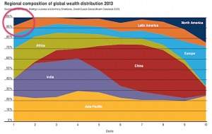
Via Felix Salmon, here’s a chart from Credit Suisse that’s been making the headlines recently, in the Oxfam report on global wealth.  The chart shows where in the world people live for each of the ‘wealth’ deciles, and I’ve circled the most interesting piece.

wealth

About 10% of the least wealthy people in the world live in North America. This isn’t (just) Mexico, Guatemala, Nicaragua, etc, it’s also the US, because some people in the US have really big debts.

If you are genuinely poor, you can’t have hundreds of thousands of dollars of negative wealth because no-one would give you that sort of money. Compared to a US law-school graduate with student loans, you’re wealthy.  This is obviously a dumb way to define wealth. Also, as I’ve argued on the ‘net tax’ issue, cumulative percentages just don’t work usefully as summaries when some of the numbers are negative.

This doesn’t mean wealth inequality doesn’t exist (boy, does it) or doesn’t matter, but it does mean summaries like the Credit Suisse one don’t capture it. If you wanted to capture the sort of wealth inequality worth worrying about, you’d need to think about what it really meant and why it was a problem separately from income inequality (which is much easier to define).

There seem to be two concerns with wealth inequality that people on a reasonably broad political spectrum might care about, if we stipulate that redistributive international taxation is not on the agenda:

  • transfer of wealth from parents to children leads to social stratification
  • high concentrations of wealth give some people too much power (and more so in societies more corrupt than NZ).

Both of these are non-linear ($200 isn’t twice as much as $100 in any meaningful sense) and they both depend on where you are ($20,000 will get you much further in Nigeria than in Rhode Island). There probably isn’t going to be a good way to look at global wealth inequality. Within countries, it’s probably feasible but it will still take some care and I expect it will be necessary to discount debts quite a lot.  If you owe the bank $10, you’re not wealthy, but if you owe the bank $10 million, you probably are.

October 7, 2014

Enumerating hard-to-reach populations

I’ve written before about how it’s hard to get accurate estimates of the size of small subpopulations, even with large, well-designed surveys.

Via the Herald

Mr Key said that was an emerging issue for New Zealand. “If I was to spell out to New Zealanders the exact number of people looking to leave and be foreign fighters, it would be larger, I think, than New Zealanders would expect that number to be.”

If the government really knows the ‘exact number’, there must have been a lot more domestic surveillance than we’ve been told about.

New Zealanders probably don’t have any very well formed expectations for that number, since we have basically no information to go on. My guess would be along the lines of “Not very many, but people are strange,  so probably some.” I’d be surprised if it were less than 10 or more than 1000.


March 18, 2014

Three fifths of five eighths of not very much at all

The latest BNZ-REINZ Residential Market Survey is out, and the Herald has even embedded the full document in their online story, which is a very promising change.

According to the report 6.4% of homes sales in March are  to off-shore buyers, 25% of whom were Chinese. 25% of 6.4% is 1.6%.

If you look at real estate statistics (eg, here) for last month you find 6125 residential sales through agents across NZ. 25% of 6.4% of 6125 is 98. That’s not a very big number.  For context, in the most recent month available, about 1500 new dwellings were consented.

You also find, looking at the real estate statistics, that last month was February, not March.  The  BNZ-REINZ Residential Market Survey is not an actual measurement, the estimates are averages of round numbers based on the opinion of real-estate agents across the country.  Even if we assume the agents know which buyers are offshore investors as opposed to recent or near-future immigrants (they estimate 41% of the foreign buyers will move here), it’s pretty rough data. To make it worse, the question on this topic just changed, so trends are even harder to establish.

That’s probably why the report said in the front-page summary “one would struggle, statistically-speaking, to conclude there is a lift or decline in foreign buying of NZ houses.”

The Herald  boldly took up that struggle.

February 4, 2014

Approximately quantified self

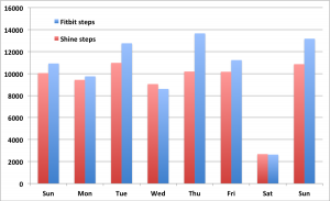
What happens if you wear two activity-monitoring devices at the same time, on the same wrist:

fitbit-shine


November 27, 2013

Interpretive tips for understanding science

From David Spiegelhalter, William Sutherland, and Mark Burgman, twenty (mostly statistical) tips for interpreting scientific findings

To this end, we suggest 20 concepts that should be part of the education of civil servants, politicians, policy advisers and journalists — and anyone else who may have to interact with science or scientists. Politicians with a healthy scepticism of scientific advocates might simply prefer to arm themselves with this critical set of knowledge.

A few of the tips, without their detailed explication:

  • Differences and chance cause variation
  • No measurement is exact
  • Bigger is usually better for sample size
  • Controls are important
  • Beware the base-rate fallacy
  • Feelings influence risk perception