Posts filed under Environment (58)

February 12, 2012

Thresholds and tolerances

The post on road deaths sparked off a bit of discussion in comments about whether there should be a `tolerance’ for prosecution for speeding.  Part of this is a statistical issue that’s even more important when it comes to setting environmental standards, but speeding is a familiar place to start.

A speed limit of 100km/h seems like a simple concept, but there are actually three numbers involved: the speed the car is actually going, the car’s speedometer reading, and a doppler radar reading in a speed camera or radar gun.  If these numbers were all the same there would be no problem, but they aren’t.   Worse still, the motorist knows the second number, the police know the third number, and no-one knows the actual speed.

So, what basis should the police use to prosecute a driver:

  • the radar reading was above 100km/h, ignoring all the sources of uncertainty?
  • their true speed was definitely above 100km/h, accounting for uncertainty in the radar?
  • their true speed might have been above 100km/h, accounting for uncertainty in the radar?
  • we can be reasonably sure their speedometer registered above 100km/h, accounting for both uncertainties?
  • their true speed was definitely above 100km/h, accounting for uncertainty in the radar and it’s likely that their speedometer registered above 100km/h, accounting for both uncertainties?

(more…)

January 30, 2012

Global temperatures for 2011

NASA’s annual summary of global temperatures is out.  2011 was not the warmest year on record, it was only ninth, a whole eighth of a degree cooler than last year.  One of the years that beat 2011 wasn’t even in the twenty-first century. [It was 1998.]

December 19, 2011

Actual air pollution figures

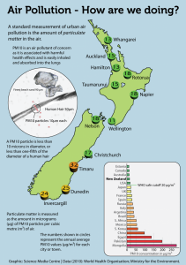
You may remember the story about Auckland air pollution being worse than Tokyo, due to data entry errors by the World Health Organization.  The Science Media Centre has put out a new graphic showing actual air pollution levels around the country and around the world. [They also have the right spelling and location for Dunedin]

Levels are moderately high in the south of the South Island, due largely to the use of wood fires for heating.  It’s worth noting that woodsmoke seems to have different health effects from the car and truck exhaust and factory emissions that dominate the fine-particle air pollution in other places with dirty air.  Seattle, where I used to live, had a similar problem with wood smoke, and there has been a lot of study of the health effects. It looks as though wood smoke has harmful effects on the lungs, especially in triggering asthma attacks, but that it doesn’t have as much effect on the heart. Studies in Seattle find no relationship between heart disease and PM10, in contrast to cities where coal or diesel emissions are the main pollutant and associations are found consistently.

Windblown dust also seems to be less harmful: at the Biometric Society conference in Australia a couple of weeks ago there was a presentation on the 2009 Sydney dust storm, which raised PM10 levels to an amazing 15,000 micrograms per cubic meter.  Even at these massive doses the researchers saw no increase in hospital admissions for cardiovascular disease, and a only modest 15% increase for asthma admissions and 25% increase for asthma hospital visits.

November 9, 2011

What the frack?

The New Zealand Herald (09-Nov-2011) has a very interesting article about earthquakes in Oklahoma. Scientists from the Oklahoma Geological Survey plan to investigate whether the process of “fracking” has led to an increase in earthquake activity.

Fracking is a controversial fossil fuel recovery method whereby high pressure water is injected into rock, fracturing it, and then send is forced into the cracks allowing the substance of interest, in this case gas, to escape. This process has been known about for quite sometime, but it is the depletion of existing reserves, and the subsequent increase in the price of oil and gas that has made it exceptionally popular in recent times.

In Oklahoma, the principal fracking area is known as the Devonian Woodford Shale. According to Wikipedia, the first gas production was recorded in 1939, and by late 2004, there were only 24 Woodford Shale gas wells. However, by early 2008, there were more than 750 Woodford gas wells. Another site reports that currently over 1,500 wells have already been drilled with many more to come. The wells cost $US2-3 million, and there are more than 35,000 shale gas wells currently in the United States.

One of the nice things about the US Geological Survey, and its state based constituents, is that it is usually relatively easy to get data from them. I say relatively, because it required some searching and programming to speed the process up, but the data is all there for someone willing to spend sometime getting it.

To show fracking is causing an increase in seismic activity would require proper experimentation. However, it may be possible to show correlation at least between the increase in fracking wells and the number of seismic events. I don’t have enough clout, or time, to extract the information about the number of wells, and their location. However it is still interesting just to take a look at the data we can get regarding the number of earthquakes ourselves.
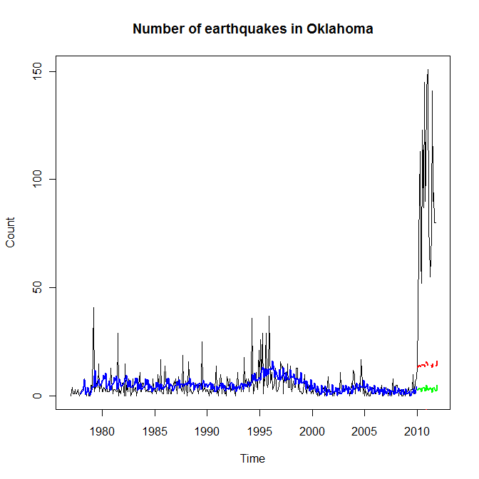
Time series plot of earthquakes in Oklahoma

The black line in time series plot above shows the number of seismic events from January 1977 to October 2011. The rise at the start of 2010 is certainty indisputable. The blue line a form of exponential smoothing called Holt-Winters smoothing (or Holt-Winters triple exponential smoothing). It is a simple statistical technique that attempts to model the trends (among other things) in time series data. The green line is the predicted number of earthquakes using this smoothing model (calculated on the pre-2010 data) for the time period starting January 2010 to October 2011, and the red line is the upper confidence limit on this prediction. This is a very simple modelling attempt, and undoubtedly the “real time-series analysts” could do better (and here is the data for you), but what I would like to think this shows is that the increase in quake count is so far off the charts that it definitely qualifies for further investigation.

Some of you will no doubt be grumbling that I have not accounted for the magnitude, or depth, or location, or in fact many other things, and indeed I have not. However, I do think the data is interesting, and the association with the increase in fracking should be explored further – which is what the Oklahoma Geological Survey plans to do.

I have made the uncleaned raw data available here.

November 7, 2011

MV Rena oil graphic

Articles about the MV Rena appeared in the New Zealand Herald over the past week and I’m surprised they didn’t show up in the Stat of the Week competition.

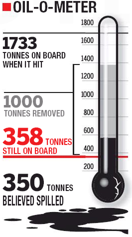
Let’s take a look at one in particular, from October 31. See that graphic there? Cam Slater didn’t like the manipulated Likert-scale, but I was more concerned by the thermometer:

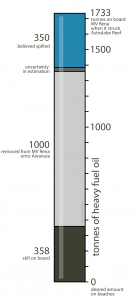
It raises more questions than it answers, and even after several minutes staring at it and trying to decipher it, I was even more bewildered. The areas are overlapping, there’s a giant bulb on the bottom hiding where 0 belongs, and the different colours and sizes drag the eye around in a mad series of saccades.

I took it upon myself to redo this into something a bit tidier and less confusing. Is it better? I’ll let you be the judge of that:

October 30, 2011

New climate change datasets: boring but useful results. (updated)

The Berkeley Earth Surface Temperature project has just released its first data sets and analyses.  The aim of this project is to summarise all the temperature records around the world in a comprehensive and transparent way, both to get an estimate of changes in global temperature and to make it easy to see the impact of  data quality filters that have been applied by previous climate modelling projects.  So far, they have analysed all the land measurements; ocean measurements are coming next. You can download the data and code yourself, and check their findings or explore further (if you actually want 1.6 billion temperature measurements — don’t try this on a smartphone).

The main finding of the project won’t surprise most people: it’s getting hotter. More importantly, the estimates based on all available data agree almost perfectly with the previous estimates that were based on a small subset of ‘best’ weather stations.  Incorporating lower-quality stations doesn’t change the estimates. Even using just the low quality stations gives pretty much the same estimates. Other things that don’t affect the results include the urban heat island effect: cities are hotter than the countryside, but most of the world isn’t in a city. They’ve also made a neat movie of the climate since 1800: you can see the normal oscillations over time, and the heating trend that eventually swamps them.

Combining temperature records with varying quality, measurement frequency, and duration, is a major statistical task even without considering the volume of data involved. The statistical expertise on the Berkeley Earth team includes an Auckland Stats graduate (and Berkeley Stats PhD), Charlotte Wickham.

Updated to add: this is now in the Kiwi media: NZ Herald, Stuff, 3 News.

October 3, 2011

Noted for the record

One of the reasons statistics is difficult is the ‘availability heuristic’. That is, we estimate probabilities based on things we can remember, and it’s a lot easier to remember dramatic events than boring ones.  It’s not just that correlation doesn’t imply causation; our perception of correlation doesn’t even imply correlation.

To help with availability, I’d like to make two boring and predictable observations about recent events.

1.  This winter, despite the Icy Polar Blast™, was slightly warmer than the historical average, as forecast.

2. There wasn’t a major earthquake in ChCh in the last week of September, despite the position of the moon or the alignment of Uranus (or anything else round and irrelevant).

September 28, 2011

Auckland air as dirty as New York?(updated 2x)

The Herald is reporting a WHO report that says the average levels of particulate air pollution are higher in Auckland than in New York.   The Environment Minister doesn’t believe it, and I tend to agree with him.

As the Green Party correctly points out, Auckland has far too many cars on the road.  But the same is true of New York, even though a larger fraction of their cars are taxis.  Auckland is surrounded by ocean, and the background levels of pollution in incoming air are very low.  New York is surrounded by a conurbation with a population of 21 million, nearly all of whom drive everywhere, and gets a substantial amount of pollution from the old coal-fired powerplants in the Ohio Valley.   Yes, the Northwestern Motorway is full of cars, but have you seen the Jersey Turnpike? (more…)