Posts filed under Environment (58)

March 23, 2013

It’s dry

How dry is a 100m soil moisture deficit, which we have over a lot of the country (yellow, on the NIWA soil moisture maps)?

  • 100mm over 1 hectare is 1 million litres
  • A typical full section in Auckland is about 0.07 hectares [ok, I can’t do simple arithmetic, and the US has made me think in acres]
  • Water at the tap costs $1.343/ 1000 litres

So, a 100mm moisture deficit over the area of a city section would need about $1000 of tap water to make up.


March 20, 2013

It’s still dry

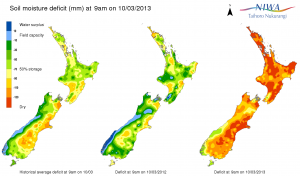
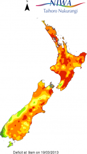
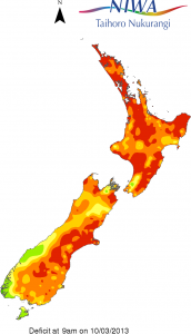
The NIWA soil moisture maps from March 10 and yesterday show how much difference a single storm doesn’t make:

niwa-now niwa-then


It’s a good thing there are date labels to distinguish them.

March 12, 2013

It’s dry

Interesting new interactive drought map from Stuff.

I’m not 100% convinced it’s better than a couple of contour maps, but it’s probably the best interactive graph I’ve seen in the NZ mainstream media. (via Mike “@adzebill” Dickison on Twitter)

March 11, 2013

Suppressio variation, suggestio falsi

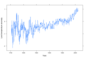
The global mean land-surface temperature reconstruction from the Berkeley Earth Surface Temperature project (other reconstructions are very similar), looks like this:

Rplot001

I’ve scaled the axes using Bill Cleveland’s method of “banking to 45 degrees“, that is, so the median of the slope is 45 degrees.  Based on his research, this seems to give close to optimal perception of patterns. (more…)

March 10, 2013

Bad news, good graphic

From NIWA, soil moisture across the country (via @nzben on Twitter), compared to the same time last year and to the average for this date.

smd_map


Update: If I had to be picky about something: that light blue colour. It doesn’t really fit in the sequence.

Update: Stuff also has a NIWA map, and theirs looks worse, but it’s based on rainfall over just the past three weeks (and, strangely, labelled “Drought levels over the past six days”)

February 25, 2013

But that’s not the worst part

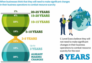
Andrew Gelman passes on this infographic from the Carbon Trust

hourglass


His correspondent points out that the colour scheme is awful, and that the hourglass metaphor would only make sense if the ‘pinch point’ in the hourglass was ‘now’, not 3-5 years in the future.

But that’s not the worst part: Andrew points out that the teeny orange area is actually highest rate per year over the whole time period, a fact that’s masked by the design.

But that’s not the worst part.  The data in the graph come from telephone interviews with some unspecified set of senior executives (CEO, CIO, CTO, COO, etc) selected in an unspecified way with an unspecified response rate, from companies of varying but unspecified size in varying but unspecified industries, so it isn’t really as if the numbers mean much anyway.

February 15, 2013

Genuine sasquatch DNA probably not found

There’s been a bunch of publicity recently over claims that Bigfoot really exists and that a group of forensic scientists have the DNA to prove it.

After being rejected from the top journals either because of prejudice and hide-bound conservatism or because of not having any worthwhile evidence, the researchers have managed to publish some results in a peer-reviewed journal. That they set up for the purpose. (unkind scientists on Twitter are making jokes about the next issue, some of which are quite funny)

Ars Technica has the closest to actual information about the paper that I’ve seen, and their analysis sounds right to me. The paper says that the Bigfoot mitochondrial DNA matches humans, so the creature is a hybrid between humans and some unknown primate.  However, the mitochondrial DNA matches are mostly to sequences from Europe and the Middle East, not to Native American sequences, which looks like contamination rather than hybridisation.  Similarly, the results for nuclear DNA should show fairly long sequences matching humans, and other fairly long sequences that look similar to but not identical to other known primates, but they don’t seem to.

The genome data has only been released in PDF format, not in any of the formats that scientists normally use for storing genome sequences. When someone gets around to converting it, and the full surplus power of the world’s sequence matching software is turned loose, the results will be obvious — so the fact this hasn’t happened is not encouraging.

Is this scientific fraud?  Given the real attempts the researchers have made to publish their results, I think we can repeat an answer quoted by physicist Bob Park after the first cold fusion press conference: “Not yet.” And let’s hope it stays that way.
January 17, 2013

Briefly

  • An illustration of what happens to promising new medical treatments: the first randomized trial of fish oil found a 70% reduction in rate of deaths, though the study was too small to be reliable.  After the second study, the estimate was down to 20%.  It’s now 4%, with a margin-of-error of 6%. 
  • A Wall Street Journal infographic that’s doing the rounds, on the impact of the ‘fiscal cliff’.  Includes a representative solo mother with two children, who faces a $3300 tax increase. On her income of US$260,000.  The median household income for families with female householder and no husband is US$32978 (that also includes a subset of the unmarried couples with children, but there’s fewer of them in the US than here).
  • Roger Peng writes about the Beijing air pollution. It is indeed ‘crazy bad’, but the Great London Fog was substantially worse.  Similarly, when you read about developing-country water pollution, remember that the Cuyahoga River, in Cleveland, caught fire several times.
January 11, 2013

With friends like these…

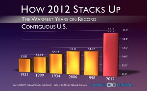
One of the worst graphs of the year, from Climate Central, via Andrew Gelman

Conclusively proving that hotter years are further to the right


More temperature graphics

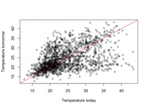
There has been a lot of coverage of Australian weather recently, and people who haven’t been to southeastern Australia in summer may have been struck by how big the reported temperature variations are.  There’s a data set of daily maximum temperatures in Melbourne over ten years that has been used as an example in time series research because of the unusual patterns — a bimodal distribution in day-to-day temperature change.

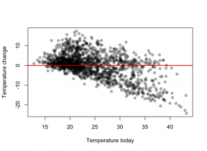
The graph shows Melbourne maximum temperatures from November through March for ten years.  The basic pattern is that tomorrow’s maximum is either slightly higher than today’s, or is about 21C.  The temperature keeps increasing day to day as long as the wind is from the land, then you get a cold front and people can sleep for a few nights.

It looks even more dramatic (why?) when the change in temperature is plotted against today’s temperature