Posts filed under Environment (58)

March 19, 2015

Model organisms

The flame retardant chemicals in your phone made zebra fish “chubby”, says the caption on this photo at news.com.au. Zebra fish, as it explains, are a common model organism for medical research, so this could be relevant to people

591917-2a8735a0-cced-11e4-a716-dcac481e1bbe

On the other hand, as @LewSOS points out on Twitter, it doesn’t seem to be having the same effect on the model organisms in the photo.

What’s notable about the story is how much better it is than the press release, which starts out

Could your electronics be making you fat? According to University of Houston researchers, a common flame retardant used to keep electronics from overheating may be to blame.

The news.com.au story carefully avoids repeating this unsupported claim.  Also, the press release doesn’t link to the research paper, or even say where it was published (or even that it was published). That’s irritating in the media but unforgivable in a university press release.   When you read the paper it turns out the main research finding was that looking at fat accumulation in embryonic zebrafish (which is easy because they are transparent, one of their other advantages over mice) was a good indication of weight gain later in life, and might be a useful first step in deciding which chemicals were worth testing in mice.

So, given all that, does your phone or computer actually expose you to any meaningful amount of this stuff?

The compounds in question, Tetrabromobisphoneol A (TBBPA) and tetrachlorobisphenol A (TCBPA) can leach out of the devices and often end up settling on dust particles in the air we breathe, the study found.

That’s one of the few mistakes in the story: this isn’t what the study found, it’s part of the background information. In any case, the question is how much leaches out. Is it enough to matter?

The European Union doesn’t think so

The highest inhalation exposures to TBBP-A were found in the production (loading and mixing) of plastics, with 8-hour time-weighted-averages (TWAs) up to 12,216 μg/m3 . At the other end of the range, offices containing computers showed TBBP-A air concentrations of less than 0.001 μg/m3 . TBBP-A exposures at sites where computers were shredded, or where laminates were manufactured ranged from 0.1 to 75 μg/m3 .

You might worry about the exposures from plastics production, and about long-term environmental accumulations, but it looks like TBBP-A from being around a phone isn’t going to be a big contributor to obesity. That’s also what the international comparisons would suggest — South Korea and Singapore have quite a lot more smartphone ownership than Australia, and Norway and Sweden are comparable, all with much less obesity.

February 3, 2015

Meet Statistics summer scholar Daniel van Vorsselen

Every year, the Department of Statistics offers summer scholarships to a number of students so they can work with staff on real-world projects. Daniel, right, is working on a project called Working with data from conservation monitoring schemes with Associate Professor Rachel Fewster. Daniel explains:

Daniel Profile Picture“The university is involved in a project called CatchIT, an online system that aims to help community conservation schemes by proving users with a place where they can input and store their data for reference. The project also produces maps and graphics so that users can assess the effectiveness of their conservation schemes and identify areas where changes can be made.

“My role in the project is to help analyse the data that users put into the project. This involves correctly formatting and cleaning the data so that it is usable. I assist users in the technical aspects relating to their data and help them communicate their data in a meaningful way.

“It’s important to maintain and preserve the wildlife and plant species we have in New Zealand so that future generations have the opportunity to experience them as we have. Our environments are a defining factor of our culture and lifestyles as New Zealanders and we have a large amount of native species in New Zealand. It would be a shame to see them eradicated.

“I am currently studying a BCom/BA conjoint, majoring in Statistics, Economics and Finance. I’m hoping to do Honours in statistics and I am looking at a career in banking.

“Over summer, I hope to enjoy the nice weather, whether out on the boat fishing, at the beach or going for a run.”


January 8, 2015

Climate trends

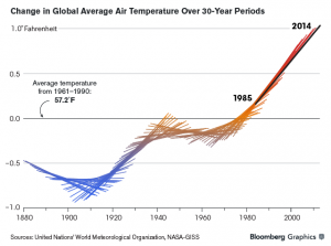
From an interview with Robert Simmons, a data visualisation designer specialising in environmental data, this graph was created by Chloe Whiteaker (at Bloomberg) working with NASA’s Gavin Schmidt. It shows a thirty-year global temperature trend centered around each year.

iop06mGoMi3Q1

If you just plotted the central point of each line segment you’d have a ‘local linear smoother’, one of the standard ways of drawing a smooth curve through a set of data. Plotting the whole line segment makes it clearer how the curve is computed.

(via Alberto Cairo)


August 22, 2014

California drought visualisation


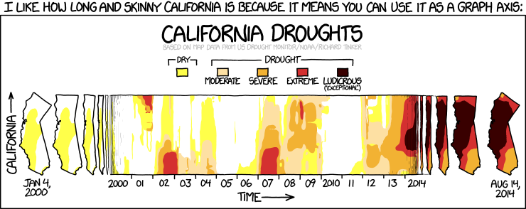
From XKCD. Both the data and the display technique are worth looking at

california


Presumably you could do something similar with New Zealand, which is roughly the same shape.

May 21, 2014

Sea rise visualisation

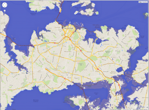
A new map to let you see the impact of rises in sea levels on your area: this is Auckland with 13m sea rise

flood


This doesn’t show the impact of storm surges, which are the big problem for a lot of eastern coastal Auckland (though not so much for Manukau Harbour).

(via everyone on twitter)

March 14, 2014

The wind and the rain

Cyclone Lusi, from the earth wind animation

lusi


And coloured by total precipitable water (orange: dry, light blue: very wet)

lusi-water

Keep safe.


March 1, 2014

It’s cold out there, in some places

Next week I’m visiting Iowa State University, one of the places where the discipline of statistics was invented. It’s going to be cold — the overnight minimum on Sunday is forecast at -25C — because another of the big winter storms is passing through.

The storms this year have been worse than usual. Minneapolis (where they know from cold) is already up to its sixth-highest number of days with the maximum below 0F (-18C, the temperature in your freezer). The Great Lakes have 88% ice cover, more than they have had for twenty years.

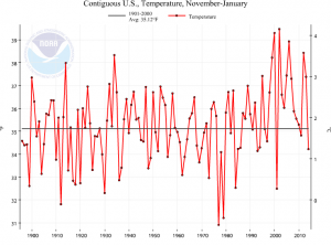
Looking at data from NOAA, this winter has been cold overall in the US, very slightly below the average for the past century or so.

us

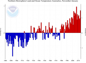
However, that’s just the US. For the northern hemisphere as a whole, it’s been an unusually warm winter, well above historical temperatures

hemisphere


This has been your periodic reminder that weather news, for good reasons, gives you a very selective view of global temperature.


February 13, 2014

Commuting costs are housing costs

There’s an interesting story in the Herald about research on the combined cost of commuting and housing in Auckland.

“If you just look at housing costs alone, outlying areas appear really affordable and it initially seems to make sense to say, hey, let’s open up greenfield sites on the urban periphery and develop here,” Mr Mattingly said. “But when you include these broader costs, they are not as affordable as they seem.”

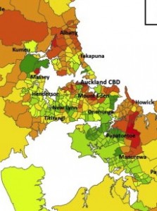
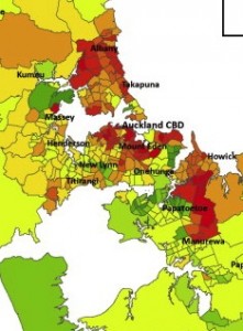
This is the sort of conclusion I like to see, as a non-driver, so I looked at the research paper (there wasn’t a link, but the Herald did give the researchers’ names and journal name). I was disappointed that the impact of commuting costs wasn’t higher, at least until you got out to Pukekohe or Warkworth.

Since the journal is published by a company known for its dedication to preventing knowledge being disseminated for free, I won’t show any whole maps, but here are the central chunks of the cost maps with and without commuting costs. Or perhaps the other way around.


February 5, 2014

With friends like these

Stuff has fallen for an egregiously over-promoted paper on future temperature-related deaths in the UK

Deaths caused by hot weather are projected to rise by more than 250 per cent, with the elderly most at risk, the New Zealand Doctor magazine reported today.

The increased death rate, driven by climate change, population growth and ageing, would occur by the middle of the century, according to research published in the Journal of Epidemiology and Community Health on Monday.

It was found that “in the absence of any adaptation of the population”, heat-related deaths would be expected to rise by about 257 per cent by the 2050s, and cold-related mortality would decline by 2 per cent.

Stuff attributes this story to NZ Doctor, but all they did was reprint an explicitly unedited Green Party press release. [update: it looks as though NZ Doctor did also have a story that provided the last four paragraphs of the Stuff story]

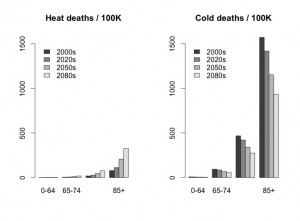
Professor David Spiegelhalter has already savaged this one elegantly on his blog.  All the projected increase in temperature-related deaths in the UK is due to the increase in the number of elderly people.

If you compare people of the same age, the projections say cold-related deaths will fall by about twice as much as heat-related deaths rise, as his graph of the numbers from the paper shows.  That is, the paper actually predicts that global warming will reduce the number of temperature-related deaths in the UK.

bar chart of age-standardised deaths, showing decreases are larger than increases

In the USA or Australia, let alone Africa, India, and other less-wealthy tropical places, there is going to be a real problem with temperature-related deaths from global warming.  In many more parts of the world, there’s a potential for weather-related deaths from drought, flood, storm, and ‘tropical’ disease.

Heat waves in the UK are not in the top ten list of things to worry about from global warming. Pretending they are is likely to be counterproductive.

January 6, 2014

In the deep midwinter

It’s cold in the United States at the moment. Very cold. Temperatures in places where lots of people live are down below -20C (before worrying about the wind chill).This isn’t just hypothermia weather, this is ‘exposed skin freezes in minutes’ weather, and hasn’t been seen on such a large scale for decades. So why isn’t this evidence against global warming?

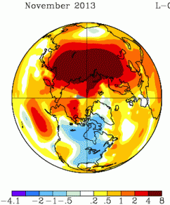
It will be a month or two before we have the global data, but the severe cold snaps in recent years have been due to cold air being in unusual places, rather than to the world being colder that week. For example, November 2013 was also cold in the North America, but it was warm in northern Russia; the cold had just moved (map from NASA).

nmaps


The cold spells in Europe in recent years have been matched by warm spells in Greenland and northeast Canada. You don’t hear about these as much, because hardly anyone lives there.  The ‘polar vortex‘ being described on the US news is an example of the same thing: cold air that usually stays near the pole has moved down to places where people live. That suggests the global temperature anomaly maps for December/January will show warmer-than-usual conditions in other parts of the far northern hemisphere.

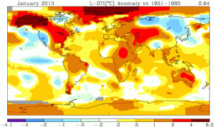
For contrast, look at the heat wave in Australia last January, when the Bureau of Meteorology had to find a new colour to depict really, really, really hot. This map is from the same NASA source (just a different projection)

nmaps-oz


Not only was all of Australia hot, the ocean south of Australia was warmer than typical. This wasn’t a case of cold air from the Southern Ocean failing to reach Australia, which causes heat waves in Melbourne several times a year. It doesn’t look like a case of just moving heat around.

No single weather event can provide any meaningful evidence for or against global warming. What’s important for honest scientific lobbying is whether this sort of event is likely to become more common as a result. The Australian heat waves definitely are. The situation is less clear for the US winter cold: the baseline temperatures will go up, which will mitigate future cold snaps, but there is some initial theoretical support for the idea that warming of the Arctic Ocean increases the likelihood that polar vortices will wander off into inhabited areas.


[note: you can also see in the Jan 2013 picture that the warm winter in the US was partly balanced by cold in Siberia that you didn’t hear so much about]