Posts filed under Denominator? (87)

August 8, 2012

NZ troops more at risk abroad than at home

The Herald’s headline is “NZ troops more at risk at home than abroad”, but there’s the familiar problem with denominators.

Of more than 3500 injuries recorded between January 2011 and May 2012, 269 were suffered overseas, according to figures released to the Herald under the Official Information Act.

The majority of injuries are in NZ, because that’s where most NZDF staff time is spent.  At the moment, 343 NZDF personnel are on operations and UN missions, and 553 on other overseas deployments.  That’s from a total of 11891 military personnel and 2455 (equivalent full time) civilian staff (annual report, p13).  So, just over 6% of NZDF staff  are deployed overseas, and they get 7.7% of the reported injuries.   They are at more risk overseas, even if you lump together minor sporting injuries with deaths from enemy action.     That’s what you would expect, and it’s what Lt General Rhys Jones is quoted as saying.

Ignoring the denominators misses out the opportunity to comment on the real differences: it’s a bit surprising that being deployed doesn’t increase the injury risk more, but the increase in serious and fatal injuries is probably masked by the noise of miscellaneous exercise-related injury.

August 7, 2012

Even more alternative medal comparisons

As a former Australian, I need to point out that the natural denominator for comparisons between Aus and NZ should include sheep as well as people.

On this metric, Australia has one medal per 4.5 million population, and one gold medal per 50 million population. New Zealand has one medal per  4.4 million population, and one gold medal per 11.8 million population.

Looks like New Zealand is still ahead, even if you include sheep in the population.  On the other hand, Jamaica leaves us both in the dust.

August 6, 2012

Think of a number, then multiply by five to seven

The multi-year aggregate headline number is back again.  The Herald tells us

John Ivil is the $300 million man – that’s the amount of money he and his team of public servants have saved the taxpayer in two years.

You might think that that’s $300 million per year, or since ‘two years’ was mentioned, $150 million per year.  In fact, if you read on, the savings are totals over contracts that run for five to seven years, so we’re looking at perhaps $50 million per year.  Still well worth saving, but less than the headline number suggests.

July 29, 2012

Not quite, but thanks for playing

An interesting attempt at data visualization for Olympic medal counts, from US progressive magazine Mother Jones.  Dave Gilson looks to have used Google’s Motion Chart tools, which give the look of the GapMinder animations to your own data.  Unfortunately, it doesn’t quite work.


The first problem (as the article goes on to admit) is that the Olympics happen only every four years, but the animation is continuous — the snapshot above shows the medal counts for 1967, when the Olympics would have been held 3/4 of the way from Tokyo to Mexico City.

There’s also data problems: the vertical line of blue points should correspond to countries that do well on medals per capita, and poorly on medals per $GDP — ie, infinitely rich countries.  They are actually Eastern Bloc countries whose GDP was not available.  The article actually says a GDP of zero was used, but that’s not what the graph shows.

The whole idea of standardizing to total GDP and total population doesn’t really make sense here: GDP and population are roughly proportional for large sets of countries, so you’d expect a strong diagonal tendency in the graph even if wealth wasn’t all that important.   To spread the points out a bit and help disentangle GDP from population, it would be better to use population on one axis and per capita GDP on the other.  Han Rosling, in the original GapMinder animation, uses per capita GDP.

Incidentally, GapMinder also has much more complete data on GDP, which could have improved the medal graph.


July 5, 2012

Denominators yet again

Tony Cooper, in a Stat of the Week nomination, point us to the Herald’s headline

“Men over 50 nation’s biggest drinkers”

When you look at the body of the text, though, the data only say that men over 50, in aggregate, drank more than the other subgroups of the population.  That’s somewhat relevant if you are planning a sales campaign, in which case the Roy Morgan report might be useful.  It doesn’t tell you which group are the biggest drinkers, because that depends on per-person alcohol consumption.

As two of the experts actually quoted in the story said, men over 50 accounted for the largest chunk of the booze because there are a lot of men over 50, not because they are the heaviest drinkers.  A little simple arithmetic shows that, per person, men over 50 drank less than men 35-50, and less than men 25-34.  Not doing the arithmetic is one thing, but it really doesn’t look good when the headline also directly contradicts what your sources are quoted as telling you.

June 8, 2012

Fractional companies or fractional women?

We have a Stat of the Week submission, for the NZ Herald’s claim that

Of Australia’s top 200 listed companies, 12.7 per cent had female directors by the beginning of August, compared to 9.3 per cent for the top 100 listed companies here.

That is, 25.4 of the Australian companies and 9.3 of the NZ companies have female directors.  Perhaps the 0.3 is either only partly a company or partly female.

Or perhaps, since the story mentions earlier that about 9% of all private-sector directors are female, you might guess that 9.3% is the proportion of females among all directors of the NZ 100.  That implies the proportion of companies with at least one female director is almost certainly higher than 9%.

A little Googling confirms this: 43% of the NZ 100 companies (that’s 43 companies, for those of you playing along at home) have at least one female director. 13% have more than one.

June 5, 2012

Think of a number, then multiply by five

You will have seen the controversy about the number of jobs in the new Sky City convention center.  I don’t have anything to add on the number of employees after it is built, but it’s interesting to see how construction jobs seem to be defined

The company’s report says 150 construction jobs could be created each year over a five-year period, making a total of 750, but they would be filled by people already employed on other projects. (3 News)

The original Horwath report said 150 jobs could be created over a five-year construction period for a total of 750.(Herald)

That is, if you have a five-year construction project that at a typical moment employs 150 people, this creates 750 jobs.  If you have a factory, or an office, or a convention center that employs 150 people at any time you would usually say it created 150 jobs — even that wouldn’t actually be true, since it mostly relocates jobs rather than creating them, but at least it’s fairly clear what is meant.

We should clearly hope that the convention center takes more than five years: the longer the construction period, the more jobs are created.

April 13, 2012

What’s wrong with this picture?

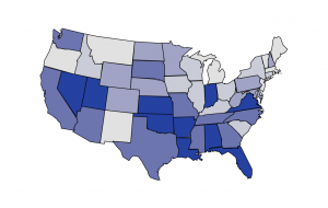
It’s not just the NZ media that has problems with denominators.  This graph from the Washington Post shows where US Federal health reform money is being spent.  And, surprise, surprise, there’s more money being spent in states with large populations.

The map is actually from the Kaiser Family Foundation, and they even have a cute interactive version that lets you look at different subcategories of funding.  What they don’t let you do is standardize by any useful denominator: population, health care expenditure,…   They do let you look at the map both in dollars and in fraction of the total, but, not surprisingly, it looks exactly the same on both scales.

Fortunately it isn’t hard to find the populations of US states, and R lets us draw pretty maps.  Below is the same map coloured according to per-capita Federal health reform funding, which looks almost completely different.

March 27, 2012

Better than nothing

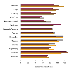
Our helpful commenters provided alternative suggestions on how the intersection car crash rates could have been standardised, instead of using population of each region

Number of registered vehicles is a bit of a pain, because it is reported for postal districts, not for regions.  I assumed that postal districts are a partition of regions (I couldn’t confirm or deny this immediately), and did a bit of Wikipedia. Presumably an NZ journalist could do this quicker than me, and would already know, for example, that the Canterbury:Otago border passes between Timaru and Oamaru.

It doesn’t matter a lot which standardisation you use.  The graph below (click to embiggen) shows all three, scaled so NZ as a whole is 100.  The orange bars are by population, the brown bars by km, and the maroon bars by registered vehicles.  The most striking difference is probably for Wellington, where the rate per registered vehicle is high: there are fewer registered vehicles per capita than in the rest of the country.

All three versions confirm that there is much less variation than the Herald story would suggest, and that  urbanisation is likely responsible.  Error bars would be nice, but I don’t know what the uncertainties in the NZTA denominators are like.

March 26, 2012

Auckland is still bigger than Wellington

According to the Herald,

Figures compiled from 2006 to 2010 show, on average, Auckland makes up about one third of all intersection crashes around the country.

 They don’t say how they are defining “Auckland”, but since the comparisons are with Canterbury and Wellington, it looks like the Auckland Region is what they mean.  The Auckland region has 1/3 of the country’s population and just over 1/3 of the crashes.   Canterbury, with 13% of the population, had 12% of the crashes.
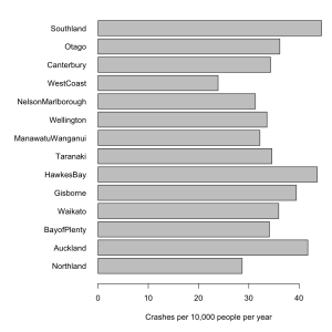
Failing to divide by population size makes it impossible to see any real variations between regions.  For example, you would expect more intersection crashes in more urbanised regions and it would be interesting to see how big this effect is.   The first graph is what the Herald is telling you, total intersection crashs over five years (with more complete data from NZTA).

The variation between regions is almost all due to differences in population, and so doesn’t tell us anything we didn’t already know. The second graph is intersection crashes per year, per 10000 population, which might actually be useful.

Even better would be a graph that indicated the uncertainties, but I don’t have time right now.

NZTA, whose press release is responsible for the story, says

The NZ Transport Agency (NZTA) is providing media organisations with background data on intersection crashes in New Zealand to assist with coverage of the implementation of new give way rules which come into force at 5am on Sunday 25 March.

It probably did assist in getting stories into the paper.  Unfortunately, the story didn’t emphasize what they wanted, which is that intersection crashes are common.  The story tried to do a comparison — as the old journalism rule says, “when you have two numbers, do something with them”. Unfortunately, they divided the wrong two numbers.