Posts filed under Denominator? (87)

September 13, 2013

How dangerous are weddings?

According to the Herald, the ACC wants us to be careful about weddings — about getting injured at them, that is.

Weddings are supposed to be the happiest day of your life – try telling that to the hundreds of people who make ACC claims for injuries at ceremonies.

From tripping on the bride’s dress to swallowing the ring, nuptials can be surprisingly hazardous.

New figures show at least 600 people made claims to the ACC between 2010 and 2012.

So, how does the 600 claims over three years compare to what you’d expect from an average day?

The ACC accepted 1.7 million new claims last year, which gives about 0.4 claims per person per year, or about 0.001 per person per day.

There were about 20 000 marriages in New Zealand last year, so about 60 000 over 2010-2012, giving about 0.01 ACC claims per marriage.  The 600 reported claims would then be about what you’d expect if there were 10 person-days of exposure per marriage.

My experience is that wedding celebrations typically involve more than ten people, and, with setup and rehearsals, often more than one day.  It looks as though weddings, like Christmas, are actually safer than ordinary days.

July 15, 2013

Think of a number and multiply by eight

We haven’t had a good denominator post in a while, but I was struck by Stuff’s story on ‘social lending’.  By next April, an NZ company hopes to be able to start up peer-to-peer lending here, after changes in the law, and we’re told

“This will be a way for individuals to play alongside the big institutions,” Milsom said

Just how that can happen – and the scale that is possible – is shown from what has happened in the UK, where the largest peer-to-peer lender has lent more than £330 million since it launched in 2005.

That’s an average of just over £40 million per year over 2005-2012, or about 66p per capita per year in the UK.  On the same scale in New Zealand, that would come to perhaps $6 million per year in loans.  The UK lender in question appears to be Zopa, and they make their money by charging a 1% borrowing fee and 1% lending fee.  Under the same setup, $6 million per year in loans would mean $120 000 per year in income for an NZ equivalent, before paying any costs.

It’s certainty possible that peer-to-peer lending will take off, and it might not be long before it exceeds 1% of all unsecured consumer debt. But the idea makes more sense spun as ‘room for expansion’ not as ‘look at the scale in the UK’.

July 2, 2013

Ranking America

Via BetterPosters, a site devoted to graphics showing the US rank in international comparisons on a range of things.  Some of the graphs are misleading because they look at totals rather than some per-capita quantity and so the US ranks high because it’s a big country.

Others …well, see for yourselves.

preview-of-e2809capproval-of-russian-leadership-xlsxe2809d (1)

June 7, 2013

Proper use of denominators

Mathew Dearnaley, in the Herald, has a story today about dangerous roads where he observes that the largest number of deaths is in the Auckland region, but immediately points out that what matters is the individual risk, estimated by fatalities per million km travelled.  We’ve been over this point quite a lot on StatsChat, so it’s great to see proper use of denominators in public.

When you divide by total distance travelled, to get a fair comparison, it  turns out that Gisborne has the most dangerous roads, followed by Taranaki, and that Auckland, like Wellington, is relatively safe.

Although Waikato roads claimed 66 lives – more than a fifth of a national toll of 308 deaths – the odds of being among the 10 people who died in crashes between the Wharerata Hills south of Gisborne and East Cape were almost twice as high as in the busier northern region.

One problem with the story is the issue of random variation.  According to NZTA, Hawkes Bay and Gisborne together had a total of 16 deaths last year, up from 8 the previous year.  There’s a lot of noise in these numbers, and even though the story sensibly looked at serious injuries as well, it’s hard to tell how much of the difference between regions is real and how much is chance.

It would be helpful to add up data over multiple years, though even then there is a problem, since we know that road deaths decreased noticeably in mid-2010, and this decrease may not have been uniform across regions.

June 1, 2013

Information and its consequences, on BBC radio

From BBC Radio: listen online

On Start the Week Emily Maitlis talks to the Executive Chairman of Google, Eric Schmidt about the digital future. A future where everyone is connected, but ideas of privacy, security and community are transformed. Former Wikileaks employee James Ball asks how free we are online. The curator Honor Harger looks to art to understand this new world of technology. And worried about this brave new world? David Spiegelhalter, offers a guide to personal risk and the numbers behind it.

(via @cjbayesian)

May 24, 2013

There’s more people than there used to be

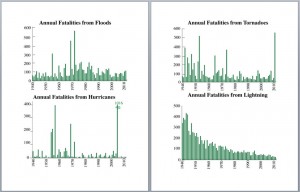
James Curran drew my attention to this graph, from daily-infographic (original source not given, but appears to be Reddit) showing weather-related deaths in the US

weatherdeaths

The decrease in lightning deaths is impressive, but it doesn’t look as though there is much decline in tornado deaths, and apparently an increase in flood deaths.  Why isn’t forecasting helping more? Business Insider Australia also found this graph and was confused

You can pick out some major weather events — Katrina, floods, different major fatal hurricanes — from the chart, but the most interesting one is definitely lightening deaths. 

While the other systems are generally sporadic, lightning fatalities have declines. 

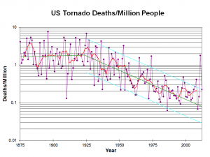
The explanation is simple: there are a lot more people now than in 1940 (about 2.5 times as many), so although the death rate has gone down, the number of deaths has stayed fairly stable. The National Severe Storms Lab (in Norman, Oklahoma, where they know from severe weather) gives this graph of death rates from tornados over more than a century

ustordeath2012


It would be even better to standardize by the population of the tornado-affected region, but that would be more difficult to define. It would also be better to remove some of the clutter from the graph: lose the grid lines and just have the points and a smooth curve. The message is still clear.

Deaths per million people were roughly steady until 1925, and have been decreasing since then, though the decrease may have levelled off.  The combination of sensible scaling by population, using a logarithmic scale, and adding a smoother and fitted line makes it easy to see the real trend in safety.  The first graph shows the danger of “letting the data speak for themselves”.


May 6, 2013

Some surprising things

  • From Felix Salmon: US population is increasing, and people are moving to the cities, so why is (sufficiently fine-scale) population density going down? Because rich people take up more space and fight for stricter zoning.  You’ve heard of NIMBYs, but perhaps not of BANANAs
  • From the New York Times.  One of the big credit-rating companies is no longer using debts referred for collection as an indicator, as long as they end up paid.  This isn’t a new spark of moral feeling, it’s just for better prediction.
  • And from Felix Salmon again: Firstly, Americans are bad at statistics. When it comes to breast cancer, they massively overestimate the probability that early diagnosis and treatment will lead to a cure, while they also massively underestimate the probability that an undetected cancer will turn out to be harmless.
March 21, 2013

That’s not worth a thousand words

The Herald has an interesting set of displays of the latest DigiPoll political opinion survey.  According to the internets it was even worse earlier in the day, but we can pass over that and only point out that corrections in news stories shouldn’t happen silently (except perhaps for typos).

We can start with the standard complaint: the margin of error for the poll itself is 3.6%, so the margin of error for change since the last poll is 1.4 times higher, or a little over 5%. None of the changes is larger than 5%, and only one comes close.

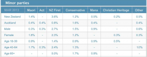
Secondly, there is a big table for the minor parties. I would normally not quote the whole table, but in this case it’s already changed once today.

minorparties


The total reported for the minor parties is 6.1%, and since there were 750 people sampled, 46 of them indicated support for one of these parties. That’s not really enough to split up over 7 parties. These 46 then get split up further, by age and gender. At this point, some of the sample proportions are zero, displayed as “-” for some reason.

[Updated to add: and why does the one male 40-64 yr old Aucklander who supported ACT not show up in the New Zealand total?]

Approximately 1 in 7 New Zealanders is 65+, so that should be about 6 or 7 minor-party supporters in the sample.  That’s really not enough to estimate a split over 7 parties. Actually, the poll appears to have been lucky in recruiting older folks: it looks like 6 NZ First, 2 Conservative, 1 Mana.

That’s all pretty standard overtabulating, but the interesting and creative problems happen at the bottom of the page.  There’s an interactive graph, done with the Tableau data exploration software.  From what I’ve heard, Tableau is really popular in business statistics: it gives a nice clear interface to selecting groups of cells for comparison, dropping dimensions, and other worthwhile data exploration activities, and helps analysts present this sort of thing to non-technical managers.

However, the setup that the Herald have used appears to be intended for counts or totals, not for proportions.  For example, if you click on April 2012, and select View Data, you get

tab


which is unlikely to improve anyone’s understanding of the poll.

I like interactive graphics.  I’ve put a lot of time and effort into making interactive graphics.  I’ve linked to a lot of good interactive graphics on this blog. The Herald has the opportunity to show the usefulness of interactive graphics to a much wider community that I’ll ever manage. But not this way.

March 10, 2013

Your media on drugs

Last night, 3News had a scare story about positive drug tests at work.  The web headline is “Report: More NZers working on drugs”, but that’s not what they had information on:

New figures reveal more New Zealanders were caught with drugs in their system at work last year.

…new figures from the New Zealand Drug Detection Agency reveal 4300 people tested positive for drugs at work last year.

but

The New Zealand Drug Detection Agency says employers are doing a better job of self-regulating. The agency performed almost 70,000 tests last year, 30 percent more than in 2011.

If 30% more were tested, you’d expect more to be positive. The story doesn’t say how many tested positive the previous year, but with the help of the Google, I found last year’s press release, which says

8% of men tested “non-negative” compared with 6% of women tested in 2011.

Now, 8% of 70000 is 5600, and even 6% of 70000 is 4200. Given that the majority of the tests are in men, it looks like the proportion testing positive went down this year.

The worst part of the story statistically is when they report changes in proportions of which drug was found as if this was meaningful.  For example,

When it comes to industries, oil and gas had an 18 percent drop in positive tests for methamphetamine, but showed a marked increase in the use of opiates.

That’s an increase in the use of opiates as a proportion of those testing positive.  Since proportions have to add up to 100%, a decrease in the proportion positive tests that are for methamphetamine has to come with an increase in some other set of drugs — just as a matter of arithmetic.

Stuff‘s story from January just as bad, with the lead

Employers are becoming more aware of the dangers of drugs and alcohol in the workplace as well as the benefits of testing for them.

and quoting an employer as saying

“And, we have no fear of an employee turning up to work and operating in an unsafe way, putting themselves and others at risk.”

as if occasional drug tests were the answer to all occupational health and safety problems.

The other interesting thing about the Stuff story is that it’s about a different organisation: Drug Testing Services, not NZ DDA — there’s more than one of them out there! You might easily have thought from the 3News story that the figures they quoted referred to all workplace drug tests in NZ, rather than just those sold by one company.

Given the claims being made, the evidence for either financial or safety benefits is amazingly weak.   No-one in these stories even claims that introducing testing has actually reduced  on-the-job accidents in their company, for example, let alone presents any data.

If you look on PubMed, the database of published medical research, there are lots of papers on new testing methods and reproducibility of test results, and a few that show people who have accidents are more likely than others to test positive.  There’s very little even of before-after comparisons: a Cochrane review on this topic found three before-after comparisons. Two of the three found a small decrease in accident rates immediately after introducing testing; the third did not.  A different two of the three found that the long-term decreasing trend in injuries got faster after introducing testing; again, the third did not.   The review concluded that there was insufficient evidence to recommend for or against testing.

There’s better evidence for mandatory alcohol testing of truck drivers, but since those tests measure current blood alcohol concentrations, not past use, it doesn’t tell us much about other types of drug testing.



February 22, 2013

Drug safety is hard

There are new reports, according to the Herald, that synthetic cannabinoids are ‘associated’ with suicidal tendencies in long-term users.  One difficulty in evaluating this sort of data is the huge peak in suicide rates in young men.  Almost anything you can think of that might be a bad idea is more commonly done by young men than by other people, so an apparent association isn’t all that surprising.  There is also the problem with direction of causation — the sorts of problems that make suicide a risk might also increase drug use — and difficulties even in getting a reasonable estimate of the denominator, the number of people using the drug. Serious, rare effects of a recreational drug are the hardest to be sure about, and the same is true of prescription medications.  It took big randomized trials to find out that Vioxx more than doubled your rate of heart attack , and a study of 1500 lung-cancer cases even to find the 20-fold increase in risk from smoking.

In this particular example there is additional supporting evidence. A few years back there was a lot of research into anti-cannabinoid drugs for weight loss (anti-munchies), and one of the things that sank these was an increase in suicidal thoughts in the patients in the early randomized trials.  It’s quite plausible that the same effect would happen as a dose of the cannabinoid wears off.

In general, though, this is the sort of effect that the proposed testing scheme for psychoactive drugs will have difficulty finding, or ruling out.