Posts filed under Correlation vs Causation (68)

August 5, 2012

One-third of who?

The lead in an otherwise reasonable story about a large employee survey in the Herald today is

Just one-third of New Zealand employees are currently working to their full potential.

If you go and look at the report (the first PDF link on this page), you find that the survey says it’s a stratified random sample, matched on organisation size, and then goes on to say that 93% of respondents “were from private organisations employing 50 or more people”.  At little work with StatsNZ’s business demography tables shows that about 57% of NZ employees work for organisations employing 50 or more people, and when you remove the public-sector employees from the numerator you get down to 42%.  The survey must have specifically targeted people working for large private organisations. Which is fine, as long as you know that and don’t just say “NZ employees”.

Also, the link between “working to their full potential” and what was actually measured is not all that tight.  The 33% is the proportion of respondents who are “engaged”, which means responding in the top two categories of a five-point scale on all eight questions targeting “job engagement” and “organisational engagement”.

Although it’s harder to interpret actual numerical values, since the company seems to use consistent methodology, changes since the last survey really are interpretable (bearing in mind a margin of error for change of around 3%).  And if you bear in mind that the survey was done by people who are trying to sell managers their services, and read the report with an skeptical eye to what was actually measured, it might even be useful.
 

July 21, 2012

One of these countries is different

You will have heard about the terrible shootings in Colorado.

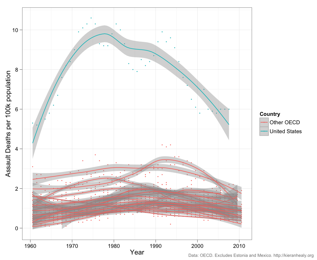
From a post by Kieran Healy, at Crooked Timber, responding to the tragedy: death rates from assault, per 100,000 population per year, for the US and 19 other OECD countries.  New Zealand is roughly in the middle (his post gives separate plots for each country).  Dots are the data for individual years, the curves are smoothed trends with margin of error.

The much higher rate in the US is obvious, but so is the decline.


Part of the decline is attributable to better medical treatment, so that assault victims are less likely to die, but far from all of it.  The rate of reports of aggravated assault is also down over the same time period.  Similarly, simple explanations like gun availability probably contribute but can’t explain the whole pattern.

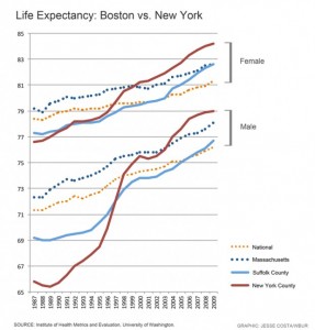
The decline in violent deaths is so large that it shows up in life expectancy comparisons.  New York, and especially Manhattan, used to have noticeably worse life expectancy than Boston, but the falling rate of violent deaths and the improvements in HIV treatment now put Manhattan, and the rest of New York City, at the top of US life expectancy

July 18, 2012

Global Innovation Barchart

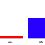
So.  The 2012 Global Innovation Index is out and NZ looks quite good.  Our only Prime Minister has a graph on his Facebook page that looks basically like this.


The graph shows that NZ was at rank 28 in 2007 and is now at rank 13.

A bar chart for two data points is a bit weird, though not nearly as bad as the Romney campaign’s efforts at Venn diagrams in the US.

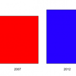
The scaling is also a bit strange.  The y-axis runs from 1 to 30, but there’s nothing special about rank 30 on this index. If we run the y-axis all the way down to 141 (Sudan), we get the second graph on the right, which shows that New Zealand, compared to countries across the world, has always been doing pretty well.


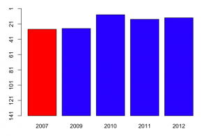
Now, there are some years missing on the plot, and the Global Innovation Index was reported for most of them.  Using the complete data, we get a graph like

So, in fact, NZ was doing even better on this index in 2010, and we get some idea of the year-to-year fluctuations.   Now, a barchart is an inefficient way to display data with just one short time series like this: a table would be better.

More important, though, what is this index measuring.  Mr Key’s Facebook page doesn’t say. Some of the commenters do say, but incorrectly (for example, one says that it’s based on current government policies).  In fact, the  exact things that go into the index change every year.  For example, the 2012 index includes Wikipedia edits and Youtube uploads,  in early years internet access and telephone access were included.  There are also changes in definitions: in early years, values were measured in US$, now they are in purchasing-power parity adjusted dollars.

Some of the items (such as internet and telephone access) are definitely good, others (such as number of researchers and research expenditure) are good all things being equal, and for others (eg, cost of redundancy dismissal in weeks of pay, liberalised foreign investment laws) it’s definitely a matter of opinion.Some of the items are under the immediate control of the government (eg public education expenditure per pupil, tariffs), some can be influenced directly by government (eg, gross R&D funding, quality of trade and transport infrastructure), and some are really hard for governments to improve  in the short term (rule of law, GMAT mean test score, high-tech exports, Gini index).

Since the content and weighting varies each year, it’s hard to make good comparisons. On the plus side, the weighting clearly isn’t rigged to make National look good — the people who come up with the index couldn’t care less about New Zealand — but the same irrelevance will also tend to make the results for New Zealand more variable.   Some of the items in the index will have been affected by the global financial crisis and the Eurozone problems. New Zealand will look relatively better on these items, for reasons that are not primarily the responsibility of the current governments even in those countries, let alone here.

I’d hoped to track down why New Zealand had moved up in the rankings, to see if it was on indicators that the current administration could reasonably take credit for, but the variability in definitions makes it very hard to compare.

April 30, 2012

Drinking age and suicide?

The Herald says “Lower drinking age blamed for high rate of youth deaths” and quotes a University of Auckland researcher, Dr Anne Beautrais,

“Addressing alcohol use and binge drinking in young people in New Zealand is one of the most obvious avenues to reducing both suicide and traffic mortality.”

Dr Beautrais points out that the high suicide rate in NZ can’t just be attributed to better reporting than in other countries. The overall youth death rate is high in NZ, and while diagnosis of suicide might be variable, diagnosis of death is pretty reliable.   That all makes sense.   Road deaths are an important component, and there you’d expect lowering the drinking age to have some effect.

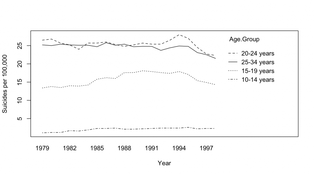
I’m less convinced by the drinking-age argument  for suicide.  One reason is the US experience, where the Reagan administration raised the drinking age to 21 in 1984.  The graph below (data from CDC) shows US male suicide rates by age group across time, and there’s really no sign of a decrease in 1984

April 28, 2012

Malignant iPhones?

The Herald has a headline “Scientists call for urgency on cancer-phone link”.  The actual content is ok, but the story does give the impression that it’s scientific consensus vs evil cellphone companies, which is not remotely true.  There’s a more balanced story in the Daily Mail (and that’s not a sentence you want to find yourself writing too often).

The facts:  there has been an increase in frontal lobe and temporal lobe brain tumours in the UK over the past decade, though not in total brain tumours.   If you lump together the two regions of the brain with increases and exclude all the ones with  decreases, you get about a 50% increase in rates, which comes to a bit less than one extra case per 100,000 people per year.   For context, that’s a bit less than the estimates of numbers of deaths due to phone use while driving.    There was a Danish study last year that did not find any differences between cell phone users and non-users, or differences in side of the head for users, but that doesn’t quite contradict the British results, for two reasons.  Firstly, there’s quite a bit of uncertainty in both sets of estimates, and they are just about compatible with, say, a 25% increase.  Secondly, the Danish study was mostly of non-malignant tumours, which are the most common ones, and the British statistics are for malignant tumours, so it’s possible the effect could be different, though there’s no known reason that it should be.

The increase could be chance (it’s statistically significant, but still), or an increase in diagnosis, or be due to something else entirely.  Or it could, perhaps, be due to cellphones.  In order to be confident it is cellphones we’d need much better evidence, especially as there isn’t really a convincing story yet of how cellphones could promote tumour growth.

The obvious textbook example of time trends revealing a cancer cause is smoking and lung cancer: smoking took off during World War I and lung cancer rates followed. Except that really isn’t the story.  When Richard Doll and Austin Bradford Hill set out to do their pioneering case-control study of lung cancer in London they were both smokers.  They were expecting the increases in lung cancer to be something to do with the dramatic increase in cars and bitumen roads — perhaps car exhaust, or perhaps some of the pollutants that evaporate off as roads are laid.  The real explanation was enough of a surprise that they were planning to extend the study to four additional cities as confirmation before publishing (until confirmation came instead from a parallel US study).   In that case the relative risk was 20 rather than 1.5, and the absolute lifetime risk increase was about 15% rather than about 0.05%, so it was a lot easier (and much more important) to find the real cause.

 The anti-cellphone scientists argue that it’s worth taking steps to reduce cellphone exposure even though the evidence is pretty weak, and they have a point.  The main step they propose is using a headset, preferably wired.  Lots of people are already doing that — if your phone is also your music player,  then headphones are an obvious necessity even if they don’t provide any protection from brain cancer.


April 18, 2012

Lost in transcription

It’s often hard to tell who is responsible for a bad statistics story: did the journalist mess up it, or was it already broken? The  Herald’s story “Shoe therapy has real benefits – study” is an exception. It’s the paper’s fault.

If you go to the University of Canterbury home page, there’s a link to their press release about Jessica Boyce’s research.  Ms Boyce has found

  • Women who feel more insecure after exposure to media body ideals own more attractiveness-conferring accessories such as shoes and handbags, but not trousers
  • Women who are, in general, insecure, own fewer accessories

where ‘women’ means female students at UoC or University of Alberta.   She interprets the first finding to mean that buying accessories is a response to the media images, since the second finding means it isn’t simple reverse causation.  The Herald reports the first of these points, but not the second, which unfortunately makes the interpretation look completely silly, rather than perfectly plausible, though not compelling.

I’m a bit confused as to why UoC is promoting the story  now.  There isn’t any mention made of a publication or conference presentation, and she  still ‘hopes to finish her thesis by the end of the year’, so that’s not the trigger.

April 15, 2012

Sleep, and his brother

The Herald has a very good story on sleeping pils and increased rates of death.  The story describes the study design and the findings, names the journal, and even gives a link to the paper, which is  in an open-access journal.

The study itself is interesting: they looked at at 10,000 people who took sleeping pills, and about 23,000 who didn’t, from a large US healthcare system (about the 2/3 the size of New Zealand).  After matching as well as they could on other health factors, the researchers still found a much higher rate of death, 3-5 times higher, in people who took sleeping pills.

It’s not easy to think of a sufficiently-strong confounding effect to explain this — you would need a factor that increases people’s chance of taking sleeping pills at least 3-5 times and also increases their rate of death at least that much. One possibility is sleep disturbance itself — it could be that needing sleeping pills is the risk factor, and the pills themselves are relatively innocent.

One factor that, I think, does cast a bit of doubt on the results is that the associations were about the same for all classes of sleeping pills:  the traditional benzodiazepines, the new short-acting drugs such as Ambien, and sedating antihistamines.   It’s entirely plausible that they all have adverse effects, but it’s a bit surprising that the effects would be so similar.

April 11, 2012

Tooth nuking

The Herald (and media sources worldwide) is covering a research paper on brain tumours and dental x-rays.  The paper asked roughly 1500 people with meningioma, and the same number of healthy people, about their histories of dental X-rays.  The people with meningiomas were more likely than the controls to report having X-rays at least annually, and the researchers estimated a relative risk of 1.5.

Now, meningioma is pretty rare, so this increase works out to an extra lifetime risk of maybe 5 cases for each 10,000 people.  Also, if you are going to have a brain tumour, meningioma is the one to have — some are not even diagnosed, and most diagnosed ones are treated successfully.  On the other hand, brain tumours are usually something you’d like to avoid, so is the risk real?

There are at least two issues that make the relative risk of 1.5 less plausible

  • Self-report of risk factors for cancer is notoriously unreliable
  • Since meningiomas can be relatively minor, the time of diagnosis varies, there might be some tendency for the sort of people who have regular dental x-rays to also be the sort of people who get earlier diagnoses, which would show up as a higher rate

The Science Media Centre also has a good summary, with quotes from experts.

It’s interesting to work out whether the risk increase is in the right ballpark given general knowledge about radiation.  A 1991 paper looked at the dose from different sorts of bite-wing dental X-ray setups, and found a range from 2 microSievert to 20 microSievert.   (XKCD shows what a microSievert means).   The same paper quotes an estimated risk of 0.73 health events including cancers per Sievert of dose to a population.   We don’t know what the population size was, but we can get a rough idea from the original paper.  They found 1500 meningiomas in 5 years, so at a rate of 3 per 100,000 people per year, that means about ten million people.  Roughly a third of the controls (and so roughly a third of the population) had at least yearly X-rays, so let’s suppose we are looking at 20 x-rays exposure on average for this third of people.Multiplying all the numbers together gives about 150 extra health events at 20 microSieverts per X-ray, or about 40 at the more-typical modern value of 5 microSieverts per X-ray.  The 1.5 relative risk that the researchers found is larger than this crude extrapolation would predict, but the order of magnitude is right.

So, there may well be a small increase in risk of a rare, mostly treatable brain tumour from having yearly dental x-rays.  It’s uncertain how big the risk is, and there are reasons to expect it might be less than a 1.5-fold increase, but that increase is at least of a plausible order of magnitude.   The radiation exposure from a dental x-ray is quite a bit less than from a trans-Tasman flight, and hugely less than from a CT scan, but it’s not zero.

April 9, 2012

‘Causal’ is not enough

Yesterday’s post about crime rates and liquor stores was tagged ‘correlation vs causation’, but it’s more complicated than that.  It’s not even clear what sort of causation is at stake.

I think we can all agree that being drunk, like being young and male, is a causal factor in violent crime. But that’s not the question.  There are two possible causal stories behind higher crime rates near liquor stores, or, more precisely, alcohol licenses.   These are truly causal alternatives to the skeptical argument that it’s actually (demand for) drinking that leads to alcohol licenses.

The weaker causal story is that people get drunk, and when they do, they are more likely to do it nearer to alcohol licenses.  That’s certainly the case for pubs and restaurants — if you buy beer from a pub, you are going to be drinking it at the pub  — and could be true for liquor stores as well.   This story would say that if you moved an alcohol license the crime would move, and if you shut down one place, the drunkenness and crime would relocate among the available options.  If this is true, it’s useful to local community groups wanting to improve local conditions, but it’s pretty much useless from a public health and safety viewpoint.

The stronger story is that people won’t drink if they have to go further to get alcohol, so that reducing the number of licenses will reduce drinking.   On this theory, reducing licenses could have a health and safety impact beyond just local redistribution of crime.

It’s not possible to distinguish these using the available data.  There’s good evidence that something like the first story holds for CCTV installation — it pushes crime out of the surveillance zone but doesn’t stop it.  And there’s some evidence that something like the second explanation works for stopping kids from smoking — adding inconvenience and cost has much more of an impact on them than on adults.

April 8, 2012

Statistical crimes double near liquor stories[updated]

Stuff has the  headline “Crime doubles close to liquor outlets”, based on an analysis from the University of Canterbury.  Now, can we think of possible non-headline explanations for this?  Indeed we can. As the story admits, near the end

The areas with the most serious violent crime had more Maori and young males, over-represented in crime statistics, and the highest population densities.

and

The three spikes with the highest numbers of liquor outlets were Auckland central (447 alcohol licences), Wellington central (423) and Christchurch central (394), all of which had high crime rates.

These numbers raise the question of what sort of alcohol licenses were included.  I’d be surprised if there were 447 liquor stores in Auckland Central, but if you include pubs and licensed restaurants the numbers look more plausible. If so, we’re not talking about liquor stores at all.  The fact that the three CBD areas (all places with bans on alcohol consumption in the street)  top the list also suggests that there’s a problem with denominators: since many of the people in the CBD don’t live there, rates of crime per 1000 population  will tend to be inflated.

What is really infuriating is that the researchers actually did a better version of the analysis, but we don’t get to see it. In the last paragraph of the story, we get

Day said the correlation was weaker, but still held, when those factors were statistically removed from the equation.

So why don’t we get told the numbers that at least have a chance of meaning something, rather than the “crime doubles”?

Updated to add:  A commenter on a later post gave a link to the published paper,  and the adjustment brings relative rates of 2.4, 2.0, and 2.4 for any license, on-license and off-license, respectively, to 1.5, 1.6, and 1.4.   Also, without adjustment there is a much higher rate in for the areas closest to off-license stores, but after adjustment the elevated rate is constant out to 5km, which seems much less plausible.