Posts filed under Correlation vs Causation (68)

March 8, 2018

“Causal” is only the start

Jamie Morton has an interesting story in the Herald, reporting on research by Wellington firm Dot Loves Data.

They then investigated how well they all predicted the occurrence of assaults at “peak” times – between 10pm and 3am on weekends – and otherwise in “off-peak” times.

Unsurprisingly, a disproportionate number of assaults happened during peak times – but also within a very short distance of taverns.

The figures showed a much higher proportion of assault occurred in more deprived areas – and that, in off-peak times, socio-economic status proved a better predictor of assault than the nearness or number of bars.

Unsuprisingly, the police were unsurprised.

This isn’t just correlation: with good-quality location data and the difference between peak and other times, it’s not just a coincidence that the assaults happened near bars, nor is it just due to population density.  The closeness of the bars and the assaults also argues against the simple reverse-causation explanation: that bars are just sited near their customers, and it’s the customers who are the problem.

So, it looks as if you can predict violent crimes from the location of bars (which would be more useful if you couldn’t just cut out the middleman and predict violent crimes from the locations of violent crimes).  And if we moved the bars, the assaults would probably move with them: if we switched a florist’s shop and a bar, the assaults wouldn’t keep happening outside the florist’s.

What this doesn’t tell us directly is what would happen if we dramatically reduced the number of bars.  It might be that we’d reduce violent crime. Or it might be that it would concentrate around the smaller number of bars. Or it might be that the relationship between bars and fights would weaken: people might get drunk and have fights in a wider range of convenient locations.

It’s hard to predict the impact of changes in regulation that are intended to have large effects on human behaviour — which is why it’s important to evaluate the impact of new rules, and ideally to have some automatic way of removing them if they didn’t do what they were supposed to.  Like the ban on pseudoephedrine in cold medicine.

August 16, 2017

Seatbelts save (some) lives

It’s pretty standard that headlines (and often politicians) overstate the likely effect of road safety precautions — eg, the claim that lowering the blood alcohol limit would prevent all deaths in which drivers were over the limit, which it obviously won’t.

This is from the Herald’s front page.

belt

On the left, the number 94 is the number of people who died in crashes while not wearing seatbelts. On the right (and in the story), the we find that this is about a third of all the deaths. It’s quite possible to wear a seatbelt and still die in a crash.

Looking for research, I found this summary from a UK organisation that does independent reviews on road safety issues. They say seatbelts in front seats prevent about 45% of fatal injuries in front seat passengers. For rear-seat passengers the data are less clear.

So, last year probably about 45 people died on our roads because they weren’t wearing seatbelts. That’s a big enough number to worry about: we don’t need to double it.

March 9, 2017

Causation, correlation, and gaps

It’s often hard to establish whether a correlation between two variables is cause and effect, or whether it’s due to other factors.  One technique that’s helpful for structuring one’s thinking about the problem is a causal graph: bubbles for variables, and arrows for effects.

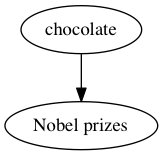
I’ve written about the correlation between chocolate consumption and number of Nobel prizes for countries.  The ‘chocolate leads to Nobel Prizes’ hypothesis would be drawn like this:

chocolate

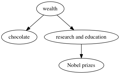
One of several more-reasonable alternatives is that variations in wealth explain the correlation, which looks like

chocolate1

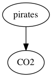
As another example, there’s a negative correlation between the number of pirates operating in the world’s oceans and atmospheric CO2 concentration.  It could be that pirates directly reduce atmospheric CO2 concentration:

pirates

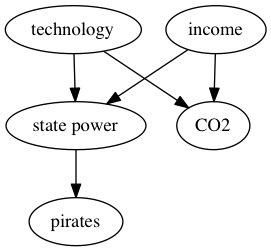
but it’s perhaps more likely that both technology and wealth have changed over time, leading to greater CO2 emissions and also to nations with the ability and motivation to suppress piracy:

pirates1

The pictures are oversimplified, but they still show enough of the key relationships to help with reasoning.  In particular, in these alternative explanations, there are arrows pointing into both the putative cause and the effect. There are arrows from the same origin into both ‘chocolate’ and ‘Nobel Prizes’; there are arrows from the same origins into both ‘pirates’ and ‘CO2‘.  Confounding — the confusion of relationships that leads to causes not matching correlations — requires arrows into both variables (or selection based on arrows out of both variables).

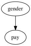
So, when we see a causal hypothesis like this one:

paygap

and ask if there’s “really” a gender pay gap, the answer “No” requires finding a variable with arrows into both gender and pay.  Which in your case you have not got. The pay gap really is caused by gender.

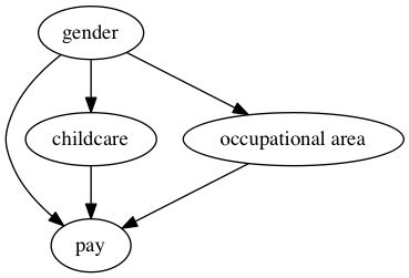
There are still interesting and important questions to be asked about mechanisms. For example, consider this graph

paygap1

We’d like to know how much of the pay gap is direct underpayment, how much goes through the mechanism of women doing more childcare, and how much goes through the mechanism of occupations with more women being  paid less.  Information about mechanisms helps us think about how to reduce the gap, and what the other costs of reducing it might be.  The studies I’ve seen suggest that all three of these mechanisms do contribute, so even if you think only the direct effects matter there’s still a problem.

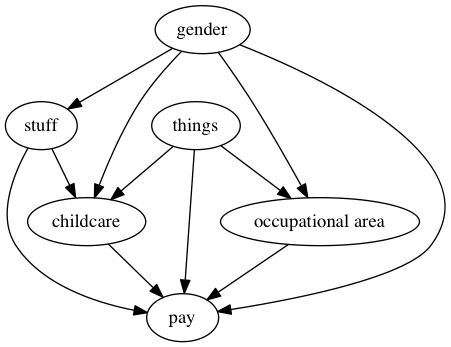
You can also think of all sorts of things and stuff I’ve left out of that graph, and you could put some of them back in

paygap2

But you’re still going to end up with a graph where there are only arrows out of gender.  Women earn less, on average, and this is causation, not mere correlation.

June 23, 2016

Or the other way around

It’s a useful habit, when you see a causal claim based on observational data, to turn the direction around: the story says A causes B, but could B cause A instead? People get annoyed when you do this, because they think it’s silly. Sometimes, though, that is what is happening.

As a pedestrian and public transport user, I’m in favour of walkable neighbourhoods, so I like seeing research that says they are good for health. Today, Stuff has a story that casts a bit of doubt on those analyses.

The researchers used Utah driver’s-licence data, which again included height and weight, to divide all the neighbourhoods in Salt Lake County into four groups by average body mass index. They used Utah birth certificates, which report mother’s height and weight, and looked at 40,000 women who had at least two children while living in Salt Lake County during the 20-year study period.  Then they looked at women who moved from one neighbourhood to another between the two births. Women with higher BMI were more likely to  move to a higher-BMI neighbourhood.

If this is true in other cities and for people other than mothers with new babies, it’s going to exaggerate the health benefits of walkable neighbourhoods: there will be a feedback loop where these neighbourhoods provide more exercise opportunity, leading to lower BMI, leading to other people with lower BMI moving there.   It’s like with schools: suppose a school starts getting consistently good results because of good teaching. Wealthy families who value education will send their kids there, and the school will get even better results, but only partly because of good teaching.

June 3, 2015

Cancer correlation and causation

It’s a change to have a nice simple correlation vs causation problem. The Herald (from the Telegraph) says

Statins could cut the risk of dying from cancer by up to half, large-scale research suggests. A series of studies of almost 150,000 people found that those taking the cheap cholesterol-lowering drugs were far more likely to survive the disease.

Looking at the conference abstracts,  a big study found a hazard ratio of 0.78 based on about 3000 cancer deaths in women and a smaller study found a hazard ratio of 0.57 based on about half that many prostate cancer deaths (in men, obviously). That does sound impressive, but it is just a correlation. The men in the prostate cancer studies who happened to be taking statins were less likely to die of cancer; the women in the Women’s Health Initiative studies who happened to be taking statins were less likely to die of cancer.

There’s a definite irony that the results come from the Women’s Health Initiative. The WHI, one of the most expensive trials ever conducted, was set up to find out if hormone supplementation in post-menopausal women reduced the risk of serious chronic disease. Observational studies, comparing women who happened to be taking hormones with those who happened not to be, had found strong associations. In one landmark paper, women taking estrogen had almost half the rate of heart attack as those not taking estrogen, and a 22% lower rate of death from cardiovascular causes. As you probably remember, the WHI randomised trials showed no protective effect — in fact, a small increase in risk.

It’s encouraging that the WHI data show the same lack of association with getting cancer that summaries of randomised trials have shown, and that there’s enough data the association is unlikely to be a chance finding. As with estrogen and heart attack there are biochemical reasons why statins could increase survival in cancer. It could be true, but this isn’t convincing evidence.

Maybe someone should do a randomised trial.

March 20, 2015

Ideas that didn’t pan out

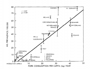
One way medical statisticians are trained into skepticism over their careers is seeing all the exciting ideas from excited scientists and clinicians that don’t turn out to work. Looking at old hypotheses is a good way to start. This graph is from a 1986 paper in the journal Medical Hypotheses, and the authors are suggesting pork consumption is important in multiple sclerosis, because there’s a strong correlation between rates of multiple sclerosis and pork consumption across countries:

pork

This wasn’t a completely silly idea, but it was never anything but suggestive, for two main reasons. First, it’s just a correlation. Second, it’s not even a correlation at the level of individual people — the graph is just as strong support for the idea that having neighbours who eat pork causes multiple sclerosis. Still, dietary correlations across countries have been useful in research.

If you wanted to push this idea today, as a Twitter account claiming to be from a US medical practice did, you’d want to look carefully at the graph rather than just repeating the correlation. There are some countries missing, and other countries that might have changed over the past three decades.

In particular, the graph does not have data for Korea, Taiwan, or China. These have high per-capita pork consumption, and very low rates of multiple sclerosis — and that’s even more true of Hong Kong, and specifically of Chinese people in Hong Kong.  In the other direction, the hypothesis would imply very low levels of multiple sclerosis among US and European Jews. I don’t have data there, but in people born in Israel the rate of multiple sclerosis is moderate among those of Ashkenazi heritage and low in others, which would also mess up the correlations.

You might also notice that the journal is (or was) a little non-standard, or as it said  “intended as a forum for unconventional ideas without the traditional filter of scientific peer review”.

Most of this information doesn’t even need a university’s access to scientific journals — it’s just out on the web.  It’s a nice example of how an interesting and apparently strong correlation can break down completely with a bit more data.

March 18, 2015

Men sell not such in any town

Q: Did you see diet soda isn’t healthier than the stuff with sugar?

A: What now?

Q: In Stuff: “If you thought diet soft drink was a healthy alternative to the regular, sugar-laden stuff, it might be time to reconsider.”

A: They didn’t compare diet soft drink to ‘the regular, sugar-laden stuff’.

Q: Oh. What did they do?

A: They compared people who drank a lot of diet soft drink to people who drank little or none, and found the people who drank a lot of it gained more weight.

Q: What did the other people drink?

A: The story doesn’t say. Nor does the research paper, except that it wasn’t ‘regular, sugar-laden’ soft drink, because that wasn’t consumed much in their study.

Q: So this is just looking at correlations. Could there have been other differences, on average, between the diet soft drink drinkers and the others?

A: Sure. For a start, there was a gender difference and an ethnicity difference. And BMI differences at the start of the study.

Q: Isn’t that a problem?

A: Up to a point. They tried to adjust these specific differences away, which will work at least to some extent. It’s other potential differences, eg in diet, that might be a problem.

Q: So the headline “What diet drinks do to your waistline” is a bit over the top?

A: Yes. Especially as this is a study only in people over 65, and there weren’t big differences in waistline at the start of the study, so it really doesn’t provide much information for younger people.

Q: Still, there’s some evidence diet soft drink is less healthy than, perhaps, water?

A: Some.

Q: Has anyone even claimed diet soft drink is healthier than water?

A: Yes — what’s more, based on a randomised trial. I think it’s fair to say there’s a degree of skepticism.

Q: Are there any randomised trials of diet vs sugary soft drinks, since that’s what the story claimed to be about?

A: Not quite. There was one trial in teenagers who drank a lot of sugar-based soft drinks. The treatment group got free diet drinks and intensive nagging for a year; the control group were left in peace.

Q: Did it work?

A: A bit. After one year the treatment group  had lower weight gain, by nearly 2kg on average, but the effect wore off after the free drinks + nagging ended. After two years, the two groups were basically the same.

Q: Aren’t dietary randomised trials depressing?

A: Sure are.


February 27, 2015

What are you trying to do?


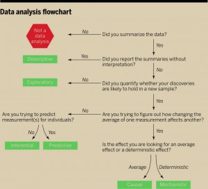
There’s a new ‘perspectives’ piece (paywall) in the journal Science, by Jeff Leek and Roger Peng (of Simply Statistics), arguing that the most common mistake in data analysis is misunderstanding the type of question. Here’s their flowchart

F1.large

The reason this is relevant to StatsChat is that you can use the flowchart on stories in the media. If there’s enough information in the story to follow the flowchart you can see how the claims match up to the type of analysis. If there isn’t enough information in the story, well, you know that.


January 16, 2015

Women are from Facebook?

A headline on Stuff: “Facebook and Twitter can actually decrease stress — if you’re a woman”

The story is based on analysis of a survey by Pew Research (summary, full report). The researchers said they were surprised by the finding, so you’d want the evidence in favour of it to be stronger than usual. Also, the claim is basically for a difference between men and women, so you’d want to see summaries of the evidence for a difference between men and women.

Here’s what we get, from the appendix to the full report. The left-hand column is for women, the right-hand column for men. The numbers compare mean stress score in people with different amounts of social media use.

pew

The first thing you notice is all the little dashes.  That means the estimated difference was less than twice the estimated standard error, so they decided to pretend it was zero.

All the social media measurements have little dashes for men: there wasn’t strong evidence the correlation was non-zero. That’s not we want, though. If we want to conclude that women are different from men we want to know whether the difference between the estimates for men and women is large compared its uncertainty.  As far as we can tell from these results, the correlations could easily be in the same direction in men and women, and could even be just as  strong in men as in women.

This isn’t just a philosophical issue: if you look for differences between two groups by looking separately for a correlation each group rather than actually looking for differences, you’re more likely to find differences when none really exist. Unfortunately, it’s a common error — Ben Goldacre writes about it here.

There’s something much less subtle wrong with the headline, though. Look at the section of the table for Facebook. Do you see the negative numbers there, indicating lower stress for women who use Facebook more? Me either.


[Update: in the comments there is a reply from the Pew Research authors, which I got in email.]

September 25, 2014

Asthma and job security

The Herald’s story is basically fine

People concerned that they may lose their jobs are more likely to develop asthma than those in secure employment, a new study suggests.

Those who had “high job insecurity” had a 60 per cent increased risk of developing asthma when compared to those who reported no or low fears about their employment, they found.

though it would be nice to have the absolute risks (1.3% vs 2.1% over two years) , and the story is really short on identifying information about the researchers, only giving the countries they work in (the paper is here).

The main reason to mention it is to link to the NHS “Behind the Headlines” site, which writes about stories like this one in the British Media (the Independent, in this case).

Also, the journal should be complimented for having the press release linked from the same web page as the abstract and research paper. It would be even better, as Ben Goldacre has suggested, to have authors listed for the press release, but this is at least a step in the direction of accountability.