Posts written by Thomas Lumley (2567)

avatar

Thomas Lumley (@tslumley) is Professor of Biostatistics at the University of Auckland. His research interests include semiparametric models, survey sampling, statistical computing, foundations of statistics, and whatever methodological problems his medical collaborators come up with. He also blogs at Biased and Inefficient

July 18, 2022

Sampling and automation

Q: Did you see Elon Musk is trying to buy or maybe not buy Twitter?

A: No, I have been on Mars for the last month, in a cave, with my eyes shut and my fingers in my ears

Q: <poop emoji>.  But the bots? Sampling 100 accounts and no AI?

A: There are two issues here: estimating the number of bots, and removing spam accounts

Q: But don’t you need to know how many there are to remove them?

A: Not at all. You block porn bots and crypto spammers and terfs, right?

Q: Yes?

A: How many?

Q: Basically all the ones I run across.

A: That’s what Twitter does, too. Well, obviously not the same categories.  And they use automation for that.  Their court filing says they suspend over a million accounts a day (paragraph 65)

Q: But the 100 accounts?

A: They also manually inspect about 100 accounts per day, taken from the accounts that they are counting as real people — or as they call us, “monetizable daily active users” — to see if they are bots.  Some perfectly nice accounts are bots — like @pomological or @ThreeBodyBot or @geonet or the currently dormant @tuureiti — but bots aren’t likely to read ads with the same level of interest as monetizable daily active users do, so advertisers care about the difference.

Q: Why not just use AI for estimation, too?

A: One reason is that you need representative samples of bots and non-bots to train the AI, and you need to keep coming up with these samples over time as the bots learn to game the AI

Q: But how can 100 be enough when there are 74.3 bazillion Twitter users?

A: The classic analogy is that you only need to taste a teaspoon of soup to know if it’s salty enough.   Random sampling really works, if you can do it.  In many applications, it’s hard to do: election polls try to take a random sample, but most of the people they sample don’t cooperate.  In this case, Twitter should be able to do a genuine random sample of the accounts they are counting as monetizable daily active users, and taking a small sample allows them to put more effort into each account.  It’s a lot better to look at 100 accounts carefully than to do a half-arsed job on 10,000.

Q: 100, though? Really?

A: 100 per day.  They report the proportion every 90 days, and 9000 is plenty.  They’ll get good estimates of the average even over a couple of weeks


June 15, 2022

Briefly

  • The Herald says House prices: ‘Another bloodbath’ as prices slump again in May for sixth straight month – REINZ figures. Estimates in the story range from 10-15% drop by the end of the year, and maybe 18% peak to trough.  In January, the Herald reported that prices had risen 30% in 2021, so even an 18% drop would leave prices about 10% higher than they were at the start of 2021.  So even the most optimistic forecast has housing prices pretty much keeping up with inflation over 2021-22.
  • Emma Vitz updated her housing price maps for the Spinoff, which you probably saw this time last year
  • Len Cook, former Government Statistician of New Zealand and former Chief Statistician of the UK, is Not Happy with the proposed  Data and Statistics Bill,  replacing the old Statistics Act.  As I said on Twitter, you don’t necessarily have to agree with Len, but you do need to pay attention to what he thinks.
  • Covid has now killed more White people in the US than Hispanic or Black or Asian, according to a New York Times story.  As this Twitter thread points out, that’s because of age differences in the populations of different ethnicities.  Mortality rates are lower for White people <45 than Black or Hispanic. The same is true for White people 45-64. And 65-74, and over 75. Because the White population averages older, the total numbers of deaths are higher — but that’s like the way deaths are higher in Australia than New Zealand because the population is larger.  Age standardisation is really important if you want to think about reasons for differences between groups
June 8, 2022

Briefly

Remember Pheidippides

From the Herald today (from the Daily Telegraph)

The story is somewhat better than the headline — for a start, it mentions in the second sentence that this is unpublished research being presented at a conference, so it’s really just a press release and there won’t be much further information available.  There’s a slightly more detailed story at Yahoo, from the Evening Standard.

You might think from the the headline that the research studied men who ran marathons after the age of 40, and that it came with recommendations not to do this.  Not quite. These were people aged over 40 who had taken part in more than 10 endurance events and had exercised regularly for at least 10 years, but quite a lot of their excessive exercise could have taken place when they were under 40.  More importantly, there wasn’t a “warning”:  the Yahoo piece quotes the researchers as saying

“In non-athletes, aortic stiffening is associated with heart and circulatory diseases.

“How this finding applies to potential risk in athletes is not yet fully understood, so more work will be needed to help identify who could be more at risk.”

As usual, this isn’t the first piece of research on the topic.

Earlier research of endurance athletes over 50, from 2020 (press release, paper) supports the current findings. It did find enlargement of the aorta in male but not female athletes, and like the current research it came with vague concerns rather than dire warnings

The first option is that aortic enlargement among masters athletes is a benign adaptation and another feature of the so-called athlete’s heart, where big is good. “The alternative is that being a lifelong exerciser may cause dilation of the aorta with the sort of attendant risk seen in nonathletes.”

A 2021 paper looked at the ‘aortic age’ in people doing their first marathon, at ages ranging from 21 to 69. It found

… a reduction in “aortic age” by 3.9 years (95% CI: 1.1 to 7.6 years) and 4.0 years (95% CI: 1.7 to 8.0 years) (Ao-P and Ao-D, respectively). Benefit was greater in older, male participants with slower running times (p < 0.05 for all).

That is, if these measurements have the same interpretation in athletes as in normal people, running a single marathon seems to be good for men over 40.

It might turn out that overindulgence in marathon running is bad for your cardiovascular system, but we’re not there yet.  If you’re running for fitness, you might be better off not going the full 42km. But if you enjoy it, go in (hopefully) good health.

May 20, 2022

Briefly

  • The WHO has released new estimates of Covid mortality.  Here’s Jon Wakefield, a statistician at the University of Washington, talking about them on PBS Newshour, Radio New Zealand, BBC’s More or Less, and Checks and Balance, at The Wire in India
  • A nice new Australian electoral map, just in time for the election
  • Some interesting sound-based data display from NASA. I’m not sure how well it works as communication
  • The making of a data visualisation — all the plots that Georgios Karamanis made in the process of looking at some data and making a final graphic
  • Media Council ruling on a terrible graph accompanying a column by Shane Reti in the Northern Advocate: “Opinion pieces must be based on a foundation of fact, and should not contain clear errors of fact.  There is no doubt that the graphs presented by Dr Reti as justifying his headline and comment in his column were misleading in that they did not fairly show the trend in cases through the period.”
  • The sources of data for online panel surveys are more complicated and messy than many people expect: “We began wondering about survey data sourcing when we noticed that since 2018, the Cooperative Election Study  has included data from Dynata, Critical Mix, and Prodege. This was a shock to us because among academic researchers, the Cooperative Election Study is widely understood as a survey conducted by YouGov
  • A Twitter thread about Tesco Clubcard, perhaps the first store loyalty programme to focus on data collection
April 19, 2022

Briefly

  • The Herald has a story on a penis size ‘survey’ from a UK online pharmacy specialising in men’s health, who “used Google data to rank the average penis size of 86 countries – and New Zealand has placed 50th”. That’s not an indication of worrying privacy leaks in Android phones; it seems they did just Google for the results. The pharmacy obviously wants to get publicity because being unknown will be its biggest business problem. In the UK, they did well and got a mention in The Sun. Being in the Herald doesn’t do them much good, though.
  • ESR is now publishing detailed wastewater Covid data, which is great — the big advantage of wastewater data is that the sampling is independent of Covid prevalence, in contrast to data on testing, where you tend to miss more cases as the prevalence goes up.
  • One thing I don’t like about the current ESR graphs is that they use a log scale for viral load and a linear scale for cases, which is one reason the peak for wastewater looks so much broader than the peak for cases (the other reason is that wastewater measures total active cases, not daily new cases)
  • Ben Schmidt has made an interactive map of ethnicity in the US, based on Census data — in the sense that it has a dot for each of the 300-odd million people recorded in the Census
  • Interesting Twitter thread about the case against the continued existence of Ivory-billed Woodpeckers in the US.  Not precisely statistical, but definitely statistics-adjacent.
  • Somewhat dodgy graphic from Labour about housing consents. If this is an area graph, the axis should go down to zero.  It’s not as bad as some I’ve covered in the past, but it’s annoying. The second graph is an edited version where the axis does go down to zero and the areas are meaningful
April 11, 2022

Blowing in the wind

Last month, the Italian region of Marche announced they had installed ventilation in schools and it had reduced Covid infections by a 82% (Reuters, Stuff, La Repubblica).  A report was supposed to follow, but this is all I’ve been able to find.  It’s not really surprising that Covid rates went down with improved ventilation, but what’s currently available is very low on detail. Ventilation was installed in 3% of classrooms (or for 3% of classes, I’m not certain), and this 3% was compared to those that didn’t get new ventilation.  The reported benefits were:

That’s great! But. Things you’d really like to know when you think about how much this should change policy in other countries:

  • How were the schools with new ventilation chosen, and how were the different ventilation levels chosen? How did their Covid rates compare before the change?
  • How was Covid measured? Was there any systematic testing or was it just a matter of who got sick and then got tested? Is this symptomatic infections or all infections? Do you know anything about their testing rates?
  • Was there any attempt to decide if Covid cases were connected with school or were household infections or something else?
  • Did the ventilation involve any measurement of air mixing and effective air changes, or does this study show you don’t need that?
  • Were students wearing masks? What were the isolation rules for infections?
  • What are the uncertainty intervals on those efficacy estimates? How many students and Covid cases in each group are the estimates based on?

In particular, the relationship between air changes and transmission risk looks very close to what you might expect from just diluting the air — but it really shouldn’t! The ventilation should only have changed Covid risk while students were at school; it shouldn’t have reduced the risk of transmission at home or in other places.  To get an 82.5% reduction in total infections, they must have been doing much better than 82.5% reduction in infections at school.  For example, if 82.5% of infections in the schools without new ventilation happened at school, you’d need to abolish those at-school infections completely to get 82.5% overall effectiveness.  If 90% of infections happened at school, you’d need 92% effectiveness in reducing at-school infections to get 82.5% overall effectiveness.

If the point of the Italian study is just that ventilation is beneficial, it really isn’t major news and it’s not all that helpful to other countries. If the detailed estimates are to be useful, we need to know what they are detailed estimates of.

April 7, 2022

Cancer and weed?

Q: Did you see a study has found cannabis causes more cancers than tobacco?

A: Sigh. That’s not what it says

Q: Otago Daily Times: Study finds cannabis causes more cancers than tobacco

A: Read a bit further

Q: “shows cannabis is causal in 27 cancers, against 14 cancers for tobacco”. So it’s just saying cannabis is involved in causing more different types of cancer than tobacco? Nothing about more actual cases of cancer.

A: Yes, and if you’re not too fussy about “causes”

Q: Mice?

A: No, people. Well, not people exactly. States.  The study had drug-use data averaged over each year in each US state, from a high-quality national survey, and yearly state cancer rates from SEER, which collects cancer data, and correlated one with the other.

Q: Ok, that makes sense. It doesn’t sound ideal, but it might tell us something. So I’m assuming the states with more cannabis use had more cancer, and this was specific to cannabis rather than a general association with drug use?

A: Not quite. They claim the states and years where people used more cannabidiol had higher prostate and ovarian cancer rates — but the states and years where people used more THC had lower rates.

Q: Wait, the drug-use survey asked people about the chemical composition of their weed? That doesn’t sound like a good idea. What were they smoking?

A: No, the chemical composition data came from analyses of illegal drugs seized by police.

Q: Isn’t the concern in the ODT story about legal weed? <reading noises> And in the research paper? Is that going to have the same trends in composition across states

A: Yes. And yes. And likely no.

Q: So their argument is that cannabidiol consumption is going up because of legalisation and prostate cancer is going up and this relationship is causal

A: No, that was sort of their argument in a previous study looking at cancer in kids, which is going up while cannabis use is going up.  Here, they argue that ovarian and prostate cancer are going down while cannabidiol use is going down.  And that it’s happening in the same states. In this map they say that the states are basically either purple (high cancer and high cannabidiol) or green (low both) rather than red or blue
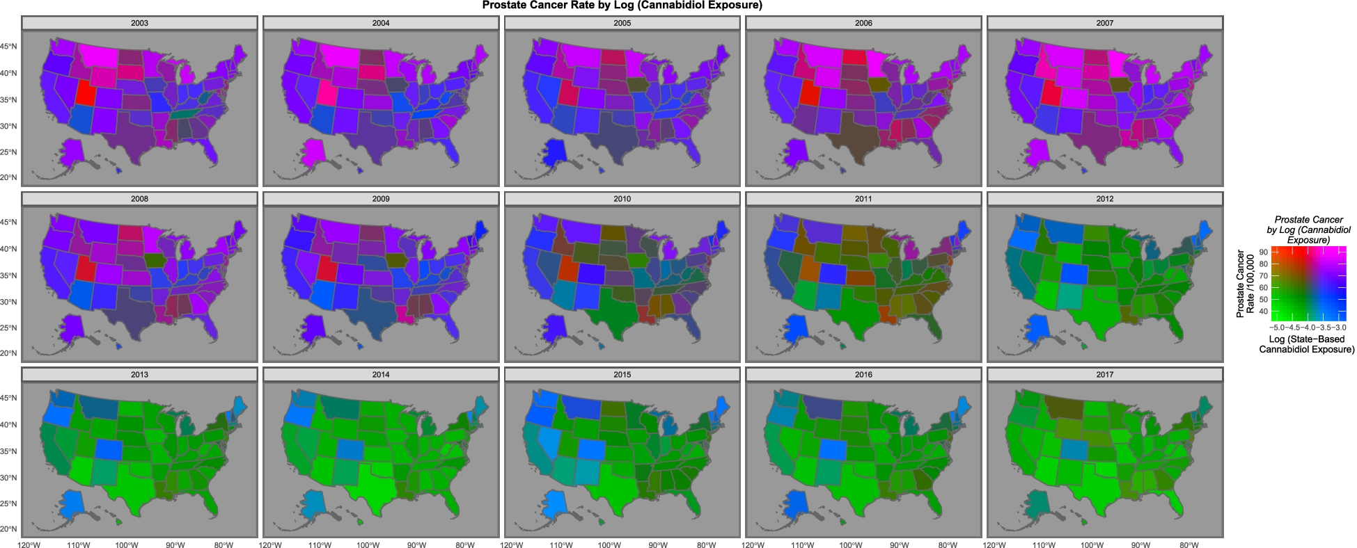
Q: Um.

A: “The purple and pink tones show where both cannabidiol and prostate cancer are high. One notes that as both fall the map changes to green where both are low, with the sole exception of Maine, Vermont and New Hampshire which remain persistently elevated.”

Q: What’s the blue square near the middle, with high weed and low cancer?

A: Colorado, which had one of the early legalisation initiatives.

Q: Isn’t the green:purple thing mostly an overall trend across time rather than a difference between states?

A: That would be my view, too.

Q: How long do they say it takes for cannabis to cause prostate cancer? Would you expect the effect to show up over a period of a few years?

A: It does seem a very short time, but that’s all they could do with their data.

Q: And, um, age? It’s older men who get prostate cancer mostly, but they aren’t the ones you think of as smoking the most weed

A: Yes, the drug-use survey says cannabis use is more common in young adults, a very different age range from the prostate cancer. So if there’s a wave of cancer caused by cannabis legalisation it probably won’t have shown up yet.

Q: Ok, so these E-values that are supposed to show causality. How do they find 20,000,000,000,000,000,000,000,000,000,000,000,000,000,000,000,000,000,000,000,000,000,000,000,000,000,000,000,000,000,000,000,000,000,000,000,000,000,000,000,000,000 times stronger evidence for causality with cannabis, not even using any data on individuals, than people have found with tobacco?

A: It’s not supposed to be strength of evidence, but yes, that’s an implausibly large number.  It’s claiming any other confounding variable that explained the relationship would have to have an association that strong with both cancer and cannabidiol.  Which is obviously wrong somehow. I mean, we know a lot of the overall decline is driven by changes in prostate screening, and that’s not a two bazillion-fold change in risk.

Q: But how could it be wrong by so much?

A: Looking at the prostate cancer and ovarian cancer code file available with their paper, I think they’ve got the computation wrong, in two ways. First, they’re using the code default of a 1-unit difference in exposure when their polynomial models have transformed the data so the whole range is very much less than one. Second, the models with the very large E-values in prostate cancer and ovarian cancer are models for a predicted cancer rate as a function of percentile (checking for non-linear relationships), rather than models for observed cancer as a function of cannabidiol.

Q: They cite a lot of biological evidence as reasons to believe that cannabinoids could cause cancer.

A: Yes, and for all I know that could be true; it’s not my field. But the associations in these two papers aren’t convincing — and certainly aren’t 1.92×10125-hyper-mega-convincing.

Q:  Russell Brown says that the authors are known anti-drug campaigners. But should that make any difference to getting the analysis published? They include their data and code and, you know, Science and Reproducibility and so on?

A: Their political and social views shouldn’t make any difference to getting their analysis published in Archives of Public Health. But it absolutely should make a difference to getting their claims published by the Otago Daily Times without any independent expert comment.  There are media stories where the reporter is saying “Here are the facts; you decide”. There are others where the reporter is saying “I’ve seen the evidence, trust me on this”. This isn’t either of those. The reporter isn’t certifying the content and there’s no way for the typical reader to do so; an independent expert is important.


March 23, 2022

Briefly

  • BBC’s More or Less on the actual evidence for mask use. Probably not 53% reduction in risk. But is it worthwhile? Yes, they say.
  • I’m the The Conversation on the benefits of vaccines: modest against infection but pretty good against serious illness
  • People are (quantatively) bad at estimating the population income distribution — and everything else
  • The USA may be about to stop daylight saving time changes. The Washington Post shows where the impact will fall if they do.  It’s probably a good idea, but it’s going to be a pain for some people.
  • Trip planning for Ancient Rome
  • The problem with caring too much about university rankings is that it may be easier to improve the ranking than to improve the university. Columbia University allegedly submitted dodgy data to US News & World Report to get a better ranking.  Now, there are differences between universities, on lots of metrics, and it’s good for people outside the academic or social elites to be able to learn about these differences. The problem is folding them into a ranking and then treating the ranking as the important thing.  And if you’re running a ranking system as valuable as that one, you should probably be doing a bit of data checking.
  • “When covid testing flipped to home RATs, there was a big drop in the children reported as having covid relative to parents compared to professional tests. Then came people sharing advice on how to swab kids, then easier reporting, and now we seem to be back where we were.” @thoughtfulnz on Twitter
  • Phrasing of poll questions is important. Here’s one from the UK about a “no-fly zone in Ukraine” that lays out some of the risks and gets different results from polls that didn’t. (I’m also glad to see a high “Don’t Know” proportion reported.)
March 4, 2022

Density trends

This came from Twitter (arrows added). I don’t have a problem with the basic message, that when people are packed into a smaller area it takes less energy for them to get around, but there are things about the graph that look a bit idiosyncratic, and others that just look wrong

The location of the points comes from an LSE publication that’s cited in the footnote, which got it from a 2015 book, using 1995 data (data not published).  The label on the vertical axis has been changed — in both the sources it was “private passenger transport energy use per capita”, so excluding public transport — and the city-size markers have been added.

One thing to note is that you could almost equally well say that transport energy use depends on what continent you’re in: the points in the same colour don’t show much of a trend.

Two points that first really stood out for me were San Francisco (lower population density than LA) and Wellington (higher population than Frankfurt, Washington, Athens, Oslo; same general class as Manila and Amsterdam).   In this sort of comparison it makes a big difference how you define your cities: is Los Angeles the local government area or the metropolis or something in between? In this case it’s particularly important because the population data were added in by someone else to an existing graph.

In some cases we can tell. Melbourne must be the whole metropolitan area (the thing a normal person would call ‘Melbourne’), not the small municipality in the centre.  The book gives the density for Los Angeles on a nearby page as the “Los Angeles–Long Beach Urbanized Area”, which is (roughly speaking) all the densely populated bits of Los Angeles County. Conversely, San Francisco looks to be the whole San Francisco-Oakland Urbanized Area, which has rather lower density than what you’d think of as San Francisco. The circle looks wrong, though: the city of San Francisco is small, but the San Francisco area has a higher population than Brisbane or Perth.

The same happens in other countries. Manila, by its population, should just be the city of Manila, but that had a population density of 661/ha in 1995 so the density value is for something larger than Manila but smaller than the whole National Capital region (which had a density of 149/ha and a population of 9.5 million).  If it’s in the right place on the graph, its bubble should be bigger. The time since 1995 also matters: Beijing is over 20 million people now, but was under 10 million at the time the graph represents. We’ve seen that the San Francisco point is likely correct, but the size is probably wrong.  The same seems to be true for Wellington: the broadest definition of Wellington will give you a smaller population than the narrowest definition of Washington or Frankfurt.

As I said at the beginning, I don’t think the basic trend is at all implausible. But when you have data points that are as sensitive to user choice as these, and when the size data and density data were constructed independently and don’t have clearly documented sources, it would be good to be confident someone has checked on whether Manila really has the same population as Wellington and San Francisco is really less dense than LA.