Posts written by Thomas Lumley (2566)

avatar

Thomas Lumley (@tslumley) is Professor of Biostatistics at the University of Auckland. His research interests include semiparametric models, survey sampling, statistical computing, foundations of statistics, and whatever methodological problems his medical collaborators come up with. He also blogs at Biased and Inefficient

August 25, 2022

Less creepy than it sounds

News.com.au has the headline New report from Westpac reveals ‘turbocharged’ spending and increased dependence on antidepressant drug, and follows it up with A new report looking at Australia’s spending on health services shows one drug entered the ‘Top 10’ list of prescription medicines for the first time in 14 years.”  The article then goes on about using Westpac card data and a survey of pharmacies. I saw this on Twitter, where someone was outraged that Westpac was using individual drug purchase data this way. They’re not.

There’s literally nothing in the article, or the press release it’s based on, or the report that’s based on to support “increased dependence on antidepressant drug”, and not much to support increased use. The information on sertraline prescriptions didn’t come from the Westpac survey. The news about sertraline entering the top ten prescribed medicines is from the Pharmaceutical Benefit Scheme (Australia’s version of Pharmac), who (like Pharmac) release this sort of data every year. In the year 2019-2020, sertraline was one of the top ten; it hadn’t been in previous years. This isn’t a new report; it came out in late 2020 and we already have the data for 2020-21.  Moving into the top ten doesn’t necessarily imply higher use, and we can’t tell from these data whether the prescriptions for antidepressants in general increased or whether the relative use of different antidepressants changed.

The actual Westpac survey information is probably interesting if you run a pharmacy in Australia, but it doesn’t have much headline potential.


August 18, 2022

Pay gap confusion

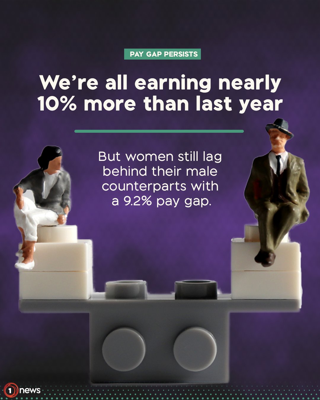
From 1News on Twitter — with the text “Do these stats make you mad? Pay attention – for every $100 a man earns in NZ, a woman doing the same job earns $8 less.”

As Graeme Edgeler says, the linked article does not substantiate the claim in the text of the tweet at all. The $8 number isn’t referenced in the article and the 9.2% number doesn’t measure earnings differences for two people doing the same job.  It’s also worth considering a second article about the new income statistics linked from the first article. It gives yet another pair of income numbers for men and women, one where the gap is 25% and is slightly smaller than last year.  On top of that,  the 10% and 9.2% claims in the image seem to be about two different income measures, though it’s not really clear where the 10% is sourced.  I’ll also link the new StatsNZ figures, which 1News doesn’t bother to do.

Let’s start with the gender pay gap.  Stats New Zealand’s indicator for gender pay differences is the percentage difference in median hourly earnings.  They have a nice document from 2015 explaining why they define it this way. It’s not a perfect summary — it’s not going to be; it’s a single number — but it’s what they use.  A gender pay gap of 9.2% means that if median hourly earnings for men were $100 (sadly, no) they would be $90.80 for women.  That’s not $8 less; it’s $9.20 less.  The $8 figure doesn’t seem to come from anything in the article, and it’s an understatement of the gap, which is a bit unusual.

Not only is the figure of $8 apparently wrong, the interpretation is wrong.  The gender pay gap isn’t about comparing income for  the same job. That’s good, because a significant part of gender discrimination in pay comes from women’s jobs being paid less.  Looking at the exact same job would understate the pay gap, and would get you into endless arguments over, eg, whether “captain of the national rugby union team” was or was not the same job for Sam Cane and Ruahei Demant.  The interpretation is also wrong because another reason women earn less money than men is they tend to work fewer hours, and that’s not included in the pay gap.

The second linked article discusses median weekly earnings. It has figures of $1320 for men and $1055 for women, a 25% gap.  The increase in median weekly earnings for the population as a whole was 8.8%, which is the only whole-population percentage increase in either article, so it seems like it should be the basis for “we’re all earning nearly 10% more than last year”.  If you dismiss the ‘all’ as journalistic license, and rephrase as “a typical person” then I suppose 8.8% is nearly 10%, but it’s further from 10% than 9.2% is.

Given how different the gender pay gap is when you compute it in different ways, you might  wonder if international comparisons use StatsNZ’s preferred definition. They don’t.  The OECD restricts to people working full time:  hourly and weekly earnings will have the same gaps, but you’ll miss out the pay gap due to more women working in part time jobs.  By the OECD definition, the New Zealand gender pay gap is 6.7% for employees and 30.8% for self-employed people.

The article linked to the tweet is about a campaign to make large businesses disclose their gender pay gap.  I’m fairly generally in favour of this sort of transparency, but when major news outlets seem to not understand or not care what the number means, publicising it might not be as effective as you’d like.

August 14, 2022

Briefly

August 5, 2022

Briefly

  • There’s a new version of ESR’s Wastewater Covid dashboard. It has information on which variants are being found, by location and over time
  • Hashigo Zake, the Wellington craft beer bar, has a new Twitter bot tweeting out the CO2 concentration inside the bar. I summarised a couple of days of it:
  • How far can you go by train in 5 hours? A map of Europe
  • How likely are people to win the lottery: the Washington Post did a quiz
  • Jamie Morton in the Herald has a good discussion of the Stats NZ review of the population denominator used in Covid vaccine stats.  The HSU undercounts somewhat, especially for Māori and Pacific Peoples, but it has the virtue of counting ethnicity the same way that the vaccination data does, and of including people in NZ who are not residents.
August 2, 2022

Homelessness statistics

Radio NZ reported an estimate by the charity Orange Sky “One in six kiwis have been homeless and tonight about 41,000 of us will bed down without adequate access to housing”.  I saw some skepticism of these figures on Twitter, so let’s take a look.

Based on the 2018 Census, researchers at the University of Otago estimated

  • 3,624 people who were considered to be living without shelter (on the streets, in improvised dwellings – including cars – and in mobile dwellings). 
  • 7,929 people who were living in temporary accommodation (night shelters, women’s refuges, transitional housing, camping grounds, boarding houses, hotels, motels, vessels, and marae). 
  • 30,171 people who were sharing accommodation, staying with others in a severely crowded dwelling. 
  • 60,399 people who were living in uninhabitable housing that was lacking one of six basic amenities: tap water that is safe to drink; electricity; cooking facilities; a kitchen sink; a bath or shower; a toilet.

So, the figure of 41,000 is a surprisingly close match to the Census data for those first three groups — if you’d only count the first group or the first two, you would obviously get a smaller number.  Because it would be hard to estimate current homelessness from a YouGov survey panel, I suspect the number did come from the Census,  and the ‘new study’ the story mentions is responsible for the ‘one in six’, though Orange Sky actually gives the number as ‘more than one in five (21%)’.

Do the two figures match? Well, if about a million people had ever been homeless (in the broad sense) and 41,000 currently are, that’s a ratio of 25.  The median age of adults (YouGov interviews adults) is probably in the 40s, so if the typical person who was ever homeless spent less than a couple of years homeless the figures would match.  The People’s Project NZ say that homelessness in NZ is mostly short-term — in the sense that most people who are ever homeless are only that way for a relatively short time (which isn’t the same as saying most people who are currently homeless will be that way for a short time).

So, the figures aren’t obviously implausible, and given that they’re presented as the result of research that should be able to get reasonable estimates, they may well be reasonably accurate.

July 28, 2022

Counting bots better

I wrote before about estimating the proportion of spam bots among the apparent people on Twitter.  The way Twitter does it seems ok. According to some people in the internet who seem to know about Delaware mergers and acquisitions law it doesn’t even matter if the way Twitter does it is ok, as long as it roughly matches what they have claimed they do.  But it’s still interesting from a statistics point of view to ask whether it could be done better given the existence of predictive models (“AI”, if you must).  It’s also connected to my research.

Imagine we have a magic black box that spits out “Bot” or “Not” for each user.  We don’t know how it works (it’s magic) and we don’t know how much to trust it (it’s magic). We feed in the account details of 217 million monetisable daily active users and it chugs and whirrs for a while before saying “You have 15696969 bots.”

We’re not going to just tell investors “A magic box says we have 15696969 bots among our daily active users“, but it’s still useful information.  We also have reviewed a genuine random sample of 1000 accounts by hand, over a couple of weeks, and we get 54 bots. We don’t want to just ignore the magic box and say “we have 5.4% bots” What should our estimate be, combining the two? It obviously depends on how accurate the magic box is!  We can get some idea by looking at what the magic box says for the 1000 accounts reviewed by hand.

Maybe the magic box says 74 of the 1000 accounts are bots: 50 of the ones that really are, and 24 others. That means it’s fairly accurate, but it overcounts by about 40%.  Over all of Twitter, you probably don’t have 15696969 bots; maybe you have more like 11,420,000 bots.   If we want the best estimate that doesn’t require trusting the magic box and only requires trusting the random sampling, we can divide up Twitter into accounts the box says are bots and ones that it says aren’t bots, estimate the true proportion in each group, and combine.   In this example, we’d get 5.3% with a 95% confidence interval of  (4.4%, 6.2%). If we didn’t have the magic box at all, we’d get an estimate of 5.4% with a confidence interval of (4.0%, 6.8%).  The magic box has improved the precision of the estimate.  With this technique, the magic box can only be helpful. If it’s accurate, we’ll get a big improvement in precision. If it’s not accurate, we’ll get little or no improvement in precision, but we still won’t introduce any bias.

The techique is called post-stratification, and it’s the simplest form of a very general approach to using information about a whole population to improve an estimate from a random sample.  Improving estimates of proportions or counts with post-stratification is a very old idea (well, very old by the standards of statistics).  More recent research in this area includes ways to improve estimation of more complicated statistical estimates, such as regression models. We also look at ways to use the magic box to pick a better random sample  — in this example, instead of picking 1000 users at random we might pick a random sample of 500 accounts that the magic box says are bots and 500 accounts that it says are people. Or maybe it’s more reliable on old accounts than new ones, and we want to take random samples from more new accounts and fewer old accounts.

In practical applications the real limit on this idea is the difficulty of doing random sampling.  For Twitter, that’s easy. It’s feasible when you’re choosing which medical records from a database to check by hand, or which frozen blood samples to analyse, or which Covid PCR swabs to send for genome sequencing.  If you’re sampling people, though, the big challenge is non-response. Many people just won’t fill in your forms or talk to you on the phone or whatever. Post-stratification can be part of the solution there, too, but the problem is a lot messier.
 

July 27, 2022

Attendance figures

Chris Luxon said today on RNZ Morning Report that “55% of kids aren’t going to school regularly”.  On Twitter, Simon Britten said “In Term 1 of 2022 the Unjustified Absence rate was 6.4%, up from 4.1% the year prior. Not great, but also not 50%.”

It’s pretty unusual for NZ politicians to make straightforwardly false statements about publicly available statistics, so if there are numbers that seem to disagree or are just surprising, the most likely explanation is that the number doesn’t mean what you think it means.   It sounds like we have a disagreement about facts here, but we actually have a disagreement about which summary is most useful.

New Zealand does have an ongoing problem with school attendance — according to the Government, not just the Opposition.  The new Attendance and Engagement Strategy document (PDF) says that the percentage of regular attendance was  59.7% in 2021, down from  69.5% in 2015. The aim is to raise this to 70% by 2024 and 75% by 2026.

So if the unjustified absence rate is 6.4%, how can the regular attendance rate be 59.7% or 45%?  “Regular attendance” is defined as attending school at least 90% of the time — so if you miss more than one day per fortnight, or more than one week per term, you are not attending regularly.

For example, suppose half the kids in NZ missed one week and one day in term 1. The absence rate would be about 12% but the regular attendance rate would be 50%.  The unjustified absence rate could be anything from 0% to 12%. It’s quite possible to have a 5% unjustified absence rate and a 50% regular attendance rate.

Now we want more details. They are available here.  The regular attendance rate is down dramatically this year, from 66.8% in term 1 last year to 46.1% in term 1 this year. The proportion of half-days attended is down less dramatically, from 90.5% in term 1 last year to 84.5% in term 1 this year.  Justified absences are up 4.5 percentage points and unjustified absences up by just under 2 percentage points.

What’s different between term 1 this year and term 1 last year?

Well…

It wouldn’t be surprising if a fair fraction of NZ kids took a week off school in term 1, either because they had Covid or because they were in isolation as household contacts.  That’s what should have happened, from a public health point of view.  It’s actually a bit surprising to me that justified absences weren’t even higher. Term 1, 2022, shouldn’t really representative of the long-term state of schools in NZ.  Attendance rates were higher before the Omicron spike; they will probably be higher in the future even without anti-truancy interventions.

It’s reasonable to be worried about school attendance, as the Government and Opposition both claim they are. I don’t think “55% of kids aren’t going to school regularly”  is a particularly good way to describe a Covid outbreak.  Last year’s figures are more relevant if you want to talk about the problem seriously.

July 26, 2022

Briefly

  • Derek Lowe writesLate last week came this report in Science about doctored images in a series of very influential papers on amyloid and Alzheimer’s disease. That’s attracted a lot of interest, as well it should, and as a longtime observer of the field (and onetime researcher in it), I wanted to offer my own opinions on the controversy.”  As he says, the interest in amyloid is not just (or primarily) driven by the allegedly fraudulent research. There’s a lot of support for the importance of beta-amyloid from genetics: mutations that cause early-onset Alzheimer’s, and perhaps even more convincingly, a mutation found in Icelanders that protects against Alzheimers. The alleged fraud is bad, as is the current complete failure of research into treatments, but the link between the two isn’t as strong as some people are implying.
  • Prof Casey Fiesler, who teaches in the area of tech ethics and governance, is developing a TikTok-based tech ethics and privacy course
  • ESR’s Covid wastewater dashboard is live.  This is important because Everyone Poops. We don’t have an exact conversion from measured viruses to active cases, and the conversion could vary with the strain of Covid and with age of the patients, but at least it won’t depend on who decides to get tested and report their test results.
  • The wastewater data will be an excellent complement for the prevalence survey that the Ministry of Health is starting up. The survey, assuming that a reasonable fraction of people go along with getting tested, will give a direct estimate of the true population infection rate, but it will not be as detailed as the wastewater data, which can give estimates for relatively small areas and short time frames.
  • Briefing on the Data and Statistics Bill from the NZ Council of Civil Liberties. If you follow StatsChat you’ve seen these points before. And you will see them again.
July 18, 2022

Briefly

  • Training data for emotions/sentiment from Google appears to be badly wrong (Inconceivable!)
  • About 12% of people surveyed in the UK said they knew “a great deal” or “a fair amount” about a non-existent candidate for leader of the Conservative Party.  More reassuringly, the proportion who had ‘never heard of’ this candidate was much higher than for the real candidates.
  • The New York Times asks what’s the chance that Trump adversaries McCabe and Comey got tax audits — and, much more usefully, shows how the answer to this question depends on how you define the comparison
  • Hilda Bastian looks at the evidence on whether female national leaders handled the pandemic better, now that we have more follow-up
  • From the President of the Royal Society (of London), the need for data literacy, but also the need to “avoid shoehorning everything to do with numbers into a box labelled “Maths”, which has negative connotations for many. If you use that box as a place to pigeonhole quantitative literacy, you are shooting yourself in the foot.” (disclaimer: he’s a statistician)
  • A re-analysis suggests that the vaccine effectiveness data for the Sputnik coronavirus vaccine cannot possibly be correct. Among other red flags, the estimated effectiveness in different age groups was far more similar than would be expected even if the true effectiveness was identical in the groups.

Sampling and automation

Q: Did you see Elon Musk is trying to buy or maybe not buy Twitter?

A: No, I have been on Mars for the last month, in a cave, with my eyes shut and my fingers in my ears

Q: <poop emoji>.  But the bots? Sampling 100 accounts and no AI?

A: There are two issues here: estimating the number of bots, and removing spam accounts

Q: But don’t you need to know how many there are to remove them?

A: Not at all. You block porn bots and crypto spammers and terfs, right?

Q: Yes?

A: How many?

Q: Basically all the ones I run across.

A: That’s what Twitter does, too. Well, obviously not the same categories.  And they use automation for that.  Their court filing says they suspend over a million accounts a day (paragraph 65)

Q: But the 100 accounts?

A: They also manually inspect about 100 accounts per day, taken from the accounts that they are counting as real people — or as they call us, “monetizable daily active users” — to see if they are bots.  Some perfectly nice accounts are bots — like @pomological or @ThreeBodyBot or @geonet or the currently dormant @tuureiti — but bots aren’t likely to read ads with the same level of interest as monetizable daily active users do, so advertisers care about the difference.

Q: Why not just use AI for estimation, too?

A: One reason is that you need representative samples of bots and non-bots to train the AI, and you need to keep coming up with these samples over time as the bots learn to game the AI

Q: But how can 100 be enough when there are 74.3 bazillion Twitter users?

A: The classic analogy is that you only need to taste a teaspoon of soup to know if it’s salty enough.   Random sampling really works, if you can do it.  In many applications, it’s hard to do: election polls try to take a random sample, but most of the people they sample don’t cooperate.  In this case, Twitter should be able to do a genuine random sample of the accounts they are counting as monetizable daily active users, and taking a small sample allows them to put more effort into each account.  It’s a lot better to look at 100 accounts carefully than to do a half-arsed job on 10,000.

Q: 100, though? Really?

A: 100 per day.  They report the proportion every 90 days, and 9000 is plenty.  They’ll get good estimates of the average even over a couple of weeks