February 23, 2025
Official data bad news
- USA: Unfortunately, the Economy Runs On the Data Trump Is Trying to Delete (article, podcast discussion)
- New Zealand: Len Cook: Trust must be recovered after a second Census failure (The Post)
Thomas Lumley (@tslumley) is Professor of Biostatistics at the University of Auckland. His research interests include semiparametric models, survey sampling, statistical computing, foundations of statistics, and whatever methodological problems his medical collaborators come up with. He also blogs at Biased and Inefficient
As you have probably heard, a modest-sized asteroid will pass really quite close to the earth in seven years. Perhaps very close. Maybe even closer than that. If this happens, it won’t be civilisation-destroying but could be locally devastating. The main StatsChat relevant issue is that the probability of the asteroid hitting the earth keeps going up: 1.4%, 2.2%, 3.1%. Why is it getting consistently higher? Does that mean we can expect it will keep going up?
Most likely, the probability will keep going up for a while, then suddenly plunge to zero — though it might keep going up and up to 100%. The sudden plunge to zero and the increase before that point happen for the same reason. Because of our limited measurements so far, we know only approximately where the asteroid will be in seven years’ time. You can think of a little moving cloud of possible asteroid positions in space. At the moment, the cloud of possible positions intersects where the Earth will be, but the Earth is a pretty small target (Space is big. Really big.)
As we get more precise information (for example, from the Webb Space Telescope) the cloud of possible positions gets smaller. If the cloud still intersects the Earth’s position, the smaller cloud of possibilities means the probability of impact goes up. If it doesn’t still intersect the Earth’s position, the probability of impact drops to zero.
If the randomness in predictions is approximately correct in some consistent way, the predicted average value of the estimate should stay the same over time (the technical term is ‘martingale’). The chance that the estimate has gone to zero will go up over time, so the estimate in scenarios where it doesn’t go to zero must also go up over time.
Update: it’s down to 0.36%
Update: and now down to 0.0022%. Asteroid goneburger.
When you get access to some data, a first step is to see if you understand it: do the variables measure what you expect, are there surprising values, and so on. Often, you will be surprised by some of the results. Almost always this is because the data mean something a bit different from what you expected. Sometimes there are errors. Occasionally there is outright fraud.
Elon Musk and DOG-E have been looking at US Social Security data. They created a table of Social Security-eligible people not recorded as dead and noticed that (a) some of them were surprisingly old, and (b) the total added up to more than the US population.
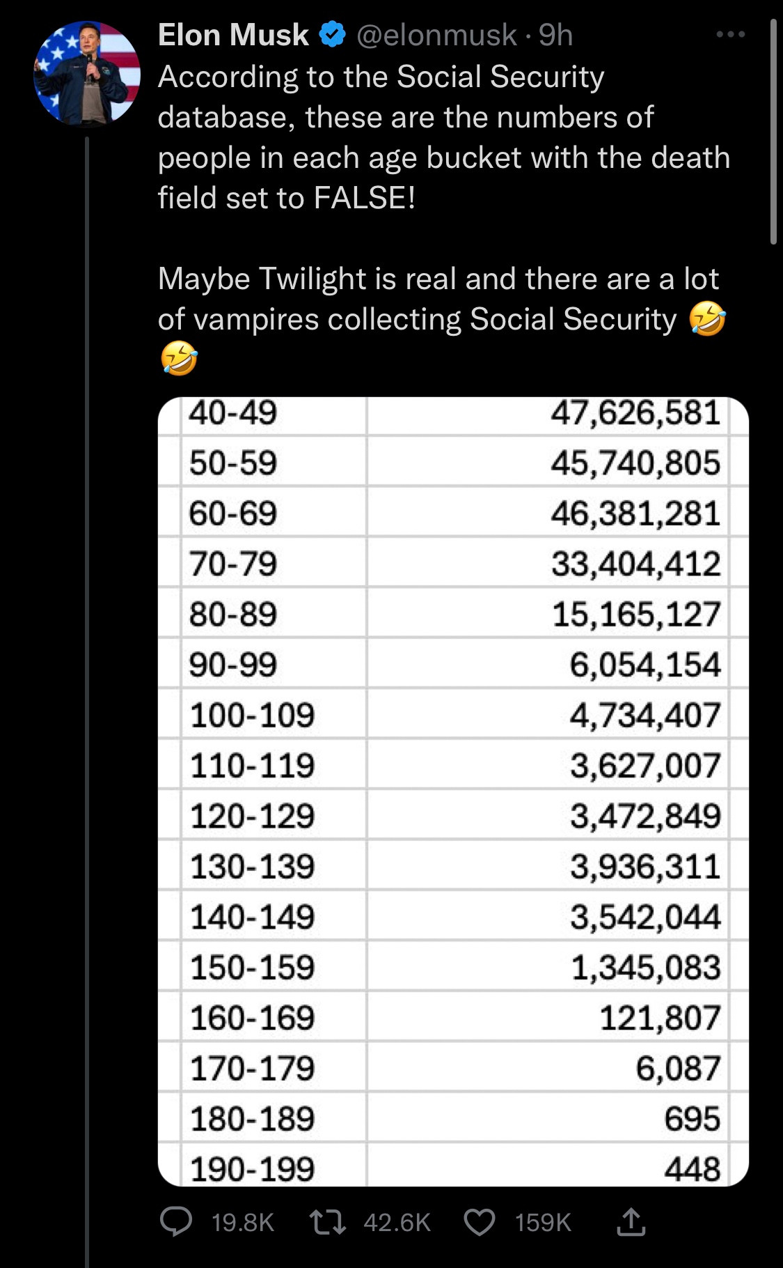
That’s a good first step, as I said. The next step is to think about possible explanations (as Dan Davies says: “if you don’t make predictions, you won’t know when to be surprised”). The first two I thought of were people leaving the US after working long enough to be eligible for Social Security (like, for example, me) and missing death records for old people (the vital statistics records weren’t as good in the 19th century as they are now).
After that, the proper procedure is to ask someone or look for some documentation, rather than just to go with your first guess. It’s quite likely that someone else has already observed the existence of records with unreasonable ages and looked for an explanation.
In this case, one would find (eg, by following economist Justin Wolfers) a 2023 report “Numberholders Age 100 or Older Who Did Not Have Death Information on the Numident” (PDF), a report by the Office of the Inspector General, which said that the very elderly ‘vampires collecting Social Security’ were neither vampires nor collecting Social Security, but were real people whose deaths hadn’t been recorded. This was presumably a follow-up to a 2015 story where identity fraud was involved — but again, the government wasn’t losing money, because it wasn’t paying money out to dead people.
The excess population at younger years isn’t explained by this report, but again, the next step is to see what is already known by the people who spend their whole careers working with the data, rather than to decide the explanation is the first thing that comes to mind.
The Herald (from the Telegraph) says People with divorced parents are at greater risk of strokes, study finds
The study is here and the press release is here. It uses 2022 data from a massive annual telephone survey of health in the US, the Behavioral Risk Factor Surveillance System, “BRFSS” to its friends.
Using BRFSS means that the data are representative of the US population, which is useful. On the other hand, you’re limited to variables that can be assessed over the phone. That’s fine for age, and probably fine for parental divorce. It’s known to be a bit biased for BMI and weight. The telephone survey doesn’t even try to collect blood pressure, cholesterol, or oral contraceptive use, all known to be risk factors for stroke. And if you call people up on the phone and ask if they’ve ever had a stroke, you tend to miss the people whose strokes were fatal or incapacitating (about a quarter of people die immediately or within a year if they have a stroke).
Still, the researchers collected some useful variables to try to adjust away the differences between people with and without divorced parents. As usual, we have to worry about whether they went too far — for example, if the mechanism was via diabetes or depression, then adjusting for diabetes or depression would induce bias in the results.
This sort of research can be useful as a first step, to see if it’s worth doing an analysis using more helpful data from a study that followed people up over time — either a birth cohort study or a heart-disease cohort study. It’s interesting as initial news that there’s a relationship — though you also might think adverse effects of divorce would get smaller in recent decades as divorce became less noteworthy.
All this is background for my main point. While looking for links to published papers, I found that one of the same researchers had done the same sort of analysis with the BRFSS data from 2010 and published it in 2012. They found a stronger association twelve years ago than now. I don’t know about you, but I would have appreciated this fact being in the press release and in the news story.
Listening to the Slate Money podcast, I heard about an interesting survey result
Elizabeth Spiers: My number is 73 and that’s percent and that’s the number of men in a recent YouGov survey who say they do most of the chores in their household.
I found a Washington Post story
60 percent of women who live with a partner say they do all or most of the chores. But 73 percent of similarly situated men say that they do the most — or that they share chores equally.
Here’s the top few lines of the YouGov table

Breaking out advanced statistical software, 23%+19% is 42%, and 33%+30% is 63%. The figure for women matches the story, allowing for reasonable rounding. The figure for men doesn’t?
If we add in “shared equally”, which is given as 33% for men and 22% for women we can get to 75% “all” or “most” or “equally” for men, but 83% “all” or “most” or “equally” for women. And while the story is supposed to be that men say they are doing more and are delusional, the reported table has more work self-reported by women than men at all levels. It’s still possible, of course, that some the 42% of men claiming to do all or most chores are not fully aware of the situation, but the message that makes the results headline-worthy is not in the data.
The Washington Post story is still well worth reading — it uses the YouGov poll as a hook to discuss much more detailed data from the American Time Use Survey, which has the advantage that people write down contemporaneously what they are doing for an actual two weeks rather than trying to guess at an average.
Except notice the data points being used to come up with this story: the visible population of landless men in Rome and the Roman census returns. But, as we’ve discussed, the Roman census is self-reported, and the report of a bit of wealth like a small farm is what makes an individual liable for taxes and conscription.
In short the story we have above is an interpretation of the available data but not the only one and both our sources and Tiberius Gracchus simply lack the tools necessary to gather the information they’d need to sound out if their interpretation is correct.
Ipsos, the polling firm, has again been asking people questions to which they can’t reasonably be expected to know the answer, and finding they in fact don’t. For example, this graph shows what happens when you ask people what proportion of their country are immigrants, ie, born in another country. Everywhere except Singapore they overestimate the proportion, often by a lot. New Zealand comes off fairly well here, with only slight underestimation. South Africa and Canada do quite badly. Indonesia, notably, has almost no immigrants but thinks it has 20%.

Some of this is almost certainly prejudice, but to be fair the only way you could know these numbers reliably would be if someone did a reliable national count and told you. Just walking around Auckland you can’t tell accurately who is an immigrant in Auckland, and you certainly can’t walk around Auckland and tell how many immigrants there are in Ashburton. Specifically, while you might know from your own knowledge how many immigrants there were in your part of the country, it would be very unusual for you to know this for the country as a whole. You might expect, then, that the best-case response to surveys such as these would be an average proportion of immigrants over areas in the country, weighted by the population of those areas. If the proportion of immigrants is correlated with population density, that will be higher than the true nationwide proportion.
That is to say, if people in Auckland accurately estimate the proportion of immigrants in Auckland, and people in Wellington accurately estimate the proportion in Wellington, and people in Huntly accurately estimate the proportion in Huntly, and people in Central Otago accurately estimate the proportion in Central Otago, you don’t get an accurate nationwide estimate if areas with more people have a higher proportion of immigrants. Which, in New Zealand, they do. If we work with regions and Census data, the correlation between population and proportion born overseas is about 50%. That’s enough for about a 5 percentage point bias: we would expect to overestimate the proportion of immigrants by about 5 percentage points if everyone based their survey response on the true proportion in their part of the country.
Fortunately, if the proportion of immigrants in your neighbourhood or in the country as a whole matters to you, you don’t need to guess. Official statistics are useful! Someone has done an accurate national count, and while they probably didn’t tell you, they did put the number somewhere on the web for you to look up.
“These improvements reveal that the U.S. population is much more multiracial and diverse than what we measured in the past,” Census Bureau officials said at the time.
But does that mean there are more people now with the same sort of multiple heritage, or that the same people are newly identifying as multi-ethnic, or just that the question has changed? According to Associated Press, new research suggests it’s mostly measurement.
An article from ABC News in Adelaide, South Australia, describes incidents where fencing wire was strung across a bike path. According to police
The riders were travelling about 35 kilometres per hour and fell from their bikes. Two suffered minor injuries, while the third was not injured.
Police said each of their bicycles were severely damaged.
That sounds at first like extraordinary good luck: if you come off a bike at 35 km/h and your bike was wrecked, you’d expect to be damaged too. I think the problem, as with a lot of discussions of road crashes, is the official assessment metrics for injuries. In South Australia, according to this and similar documents:
Serious Injury – A person who sustains injuries and is admitted to hospital for a duration of at least 24 hours as a result of a road crash and who does not die as a result of those injuries within 30 days of the crash.
Minor Injury – A person who sustains injuries requiring medical treatment, either by a doctor or in a hospital, as a result of a road crash and who does not die as a result of those injuries with 30 days of the crash.
A broken bone leading to substantial disability might easily not be a Serious Injury, and several square inches of road rash may well not be even a Minor Injury. (New Zealand has the same definition of a “serious” injury is one that gets you admitted to hospital for an overnight stay, but doesn’t have restrictive standards for minor injury)
It’s not that these definitions are necessarily bad for collecting data — there’s a lot to be said for a definition that’s administratively checkable — but it does mean you might want to translate from officialese to ordinary language when reporting individual injuries or aggregated statistics to ordinary people.
Update: One of the cyclists in the first group has talked to the ABC. One of the “minor injuries” required five stitches.
Recent comments on Thomas Lumley’s posts