The New York Post is saying
Attention-deficit/hyperactivity disorder is a common behavioral condition that affects approximately 7 million US children, including about a million kids diagnosed since 2016.
The reason for the recent rise in diagnoses is under debate — a new study in the journal Nature Mental Health suggests the culprit could be in your medicine cabinet.
They’re talking about paracetamol (or as Americans call it, acetaminophen). There’s a new study that looks at a fairly small group of US mothers and kids and finds weak evidence of a correlation between ADHD diagnosis in the kid and use of paracetamol by the mother. You might remember this topic from previous StatsChat episodes. There was originally a Danish study that was surprised to stumble across a correlation. A New Zealand study checking up on the correlation also found it.
A Spanish study resulted in the NZ Herald (from the Daily Mail) scare headline One paracetamol in pregnancy could raise risk of autism. This was especially egregious since not only did the study say nothing about ‘one paracetamol’ and wasn’t really about autism, it actually found lower rates of the symptoms in kids whose mothers took paracetamol. The study argued that while the rates were lower in those kids, they should have been even lower based on other risk factors. At this point it was all plausible and maybe a bit concerning but not reason for major change in medical practice — after all, mothers aren’t taking Panadol for fun.
In 2023, a combination of most of the published studies estimated a slight increase in risk, about 25%. On the other hand, A very big Swedish study, using data from everyone born in Sweden from 1995 to 2019, then found no suggestion of a correlation.
So what’s the point of this new study? Well, one of the issues in interpreting these correlation studies is that many of them didn’t know for sure who actually took paracetamol. For normal people this would be a big issue — lots of medications include paracetamol, and you might easily miss some, or just forget. Pregnant women, though, tend not to just casually take cough syrup or whatever. Even so, if you happened to have data lying around from blood samples which told you who had taken paracetamol, you might be interested in seeing what the correlation was like. So they did. And the correlation was broadly similar to what the small, early studies had seen: kids whose mothers blood samples showed paracetamol were about twice as likely to have ADHD. That’s nice to know, even if it’s not a big change in the evidence.
We still have the conflict between ‘no sign of a correlation’ in the big Swedish study and ‘about 25% higher’ in the combined smaller studies. It’s possible that paracetamol has an effect and that the Swedish study missed it because it didn’t measure paracetamol use as accurately. It’s also possible that the reasons for taking paracetamol (eg illness, fever) are what causes ADHD. Or it could all be some sort of bias and the Swedish study could be correct. It’s hard to tell. Ask your doctor, etc.
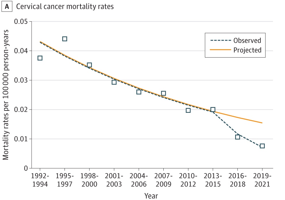
The new study, of course, does not suggest paracetamol is responsible for recent trends in ADHD diagnosis: that claim is down to the New York Post, and is pretty clearly wrong. Here’s the trend:

Paracetamol became popular as a relatively safe, over-the-counter treatment a long time ago now. It might have been response for an ADHD trend in, say, the 1980s, but not a trend in the 21st century.
Recent comments on Thomas Lumley’s posts