Posts written by Thomas Lumley (2569)

avatar

Thomas Lumley (@tslumley) is Professor of Biostatistics at the University of Auckland. His research interests include semiparametric models, survey sampling, statistical computing, foundations of statistics, and whatever methodological problems his medical collaborators come up with. He also blogs at Biased and Inefficient

April 21, 2021

Knowing what to leave out

The epidemic modelling group at Te Pūnaha Matatini (who work a few floors above me) won the Prime Minister’s Science Prize for their work on modelling the Covid epidemic in New Zealand.   There have been some descriptions in the media of their models, but not so much of what it is that mathematical modelling involves.

A good mathematical model captures some aspect of the way the real process works, but leaves out enough of the detail that it’s feasible to study and learn about the model more easily.  The limits to detail might be data available or computer time or mathematical complexity or just not understanding part the way the process works.  Weather models, for example, have improved over the years by using more powerful computers and more detailed input data, enabling them to take into account more features of the real weather system and more details of Earth’s actual geography.

The simplest epidemic models are the SIR and SEIR families.  These generate the familiar epidemic curves that we’ve all seen so often: exponential on the way up, then falling away more slowly. They are also responsible for the reproduction number “R”, the average number of people each case infects.  The simple models have no randomness in them, and they know nothing about the New Zealand population except its size.  There’s a rate at which cases come into contact with new people, and a rate at which contacts lead to new infections, and that’s all the model knows.  These models are described by simple differential equations; they can be projected into the future very easily, and the unknown rates can be estimated from data.   If you want a quick estimate of how many people are likely to  be in hospital at the epidemic peak, and how soon, you can run this model and gaze in horror at the output.  In fact, many of the properties of the epidemic curve can be worked out just by straightforward maths, without requiring sophisticated computer simulation.  The SEIR models, however, are completely unable to model Covid elimination — they represent the epidemic by continuously varying quantities, not whole numbers with uncertainty.  If you put a lockdown on and then take it off, the SEIR model will always think there’s some tiny fraction of a case lurking somewhere to act as a seed for a new wave.  In fact, there’s a notorious example of a mathematical model for rabies elimination in the UK that predicted a new rabies wave from a modelled remnant of 10-18 infected foxes — a billion billionth of a fox, or one ‘attofox’.

The next step is models that treat people not precisely as individuals but at least as whole units, and acknowledge the randomness in the number of new infections for each existing case.  These models let you estimate how confident you are about elimination, since it’s not feasible to do enough community testing to prove elimination that way.   After elimination, these models also let you estimate how big a border incursion is likely to be by the time it’s detected, and how this depends on testing strategy, on vaccination, and on properties of new viral variants.  As a price, the models take more computer time and require more information — not just the average number of people infected by each case, but the way this number varies.

None of the models so far capture anything about how people in different parts of New Zealand are different.  In some areas, people travel further to work or school, or for leisure. In some areas people live in large households; in others, small households. In some areas a lot of people work at the border; in others, very few do.  Decisions about local vs regional lockdowns need a model that knows how many people travel outside their local area, and to where.  A model with this sort of information can also inform vaccination policy: vaccinating border works will prevent them getting sick, but what will it do to the range of plausible outbreaks in the future?  Models with this level of detail require a huge amount of data on the whole country, and serious computing resources; getting them designed and programmed correctly is also a major software effort.  The model has an entire imaginary New Zealand population wandering around inside the computer; you’re all individuals!

A mathematical modelling effort on this scale involves working from both ends on the problem: what is the simplest model that will inform the policy question, and what is the most detailed model you have the time and resources and expertise to implement?  Usually, it also involves a more organised approach to funding and job security and so on, but this was an emergency.  As the Education Act points out, one reason we have universities is as a repository of knowledge and expertise; when we need the expertise, we tend to need it right now.
April 14, 2021

Why the concern about vaccine blood clotting?

The AstraZeneca vaccine causes an unusual blood clotting syndrome in about 10 out of a million recipients, and it’s not entirely clear whether the J&J vaccine also does and at what frequency.  Those are small numbers, compared to other risks. In particular,  if you’re in a country with Covid, they are small compared to the risk of getting Covid and having some serious harm as a result. So why has there been so much concern?

There are a few components to the concern, but one underlying commonality: the clotting is unexpected and poorly understood.  Patients turn up with blood clots in unusual places and a shortage of platelets (which you’d normally think of as going with not enough clotting). Some obvious treatments — a standard anticlotting drug (heparin) or a transfusion of platelets — are likely to make things worse, so doctors need to know. There isn’t a really compelling model for how the vaccine causes the problem.

If the risk is 10 in a million, taking the vaccine would still be way safer than not taking it, but a lot of the concerns prompting further urgent investigation would have been whether it’s really only 10 in a million, since we don’t understand (in any detail) what’s going on

  • have we missed a bunch of cases — remember that initially the risk was thought to be only about 1 in a million?
  • are these just the most serious cases, the tip of the iceberg, with many more milder, but still serious, cases that haven’t been noticed yet?
  • are these just the earliest-developing cases, with many more on the way?
  • is this a batch problem, with some batches of vaccine potentially having a much higher risk?
  • does the problem occur in an identifiable small group of people, who would thus be at much higher risk?

There’s been enough data and enough time now to start being confident that the answer to all these questions is ‘no’.  One might rationally prefer the mRNA vaccines, which don’t have this problem, but if you live somewhere with an active outbreak and the choice was the AZ vaccine now or the Moderna vaccine in a month or two, the clotting risk shouldn’t change your decision — and the fact that it wasn’t kept secret should be reassuring.


April 13, 2021

The problem with journalists?

Q: Did you see that journalists drink too much, are bad at managing emotions, and operate at a lower level than average, according to a new study?

A: That sounds a bit exaggerated

Q: It’s the headlineJournalists drink too much, are bad at managing emotions, and operate at a lower level than average, according to a new study

A: What I said

Q: But “The results showed that journalists’ brains were operating at a lower level than the average population, particularly because of dehydration and the tendency of journalists to self-medicate with alcohol, caffeine, and high-sugar foods.”

A: How did they measure brain dehydration?

Q: Don’t I get to ask the leading questions?

A:

Q: How did they measure brain dehydration?

A: They didn’t. It just means they drank less than 8 glasses of water per day, per the usual recommendations

Q: Aren’t those recommendations basically an urban mythl?

A: Yes, they seem to be

Q: How much caffeine was ‘too much’?

A: More than two cups of coffee per day

Q: Does that cause brain dehydration

A: No, not really

Q: What is the daily recommended limit for coffee anyway?

A: There really isn’t one. The European Food Safety Authority looked at this in 2015, and they said basically that four cups a day seemed pretty safe but they didn’t have a basis for giving an upper limit.

Q: There’s a limit for alcohol, though?

A: Yes, “To keep health risks from alcohol to a low level, the UK Chief Medical Officers (CMOs) advise it is safest not to drink more than 14 units a week on a regular basis.” And the journalists drank slightly more than that on average.

Q: What’s the average for non-journalists?

A: Hard to tell, but the proportion drinking more than 14 units/week is about 1 in 3 for men and about 1 in 6 for women in the UK.

Q: So, a bit higher than average but not much higher.  How about these brain things. How big were the differences?

A: The report doesn’t say — it doesn’t give data, just conclusions

Q: How much evidence is there that they are even real, not just chance?

A: The report doesn’t say, though the Business Insider story says “it is not yet peer reviewed, and the sample size is small, so the results should not be taken necessarily as fact.

Q: When will it be peer-reviewed?

A: Well, the story is from 2017 and there’s nothing on PubMed yet, so I’m not holding my breath.

April 12, 2021

Briefly

  • Henry Cooke for the Dominion Post “A routine report on the Government’s mental health services was delayed for over a year as officials battled behind the scenes over plans to dramatically reduce the amount of data in it”
  • A letter in response by Len Cook (former  NZ and UK chief statistician): “Few important agency statistics are prepared in order to comply with a law; rather, they maintain  public trust and inform practitioners in the field of progress and conditions across the populations of importance”
  • Kate Newton writes in the Sunday Star-Times about the impact of pre-departure Covid testing, “In the two-and-a-half months prior, the average (mean) case rate was 0.66 new cases per 1000 people in managed isolation and quarantine (MIQ). In the following two-and-a-half months, the daily rate has fallen – but only slightly — to 0.55.”
  • Derek Thompson in the Atlantic on vaccine misinformation “In a crowded field of wrongness, one person stands out: Alex Berenson.” 
  • Dan Bouk and danah boyd: The technopolitics of the U.S. census “Almost no one notices the processes that produce census data—unless something goes terribly wrong. Susan Leigh Star and Karen Ruhleder argue that this is a defining aspect of infrastructure: it “becomes visible upon breakdown.” In this paper, we unspool the stories of some technical disputes that have from time to time made visible the guts of the census infrastructure and consider some techniques that have been employed to maintain the illusion of a simple, certain count. “
April 1, 2021

Briefly

  • Eden Park is the world’s sexiest bald man. Or something like that.   The results are bogus for the obvious reason: Prince William and Eden Park both get a lot of internet coverage, so they will show up on what is basically a count of Google hits.  You might well get the same winners for ‘ugliest bald man’ and ‘least popular cricket ground.  These reports are typically done in order to get some company’s name in the news, and since they typically don’t provide any real information about the numbers, it would be poetic justice to report the claims but just leave out the company name.  Or, better, ignore them.
  • Good news: there are clinical trial results for the Pfizer/BioNTech vaccine in children aged 12-15. These still need review based on more detail than just a press release, but it’s quite likely that we’ll be vaccinating this age group by the time we’d get around to them based on risk.  Trials in younger children are just starting; the end date will depend on how bad the pandemic is in the next few months, but might be around the end of the year.
  • Books:
March 22, 2021

Prior beliefs and evidence

Remember the bin lid?

Case C tested positive in MIQ at their day-12 test. They had a room next door to D and D’s child, E. D is the person who was initially thought to have been infected by touching a bin lid that C had also touched some 20 hours before.

There’s now a published paper by Jemma Geohegan and numerous co-workers, and Siouxsie Wiles has an explainer at the Spinoff:

Now we know that SARS-CoV-2 is airborne, a much more likely scenario is that case D was infected by exposure to airborne virus shed by case C. 

CCTV footage showed that C and D were never outside their MIQ rooms at the same time. But they both got their day 12 swabs taken on the same day. And these were taken from their doorways. C was tested first. Then there was a 50-second window between them closing their door and D opening theirs to be swabbed. It looks like having the hotel room doors open for as long as it took to be swabbed was enough to move airborne virus from C and their room into the enclosed and unventilated corridor and then on to D and into their room. From the genome sequencing, it looks like D then infected their child, E, and another household member, F. 

This might seem strange: we know there was a contaminated bin lid, and the opportunity for airborne* transmission was pretty marginal, so why are we concluding it was airborne*?

Back last year, scientists and public health people worked on the assumption that the Covid virus could spread via contaminated surfaces, because lots of microbes do and it’s a relatively easy fix.  Some of us went as far as washing individual tomatoes when we got them back from the supermarket.  It became clear fairly quickly that airborne*  transmission was important; there were some smoking-gun examples that couldn’t be explained any other way.  It took a lot longer to decide that contaminated surfaces were pretty much never important, because most cases that could have been surface transmission could also have been airborne* transmission. Still, there were no smoking-gun cases of transmission by contaminated surfaces, and you’d expect a few unless it was very rare.

As the numbers of active infections rose, it became harder to track down causes for any individual case.  Except, in New Zealand, it didn’t.  Since the end of the first outbreak we have had a very small number of cases, small enough that contact tracing and genome sequencing is possible for every person involved, plus the sort of hotel surveillance that’s unusual in the public sector outside prisons.  Here, it is possible to track most individual transmissions. So, the ‘bin lid’ case was interesting because it looked like an unambiguous case of transmission from a contaminated surface.

What we know now is that it wasn’t. That is, it wasn’t an unambiguous case of transmission from a contaminated surface; it could have been airborne*  transmission.  The ‘bin lid’ case

  • definitely isn’t the smoking gun for surface transmission that it first appeared
  • and so, based on everything else we know, probably was airborne*  transmission

It’s not that we have strong evidence for airborne*  transmission from the facts of this specific case, but we don’t have strong evidence against it, and other evidence definitely points that way.


* for some definition of the word, let’s not be dicks about it.

March 15, 2021

Obesity and Covid deaths

Q: Did you see 90% of Covid deaths are due to obesity?

A: No

Q: It’s on Newshub: “90 percent or 2.2 million of the 2.5 million deaths from the pandemic disease so far were in countries with high levels of obesity.”

A: So, if that’s true, what countries are we talking about?

Q: With high levels of obesity? Australia, New Zealand, some of the Pacific Island nations, USA, UK,…

A: And what don’t those countries have in common?

Q: Lots of Covid deaths, I suppose.  But Australia and NZ and the Pacific Island countries didn’t have many deaths just because they didn’t have many cases. They don’t tell you anything about the risk

A: Neither does the ‘report’, which says, according to Newshub, “the majority of global COVID-19 deaths have been in countries where many people are obese, with coronavirus fatality rates 10 times higher in nations where at least 50 percent of adults are overweight”

Q: That sounds bad, though? Ten times higher is a lot!

A: How much do you think being overweight increases the risk of death?

Q: Well, if 50% overweight means ten times the risk, maybe a factor of twenty?

A: Yeah nah. Less than double, according to that very same report. (PDF, p13)

Q: So where do they get such a strong association?

A: Well, what are the main risk factors for dying of Covid?

Q: Um. Age?

A: And?

Q: Heart disease? Diabetes?

A:

Q:

A:

Q: Having Covid?

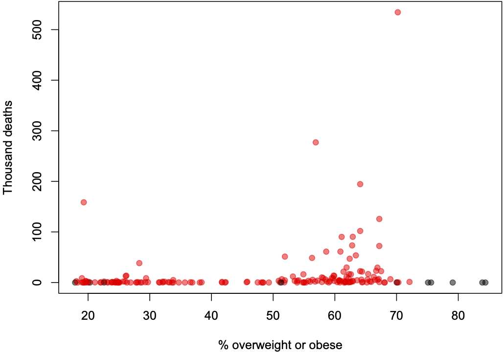
A: Exactly.  So we’d need to look at the proportion of infected people dying (the case fatality rate), not the total number of deaths, and we’d ideally want to compare countries with similar age profiles. Instead, Newshub shows us a graph of deaths, basically like this

Q: Why are some of the dots black?

A: They are countries that were missing from the Johns Hopkins Covid data, and so were missing from the original graph, mostly small nations like Samoa and Tonga and Timor-Leste with very few cases

Q: And what’s the dot on the left that isn’t in the graph on Newshub?

A: Afghanistan. I don’t know why it’s not there.

Q: So what about for risk of dying if you get Covid?

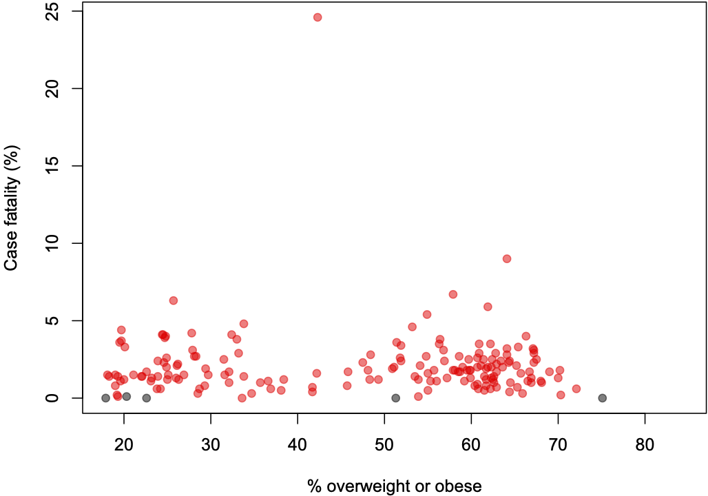
A: Here’s what it looks like for case fatality rate

Q: That’s…surprisingly unimpressive. Well, except for that one country…

A: Yemen

Q: Things they don’t need right now, number #1

A:  Too true.

Q: So the massive correlation?

A: Well, overweight is common in the USA, the UK, Brazil, and various other large countries that have handled the pandemic badly. While I suppose you could argue that handling the pandemic well should go with handling other public health issues well, the empirical evidence would not really be in your favour on that one.  You could also listen to a slightly different approach to the data from David Spiegelhalter and Tim Harford on BBC’s “More or Less”

March 12, 2021

Briefly

  • I wrote about how many people we need to vaccinate and why it’s complicated, at the Spinoff
  • And an expanded version of this post about the Pfizer vaccine and obesity, for ‘Statisticians React to the News’, a blog of the International Statistical Institute
  • While it’s true that basically no deaths and hospitalisations have been seen in the vaccinated groups in the vaccine trials, there haven’t been very many seen in the control groups either. As Hilda Bastian explains in the Atlantic, the trials were designed to see differences in symptomatic Covid, not serious/fatal Covid, and there are uncertainties about differences between the vaccines and about whether they are extremely effective or just very  effective. “It’s tempting to believe that a simple, decisive message—even one that verges on hype—is what’s most needed at this crucial moment. But if the message could be wrong, that has consequences.”
  • The RECOVERY trial in the UK keeps churning out information about effectiveness of treatments for Covid based on large numbers of hospitalised patients. A new casualty: colchicine, a gout drug that appears beneficial in non-hospitalised patients in a smaller Canadian study.  RECOVERY is now expanding internationally, starting with Nepal and Indonesia
  • “But there’s something else interesting here. The fear-and-stress argument is introduced with an historical account about a medieval experiment conducted by medieval Persian philosopher Avicenna / Ibn Sīnā. The story is *total bullshit.* Avicenna did no such experiment.”   from ‘Calling Bullshit’
  • In one of Terry Pratchett’s Discworld books, there’s a personal organiser that does handwriting recognition. You show it a page of text, and it says “Yes, that’s handwiting, I’d recognise it anywhere”.  Something a bit similar is suggested by Police Commissioner Andrew Coster’s claim “There is no use of police photos for facial recognition unless it is someone who is an unidentified suspect for an offence.”. If that were true, the facial recognition system would be able to examine a photo and say “Yeah nah, don’t recognise him but he looks like a suspect “ but nothing more useful.  A facial recognition system needs basic training on faces (which is often problematic), a set of faces with known names (which is often problematic) , and a set of faces to recognise (which… well you get the idea). It matches the third to the second, using clues from the first about general face patterns.  With just the third group of photos, nothing much will happen.
March 3, 2021

Is four a lot?

Q: Is four a lot?

A: Depends on the context. Lockdowns, yes. Incursions per 46000 people through MIQ, no.

Q: We’ve had four lockdowns in Auckland, right?

A: Yes

Q: And how many cases let through MIQ for each 46000 people?

A: About four

Q:

A:

Q: ಠ_ಠ

A: My point, and I do have one, is that more people need to say what their criteria are. If you think four lockdowns is unacceptable, what’s your target that you can argue a realistic system would achieve? If you think 10 cases in 115000 MIQ visitors is a good result, what would it take to be a bad result?

Q: So what’s your threshold?

A: I don’t know. That’s why I haven’t been making comments about the overall performance being good or bad.

March 2, 2021

Briefly

  • About 140% of Kiwis aged 20-24 are on Facebook (NZ$ Herald) — more precisely, that’s the ratio of Facebook’s claimed “reach” to StatsNZ’s population estimates.  This is an age group where the census does relatively badly, but nowhere near that badly.
  • The false-positive rate of the PCR tests for Covid has become topical again, so it’s worth revisiting how we know it is very low. In addition to knowing it should be low based on how the test works, we have simple, direct evidence that the false positive rate is low for the test as used in NZ. We have so far performed 1,720,909 tests in New Zealand and 1,717,865 of them, or 99.8%, have been negative. The 0.2% left over include all the true positives (including people with serious Covid cases), all the inconclusive results, and any false positives.
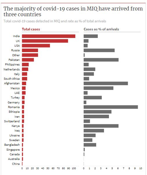
  • Business$ Week reports on the countries of origin of Covid cases in MIQ.  As you’d expect, the top four are four of the top five in the world for Covid cases: US, India, UK, Russia. Brazil, the other country in the top five, doesn’t show up, but we don’t get as many immigrants or visitors from South America.  Also, as you’d expect, China is very low on the list, because we didn’t start the MIQ system until after they’d controlled their big outbreak. Image (from tweet by @victoriayoung03)