Posts written by Thomas Lumley (2569)

avatar

Thomas Lumley (@tslumley) is Professor of Biostatistics at the University of Auckland. His research interests include semiparametric models, survey sampling, statistical computing, foundations of statistics, and whatever methodological problems his medical collaborators come up with. He also blogs at Biased and Inefficient

August 31, 2021

When data+stories=stories?

This graphic, in a tweet by @heyblake, struck a chord in a lot of people. On the one hand, data together with stories that personalise the statistics can be a very powerful way to communicate.

On the other hand, this story is a lot whiter and greener than the data, and that’s definitely a thing that can happen.

August 28, 2021

Up or down?

Having been exposed for the past year and half to stories about the ‘basic reproduction number’ and ‘effective reproduction number’ of Covid, you might ask ‘what is Reff at the moment?’

It’s hard to say. Firstly, it’s not really Covid that has an effective reproduction number but SARS-Cov-2; not the disease, but the virus.  The reproduction number is a feature of models for infection, not models for illness or even for confirmed cases.  Trends in illness or in the number of confirmed cases are important, but they are separated from trends in infection by the whole process of diagnosis, testing, and tracing. Right now, testing is on overdrive: people with minor symptoms are tesing (yay them!) and people with no symptoms but even minor contact with a case are testing (yay them, too!). As a result, cases are much more likely to be diagnosed than they were, say, two weeks ago.

In the long run, under constant conditions, the outbreak will have exponential growth or decay. In the long run, even quite large changes in the diagnosis, testing, and tracing process will be swamped by the much larger changes in the underlying infection rates. In the long run it will be obvious if total infections are going up or down and the rate can be estimated fairly well from confirmed cases. But in the long run we are all in level 1, so that’s not very satisfying.

At the moment, we have a reasonable hope that the population is effectively partitioned into bubbles, with much lower spread between bubbles than within bubbles.  If so, new confirmed cases will mostly either be new diagnoses of cases infected a while ago, or cases who got it from someone in their bubble.  For example, a lot of people who work in the same building as the Stats Department were being tested yesterday, in case they had been infected on August 17.

The number of cases like these is important, because we care about their health, but doesn’t really tell us about the effectiveness of level 4 lockdown, which is about the relatively small number of new between-bubble transmissions from people who were not yet diagnosed.  Calculating effective reproduction numbers from the number of observed cases isn’t going to be very accurate.

All this goes to say that, yes, we have good reason to hope the out-of-bubble reproduction number is well under 1, but the actual value genuinely is hard to estimate — and it’s particularly hard to estimate just from public data on numbers of newly confirmed cases.

August 26, 2021

Bogus poll lockdown headlines

The Herald had a story and headline based on a bogus online clicky poll today: Covid 19 coronavirus Delta outbreak: Majority vote for South Island alert level change

As we’ve seen in the past, bogus online polls can be very misleading. That last link, for example, compares three bogus polls from the same time period on the same question, whose results differed by more than you’d expect for random samples of only ten people.

The Herald does try to wiggle a bit on interpretation; the story starts “The votes are in and it is clear whether or not Herald readers think the South Island should stay in lockdown after Friday”. But the 70,000-odd votes are a tiny proportion of what the Herald claims as its readership: in January, they reported 610,000 daily print subscribers, 1.9 million monthly unique viewers on the blog, and a weekly ‘brand audience’ of over two million. There’s no reason to expect the poll responses are representative of any of those Herald readerships, either.

Usually one could argue that the bogus polls don’t do any major harm; they just amount to pissing in the swimming pool of public discourse. Usually they don’t get headlines. Usually they aren’t about a sensitive policy question in the middle of a pandemic. If the accuracy of the  numbers matters, you don’t want a bogus poll; if the accuracy doesn’t matter they shouldn’t be the basis for a lockdown-related headline

August 17, 2021

Transit and weather

Not news-related, but just an observation from today while I was working on real-time bus data

At 1:30pm, just over 80% of buses were on time (by my fairly stringent metric of all buses; all stops).

That was just before a band of strong wind and moderately heavy rain. Afterwards, at 3:15pm, we’re down to about 70% of buses on time

Update: 4pm: — 53% on time

Rain messes up Auckland traffic, so it will inevitably mess up buses to some extent– bus lanes help, but even with bus lanes, they are affected by other traffic at most intersections.  There isn’t any straightforward solution; making buses allow lots of extra time and take regular naps along the route might fix the on-time metric, but it wouldn’t fix the problem.

PS: The interactive map –when it’s working — is here; the corresponding Wellington one is here

PPS: Bus performance has continued to deteriorate, but now it’s probably down to the likely coming Covid lockdown. Masks on public transport, folks. It’s not just the law, it’s a good idea

August 16, 2021

Seeing like a survey panel

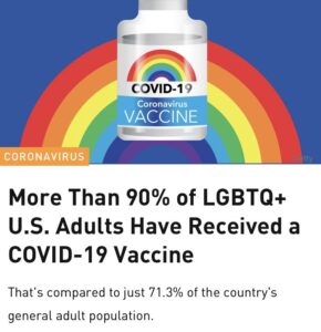
Q: Did you see more than 90% of LGBTQ adults in the US have had the Covid vaccine?

A: How could you even know that?

Q: From Twitter. And! Yahoo! News!

A: But…

Q: It makes sense, right? LGBTQ+ people are less likely to be on the anti-vaccine side of US culture wars, and there’s community experience with health activism

A: But there are queer and trans people in Alabama, not just in San Francisco. And a significant homeless population

Q: But that’s what the survey says

A: Two words: sampling frame

Q: Ok, what’s a sampling frame?

A: It’s the list you work from when you sample people: a list of phone numbers or houses or email addresses or workplaces or whatever. It defines the population you’re going to end up estimating

Q: So they’d just need a list of all the LGBTQ+ people in the US

A:

Q: Ok, yes, that would be scary. How did they really do it?

A: They had a list of some of the LGBTQ+ people in the US (press release, PDF report)

Q: Where did they get the list?

A: “Research participants were recruited through CMI’s proprietary LGBTQ research panel and through our partnerships with over 100 LGBTQ media, events, and organizations.”

Q: That sounds like it might not be very representative

A:  “Because CMI has little control over the sample or response of the widely-distributed LGBTQ Community Survey, we do not profess that the results are representative of the “entire LGBTQ community.””

Q: Exactly.  It might be useful for marketing, but it seems like it’s not going to be representative. They’ll miss some big groups of people

A: “Instead, readers of this report should view results as a market study on LGBTQ community members who interact with LGBTQ media and organizations. CMI views these results as most helpful to readers who want to reach the community through LGBTQ advertising, marketing, events, and sponsorship outreach. Results do not reflect community members who are more closeted or do not interact much with LGBTQ community organizations. More than likely, bisexual community members are also underrepresented in the results.”

Q: When you’re talking in italics like that, does it mean you’re quoting the report?

A: It does. Or the press release

Q: Sounds like they have all the right disclaimers

A: The disclaimers fell off on the way to Yahoo! News! and Twitter, though.

Briefly

July 31, 2021

Viral load

You might have seen, on social media (or asocial or antisocial media) claims that the Delta variant of Covid can be spread by vaccinated people just as easily as unvaccinated people.  It’s not true, but if you strip out the two big reasons it’s not true, what’s left is still worrying. Here’s two relatively careful stories: WaPo, NYTimes.

We know that vaccination dramatically reduces the chance that you’ll spread Covid to someone else by dramatically reducing the chance you’ll be infected if you’re exposed.  Vaccination of people you come into contact with also reduces the chance you’ll be exposed, because they are less likely to be infected.

If vaccination reduces your chance of infection with Delta by 80%, it’s going to reduce your chance of transmitting Delta by around 80%. Reducing the uncertainty on that number is important in public health planning: the chance of transmitting Delta affects how much community protection we get from a given vaccination rate, and so affects what other precautions (MIQ, lockdown, masks, etc) need to be taken to get to an acceptable level of risk.  For example, the modelling of community protection by researchers at Te Punaha Matatini had a baseline assumption that ‘breakthrough’ infections were half as likely to transmit the disease as infections in unvaccinated people (though they also used a lower estimate of vaccine effectiveness in preventing infection than I think we’d use now, so it cancels out to some extent).

Estimating ‘secondary transmission’ is hard. Ideally, you’d trace all the contacts of each infected person and determine how many people they actually transmitted the virus to.  In practice, that won’t work.  In countries like Australia and New Zealand we don’t have enough free-range infections (or vaccination) to get reliable quantitative estimates information. Somewhere like the US or Britain, where you can get a sample of hundreds of cases, you can’t easily track down who infected whom.  There’s some information from comparing high and low vaccination regions in a country such as Israel, and from cluster-randomised trials that vaccinate whole communities at once, but not enough.

Logically, breakthrough infections might be about the same as unvaccinated infections (an infection is an infection), or less transmissible (your immune system reduces the viral load) or even more transmissible (only the people who are especially susceptible get infected).  Reason unaided won’t get us any further; we need data.

One approach is to estimate the transmission from the amount of virus people are shedding.  This roughly works — viral load explains the extra transmissibility of Delta.  If we find that ‘breakthrough’ infections shed a lot less virus, they’re probably less transmissible; if they shed about the same, they’re probably about the same.  According to the CDC, they’re about the same.  This doesn’t mean the vaccine has no effect on viral load — it could easily be that the people who get breakthrough infections would have had higher than average viral load without the vaccine, and the vaccine has reduced it to only average. It doesn’t mean that vaccination isn’t preventing infections — vaccination absolutely is.  It does mean the relationship between number of cases walking  around in the population and risk of new infections is about the same.  Knowing this will allow better estimates of population risk and better choices of precautions.

July 30, 2021

The missing $30,000

A graph about the current salary negotiations for nurses, tweeted by Andrew Little, the Minister of Health:

There are many situations when it is entirely proper to draw a graph with a y-axis starting somewhere other than zero.  There are essentially no situations where a bar chart should have the axis starting somewhere other than zero (the very occasional exception is when ‘zero’ basically is a number other than zero).  There’s a reason for this: in a bar chart, the area (length) of the bar conveys the information, and cutting the feet out from under the bar changes the information.

That’s all very well and good, you say, but is there empirical evidence that real people are misled by truncated bar charts? I’m glad you asked! Yes, there was a research paper published last year, titled “Truncating Bar Graphs Persistently Misleads Viewers”, which found …well, what it says on the label.  A truncated graph was misleading; it was still misleading for graphically-sophisticated nerds; and it was still misleading when accompanied by a warning. Truncated bar charts are bad. Don’t use them.

Sticking the missing $30,000 into the bottom of the Minister’s graph gives this:

July 29, 2021

Briefly

  • Queueing theory is a branch of applied probability and so is StatsChat relevant. Tava Olsen, a professor in the UoA business school, was interviewed on RadioNZ about the MIQ booking system and wrote for The Spinoff.   (disclaimer: I recommended her to RadioNZ)
  • Matt Nippert writes in the Herald about Pharmac and — unusually for a story about Pharmac — looks at the tradeoffs involved in what they choose to fund.
  • Via Axios: JAMA, the medical journal, requested revisions to the research paper with data supporting approval of aducanumab for Alzheimer’s disease. That’s pretty standard.  Apparently the company said “Nope” and will look for a different journal.  This isn’t unheard of — sometimes, reviewers are just wrong and you try another journal — but it is another unusual occurrence.
  • Mediawatch reported that economic forecasts are often wrong.  That’s not really surprising: economics says that (a) recessions are unpredictable and (b) if economists benefit from their forecasts being mentioned in the news they will tend to produce newsworthy forecasts. I suggested that the forecasts should come with uncertainty intervals, so we have some ability to tell if they’re bad at forecasting or it’s just that the economy is uncertain.
July 15, 2021

Briefly

  • From Radio NZ: an exegesis of the non-quantitative weakly graph-like thing that accompanied information about NZ vaccine rollout plans in March.  This was unusually bad for a graph from the NZ public service, but I think the story is overthinking it.
  • The FDA approval of aducanumab for Alzheimer’s disease seems may have been procedurally a bit dodgy as well as scientifically dubious. (STAT($), Washington Post)
  • photochrome.io will take a word or phrase and give you a colour palette based on photos found using the word/phrase
  • “Why are gamers so much better at catching fraud than scientists?”  (I don’t think they are; they just care about it more)
  • The US is having problems getting new electorates laid out because of the Census delays.  In NZ, one of the constraints on the Census 2018 data quality improvement process was that it absolutely positively had to be done in time for the Representation Commission to make electorates.
  • A twitter thread on finding evidence of secret US flights into Australia. Only not.
  • Why housing costs aren’t in the Consumer Price Index (but are in other indexes, which you might want to use instead)