Posts written by Thomas Lumley (2569)

avatar

Thomas Lumley (@tslumley) is Professor of Biostatistics at the University of Auckland. His research interests include semiparametric models, survey sampling, statistical computing, foundations of statistics, and whatever methodological problems his medical collaborators come up with. He also blogs at Biased and Inefficient

October 18, 2021

Kākāpō for bogus poll of the year

It’s time for NZ’s Bird of the Year.  There are two important things to remember about Bird of the Year. First, if you’re going to talk about it on social media use the appropriate hashtag so normal people can mute you.  Second, Bird of the Year is a popularity contest driven by who votes and by last minute social influences; it doesn’t tell us anything new about the birds themselves or really even anything about their popularity in other settings. That’s not the thing you need to remember. The thing you need to remember is that all other online bogus clicky polls work the same way.

I’m campaigning for kākāpō because Zoe Luo, who is doing a PhD with me, is working on ways to model the genetics of rare species, using kākāpō as an example.  The entire kākāpō species had full genome sequencing done.  You usually can’t do that; Zoe is looking at how to use genome sequencing on a sample of the population together with other information on the rest of the birds to fit similar statistical models to the ones you would fit with full genome sequencing.  We can do this with the kākāpō because it’s easy to see what how well your models would work if you had less data than you really do — you can just ignore some of it — but it’s harder to see how well your models would work if you had more data than you really do.


October 16, 2021

Vaxathon!

Today is the NZ Vaxathon! I had my second dose last week. All the statisticians I’ve talked to on the issue have had either one or two doses depending on when they became eligible.  For fans of anecdata, our experience varied from no adverse effects at all to a day or so feeling pretty bloody average, consistent with what the randomised trial reported.

In the spirit of StatsChat, here are some links to primary sources for anyone who wants to do their own reading rather than getting clinicians and scientists to translate it

  • Official guidance from the US Food and Drug Administration on what sort of evidence they would need to approve a Covid vaccine (June 2020)
  • The protocol (plan) for the Pfizer vaccine trial. It’s unusual for these to be public, but it was reassuring when this one was published last year (PDF)
  • The meeting briefings for the external expert advisory committee meeting that recommended authorisation of the vaccine. You want ‘Briefing Document -FDA’ and ‘Briefing Document -Sponsor’. And if you’re really dedicated, the transcript of the discussion.  This is where you get all the detailed information that doesn’t fit into a published research paper, plus discussion from the medical and scientific experts
  • Real-world effectiveness assessment of the vaccine in Israel. Authors include Miguel Hernán, who is a leading expert on causal inference from observational data
  • What we know about heart inflammation after vaccination: an adverse reaction in about one person per 100,000 aged under 40.  Most recover fully, but there has been one death in New Zealand that was probably due to this.
  • A summary on vaccine effectiveness with links to primary sources, covering effectiveness against Delta, prevention of infection, and prevention of symptomatic disease
  • Vaccination of health care workers in the UK reduced infection rates for their household members
  • A recent study in China (with different vaccines) found vaccinated people were less likely to pass on the virus even with Delta
  • An even more recent UK study looking at the Pfizer and AZ vaccines found the same


October 11, 2021

Vaccine percentages

A few assorted issues:

First, the denominator questions — not the question of the actual population of NZ, which Henry Cooke is in charge of, but the eligibility and ethnicity questions.

Should we be quoting vaccination as a percentage of those eligible or as a percentage of the population? Yes, both. They answer two different important questions.  There’s a question of epidemic dynamics: are we getting to a point where enough people are vaccinated for Delta to be controllable more easily? What’s relevant there is vaccination as a percentage of the population; kids still count as unvaccinated, even though they aren’t eligible. There’s also a social question: are we providing the right access, information, and incentives to get people vaccinated? What’s relevant there is vaccination as a percentage of those eligible.

Next, ethnicity. I’ve seen people asking how ethnicity is counted in the MoH reports. Most of the NZ government tries to count people according to all the ethnicities they identify with — you can be in multiple categories. As a result, the categories add up to more than 100% of the population. The Ministry of Health does something different. If you give them multiple ethnicities, they pick one.  They prioritise: you’re Māori if that’s one of your ethnicities; you’re Pacific if that’s one of your ethnicities and Māori isn’t; you’re Asian if that’s one of your ethnicities and Māori and Pacific both aren’t, and so on. The advantage of this is that subgroups add up nicely: the number of vaccinations overall is the sum  of the numbers in each ethnic group. The disadvantage is that you may not be in the group or groups you expect.

Finally, pictures like this (this one is from @farmgeek on Twitter)

This is aiming to show the protective effect of vaccines. It’s a lot better than just reporting the % vaccinated among cases or hospitalised cases, because it shows the denominator.  The ratio of the red:green ratios in two bars is an estimate of one aspect of vaccine effectiveness; you can see it’s big.

It’s not a perfect estimate, for two reasons. The first is differences in exposure. If people who are unvaccinated are also more likely to be exposed, the vaccine will look more effective than it is; if people who are unvaccinated are less likely to be exposed the vaccine will look less effective than it is.  Both of these are likely: vaccination and exposure is broadly higher in Auckland than in the rest of the country, but within Auckland vaccination is  higher in areas where exposure is probably lower.

On top of any differences in exposure, a graph like this underestimates the impact of the vaccine because it misses out the reduction in unvaccinated cases due to the vaccine. Getting vaccinated protects you, but as the vaccination rates slowly rise, getting vaccinated also increasingly protects other people, regardless of their vaccination status.  Measles is a good example here: vaccinated people are almost never hospitalised for measles, because the vaccine protects us, but very few unvaccinated people are hospitalised for measles because community vaccination levels slow the outbreaks down enough for testing and tracing to control them.

October 3, 2021

Every subgroup

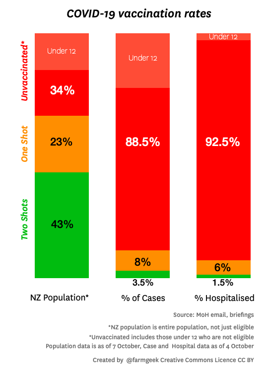
Various people have created graphics showing the breakdown of vaccination rates across subpopulations of New Zealand.  They aren’t great (the vaccination rates, not the graphics), but they are improving.  As the graphics show, vaccination rates are lower in some subgroups than others.  Even when we get to 90% coverage on average, we could be well below 90% for some groups of people. This is a problem for two reasons.

The first reason is obvious: equity. People who haven’t been vaccinated yet aren’t just freeloading, they have reasons. For some people it’s harder to get to a vaccination (because of work hours or because they live somewhere remote). Others don’t trust the medical system — often for reasons that were well founded historically. It’s important to make sure everyone has a real opportunity to get vaccinated.

The second reason is less obvious and more statistical: we need a higher vaccination rate if the unvaccinated are not evenly distributed through society.  A cluster of people with lower vaccination rate will not only be at risk of Covid themselves, they will be an opportunity for Covid to spread. This is true of ethnic groups, but also of churches, dog-walkers, soccer moms, fans of provincial rugby, or nerds at statistics conferences.

Modelling the full complexity of NZ society and Covid dynamics is beyond what I have the data and computation resources to do, so I coded up a very simplified model to show, qualitatively, the sorts of things that can happen.  This is a fairly common use of mathematical models: not just to predict what will happen, but to show the range of behaviours that are possible.

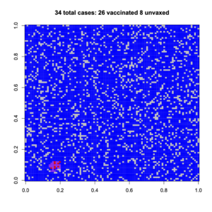
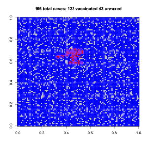
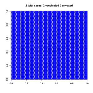
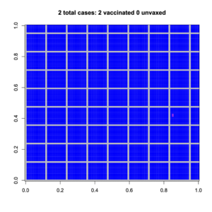
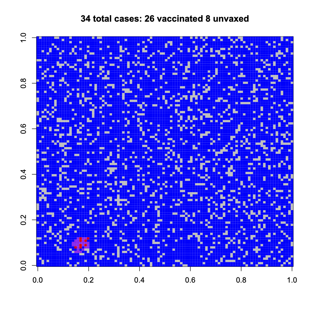
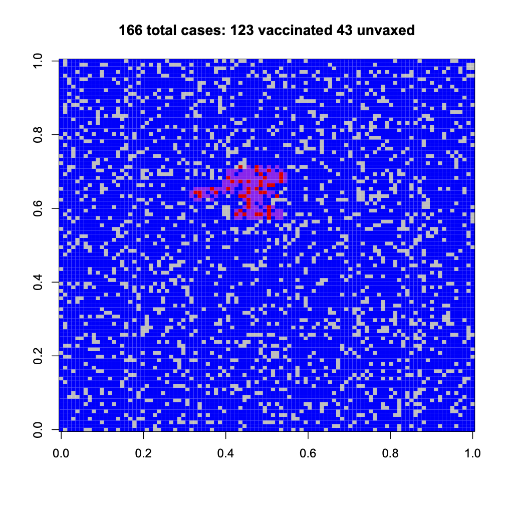
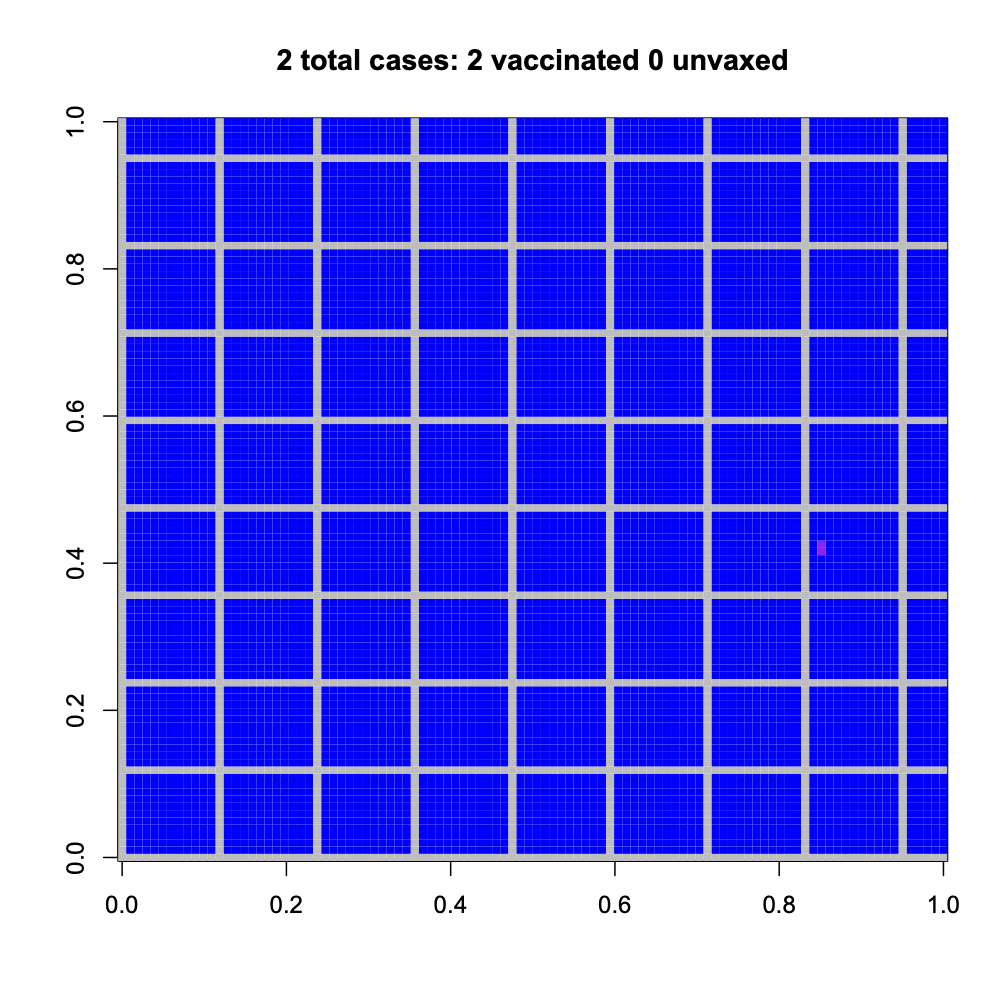
The model is a 100×100 grid, where people can only infect their neighbours (no-one accidentally flies to Wānaka or has a job as a truck driver).  Vaccination reduces your risk of being infected, and also reduces your risk of passing on the infection.  With a random 83% of the population vaccinated, the outbreaks can’t spread far (83% of the NZ population is about 95% of the 12+ population). Here are two random outbreaks. Blue is vaccinated, grey is unvaccinated; purple is vaccinated and infected, red is unvaccinated and infected

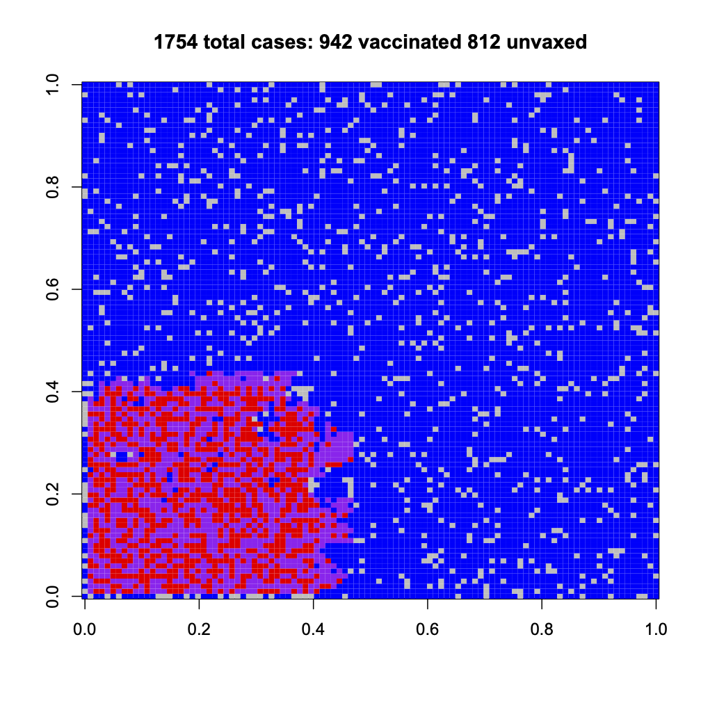
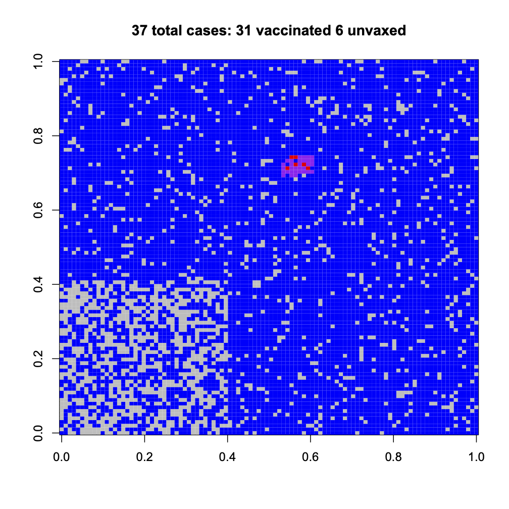
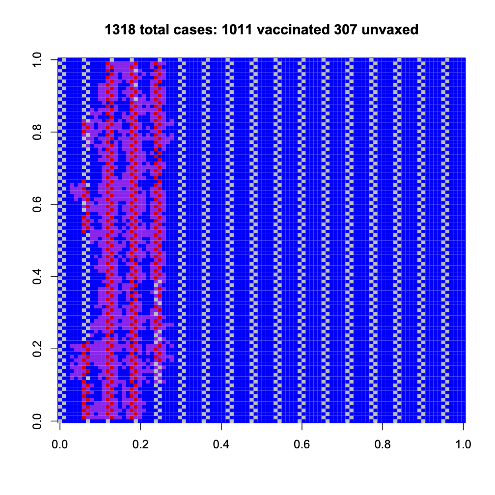
Now, suppose we have the same 83% vaccination on average, but there’s a high-risk group (lower left) who are less vaccinated and who cluster together. If we’re lucky, a random outbreak misses them; if we’re not, it hits them

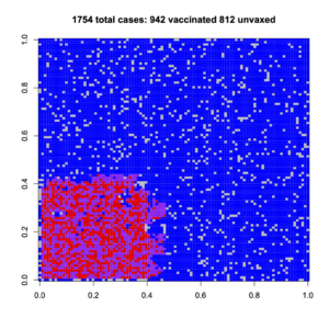
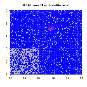
Having a non-uniform spread of unvaccinated people increases the number of cases for them, and also for vaccinated people.

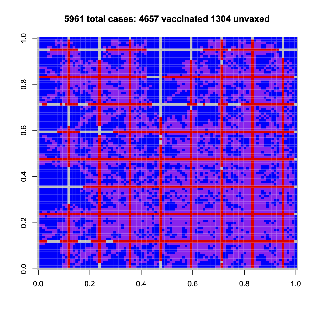
We can get more dramatic sorts of clustering, where a group of unvaccinated people are connected to each other and also across society. Again, if we’re lucky, the outbreak hits only vaccinated people; if we’re not lucky, it spread very widely and more vaccinated people are infected than with a uniform spread. Do you feel lucky?

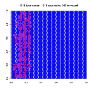
And a more dramatic example, with criss-cross connections of unvaccinated people

These obviously aren’t realistic depictions of New Zealand society, which isn’t square or blue and has lots of long-distance connections. They are, though, depictions of the sort of impact that population structure is able to have on disease spread. These example all have the same overall, high, vaccination rate, but they have very different outbreaks.

It’s not enough to get good vaccine coverage on average. Every subgroup matters.

September 30, 2021

Nature Total Landscaping

Academic journals keep expanding, especially with the growth of open-access journals. Some publishers have reacted to this by creating a bunch of new journals. A few of these publishers give all the journals related names. Nature has Nature Genetics and Nature Communications and Nature Scientific Reports. The BMJ has BMJ Open and BMJ Nutrition, Prevention and Healthcare. The Lancet has The Lancet Public Health and The Lancet Regional Health — Western Pacific and others.

These journals are not the same as the parent journal.  You might or might not think a paper published in Nature was especially reliable because it’s hard to publish in Nature; that’s much less true for Nature Scientific Reports. You might comment that research has been published “in prestigious medical journal The Lancet“, but that’s misleading if it was actually published in The Lancet Regional Health — Western Pacific. I think the importance of journal rankings is vastly overrated, but if you’re going to rely on it you need to get it right.

Back in November, the Trump Campaign held a famous press conference that was not exactly at the Four Seasons hotel.  The label Nature Total Landscaping for these additional journals is a bit unfair — Four Seasons Total Landscaping isn’t even trying to be in the posh hotel business — but it was irresistible to science social media.

September 22, 2021

An important graph

From David Hood on Twitter, this graph shows leaving-home-ness in Aotearoa and the West Island, based on Google’s phone mobility data

The most important point about the graph, to me, is that the black dots follow a horizontal line (and the blue dots mostly follow a set of three horizontal lines).  This says that level 4 restrictions (and level 3, in RoNZ) were not eroding over time.  People were staying home just as much at the end as the beginning, even after four weeks and a much reduced case load.

The second important point is that the cluster of blue dots in the middle is a bit below the rest of the middle. Level 3 is slightly more effective, in terms of people staying home, than the Victoria and NSW and ACT restrictions. Level 3 is still a risk: it relies on people being at least as careful about masks and distancing and not accidentally flying to Wanaka as in level 4. Experts seem to be worried that it might be a bad idea, but to pretty much agree it’s still an effort at elimination.

How is that possible, given all the news about level 4 breaks? Well, Auckland is a big place. If 1% of people committed some serious breach of the rules and 1% of that 1% were reported, you’d have 160 reports.

September 9, 2021

Briefly

  • Good Herald piece on the Covid network contagion model 
  • Andrew Chen organised a bunch of people to write a letter about privacy for Covid location data. He’s also been saying the same things to journalists.  It’s not that we think the government has any intention of misusing the data or letting the private sector misuse it, but the protections aren’t all that strong, the data collection is not voluntary, and having high-quality data is very important.
  • There’s an interesting poll on US vaccine attitudes from the Washington Post and ABC News. Highlights: 82% of unvaccinated people said the FDA full approval for the Pfizer vaccine won’t make any difference to their decision. Crosstabulations (don’t you love polls with actual detail) showed 18% of unvaccinated respondents were in favour of requiring vaccination for school teachers and staff, and 15% requiring vaccination for students when a vaccine is approved at their age.  72% of those employed by someone else and not vaccinated said they would resign if required by their employer to be vaccinated. Politics site The Hill headlined this as Over 70 percent of unvaccinated Americans in survey would quit their job if vaccines are mandated, which is unlikely to be true — it’s a lot easier to claim to a poller you’d quit than to actually do it.
  • Derek Lowe writes about bad clinical trials in Covid “I’m all for trying out new ideas – that’s essential, in fact. But try them out for real. … If you’re going to do research on human beings, you owe it to the subjects of your trial and to the rest of the medical community – and to the rest of the world, in this case – to do it right. To ask solid questions and get solid data on them that will allow you to make a real decision at the end of it.”
  • Animation of vaccination progress in NZ (from Jonathan Marshall)

Compared to what?

There are different ways of testing for the SARS-Cov-2 virus that causes Covid-19.  Broadly speaking, there are three approaches to the actual measurement: amplifying and testing for the viral RNA, testing for viral proteins, and testing for antibodies against the virus.  On top of that, samples can be be taken in different places: way up in the back of your nose, less far up, saliva samples, blood.

These tests are useful for different purposes because they have different characteristics.  The viral RNA tests using a deep swab and PCR have essentially zero false positives if you can avoid contamination.  That’s important in New Zealand because we use positive PCR tests to lock down the whole country, at nine-digit costs, and because we use them to put people in non-voluntary medical isolation.

The swab/PCR tests also have reasonably low false negatives. Nowhere near as low as the false positives — the lab assay is incredibly sensitive, but sometimes the swab just doesn’t pick up virus.  Again, we know this from NZ data. We currently have tests as soon after exposure as possible, again at five days, and again at twelve days, and people do test positive at five days or twelve days for the first time.  The false negative rate is important in New Zealand because we don’t want to miss even one case and allow an outbreak to expand.

For the places where we use swab/PCR testing now, we don’t want to substitute anything else. It’s the best technology available. But there are limits. The swab is a bit uncomfortable and the PCR process is slow and requires lab equipment in limited supply. We couldn’t, for example, do daily testing of all customer-facing essential workers with swab/PCR: they’d hate it and the labs would struggle to keep up.

In other countries, it’s much more valuable to have easy, rapid, and inexpensive tests even at a slight cost in sensitivity. There’s some risk of infection all the time; the consequences of a false positive or false negative are lower; there isn’t the same need to make sure all positive tests get reported. There’s a lot more scope for other tests to be helpful.

Even in NZ, though, there are gaps where other tests could be useful.  The obvious one is frequent testing of high-risk people. In normal times that would be people at the border; during an outbreak it might be essential workers whose job involves being exposed to customers or crossing the alert-level boundaries.  If we compare to swab/PCR the rapid antigen tests are not as good; but that’s not the right comparison. The rapid tests would be useful in settings where there isn’t going to be a swab/PCR. In those settings, the chance of detecting a case with swab/PCR is obviously zero, and the chance of detection with another test is actually pretty fair.

There’s a theoretical downside that negative rapid tests might slow someone with symptoms from getting a swab/PCR test until they get a positive.  If we were getting nearly 100% testing among people with symptoms, this would be a big concern. We probably aren’t anywhere near that; but it would need monitoring. There’s also a theoretical downside that false positive rapid tests might make people take positive results less seriously. I don’t think that’s plausible during lockdown, but again it would need monitoring. Somewhat more likely, it might turn out that there’s nothing actually wrong with the tests but that they don’t detect enough additional cases to be worth the cost and hassle. But that’s worth investigating, and where the realistic options are additional rapid tests or just the status quo, the effectiveness comparison should be between additional rapid tests and just the status quo.

September 2, 2021

A step forward for genomic-based medicine

The world’s Covid response has benefited from the twenty-odd years of large-scale genetics research that preceded it: inexpensive, widely-available PCR and sequencing; mRNA synthesis and delivery.  None of that was the plan, though.  Genomics was supposed to produce widely-applicable treatments for diverse medical problems, and revolutionise medical diagnosis and treatment. It didn’t: there have been genuine breakthroughs, but mostly in the  form of expensive treatments for rare diseases.

Today in Britain, there was definite progress.   NICE, who make recommendations for medication subsidy decisions, have pushed for the funding of inclisiran in people who have high cholesterol and who’ve already had a stroke or heart attack.  Inclisiran lowers LDL (‘bad’) cholesterol a long way, by a different mechanism from the current ‘statin’ drugs, and it can be given by twice-yearly injection at a GP’s office. The drug would usually cost more than it’s worth, but the NHS has a Pharmac-like secret deal to pay less than the £2,000 sticker price.

I’m not sure this is huge news from a public health point of view, but it’s interesting to someone who has worked in genetic epidemiology.  Inclisiran inhibits a gene called PCSK9.  The function of PCSK9 was originally fairly obscure; mutations in it were found by genetic linkage analysis to be related to familial high cholesterol in a group of families who didn’t have mutations in the known high-cholesterol genes.  Research in the Dallas Heart Study, a cohort study of risks for heart disease, found that several people with unusually low cholesterol also had mutations in PCSK9, suggesting that blocking the gene’s action would lower cholesterol.  Now, we actually need some cholesterol, so you’d worry that blocking the gene could be dangerous — but the Dallas Heart Study also found one woman who had natural mutations in both her copies of the gene, and who had extraordinarily low LDL cholesterol and no apparent adverse health effects.  All this came from largely correlational research that relied on inexpensive, large-scale gene sequencing — exactly what genomics had promised.

The other genetic aspect of the new treatment is that it works by silencing the gene, rather than the more-usual approach of blocking the activity of the enzyme after it has been produced.  Inclisiran is a ‘small interfering RNA’ molecule that binds to messenger RNA from the PCSK9 gene and triggers the cell’s recycling mechanisms to chop it up. The protein never gets produced.  This idea has been through hype and disappointment cycles — a small piece of RNA injected into the body looks remarkably like a virus, and the immune system tends to disapprove — but this time it seems to work, and to work on a common risk fact for a common disease.

The return on genetic ‘precision medicine’ has still been rather disappointing compared to the hype, but it’s nice to have the occasional example where it does basically work as promised.

Drug development and snakebite

Newshub has a commendably restrained story about some biochemical research into possible starting points for Covid treatment

Brazilian researchers have found that a molecule in the venom of a type of snake inhibited coronavirus reproduction in monkey cells, a possible first step toward a drug to combat the virus causing COVID-19.

Not everyone is so calm about it: The Hill says Brazilian viper venom shows promise as drug to combat COVID-19, the Daily Express says Covid breakthrough as deadly Brazilian snake venom 75% effective in stopping virus, and Indian site Zee News says Jararacussu pit viper, found in Brazil, can be the answer to Coronavirus, says study.

The research paper is here.

Researchers in Brazil were already studying the properties of a fragment of a protein from the venom of the jararacussu, a South American pit viper. This fragment blocks a protease, a protein-snipping enzyme, that is needed by the SARS-Cov-2 virus.  The protein fragment isn’t a drug on its own — and the protein it comes from definitely isn’t; it’s in the snake venom for a reason, and that reason isn’t to benefit animals that get bitten. However, this genuinely is one of the ways we get new drugs. A protein fragment from the venom of a related South America pit viper, which blocked a human protease enzyme,  was the starting point for developing ACE inhibitors, an important class of medications for high blood pressure and heart failure.

A few more things to  point out, though. First, the research paper is studying the ability of the SARS-Cov-2 virus to infect lab-grown hamster kidney cells in a Petri dish. These aren’t particularly realistic targets; they’re just convenient. The paper describes the use of a ‘positive control’, a chemical that they know is effective at stopping infection of these hamster cells under lab conditions. You might have heard of this chemical; it’s called chloroquine.  And finally, the tweet from The Hill that pushed me to write this post has a picture of a pretty green snake. It’s not the jararacussu. It’s an African snake that’s not especially closely related and whose venom hasn’t been studied all that much. They have the picture handy because a snake of that species bit a handler at the San Diego zoo in April. Zee News also use a pretty green snake picture, and it’s even less closely related.