Posts written by Thomas Lumley (2569)

avatar

Thomas Lumley (@tslumley) is Professor of Biostatistics at the University of Auckland. His research interests include semiparametric models, survey sampling, statistical computing, foundations of statistics, and whatever methodological problems his medical collaborators come up with. He also blogs at Biased and Inefficient

December 10, 2021

Briefly

  • From Ars Technica, Report reveals which sealed NES games are the rarest of the rare. This is relevant because most of the story is about selection bias “Wata’s sealed-NES report, for instance, only shows one graded, sealed copy of Jeopardy!, a game that most collector’s regard as pretty common.
    This disparity could be because sealed copies of Jeopardy! happen to be much rarer than open boxes or loose carts. Or it could simply be that almost no one has bothered going through the time, expense, and hassle of going to Wata for a professional grade on a relatively ignorable game like Jeopardy!.
  • Phillip Bump, of the Washington Post, is starting a newsletterHow to read this chart
  • NZ police release an independent report on facial recognition technology
  • The police, and various other agencies, have asked the Ministry of Health for data from Covid contact tracing. They were (correctly) turned down.
  • According to UK supermarket chain Tesco, via Wales Online,  33% of people in London and 39% of 18-24 year olds in the UK celebrate Thanksgiving. I’m reasonably sure this isn’t true, but it doesn’t seem possible to find out any more about where they got the numbers.
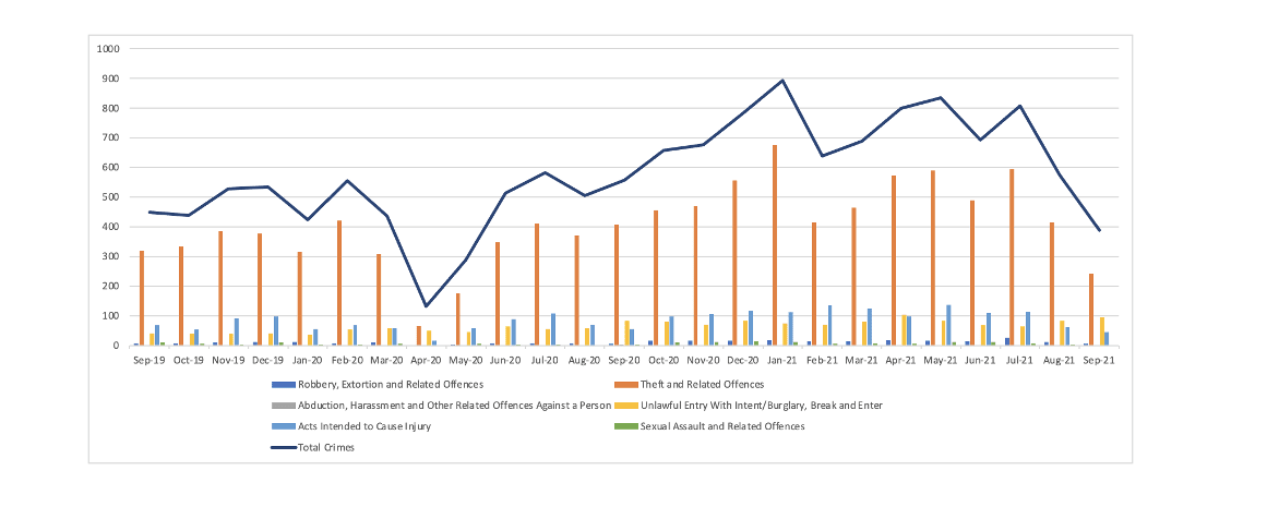
  • NZ Herald, Nov 22 “Auckland CBD sinking into anarchy and resembling 1980s New York, city leaders told. Newsroom, Dec 6, “yeah nah”

Making it up in volume

This isn’t precisely statistics in the media, but it’s research about the sort of stories we discuss a lot.  A new research paper in Nature looks at three estimates over time of the proportion of people vaccinated in the US. Two of these were based on large self-selected sets of respondents, the third was much smaller but had an attempt at random sampling.

What’s interesting about this is that we know the truth, pretty well.  US States kept track of vaccinations and the CDC collated the data.  There aren’t many examples where we have that sort of ground truth — the closest we come is elections, and even then we only get the truth for one point in time.

Here’s a graph from the research paper:

The two ‘big data’ estimates were much more precise than the smaller survey, but also much more biased: they were confidently wrong, where the small survey was pretty much right.  For some reason (and it’s not hard to think of possibilities) people who were vaccinated were more likely to respond in the big unselected data sets.

This is a general ‘big data’ phenomenon: when you get more data it tends to be of lower quality.  It’s very hard to overcome the data quality problem, so you will often get worse answers, but your estimation procedure will tell you they are much better. The ‘margin of error’ on the 75,000-person Census Household Pulse is much smaller than on the Axios-Ipsos survey, but the actual error is much larger. If you’ve seen lots of 1000-person surveys reported in the media and wondered why they aren’t bigger, this is the reason.  It’s not that you can’t do a 10,000-person survey; it’s that it needs to have much higher data quality than a 1000-person survey to be worth doing.

Now, ‘big data’ isn’t useless. It can be possible, with detailed enough data on a large number of people, to get around the data quality problems.  The polling company YouGov has had some success with large unselected samples and reweighting them to match the population. But that’s only possible where you have good data for the sample and the  population — the Nature paper hypothesises that collecting political affiliation and rurality might have helped, but the ‘big data’ surveys didn’t.

I didn’t have anything to do with this research, but one of my research areas is combining big databases and small samples in medical research: in the small sample you can afford to get accurate data and then you can use the big database to get extra precision.

December 8, 2021

Viagra and Alzheimers

Q: Did you see that Viagra prevents Alzheimer’s?

A: That’s not quite what it says

Q: “Viagra could be used to treat Alzheimer’s disease, study finds”

A: It’s possible that it could be, if it turns out to work

Q: That’s a bit misleading

A: Well, it’s a headline, what do you expect?

Q: Do you want to say that the Guardian covered this better than NewstalkZB?

A: No. Well, whether or not I want to, it’s not true.  The Guardian had the misleading headline and NewstalkZB has an expert saying “As exciting as it may be, it does sound a bit too good to be true though.”

Q: So it’s just mice?

A: No, I don’t think anyone would have had any reason to test this in mice before

Q: Men?

A: Yes. Well, mostly men. Health insurance data on 7.2 million people and 1600 different drugs

Q: How effective is Viagra, then?

A: We don’t know

Q: You know what I mean

A: The people who were prescribed Viagra were 70% less likely to end up with Alzheimer’s

Q: That’s a huge effect!

A: A huge difference. To quote Dr Phil Wood on NewstalkZB “As exciting as it may be, it does sound a bit too good to be true though.”

Q: Whatever. Can you really get a correlation that strong when it’s not a real effect?

A: Finnish research found 2/3 lower rate of dementia in people who regularly used saunas. And in a Swedish study, married men had about half the risk of single or widowed men. And early reports looking at correlations between statin drugs and Alzheimer’s found rates lower by up to 70%. And…

Q: Ok, I get the message. But it could be real?

A: In principle. The researchers give some biological arguments for why it might.  Though given how hard Alzheimer’s is to treat, it would be really surprising if some drug accidentally did way better than anything we’ve ever developed

Q: Maybe there should be a clinical trial?

A: Perhaps. Or at least an observational study in a different population. While it probably won’t work, we wouldn’t want to miss out if it did

December 2, 2021

Internet use up

The Herald has numbers from Chorus on internet data use, which is up since last October. Their data is broken down by region. I noticed that Auckland was at the top and wondered how much of this was better internet access in Auckland and how much was just larger households. Here’s a graph (click to embiggen). I had to guess that the ‘Hamilton’ region meant Waikato, and the table is missing Marlborough. Also, my data source for household  size had separate figures for Nelson and Tasman, but it should be basically right.

That’s actually more of an impact of household size than I expected. Also, I was a bit surprised that the West Coast is above the fitted line, saying that it has more internet use than you’d expect from household size, but I suppose that’s what you’d hope when people are spread out a lot.

The regression line is a bit unreliable with such a small dataset, and leaving out Auckland weakens the evidence for a relationship quite a bit (though it doesn’t actually change the fitted line very much). It’s worth thinking about alternative explanations. It’s reasonable that internet use would scale with household size (and I did think of this before looking at the data), but it could also be that Auckland has larger household size and more internet use because it’s a city

November 30, 2021

Briefly

  • Is Covid Omicron going to be a gentler, kinder virus? Actually, we have no idea at all yet, as David Welch tells Jamie Morton. Worry about something else for a week or two; there’s  no shortage of world problems.  Also, see Trevor Bedford on Twitter.
  • The Statistics Act (1975) is up for revision. You have until 22 December if you want to make a submission on the current Data and Statistics Bill.  If you read StatsChat, it’s possible that you do want to comment.
  • Story in the Herald saying that healthy diets are better for the environment. I probably won’t write about this one in detail, but you might look at this 2015 post on a Herald piece saying healthy diets are worse for the environment.
  • ” if passes weren’t going to be checked, they may not represent a justified privacy breach.” Andrew Chen (the patron saint of the NZ Covid app) in a Newsroom story on not requiring vaccine pass validation.
  • Not precisely statistics or in the media, but visualisation: Assyrian low-relief carvings with (possibly) their original colours
  • If you want to read a careful and thoughtful analysis of the data on ivermectin for Covid then I’d actually advise not bothering, but this is a good place if you really have to
  • A nice illustration (via Twitter) of why you’d expect quite a few vaccinated Covid cases if you have a lot of vaccinated people
November 29, 2021

Some of my best friends are…

Circulating on Twitter, but originally from US News and World Report

It’s an interesting list.

Most of the people talking about it on Twitter wanted to ridicule the list without actually worrying about how it was constructed, so it didn’t come with any link or any explanation beyond the source. It’s not hard to find some information, although I haven’t been able to get full details.

There are different ways you might go about constructing a ‘racism’ ordering for countries. According to a 2013 story in the Washington Post, one ranking of basically this sort started with a question in the World Values Survey. Two researchers (I’ll let your prejudices work by saying they were Swedish economists) wanted to look at relationships between economic freedom and racism.  They needed something widely measured, and used a question about kinds of people you would not be happy with having as neighbours.  One of the options was “people of a different race”, others include “people with AIDS”, “immigrants”, “heavy drinkers”, “unmarried couple living together”, “people of a different religion” and so on.  These economists used as their metric for racism the proportion of people who would not want someone from another race as a neighbour.  If you were being pedantic, like me, you might call this a xenophobia/xenophilia score rather than a racism score. It clearly measures something relevant, but you’d expect it to miss the “Some of my best friends are black/gay/Jewish/etc” type of polite racism. This follow-up piece at the Washington Post  covers some of the other complications.

The scale based on the World Values Survey has some agreement with the current version, but it’s not the same. In particular, the USA does quite well on the World Values Survey question, but rates low on the current metric.

The current version is from a survey called “Best Countries“. It has a simpler structure. Respondents (10,068 were informed elites, 4,919 were business decision-makers and 5,817 were considered general public) rated each country on 76 attributes, one of which  was racial equity.  They were also asked whether they agreed “A country is stronger when it is more racially and ethnically diverse” but it doesn’t appear this goes into the ranking (the Danes and Swedes were below the global average on this question, though NZ and Canada were high).

So, the ranking is based on whether a sample of people around the world, targeting ‘informed elites and business decision makers’, thinks that the country is racist or not. The problem with a ranking like that is that most respondents have no actual idea of whether Denmark or Botswana or Agrabah or Paraguay is racist; they’re just going by their own prejudices and what they see in the news.  It’s quite likely that the very low rating for the US is due in part to the Black Lives Matter protests — which you could argue were a good sign not a bad sign for US attitudes on race.

November 28, 2021

Up and down

From the NZ Herald, squashed-trees edition

It’s not really clear what’s going on here: the 3.75% at the bottom right vs the 3.75% at the top left.

Things are better on the NZ$ Herald website, under the headline The great divide: Why are NZ interest rates so much higher than Australia?

Here it’s clear that the label at the bottom right had just gone feral somehow and that the graph is at least plausibly correct. There’s still a bit of a problem in that, at least for the historic part of the graph, the lines should be flat where they don’t jump; there shouldn’t be any slopes. The RBNZ didn’t come out in early 2010 and say “we’re going to smoothly decrease the rate from 3 to 2.75 over the rest of the year”; that’s not how they work. Also, NZ interest rates aren’t actually “so much higher” than rates across the Tasman; they’re just projected to be higher.

Checking against this July graph from interest.co.nz basically confirms the numbers, though there is some interesting disagreement if you care about details, such as the shape of the interest rate rise and fall in 2014-15 and whether the Oz rate was above or below the NZ rate at the start of 2016

The July projections diverge less than the current predictions do: the banks aren’t actually all that good at predicting interest rates two years ahead.

The spurious slopes are still there in the graph, though in this one at least the flat bits are flat and it’s just the vertical bits that aren’t vertical. That’s even a problem on the official RBNZ website.

None of this is a criticism of the actual content of the Herald piece, which both talks about the reasons for divergence and quotes experts who don’t think the diverging forecasts will hold up

Ultimately, despite the two very divergent central bank views, the answer is somewhere in the middle and the rate tracks will move closer in the year ahead, McLeish says.

But the graph and headline don’t help

November 22, 2021

Probably in the top two

From Sophie Jones on Twitter:

If you zoom in on the fine print, that’s 50.6% of 15096 people preferring Pepsi Max over full-sugar Coca-Cola.  You could quibble about the comparison — should this be restricted to cola drinkers (or non-cola drinkers); what happened to the diet versions; how about L&P? — but it’s a comparison.

More obviously, 50.6% is very close to 50%.  You  might ask what the margin of error was for a sample of 15000. It’s more than 0.6%: these results are consistent with just a coin toss.  It might taste like victory, but only if victory doesn’t taste very distinctive.

On the other hand, Pepsi lost the cola wars in New Zealand, so the starting point might reasonably not be 50:50.  This survey doesn’t convincingly show that Pepsi Max is preferred over Coca-Cola by a majority even in blind two-way comparisons, but it does show it’s not far behind. And, in context, that’s probably worth advertising.

Vaccinate for the holidays

The Covid vaccine is safe and effective and it’s good that most eligible people are getting it. But how much protection does it give? If you look at the NZ statistics on who gets Covid, it seems to be extraordinarily effective: the chance of ending up with (diagnosed) Covid for an unvaccinated person is about 20 times higher than for a vaccinated person.

That’s probably an overestimate. People who are vaccinated are at lower risk for immunological reasons: the vaccine really works.  We’re also at lower risk for social reasons: if you’re vaccinated, your friends and family and people you interact with are also more likely to be vaccinated, so they are less likely to give you the virus. That’s partly due to equity problems in the vaccine rollout and partly just to what social-network people call homophily:  you tend to hang out with people similar to you. The immunological reason will hold true over summer; the social reason perhaps less so if people travel. 

Also, because elimination came so close to working in Auckland, the virus has been fairly effectively suppressed in most of the New Zealand population.  On top of the clustering of unvaccinated people, there’s very strong clustering of the current outbreak — it’s mostly in Auckland, but it’s not at all evenly spread within Auckland.  Even if you’re in Auckland you probably know either no-one or lots of people who have been infected.  If you’re in know no-one, you’re at lower risk– and you’re probably vaccinated. As we go from a more or less localised outbreak to many little outbreaks, this additional clustering will go away and the apparent benefit of vaccination will fall.

How much will it fall (and why am I sure)? In the USA, you’re currently about 6 times as likely to get a Covid diagnosis if you’re unvaccinated (according to the CDC). In the UK, the ratio comparing unvaccinated people to those with a Pfizer vaccination within four three months is 4-5.  That fits with the estimates of how effective the vaccine is, biologically, against Delta, plus a bit of social clustering.  The ratio in NZ will be heading that way over time.

So: vaccines, yes, but also masks and distancing and meeting people outside when you can and getting tested if you have symptoms and not going to isolated places that don’t even have enough of their own health care.  Don’t give the virus an inch.

October 23, 2021

Vaccine data in kids

The external scientific advisory committee for the FDA meets next week to consider the Pfizer Covid vaccine in kids 5-12.  Pfizer’s briefing to the committee is now up on the website; the FDA briefing is not (as of midday Saturday).

Demographically, the trial isn’t as representative as the initial adult trials, which were much better than usual. About 10% of the participants had asthma and about 10% were obese. Black and Hispanic populations were under-represented by about a half relative to the US population —  though there has been no indication that race/ethnicity matters for vaccine efficacy so far.

For the extension to ages 5-12 there are basically three questions

  1. Is the dose right? They used 1/3 of the adult dose. Using too much would increase  adverse effects; using too little would not provide reliable immunity
  2. Is there anything new and worrying about adverse effects? This trial, like all randomised trials, is too small to see surprising and rare adverse reactions that happen to 1 person in 10,000 or 1 in a million. These can only ever be picked up by post-marketing surveillance, as we’ve seen for both the Pfizer and AstraZeneca vaccines. Safety signals in the trial would involve milder, less rare reactions at elevated rates.
  3. What is the risk/benefit relationship like, given the relatively lower risk from Covid in kids and the fact that (in contrast to many infectious diseases) kids don’t seem to spread it more effectively than adults do?

The data are positive on the first point. Pain and redness at the injection site are a bit more common than with teenagers given the full dose; systemic reactions such as fatigue and fever are a bit less common.  Levels of neutralising antibodies are about the same as in teenagers given the full dose.

On the second point, the trial is again positive. Nothing new seems to have been seen (though this is where the FDA briefing will be important, to see if they agree — how you classify adverse events can make a difference).

It’s harder to say what regulators will think for the third point, but if the FDA were willing in principle to approve based on a trial of this general design there doesn’t seem to be anything obvious in the results that would make them not approve based on these data.


Update: FDA’s briefing is now available.  The main new information is an explicit risk-benefit analysis. As you’d expect, the net benefit depends on the Covid incidence, but they say the net benefit might be positive even under the lowest-incidence case (and that’s assuming only 80% effectiveness against hospitalisation, which is probably a bit low, and a pessimistic view of the data on myocarditis). They don’t seem to model any community effect of vaccination by reducing infection in other people and thus reducing exposure to the virus. Risk-benefit is where the most interesting discussion should be at next week’s meeting.