Posts written by Thomas Lumley (2569)

avatar

Thomas Lumley (@tslumley) is Professor of Biostatistics at the University of Auckland. His research interests include semiparametric models, survey sampling, statistical computing, foundations of statistics, and whatever methodological problems his medical collaborators come up with. He also blogs at Biased and Inefficient

February 6, 2022

How many omicrons (recap)

Now we’re at Waitangi weekend we can confirm that New Zealand modellers and epidemiologists, none of whom expected 50,000 cases per day at this point, were correct.  Unfortunately, the Herald has

Questioned on earlier figures that up to 50,000 new cases would be emerging by Waitangi Day – and 80,000 a day a few weeks later – Hipkins described the calculations as useful, saying it was better to have some modelling than none.

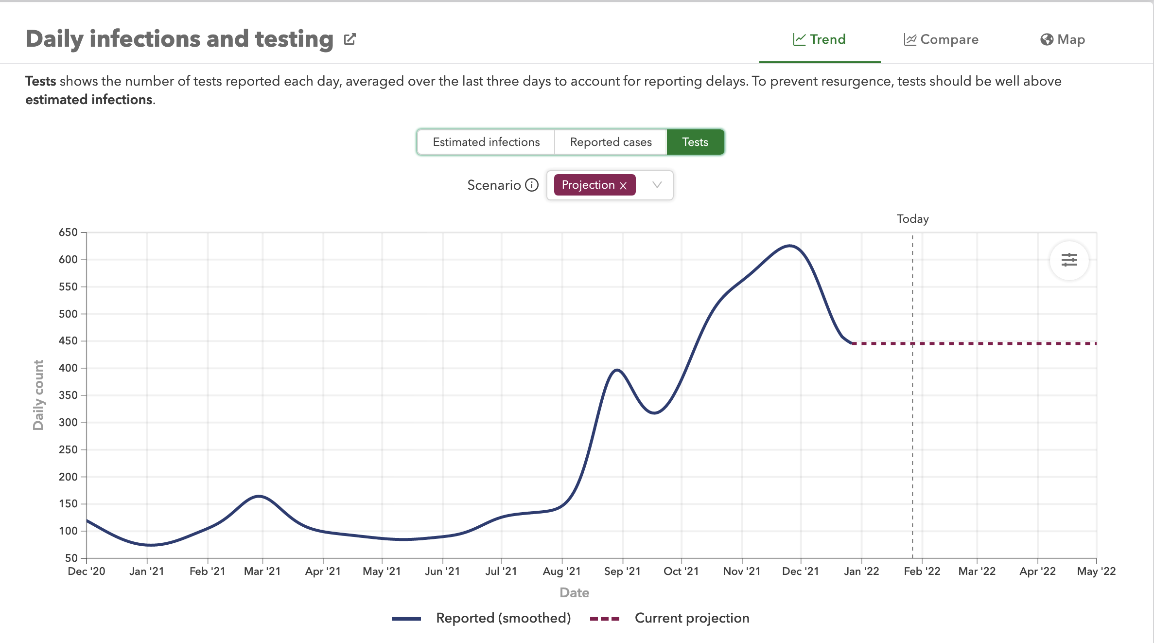
Further down, the Herald piece admits that these figures didn’t come from the New Zealand modellers that the Minister is paying and being advised by, but from IHME in Seattle. It’s worse than that, though. The only place I saw tens of thousands of cases as a description of the modelling by the IHME in Seattle was in a Herald headline.

All the other reporting of it that I saw at least said “infections”, even if they weren’t clear enough that this wasn’t remotely the same as cases. 

As you can see, the IHME model prediction for reported cases today, Sunday 6 February, was actually 332 (or 202 with good mask use), even though the projection for infections by tomorrow was nearly 50,000.

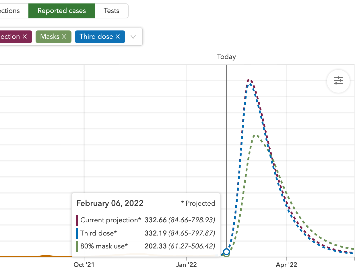
The uncertainty interval for that projected 332 went from 85 to nearly 800, so the actual figure was well inside the predicted range.

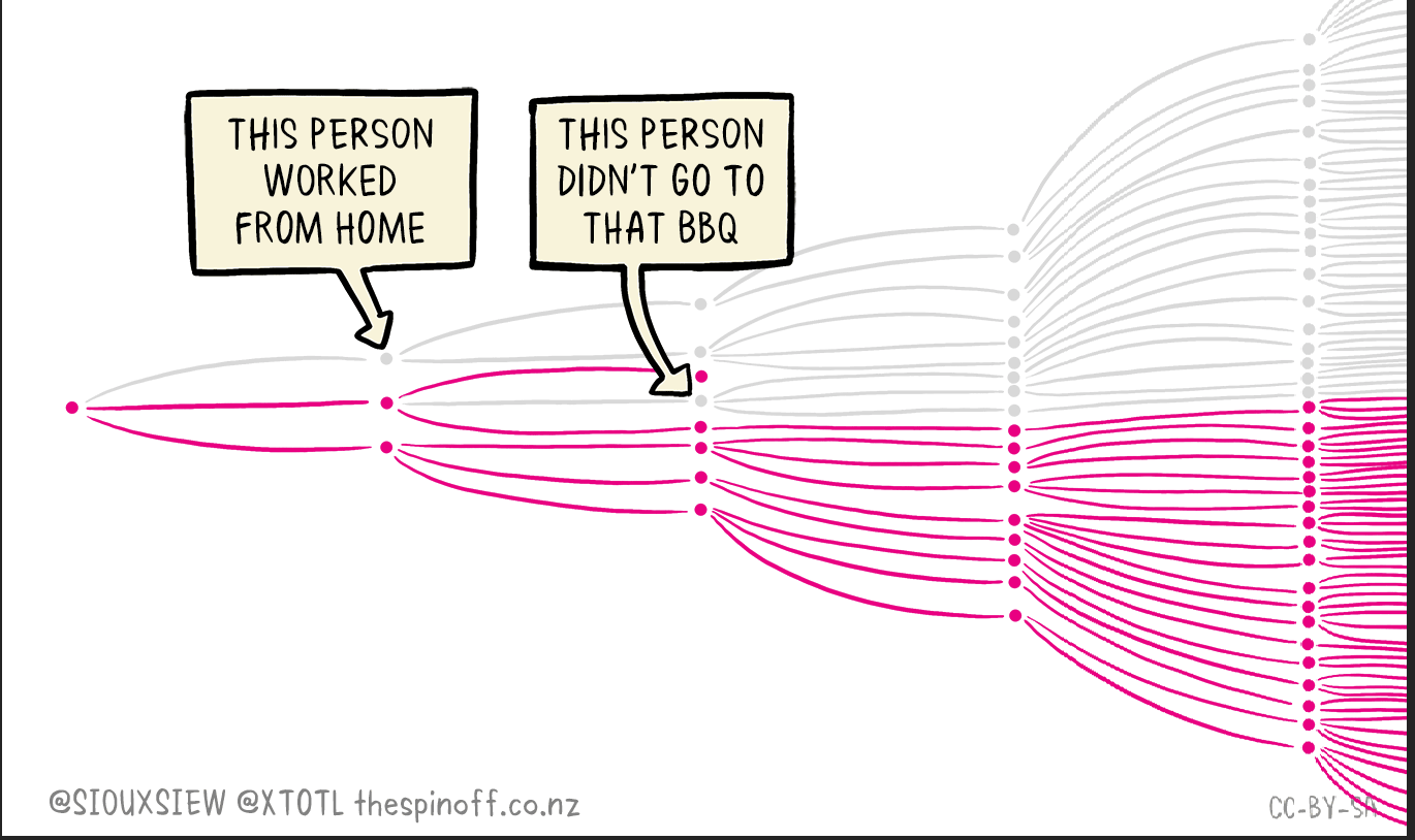
You might think that this sort of accuracy still isn’t very good. Projecting the timing of the epidemic is hard — think of the exponential-spread cartoon from Toby Morris and Siouxsie Wiles

Especially early on in an outbreak, individual choices and luck can make a big difference to how fast the outbreak spreads.  Eventually it will be overall patterns of vaccination and masking and distancing and isolation that matter for the overall outbreak size. The models will be more accurate as the outbreak gets bigger and less random, and they will likely be more accurate about total outbreak size than about timing.

I’m not a fan of the IHME models — they have notoriously been overly optimistic in the medium to long term in the US — but Michael Baker and the Otago group think they’re reasonable, and you should arguably listen to them rather than me on this topic.  We’ll find out soon. Whatever you think of them in general, though, the modellers certainly didn’t predict 50,000 cases by today, and shouldn’t be criticised for failing to predict something that didn’t happen.


February 1, 2022

Pie charts, Oz edition

From The Australian (via Luke Wihone on Twitter)

There’s two issues here. First, they are called percentages for a reason — they should add up to 100. This is what it looks like with the missing 16%

Even if you decided to rescale the percentages to give a two-candidate pie, though, the graph is wrong. This is what it would actually look like

That’s Australia. A graph like this one used in New Zealand politics would seem to come under the  Advertising Standards Authority decision saying misleading graphs are not actually misleading if they have the numbers written on them.  As I said at the time, I think this is bad as a matter of political norms and factually incorrect as to the impact of graphics. Maybe we can get it changed.

January 31, 2022

Net approval

There has been quite a bit of fuss on Twitter about this headline, and to a lesser extent the reporting it leads to.  The controversy is over the ‘net approval’ metric — proportion approving minus proportion disapproving — which is relatively new in NZ politics (and which is annoying not in the “full results” summary of the 1News Kantar poll at 1News).  You might not guess from the headline that the poll gives Labour+Greens a majority in Parliament and Ardern twice the “preferred PM” percentage of anyone else.

Net approval is a commonly-reported summary for polls about the US president. According to Wikipedia, it dates back to 1937. That in itself is valuable for the US — continuity makes it easier to do long-term comparisons — and attitudes to the President, separately from his party, seem to be a useful aspect of public mood to measure.   In the US, it isn’t usual to compare the net approval of the President and the Leader of the Opposition; they don’t have one. You do sometimes get net approval ratings for Presidential candidates, but they seem to be less common that just ‘approval’ or ‘would vote for’ or more detailed breakdowns.

There’s a weaker case for personal approval ratings here than in the US, since people don’t vote for a Prime Minister separately from a party — if anything, it might be more interesting to get personal approval for electorate MPs — but it’s not irrelevant. You could argue, and some of the people complaining certainly did, that Jacinda Ardern has made her party more popular than it would be under Generic Replacement Prime Minister, and that Judith Collins made her party less popular than it would have been under Generic Replacement Leader.  That’s a meaningful question on which net approval provides some limited data, in a different way than “preferred Prime Minister” does. However, I would argue that net personal approval is more useful as a comparison over time than a comparison between government and opposition, because the level of “Don’t Care” will intrinsically tend to be higher for leaders who aren’t actually in government. As the Herald says

Just 10 per cent gave no answer or said they didn’t know, which is probably to be expected given Ardern has been Prime Minister for four years – most people have an opinion on her.

I’ve got no problem with net approval being reported. It’s definitely true that it has gone down for Ardern, though it’s not clear how much is a reduction in approval and how much is an increase in disapproval. I don’t think the headline is appropriate given how new ‘net approval’ is, and given the problems of comparing opposition and government net approval.  It’s clear that Luxon’s approval is up, and that National’s support is up, though more at the expense of ACT than Labour.  The second headline, if you click through from the front page, is more reasonable —  Jacinda Ardern’s personal approval rating plummets in new 1News poll, but Christopher Luxon won’t be getting too excited — though even there I’d be happier if the headline was about one of the familiar metrics or at least said ‘net’.

Briefly

  • The Financial Times reports that the head of Turkey’s official statistics agency has been sacked, and suggests that it’s because the government doesn’t like the inflation data.  This is counterproductive; the reasons that inflation estimates are useful rely on people believing them.
  • David Epstein has a nice post about the ‘everything in your fridge causes and prevents cancer’ problem
  • Entirely separately from the question of how it should be headlined, here’s a Twitter thread about the accuracy of the IHME Covid predictions (for the USA).
  • From Russell Brown, a post criticising the ‘Drug Harm Index’ 
  • Via Tobias Schneider on Twitter, some interesting beliefs about NATO membership from this report. The Saudi Arabia, South Africa, and China samples are admitted to tilt wealthy/educated; the others are supposed to be representative. Yes, 11% of Russian respondents say they think Russia is in NATO
  • A pointlessly bad graph from the White House — why would anyone make an obviously distorted y-axis like this when it doesn’t convey a particularly misleading impression?
  • A graph of Google mobility data (from @thoughtfulnz on Twitter) showing the number of people out and about in retail or recreation locations was a bit higher than pre-Covid, then decreased to about pre-Covid levels after the Omicron traffic lights introduction.  From a public health point of view, we could do with being less normal and more like the US and UK, which are much lower than pre-Covid
January 27, 2022

How many omicrons?

Radio NZ has a headline Omicron: Modelling suggests NZ could face peak of 80,000 daily infections, and the report starts “New Zealand could be facing 50,000 daily Omicron infections by Waitangi weekend”. This is technically correct, but in this context that is not the best kind of correct.

First, this is a model for infections, not cases.  It includes asymptomatic infections (which are definitely a thing) and infections that just don’t get reported. The modelled peak for cases is a couple of weeks later, and about a factor of 7 lower.  So 50,000 daily infections by Waitangi weekend, peaking at 80,000 a few weeks later means 425 daily cases by Waitangi weekend, peaking around 11,000 daily cases by late March, if we believe the model.  Given that we have been seeing reporting of cases, not infections, for the past two years, it’s misleading to quote a number that’s twice as soon and an order of magnitude higher.

Is it realistic that so many cases get unreported? It’s not clear. The best data on this, according to Trevor Bedford, who knows from Covid, is from the UK, where they have a mail-out prevalence survey.  He estimates that the UK reports about 3 in 10 cases, and thinks it would be a bit lower for the US.  I’d be surprised if it’s lower than the UK here, at least for the next few weeks. So, that conflicts a bit with the IHME infections model.

So, is the model right? Well, on the one hand, it’s a serious effort at modelling and should be taken seriously.  On the other hand, it’s a model for everywhere in the world, so the amount of attention given to New Zealand data and outcomes will be quite limited.  The NZ modellers put rather more effort into modelling New Zealand data and New Zealand policies.

The reasons that New Zealand eventually controlled our Delta outbreak were specific to New Zealand: lots of new vaccinations, quite good adherence to interventions, being happy to take it outside, being on a small island in the tropics, whatever.  This sort of thing is hard for a worldwide model to pick up.  As Radio NZ says, the model has a prediction if we use masks, and a prediction if everyone gets boostered; these are lower.  It doesn’t have a prediction that accounts for capacity restrictions or vaccination of children. It’s a model where ‘flattening the curve’ fails completely.

Looking at the model in more detail, it does seem that there are some issues with the NZ data feeds. The model for testing looks like this:

That’s clearly wrong in two ways: first, it’s not going to be steady like that. More importantly, it’s too low by about a factor of 50. Here’s what the Ministry of Health says daily testing data looks like

The vaccination model is also somewhat out of data

It projects vaccinations as stopping in mid-November. They didn’t.

What can we say about the projections? Well, Victoria, with a slightly higher population, somewhat weaker restrictions, and not wildly different vaccination rate peaked at about 14,000 cases per day.  So that’s clearly in the plausible range, and would be bad enough.  It’s not out of the question that things get as bad as the IHME estimate, but I think it’s unrealistic to think of it as a most likely projection. And it certainly doesn’t need the confusion of ‘infections’ and ‘cases’.

January 19, 2022

Coffee and houses

The idea of cutting down on lattes to be able to afford a house has cropped up again. The proximate cause is a Newshub story that doesn’t quite go there — but it does talk about rent costs and mortgage rates and about satisfying a home lender under the new CCFA credit provisions, so it’s pretty close.

Now, first, I will agree that there are almost certainly people out there who haven’t emotionally grasped that buying 200 flat whites, one per day, costs (say) $900 that you could have spent on a $900 thing instead.  I don’t know if those people are likely to be helped by the story, but maybe it’s worth a try. At the level of housing, though, $900 in a year — or even two coffees every single day, for (say) $3300 — gets you nowhere in comparison with housing price inflation.  The same is true for avocados — maybe avocado toast in a cafe costs more than a coffee, but you don’t have it every day.

You might say that coffee (or avocado) is just one example, and that the point is to pay continuous and obsessive attention to shaving the costs of everything you buy. But to keep up with the rising cost of a mortgage deposit many people would have to save more than their entire discretionary income; shaving pennies isn’t going to get you there.

Perhaps most importantly, though, these approaches can’t work for most people because the housing crisis in New Zealand isn’t due to a shortage of money to spend on housing. We’re collectively spending too much money on housing. Cutting down on coffee or avocado or any other discretionary spending, so as to put more money into the real-estate sector, isn’t going to make housing more affordable on average, even if everyone does it.

Vaccination: survey vs data

This showed up on my Twitter feed this morning, originally from here. It triggered a certain amount of wailing and gnashing of teeth from Americans.

The basic pattern looks plausible; about two-thirds of the US population vaccinated. If you look carefully at the graph, you see something else: the ‘not vaccinated’ group are broken down by attitude. This can’t be an all-ages picture: if anyone is doing large-scale surveys of attitudes to Covid vaccination among six-year-olds around the world it’s (a) a revolution in survey methods that we should know more about and (b) not all that relevant to whether the six-year-olds get vaccinated.

As the description at the link says, this was based on a survey of adults. It was supposed to be nationally representative samples of adults. It clearly wasn’t. Based on doses delivered, the USA reached 75% vaccination for adults by October; Australia is currently over 95% in adults.  The qualitative message might be true, but the numbers aren’t right.

We saw recently how two big non-random US surveys had overestimated vaccination rates, the opposite problem. Why do people do this when we already know the answer? The surveys are (potentially) useful because they ask other questions: they can break down vaccination by other attitudes and circumstance of the respondent, which the CDC data cannot do. It still matters if the answers are right, though.


January 18, 2022

Briefly

  • Covid was the leading cause of death “in the line of duty” for US law enforcement officers. (Also, the report giving the numbers had this graph

    The ‘Covid-19’ section of the bar, which should be nearly two-thirds of the total, is less than half)
  • An attempt to check up on a sample of India’s forest-planting program
  • Story on vaping from the Herald: it appears an Asthma and Respiratory Foundation survey gets very different results from the NZ Health Survey on the proportion of teens who vape daily.  That’s pretty concerning: 5.8% vape daily vs 20% ‘addicted’ means at least one of the surveys is badly wrong.
  • People are more likely to trust pretty graphics (separately from other reasons to trust the information)
  • Overestimating ‘incidental’ Covid diagnoses in London hospitals

I’m a lumberjack and I’m ok

The Herald has a story about ACC injury claims in Auckland during the lockdown.

Popular hobbies and chores like spring gardening, riding new e-bikes, lawn mowing, running and climbing ladders to paint resulted in 113,960 accident claims by Aucklanders during last year’s 107-day lockdown.

Reading on, you find that the e-bikes were involved in only one twentieth of one percent of that total (and not broken out  by new and old), but there’s a reasonable amount of detail given

There are usually two questions to ask about an ACC-based story like this one. First, are the injuries actually attributable to whatever it is the story is about? Second, is there an actual increase in injuries.  Usually the answers are “yes”, and “no, respectively: Christmas day brings injuries that are clearly Christmas-attributable, but fewer in total than a normal work day.  Usually the first question can be answered from the story, and the second takes some additional research.

This story is unusual in that we genuinely seem to have an increase in injuries, though as usual it takes some work to find this out.  Looking at historical ACC data, there were 245,149 claims for Auckland in the 2018/2019 financial year, the last year of the Before Times. Over 107 days that would scale down to about 72000, so we’re seeing nearly a 60% increase!

My guess is that the pattern would be different in other regions — it will depend on who was staying home and how risky their usual job would be.  Compared to the times before Covid, the lockdown would have increased some risks and decreased others; in Auckland the increase seems to have been larger than the decrease.


January 14, 2022

How long to Omicron?

In the Herald today, Covid 19: Officials predict when Auckland Omicron outbreak will happen

They say 2-4 weeks. That looks to me like an estimate of the midpoint of the uncertainty: we’re thinking of a uncertainty distribution, and the middle is at about 3 weeks, say 2-4 weeks.  It doesn’t look like a prediction range.

The reason it doesn’t look like a prediction range is that the time until an Omicron outbreak isn’t like boiling an egg, it’s like getting in a minor car crash. Every day, there’s a small risk that Omicron will escape the MIQ controls and get out into the community.  The risk is higher (per day) than it was for Delta, because Omicron is more transmissible and because we have a lot more cases in MIQ than we ever had before. It may be lower because we may have fixed up gaps in MIQ that let cases in before (though we don’t actually know how the August outbreak started).

Lots of processes in the world work roughly like this: there’s a small chance at each point in time, but there isn’t any memory — getting through today doesn’t make tomorrow safer or less safe.  The distribution of times to the first event in a memoryless process with a median of three weeks looks like this:


If the experts are right that 3 weeks is the 50/50 bet for how long we have, the range of possibilities will be much broader than 2-4 weeks. If we’re very lucky, the outbreak could be 2-3 months away. If we’re very unlucky, it could start today. Or yesterday.