Posts written by Thomas Lumley (2569)

avatar

Thomas Lumley (@tslumley) is Professor of Biostatistics at the University of Auckland. His research interests include semiparametric models, survey sampling, statistical computing, foundations of statistics, and whatever methodological problems his medical collaborators come up with. He also blogs at Biased and Inefficient

March 23, 2022

Briefly

  • BBC’s More or Less on the actual evidence for mask use. Probably not 53% reduction in risk. But is it worthwhile? Yes, they say.
  • I’m the The Conversation on the benefits of vaccines: modest against infection but pretty good against serious illness
  • People are (quantatively) bad at estimating the population income distribution — and everything else
  • The USA may be about to stop daylight saving time changes. The Washington Post shows where the impact will fall if they do.  It’s probably a good idea, but it’s going to be a pain for some people.
  • Trip planning for Ancient Rome
  • The problem with caring too much about university rankings is that it may be easier to improve the ranking than to improve the university. Columbia University allegedly submitted dodgy data to US News & World Report to get a better ranking.  Now, there are differences between universities, on lots of metrics, and it’s good for people outside the academic or social elites to be able to learn about these differences. The problem is folding them into a ranking and then treating the ranking as the important thing.  And if you’re running a ranking system as valuable as that one, you should probably be doing a bit of data checking.
  • “When covid testing flipped to home RATs, there was a big drop in the children reported as having covid relative to parents compared to professional tests. Then came people sharing advice on how to swab kids, then easier reporting, and now we seem to be back where we were.” @thoughtfulnz on Twitter
  • Phrasing of poll questions is important. Here’s one from the UK about a “no-fly zone in Ukraine” that lays out some of the risks and gets different results from polls that didn’t. (I’m also glad to see a high “Don’t Know” proportion reported.)
March 4, 2022

Density trends

This came from Twitter (arrows added). I don’t have a problem with the basic message, that when people are packed into a smaller area it takes less energy for them to get around, but there are things about the graph that look a bit idiosyncratic, and others that just look wrong

The location of the points comes from an LSE publication that’s cited in the footnote, which got it from a 2015 book, using 1995 data (data not published).  The label on the vertical axis has been changed — in both the sources it was “private passenger transport energy use per capita”, so excluding public transport — and the city-size markers have been added.

One thing to note is that you could almost equally well say that transport energy use depends on what continent you’re in: the points in the same colour don’t show much of a trend.

Two points that first really stood out for me were San Francisco (lower population density than LA) and Wellington (higher population than Frankfurt, Washington, Athens, Oslo; same general class as Manila and Amsterdam).   In this sort of comparison it makes a big difference how you define your cities: is Los Angeles the local government area or the metropolis or something in between? In this case it’s particularly important because the population data were added in by someone else to an existing graph.

In some cases we can tell. Melbourne must be the whole metropolitan area (the thing a normal person would call ‘Melbourne’), not the small municipality in the centre.  The book gives the density for Los Angeles on a nearby page as the “Los Angeles–Long Beach Urbanized Area”, which is (roughly speaking) all the densely populated bits of Los Angeles County. Conversely, San Francisco looks to be the whole San Francisco-Oakland Urbanized Area, which has rather lower density than what you’d think of as San Francisco. The circle looks wrong, though: the city of San Francisco is small, but the San Francisco area has a higher population than Brisbane or Perth.

The same happens in other countries. Manila, by its population, should just be the city of Manila, but that had a population density of 661/ha in 1995 so the density value is for something larger than Manila but smaller than the whole National Capital region (which had a density of 149/ha and a population of 9.5 million).  If it’s in the right place on the graph, its bubble should be bigger. The time since 1995 also matters: Beijing is over 20 million people now, but was under 10 million at the time the graph represents. We’ve seen that the San Francisco point is likely correct, but the size is probably wrong.  The same seems to be true for Wellington: the broadest definition of Wellington will give you a smaller population than the narrowest definition of Washington or Frankfurt.

As I said at the beginning, I don’t think the basic trend is at all implausible. But when you have data points that are as sensitive to user choice as these, and when the size data and density data were constructed independently and don’t have clearly documented sources, it would be good to be confident someone has checked on whether Manila really has the same population as Wellington and San Francisco is really less dense than LA.

March 2, 2022

Fair comparisons

When we look at the impact of particular government strategies in Covid, it’s important to compare them to the right thing.  The right comparison isn’t, for example, pandemic with lockdowns vs no pandemic — ‘no pandemic’ was never one of the government’s options. The right comparison is pandemic with lockdowns vs pandemic with some other strategy.

Along these lines, Stuff has a really unusual example of a heading that massively understates what’s the in the story. The headline says Covid-19: Pandemic measures saved 2750 lives, caused life expectancy to rise, based on a blog post by Michael Baker and his Otago colleagues. As you find if you read on, the actual number is more like 17,000 or 23,000 (or even higher).

The 2750 is the difference between the number of deaths we’ve seen during the pandemic period and the number we’d expect with no pandemic measures and also no pandemic.  The fair comparison for the impact of pandemic measures isn’t this, it’s the comparison to what we’d expect with a pandemic and the sort of pandemic measures used in other countries.   According to Prof Baker, we are at minus 2750 excess deaths per 5 million people, the US is at about 20000 excess deaths per 5 million people and the UK at about 13700 excess deaths per 5 million people.  The difference: 13700- -2750 or 20000- -2750 is the impact of having our pandemic measures instead of theirs.

There’s room to argue about the details of these numbers.  The UK is more densely populated than NZ and was run by Boris Johnson, so you might argue that the UK deaths were always going to be worse . Alternatively, the UK and US have more capacity in their medical systems than NZ, so you might argue that NZ deaths with a similar outbreak would have been worse. What’s important, though, is to compare our choices with other choices New Zealand could have made. No pandemic wasn’t one of those options.

March 1, 2022

Briefly

  • Like a lot of news outlets, the Herald and  Newshub reported the case of a US teen needing amputations after eating some dodgy leftover lo mein.  Fortunately or unfortunately, it’s not true — well, the “after” is true, but the implied “because of” isn’t. The victim had meningoccal disease, which isn’t foodborne, and the connection came only from YouTube.  As the Boston Globe and Ars Technica report “The article never mentioned the leftovers again—because the food wasn’t linked to his illness. The lo mein was simply a red herring that the doctors dismissed, according to the article’s editor and director of the clinical microbiology laboratory at Massachusetts General Hospital, Eric Rosenberg.”
  • As Siouxsie Wiles says in Stuff, we could really use a Covid prevalence survey now that case counts aren’t a reliable way to assess infection numbers and allow hospitals to predict what they’re going to see in a week or so.  As a stopgap, we could use various existing data sources to cobble together an estimate, but a proper random survey like the one the UK has been running would be better.  The UK is stopping theirs; the president of the Royal Statistical Society writes about why this is bad
  • Interesting US political research: I’ve mentioned quite a few times that opinion polls have a problem with the difference between what people believe and what they say.  This research looked at people who say they believe the 2020 US election was really won by Donald Trump, and concludes that most of them actually do believe it.
  • On the other hand, YouGov finds substantial differences between the proportion of people who support vaccine mandates for schoolkids and the proportion who think “parents should be required to” have their children vaccinated.
February 25, 2022

What are the odds?

Stuff (from the Sydney Morning Herald) reports that a baby was born at exact 2:22 and 22 seconds on February 22nd. An Australian maths professor is quoted as saying

“It’s about 1 in 30 million is the chance of being born at that precise second,”

Maths nerds will recognise that as the number of seconds in a year (roughly π times ten million), and music nerds will remember 525,600 as the number of  minutes in a year and multiply by 60.  So, 1 in 30 million is the chance of picking a particular second if you pick one randomly from a year. It seems a bit strange to give that as the answer for the baby’s chance of being born at that precise time.

If you had picked this specific baby, Bodhi, in advance, his chance of being born at a particular second depends on how much variation there is in birth times.  They’re roughly a Normal distribution with a standard deviation of 16 days, and it turns out this gives a chance of about 2.5% of being born five days early and so about one in 3.6 million of being born in a particular second on that fifth day early.

But we didn’t pick this specific baby in advance and look at when he was born. We picked the time and looked for the baby. There are nearly 300,000 births per year in Australia; about one per 100 seconds.  There would be about a 1 in 100 chance that some baby in Australia is born at one particular second.

So far we’ve been saying there’s one particular second. But the baby was born at 14:22:22 and presumably 02:22:22 would have done just as well. Or maybe 22:02:22 or 22:22:22.  It’s not really one special second in the day.  And on top of that, a baby isn’t really born at a single second — there’s at least a small amount of flexibility in how you define the time, and you know someone is going to take advantage of the flexibility.  What would be really surprising would be a birth recorded as 2:22:19pm on 22/2/2022.

February 21, 2022

Is the vaccine still working?

Back in November, I wrote

The Covid vaccine is safe and effective and it’s good that most eligible people are getting it. But how much protection does it give? If you look at the NZ statistics on who gets Covid, it seems to be extraordinarily effective: the chance of ending up with (diagnosed) Covid for an unvaccinated person is about 20 times higher than for a vaccinated person.

That’s probably an overestimate.

The issue was that during the Auckland Delta outbreak, unvaccinated people were probably more likely to be exposed to Covid than vaccinated people, and this was exaggerating the (real, but smaller) benefit of the vaccine.

Things have changed. The case diagnoses for vaccinated and unvaccinated people are about equal as a proportion of the population.  Partly this is because the vaccine is less effective against infection with Omicron, but now I think the social factors may well be leading to an underestimate of the vaccine benefit.  The point of the traffic-light system was to reduce virus exposure for unvaccinated people, both so they would be less likely to pass the virus on and so they’d be less likely to end up in hospital.  Reports in the news about unvaccinated people and about businesses that don’t like the system suggest that it does at least reduce the presence of unvaccinated adults in crowded indoor public settings.  You could reasonably expect, then, that unvaccinated adults are less exposed than vaccinated adults and that their equal case rate shows the vaccine is working.

In the absence of any other information it would be hard to decide how much to believe this explanation, but we do have other information. Other countries, with more cases and more data, have better estimates of the benefit of the vaccine than you can get from the published NZ data.  The vaccine does reduce infections with Omicron.  It doesn’t work as well as it did against Delta, and the benefit falls off more rapidly with time, but there is a benefit.   From the overseas data we’d expect the vaccine to working in New Zealand too, and the data we have are consistent with that expectation.

Even if we weren’t preventing cases of Omicron, there are at least two arguments for continuing to have vaccine rules. First, Delta is not actually gone — it’s still 5-7% of sequenced cases in MIQ and the community. It’s a small *fraction* of the outbreak, but the numbers haven’t gone down much. Second,  hospitalisation matters. As you may remember, we had hospitals even before Covid.  They’re important for treating everything from cancer to car crashes.  Keeping them available for non-Covid uses has always been a key motivation of the Covid strategy.

The numbers don’t decide anything; whether to change the rules is a policy question. But the inputs to policy should be the best estimates we can get of vaccine effectiveness, not the crude case counts.

February 16, 2022

Briefly

  • Stats NZ had to take down NZ.Stat, one of the main public interfaces to official statistics.  They’re being very helpful by email to people who need the data, but it’s a problem — and it’s not really the right interface for people who just wanted to look up a few numbers.  Eric Crampton wrote about why this matters (feel free to ignore the comments about wellbeing indicators)
  • The NZ Open Source Assocation awards include one to the Ministry of Health for the Covid trace app, and to the University of Auckland Computational Evolution group for their phylogenetic inference software, BEAST
  • Measuring things you don’t have any real way to interpret, from XKCD
  • “Creepiness” Is the Wrong Way to Think About Privacy from Slate. It’s a useful heuristic, but it’s not an analysis.  As an illustration of how intuitions can be non-generalisable, the chair of George W. Bush’s bioethics council thought eating ice-cream in public was offensive.
  • The power of selection bias: “In a series of tweets with an authentic February 7 timestamp, the self-described “industry insider working deep within Nintendo” showed an apparently deep foreknowledge of details that Nintendo wouldn’t officially reveal until the evening of February 9, two days later.”. He did it by making lots of predictions and then deleting all the ones that didn’t pan out.
  • Tim Harford explains Arrow’s Impossibility Theorem: it’s hard to take a set of individual preferences and turn them into a group decision
February 13, 2022

Community Covid Testing

For the past couple of years I’ve been arguing against Covid testing for people who don’t have symptoms and aren’t at high risk of exposure: they’ll have only a minute chance of testing positive, so we won’t learn anything, and we have better uses for the testing resources.  The only country that’s been doing systematic surveillance of Covid has been the UK, where the background prevalence has been, let’s say, somewhat higher than it had been here.

New Zealand is now getting a substantial Covid outbreak.  We’ll be over 1000 new cases some day soon, and it will start to matter for hospital planning purposes whether we’re detecting 20% of infections or 10% or 1% — because hospital numbers follow infection numbers with a long enough lag that the information is useful.

We’ve got two possible approaches to estimating the population Covid burden. One is wastewater testing, the other is random sampling.  Both approaches will keep working no matter how high the Covid prevalence is and no matter what fraction of infections are diagnosed and reported.  Sampling is more expensive, but has the advantage that it actually counts people rather than counting viruses and extrapolating to people.  Using both would probably help balance their pros and cons.

Sampling doesn’t have to be ‘simple random sampling’. If we know there’s more Covid in Auckland than in Oamaru, we can sample at a higher rate in Auckland and a lower rate in Oamaru.  We can also do adaptive sampling, where you take more samples in places where you find a hotspot.  Statistical ecologists trying to count plant and animal populations have studied this sort of problem quite a lot over the years — and statistical ecology is, fortunately, an area where NZ has expertise. But even simple random sampling would work, and would give us an estimate of infections and symptomatic cases across the country, and help plan the short to medium term response.

February 10, 2022

Briefly

  • Good discussion of the overinterpretation of opinion polls from Mediawatch. Hayden Donnell jokingly says “That is, of course, except for Mediawatch, which is the only truly objective outlet in town” — but like StatsChat, Mediawatch has the luxury of not commenting on stories where we don’t have anything to say.
  • In contrast to well-conducted opinion polls, Twitter polls are completely valueless as a way of collecting and summarising popular opinion. This means that while they’re fine for entertainment (yay  @nickbakernz) and collecting reckons from your friends, it’s probably not a good idea to rage-retweet batshit political polls.  Let them get 37:0 in favour of banning arithmetic or whatever, rather than 37:1000 against.
  • A summary of where the various non-profit Covid vaccines have got to, from Hilda Bastian
  • One of the repeated themes of this blog is that you need to measure the right things if you’re going to base decisions on them.  The “Drug Harm Index” may not qualify here because it’s not clear decisions are made based on it, but it’s still worth looking at whether it measures harm the right way.  As Russell Brown points out, the index would say “that cannabis is New Zealand’s most harmful drug – accounting for $626 million in “community harm” every year. Would you be surprised if I told you more than a third of that was lost GST?”
  • According to the MoH vaccination data, the vaccine roll-out for kids is going well on average, with 43% having had their first shot, but the differences by ethnicity are about the same as they were for adults. At the start of the Delta outbreak in August  (according to Hannah Martin at Stuff)  just over 40% of Aucklanders had had a first dose, 33% of Pacific people and 28% of Māori. That’s almost creepily close to the current situation with 5-11 year olds across the country now — the percentage for Māori being slightly lower this time.  Equity being a priority doesn’t seem to have had much impact.
  • Interesting post from Pew Research on writing survey questions: in particular, ‘agree:disagree’ questions give you more ‘agree’ results than forced choice “pineapple or pepperoni” questions on the same issues.
  • In New Zealand there are some issues with denominators for vaccination rates — the population that’s used undercounts minority groups.  This seems to be much worse in the UK: from Paul Mainwood on Twitter
February 7, 2022

Testing numbers

The Herald and the Spinoff both commented on the Covid testing results yesterday. The Spinoff had a quick paragraph

While the tally of new cases is down, the test positivity rate is up. Yesterday’s report saw 21,471 tests and 243 positive cases – a one in 88 result; today it was 16,873 tests and 208 new cases: a one in 81 result.

and the Herald had a detailed story with quotes from experts

Experts believe Covid fatigue and a perception that Omicron is less of a threat than Delta are to blame for low testing numbers at the start of the community outbreak.

There were 100,000 fewer tests administered in the week following Omicron community transmission than the week following Delta transmission, Ministry of Health data shows.

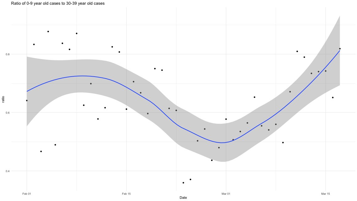
They’re both right, but the Ministry of Health is not giving out the most helpful numbers or comparisons to understand how much it’s really a problem.

There are three basic reasons for testing: regular surveillance for people in certain high-risk jobs, testing of contacts, and testing of people with symptoms.  The number of surveillance tests is pretty much uninformative — it’s just a policy choice — but the proportion of positive tests is a strong signal.  The number of tests done for (not yet symptomatic) close contacts tells us about the effectiveness of contact tracing and about the number of cases in recent days (which we knew), but it doesn’t tell  us much else, and the positivity rate will mostly depend on who we define as close contacts rather than on anything about the epidemic.  The number of tests prompted by symptoms actually is an indicator of willingness to test, and the test positivity rate is an indicator of Covid prevalence, but only up to a point.

There’s another external factor confusing the interpretation of changes in symptomatic testing: the seasonal changes in the rate of other illnesses.  When Delta appeared, testing was higher than when Omicron appeared.  That could be partly because people (wrongly) thought Omicron didn’t matter, or (wrongly) thought it couldn’t be controlled, or (perhaps correctly) worried that their employers would be less supportive of being absent, or thought the public health system didn’t care as much or something.  It will also be partly because fewer people have colds in December than in August.

As a result of much collective mahi and good luck, most of the people getting tested because of symptoms actually have some other viral upper-respiratory illness, not Covid.  At times of year when there is more not-actually-Covid illness, testing rates should be higher. August is winter and kids had been at school and daycare; it’s the peak season for not-actually-Covid. December, with school out and after a long lockdown to suppress various other viruses, is low season for not-actually-Covid. Fewer tests in December is not a surprise.

Not only will more colds mean more testing, they will also mean a lower test positivity rate — at the extreme if there were no other illnesses, everyone with symptoms would have Covid. The two key testing statistics, counts and positivity rate, are hard to interpret in comparisons between now and August.

It would help some if the Ministry of Health reported test numbers and results by reason for testing: contacts, symptoms, regular surveillance. It would help to compare symptomatic testing rates with independent estimates of the background rate of symptoms (eg from Flutracker).  But it’s always going to be hard to interpret differences over long periods of time — differences over a few weeks are easier to interpret, preferably averaged over more than one day of reporting to reduce random noise.

None of this is to disagree with the call for people with symptoms to get tested.  We know not everyone with symptoms is tested; it’s probably been a minority throughout the pandemic. Getting the rate up would help flatten the wave of Omicron along with masks and vaccines and everything else.