Posts written by Stephen Cope (7)

avatar

Stephen Cope is more than a little cautious about believing studies that defy belief. He wants to see the numbers first.

March 16, 2012

The $8 billion iPod

Actual numbers from entertainment industry lawyers and lobbyists form the basis for this, frankly, unbelievable talk about Copyright Math(TM).

http://www.ted.com/talks/rob_reid_the_8_billion_ipod.html

While this talk may seem amusing, the figures he quotes are used to justify all sorts of real world implications for you and I. The Copyright (Infringing File Sharing) Amendment Act came into power last year, the US Embassy attempted to write Section 92A for New Zealand, and now new trade agreements are being negotiated.

Next time you see unbelievable claims, specifically of a numerical nature, question the figures.

And remember to insure your music collection. It’s worth billions.

November 7, 2011

MV Rena oil graphic

Articles about the MV Rena appeared in the New Zealand Herald over the past week and I’m surprised they didn’t show up in the Stat of the Week competition.

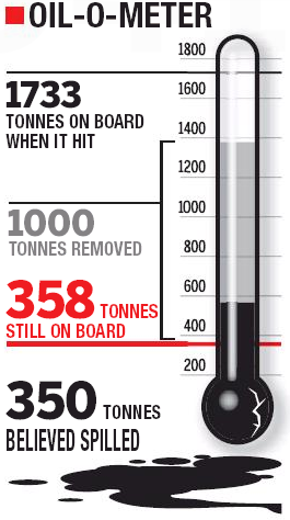
Let’s take a look at one in particular, from October 31. See that graphic there? Cam Slater didn’t like the manipulated Likert-scale, but I was more concerned by the thermometer:

It raises more questions than it answers, and even after several minutes staring at it and trying to decipher it, I was even more bewildered. The areas are overlapping, there’s a giant bulb on the bottom hiding where 0 belongs, and the different colours and sizes drag the eye around in a mad series of saccades.

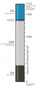
I took it upon myself to redo this into something a bit tidier and less confusing. Is it better? I’ll let you be the judge of that:

November 4, 2011

Every 46 seconds.

A full page advertisement in today’s New Zealand Herald proclaims:

Every 46 seconds a Kiwi is rewarded by Fly Buys

I, for one, am not impressed.

October 21, 2011

Our RWC 2015 team was born in March 1987

Were you born between January and March in 1987? Congratulations – you’re picked for the RWC 2015 New Zealand team!

This rather ridiculous (and untrue) piece of information I just made up was concocted by examining some data and coming to an unsubstantiated conclusion. I was inspired to do this because I read recently in a British tabloid that one should “Give birth in March for a pilot” and “Victoria Beckham’s [daughter] likely to become bricklayer”. Finding the exact source of the study from the Office of National Statistics was troublesome but instead led me to a lot of advice for when to get pregnant so your child could be a dentist.

Without seeing the original study we cannot say what got twisted around between when the UK Census was collected and when the tabloids hit the news stands. The methodological insight that we get from the Daily Mail suggests that the monthly professions-of-choice are those “with the greatest percentage above the monthly average”. Well, pick a bunch of numbers and there will be a biggest one! It doesn’t necessarily condemn your January-born aspiring sheet-metal worker to the life of a GP.

A further concern arises from multiple comparisons. The more things you look for, the more “oddities” or coincidences you’ll find – none of them have to mean anything at all. Compare 19 professions against 12 months and that’s 228 chances to find something a little unusual. You’re sure to go away with a juicy collection of headlines for these pains. Even further, oddities in the statistical sense can be decidedly underwhelming in practical terms, if we are dealing with huge numbers of respondents as in the UK census. It might be statistically all-but-certain that “Spring birth conveys height advantage” but the height advantage in question turns out to be only 6 mm.

One place where we can see a real and well-studied effect from month of birth is sport. Sport is seasonal and, unlike dentistry, has a very clear starting time every year. If sports are organised by age-group and you are among the oldest in the group, you have almost a year’s advantage over the youngest. For children, a year is a big deal in terms of size, physical coordination, and maturity – and this advantage snowballs throughout childhood as you get picked for the best teams, practise more, play against better opponents, and on and on. Ad Dudink examined Dutch and English soccer players in 1994, following in the footsteps of Barnsley and Thompson who examined Canadian hockey players in 1985 and 1988.

As for whether you’ll be a dentist or a bricklayer, it is possible that this can be affected by birth month, because the age differential in the school year affects children’s academic outcomes in a similar (but less drastic) way to sports teams. In the UK, children start school in September, so September-born children have a year’s maturity advantage over their August-born classmates. This is not a temporary effect: studies have shown that the advantage/disadvantage continues to school-leaving exams and university.

In New Zealand our school season begins in February, so don’t expect the same education outcomes to birth month misconnections as the United Kingdom.

But how about them All Blacks?

I extracted the place and date of birth of each of the team members listed for the All Blacks and French teams from the Rugby World Cup 2011 website, which I then ran through sed, R and finally dumped into Excel.

Then I separated the players out into hemisphere of birth, as each hemisphere has a different season start. All the French players were born in the northern hemisphere, and all the All Blacks were born in the southern hemisphere, making my life a bit easier.

I’ve plotted them here. French (blue) above the equator, and All Blacks (black) below:
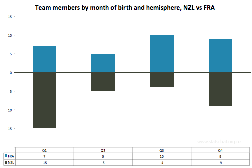
Graph of data

Team members by quarter of birth and hemisphere, NZL vs FRA

Eyeballing that does suggest some stories about when to be born if you want to play for the All Blacks or the French, but being born in January to March isn’t going to get you straight onto the All Black squad. There are many other factors that influence your selection:

Eat a healthy diet, high in Weet-Bix, exercise often, and most importantly, you can increase your chances of being on the squad by starting to play rugby.

A few references and citations for further reading:

^ Jessica Utts (2003). What Educated Citizens Should Know About Statistics and Probability. The American Statistician. May 1, 2003, 57(2): 74-79. doi:10.1198/0003130031630

^ Weber GW, Prossinger H, Seidler H (1998). Height depends on month of birth. Nature, 391(6669), 754-755 doi:10.1038/35781

^ Dudink A (1994). Birth date and sporting success. Nature, 368(6472), 592.

^ Barnsley RH, Thompson AH, Barnsley PE (1985). Hockey success and birth-date: The relative age effect. Journal of the Canadian Association for Health, Physical Education, and Recreation, Nov.-Dec., 23-28.

^ Barnsley RH, Thompson AH (1988). Birthdate and success in minor hockey: The key to the N.H.L.. Canadian Journal of Behavioral Science 20, 167-176.

Wiseman, R (2008). Quirkology: The Curious Science Of Everyday Lives, 28-29 ISBN: 9780330448093

Back in 2008 the All Black squad was also dominated by January – March births: http://rowansimpson.com/­2008/12/07/31-december/

September 30, 2011

Infographic: Laundry by family member

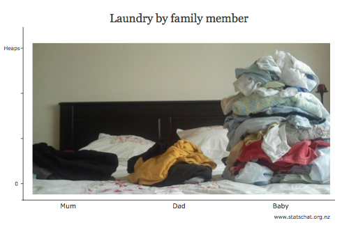
Data visualisation is difficult to do correctly, but this one just sort of fell out while I was sorting the family’s laundry:

Three stacks of laundry: Mum, Dad, Baby (gigantic)

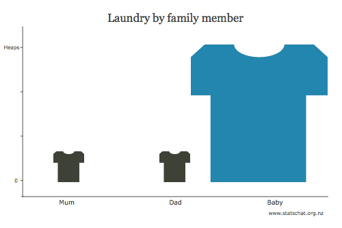
This sort of graphical representation is easy to do improperly, the most common offence being to scale on more than one axis, causing the area to confusingly increase at a much greater rate than the underlying data:

Three stacks of laundry, badly represented by a scaled picture

Here I demonstrate just one of many ways in which the graph can be manipulated to mislead the eye and thus the viewer.

Edward Tufte would still dislike my original graphic: there’s too much “chart junk” in the background. Move that pillow!

September 22, 2011

Death by toaster or death by terrorism?

Which do you think is more likely to kill you? A toaster or Islamic extremist terrorism? The answer may surprise you.

Security guru Bruce Schneier has written a piece entitled Terrorism in the U.S. Since 9/11. As a critic of the excesses of the United States of America’s response to the events of September 11, 2001, Schneier compares the spending on anti-terrorism with the number of lives saved.

In my opinion, the most interesting part was where he refers to a Comparison of Annual Fatality Risks published deep inside Hardly Existential: Terrorism as a Hazard to Human Life by John Mueller and Mark G. Stewart:

You have a 1 in 1,500,000 chance of being killed by a home appliance every year in the United States, but only a 1 in 3,500,000 chance of being killed by terrorism.

August 18, 2011

All suicides are tragic — but is the suicide rate at the iPhone factory unusual?

Over the last few years, Chinese manufacturer Foxconn has attracted attention from the international media for a spate of suicides in its factories. Foxconn makes products for Apple, including the iPhone and iPad, and manufactures for Sony, Zoostorm, Dell, and Nokia. It employs 1.2 million people in China, with its factory in Shenzhen employing 300,000 people alone.

Articles such as “Another Foxconn worker commits suicide” (NZ Herald 21 July 2011) blame working conditions and long hours of work for the number of suicides. Last year, 14 Foxconn employees committed suicide – most jumped to their deaths – resulting in the company installing netting around the factory and dormitory buildings.

Undoubtedly the working conditions are tough at Foxconn, but what do we make of this suicide rate? Is the suicide rate at Foxconn a lot higher than the suicide rate in the whole population? You’d think so, from all the media attention.

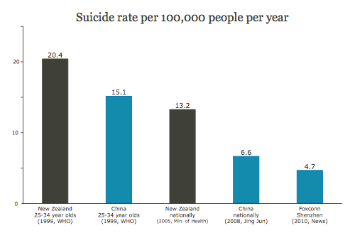
What is the suicide rate in China? It’s actually quite difficult to get a sense of the actual rate, as official figures and independent sources vary wildly from 6.6 to 30.3 per 100,000 per year. (Jing Jun, 2008, Samuel Law and Pozi Liu, 2008) For comparison, New Zealand’s suicide rate is roughly 13 suicides per 100,000 people per year (WHO, 1999, Ministry of Health, 2005).

Even if we take the lowest reported rate of 6.6 per 100,000 people per year, the Foxconn suicide rate among its mammoth workforce of 1.2 million is well below this rate. Taking a conservative view, if the 14 suicides in 2010 occurred amongst Foxconn’s 300,000 workers in Shenzhen, the rate works out to 4.7 per 100,000 people per year.

Another factor that could be at play is age. The people working at Foxconn would be young, say in the 25-34 year old group, and we know that this age group in New Zealand has a higher suicide rate than others. Surprisingly, this does not appear to be the case in China, where elderly people tend to have a higher suicide rate. (Jing Jun, 2008, WHO, 1999)

While each Foxconn suicide is a tragedy, with such a large workforce 14 suicides in 2010 is neither unexpected nor unusual. If anything, Foxconn’s workers have a lower suicide rate than could be expected, on average, amongst their peers.

The newspaper reports infer that there is a link between suicides and working conditions, and that the number of suicides is unusual.


Suicide rate per 100,000 people per year

Suicide rate per 100,000 people per year: China nationally 6.6, Foxconn Shenzhen 4.7


Disclaimer: There are many complex cultural and sociological factors at work, as well as pressures that inflate or deflate reported data from China.