Stat of the Week Competition Discussion: July 14 – 20 2012
If you’d like to comment on or debate any of this week’s Stat of the Week nominations, please do so below!
Rachel Cunliffe is the co-director of CensusAtSchool and currently consults for the Department of Statistics. Her interests include statistical literacy, social media and blogging.
If you’d like to comment on or debate any of this week’s Stat of the Week nominations, please do so below!
Each week, we would like to invite readers of Stats Chat to submit nominations for our Stat of the Week competition and be in with the chance to win an iTunes voucher.
Here’s how it works:
Next Monday at midday we’ll announce the winner of this week’s Stat of the Week competition, and start a new one.
If you’d like to comment on or debate any of this week’s Stat of the Week nominations, please do so below!
The first international competition to recognize outstanding work in the growing field of data journalism, the Data Journalism Awards, has just announced the 58 nominees for the 2012 awards.
The competition is being run by the Global Editors Network, supported by Google and in collaboration with the European Journalism Centre.
The University of Auckland’s Jonathan Albright is one of the nominees for his data-driven investigation Did Twitter censor Occupy Wall Street. Congratulations Jonathan!
Winners will be announced on May 31 during the News World Summit in Paris.
I’m very excited to learn that the Data Journalism Handbook is now live and I am looking forward to reading it. The handbook features contributions from over 70 leading practitioners of data journalism from every corner of the globe, from Japan to Finland, Nigeria to the US and from leading news outlets such the New York Times, Zeit Online, the BBC and the Guardian.
It’s an open educational resource, under a creative commons licence (CC-BY-SA) so you may share it and remix it. It is hoped that the handbook will encourage many budding data journalists to look at data as a source and give them courage to tackle it, as well as showcasing some great examples of journalism using data as inspiration for future stories.
You can find the handbook at: http://datajournalismhandbook.org/
Also available for pre-order is the e-book and print version from O’Reilly Media: http://oreil.ly/ddj-e-print.
I’m part of a panel discussion on Media7 tonight (TVNZ7, 9:05pm) on the future of public broadcasting.
We discuss an erroneous weekly cumulative audience statistic which originated from the then broadcasting Minister, Jonathan Coleman: why you just can’t take the monthly cumulative audience and divide by four to get the weekly cumulative audience.
Today’s front page of the Sunday Star Times has a bubble chart showing the amount of hectares purchased by foreigners in the past 5 years:
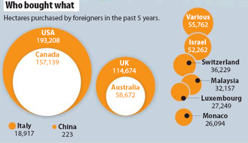
Sunday Star Times, 5 February 2012, “Who is really buying New Zealand?” A1
While bubble charts are a trendy way to present data, it is well-known that people find it hard to judge areas and even more so when the circles are not concentric (their centres don’t coincide) or when the shapes overlap as in the Sunday Star Times’ chart.
However, there’s more problems with this graph. The bubble sizes just don’t match the data.
Compare USA with Canada – the area bought by Canadians was about 81% of the amount brought by Americans but the area in their chart is only about 58%.
It should have looked like this:
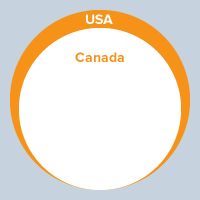
Compare China with Italy and you definitely know something has gone wrong in the calculations.
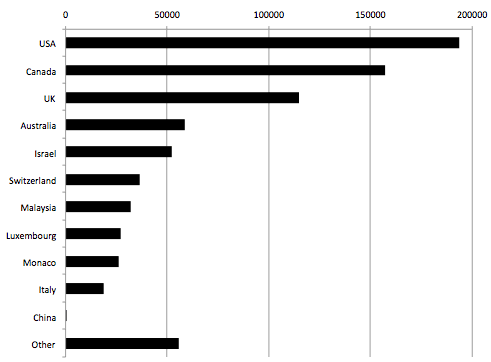
A better way to compare is via a bar chart: not quite as sexy looking but much easier to make comparisons:
Local media have been discussing the Chinese year of the dragon which starts on January 23rd and comes around every twelve years:
“Many Chinese consider the Year of the Dragon to be the most auspicious year to have a child. Those born under the sign of the dragon – the fifth, and the mightiest of the 12 Chinese zodiac signs – are said to be outstanding, driven, independent and destined for success.
[Feng shui practitioner] Mrs Chan said there would definitely be a spike in the number of Chinese mothers in New Zealand giving birth, but did not believe the numbers were large enough to affect hospitals or the health system.”
Out of curiosity, I had a look at the birth rate statistics (births per 1,000 population) for China:
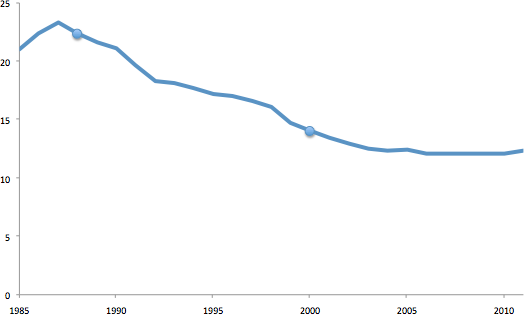
The two dots indicate the year of the Dragon – no a year of the dragon spike at all.
I couldn’t get detailed enough statistics on birth rates for women of Asian descent in New Zealand – they were grouped together over a period of years.
However, researchers have found a (small) year of the Dragon effect on birth rates in other Asian countries – their paper on the subject and its history is fascinating.
Here’s an example in Hong Kong:
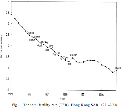
They conclude:
“birth rate rise in the Dragon Year is due to changes in timing of births that will have little effect on cumulative fertility.”
I would have liked to have seen some numbers about the “spikes” mentioned in the news stories to give context to how big this effect is (or isn’t).
Megan McArdle at The Atlantic critiques the recent online infographics trend:
…it’s time to get down to a war that really matters: the war on terrible, lying infographics, which have become endemic in the blogosphere, and constantly threaten to break out into epidemic or even pandemic status.
The reservoir of this disease of erroneous infographics is internet marketers who don’t care whether the information in their graphics is right … just so long as you link it.
Megan critiques a series of infographics and is well worth the read.
Statistics are easy: All you need are two graphs and a leading question:
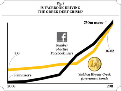
More correlation versus causation examples at Business Week.
Recent comments on Rachel Cunliffe’s posts