Search results for pie chart (66)

February 1, 2022

Pie charts, Oz edition

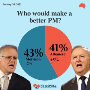
From The Australian (via Luke Wihone on Twitter)

There’s two issues here. First, they are called percentages for a reason — they should add up to 100. This is what it looks like with the missing 16%
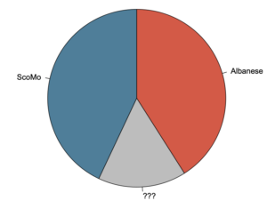
Even if you decided to rescale the percentages to give a two-candidate pie, though, the graph is wrong. This is what it would actually look like
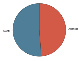
That’s Australia. A graph like this one used in New Zealand politics would seem to come under the  Advertising Standards Authority decision saying misleading graphs are not actually misleading if they have the numbers written on them.  As I said at the time, I think this is bad as a matter of political norms and factually incorrect as to the impact of graphics. Maybe we can get it changed.
May 31, 2019

Pie chart of the week

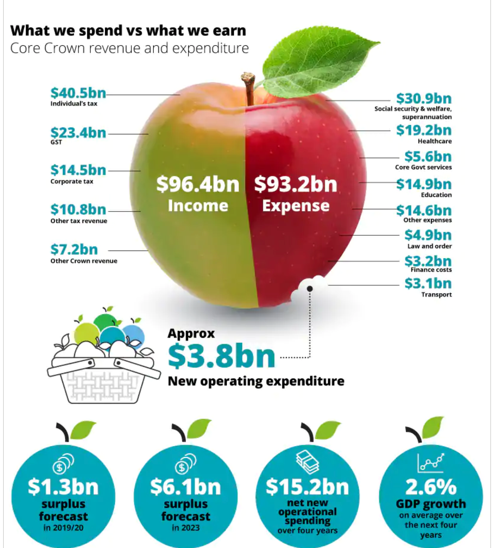
From Deloitte’s NZ budget infographic, via Siouxsie Wiles

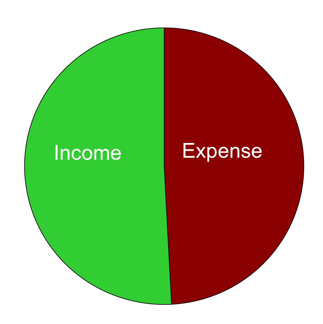
This is weird as a pie chart because the two sections aren’t components of a whole (which is how pies, or Camembert, work). It’s also strange that the new operating expenditure is shown as a bite out of expenses, when it actually makes expenses larger than they would be without it.

On top of all that, the divisions of the apple aren’t actually in proportion to the numbers.  This is what a pie chart with those numbers would look like: the difference between the halves is nearly invisible.

October 30, 2015

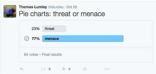
Pie charts “a menace”, study shows

StatsChat can reveal exclusive study results showing that pie charts are a menace to over 75% of us.

Although these round, delicious, data metaphors have been maligned in the past, this is the first research of its kind, based on newly-available survey technology.

Researchers used an online, multi-wave, respondent-driven sampling scheme to reach thousands of potential respondents. 77% of responses agreed that pie charts are a menace.

threatormenace

Aren’t these new Twitter polls wonderful?

August 14, 2015

Sometimes a pie chart is enough

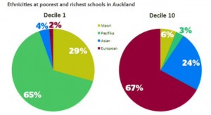
From Kirsty Johnson, in the Herald, ethnicity in the highest and lowest decile schools in Auckland.

CMUU_JjUYAAsWbG

Statisticians don’t like pie charts because they are inefficient; they communicate numerical information less effectively than other forms, and don’t show subtle differences well.  Sometimes the differences are sufficiently unsubtle that a pie chart works.

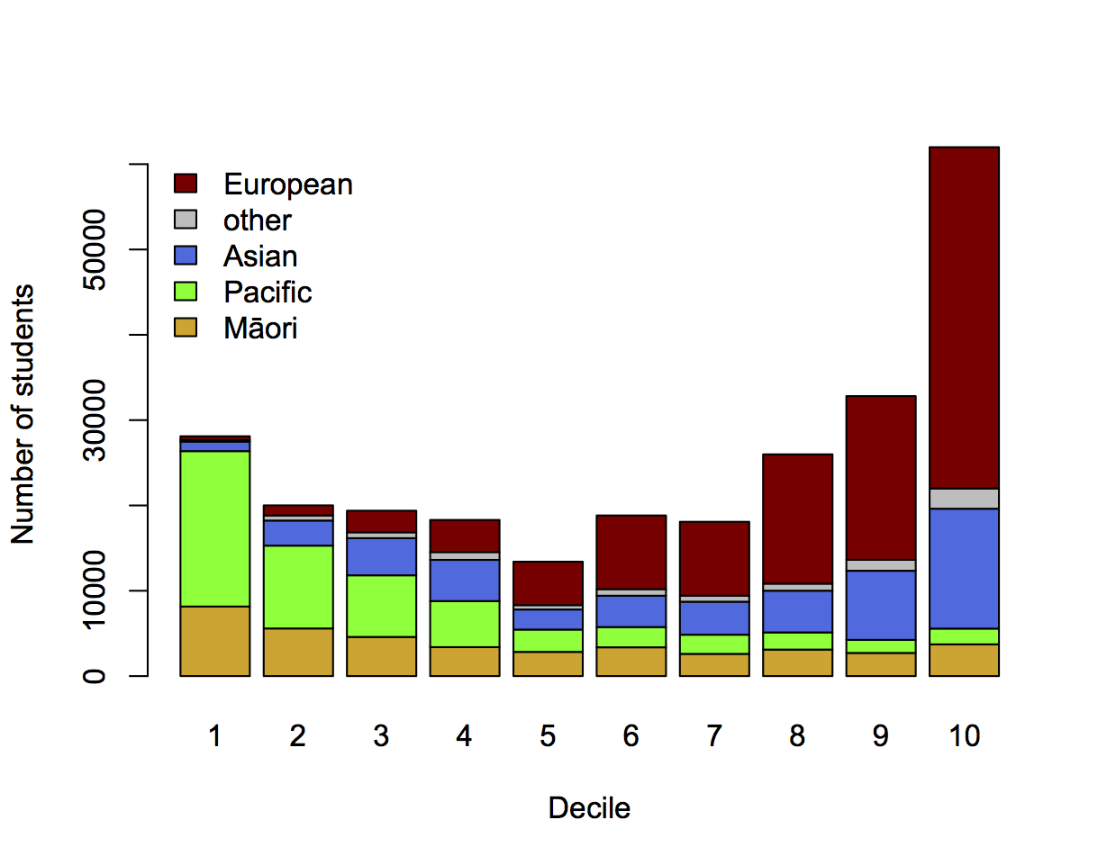
It’s still usually not ideal to show just the two extreme ends of a spectrum, just as it’s usually a bad idea to show just two points in a time series. Here’s the full spectrum, with data from EducationCounts

ethdec


[The Herald has shown the detailed school ethnicity data before in other contexts, eg the decile drift story and graphics from Nicholas Jones and Harkanwal Singh last year]

I’ve used counts rather than percentages to emphasise the variation in student numbers between deciles. The pattern of Māori and Pacific representation is clearly different in this graph: the numbers of Pacific students fall off dramatically as you move up the ranking, but the numbers of Māori students stabilise. There are almost half as many Māori students in decile 10 as in decile 1, but only a tenth as many Pacific students.

If you’re interested in school diversity, the percentages are the right format, but if you’re interested in social stratification, you probably want to know how students of different ethnicities are distributed across deciles, so the absolute numbers are relevant.


August 2, 2015

Pie chart of the week

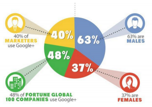
A year-old pie chart describing Google+ users. On the right are two slices that would make up a valid but pointless pie chart: their denominator is Google+ users. On the left, two slices that have completely different denominators: all marketers and all Fortune Global 100 companies.

On top of that, it’s unlikely that the yellow slice is correct, since it’s not clear what the relevant denominator even is. And, of course, though most of the marketers probably identify as male or female, it’s not clear how the Fortune Global 100 Companies would report their gender.

CLW5t4PWUAAvPNp

From @NoahSlater, via @LewSOS, originally from kwikturnmedia about 18 months ago.

July 20, 2015

Pie chart of the day

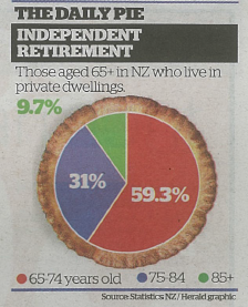
From the Herald (squashed-trees version, via @economissive)

CKUXF6iUsAAWPr-

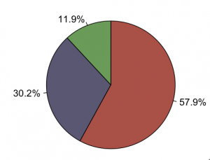
For comparison, a pie of those aged 65+ in NZ regardless of where they live, based on national population estimates:

CKUbriWVAAAWbpT

Almost all the information in the pie is about population size; almost none is about where people live.

A pie chart isn’t a wonderful way to display any data, but it’s especially bad as a way to show relationships between variables. In this case, if you divide by the size of the population group, you find that the proportion in private dwellings is almost identical for 65-74 and 75-84, but about 20% lower for 85+.  That’s the real story in the data.

October 29, 2013

Pie chart of the week

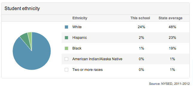
whitepieFrom “Great Schools”, a US website with information about schools, via wtfviz.net

September 23, 2013

Unclear on the pie chart concept

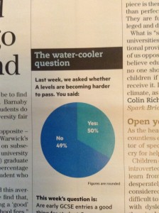
The pie-chart problems that Melbourne’s Herald-Sun had with their bogus polls appear to be spreading. This one is from wtfviz.net (via @TimHarford), and apparently comes from Britain’s TES magazine.

tespie

I suppose it’s encouraging that this sort of thing seems only to happen for bogus polls, not for actual data.


September 21, 2013

Pie chart of the week

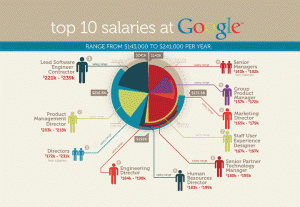
Originally from jobvine.co.za, via a Harvard Business Review piece on data visualisation, this graph is supposed to show salary ranges for different positions.

from jobvine.co.za


It really doesn’t.  Read the HBR story for a better version.

January 24, 2013

Pie charts rot the brain

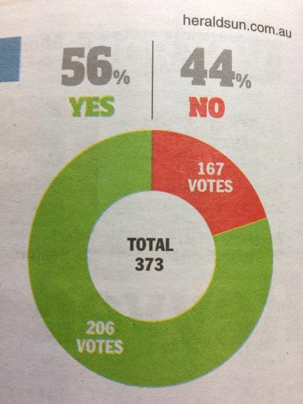
Evidence from a well-known West Island newspaper

hun


The chart says about 20%, the numbers say 44% (actually 45% if you can round correctly, but let’s not quibble).  (via and)