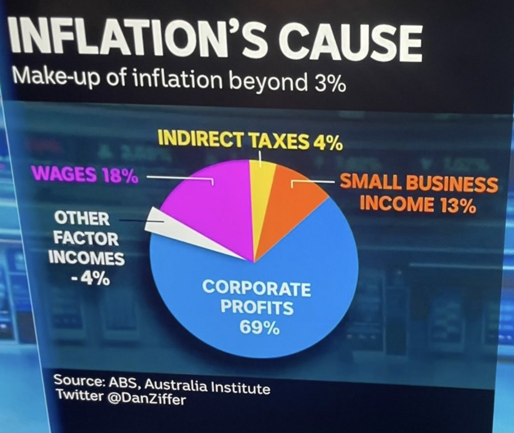
Pie and anti-pie
There are other issues with this graph (from the ABC’s Dan Ziffer): these are components of inflation rather than causes, why ‘beyond 3%’? The big issue, though, is the pie, where the positive number add to 104% and then there’s the negative 4%.
You can’t have negative numbers in a pie chart; that isn’t how pies work. If you combine 104% of a pie and 4% of an anti-pie, you’ll end up on this list
Thomas Lumley (@tslumley) is Professor of Biostatistics at the University of Auckland. His research interests include semiparametric models, survey sampling, statistical computing, foundations of statistics, and whatever methodological problems his medical collaborators come up with. He also blogs at Biased and Inefficient See all posts by Thomas Lumley »

I hope they can get this sorted because there is quite an important policy issue here – should we be raising interest rates to fight inflation in a rather blunt and broadbrush way, or are there more targetted means available to us?
2 years ago