Vaccination: survey vs data
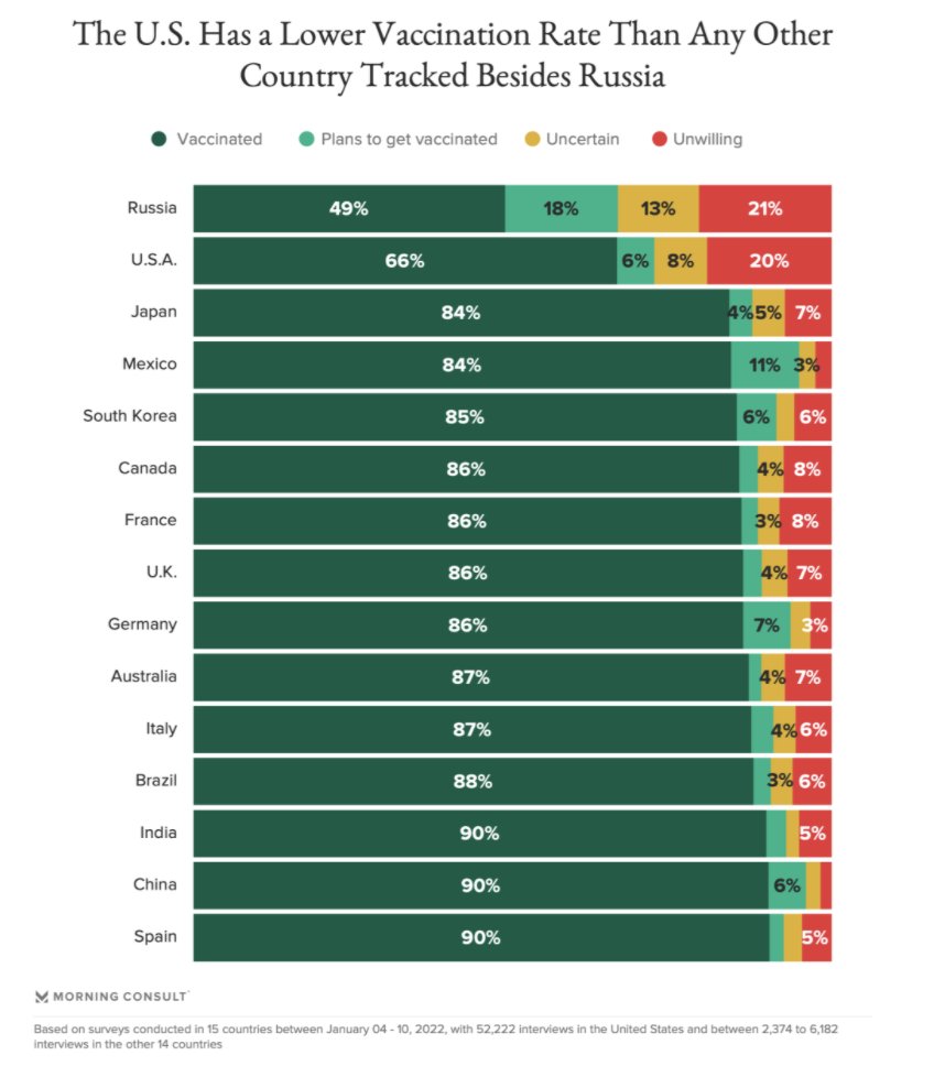
This showed up on my Twitter feed this morning, originally from here. It triggered a certain amount of wailing and gnashing of teeth from Americans.
The basic pattern looks plausible; about two-thirds of the US population vaccinated. If you look carefully at the graph, you see something else: the ‘not vaccinated’ group are broken down by attitude. This can’t be an all-ages picture: if anyone is doing large-scale surveys of attitudes to Covid vaccination among six-year-olds around the world it’s (a) a revolution in survey methods that we should know more about and (b) not all that relevant to whether the six-year-olds get vaccinated.
As the description at the link says, this was based on a survey of adults. It was supposed to be nationally representative samples of adults. It clearly wasn’t. Based on doses delivered, the USA reached 75% vaccination for adults by October; Australia is currently over 95% in adults. The qualitative message might be true, but the numbers aren’t right.
We saw recently how two big non-random US surveys had overestimated vaccination rates, the opposite problem. Why do people do this when we already know the answer? The surveys are (potentially) useful because they ask other questions: they can break down vaccination by other attitudes and circumstance of the respondent, which the CDC data cannot do. It still matters if the answers are right, though.
Thomas Lumley (@tslumley) is Professor of Biostatistics at the University of Auckland. His research interests include semiparametric models, survey sampling, statistical computing, foundations of statistics, and whatever methodological problems his medical collaborators come up with. He also blogs at Biased and Inefficient See all posts by Thomas Lumley »
