Every subgroup
Various people have created graphics showing the breakdown of vaccination rates across subpopulations of New Zealand. They aren’t great (the vaccination rates, not the graphics), but they are improving. As the graphics show, vaccination rates are lower in some subgroups than others. Even when we get to 90% coverage on average, we could be well below 90% for some groups of people. This is a problem for two reasons.
The first reason is obvious: equity. People who haven’t been vaccinated yet aren’t just freeloading, they have reasons. For some people it’s harder to get to a vaccination (because of work hours or because they live somewhere remote). Others don’t trust the medical system — often for reasons that were well founded historically. It’s important to make sure everyone has a real opportunity to get vaccinated.
The second reason is less obvious and more statistical: we need a higher vaccination rate if the unvaccinated are not evenly distributed through society. A cluster of people with lower vaccination rate will not only be at risk of Covid themselves, they will be an opportunity for Covid to spread. This is true of ethnic groups, but also of churches, dog-walkers, soccer moms, fans of provincial rugby, or nerds at statistics conferences.
Modelling the full complexity of NZ society and Covid dynamics is beyond what I have the data and computation resources to do, so I coded up a very simplified model to show, qualitatively, the sorts of things that can happen. This is a fairly common use of mathematical models: not just to predict what will happen, but to show the range of behaviours that are possible.
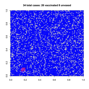
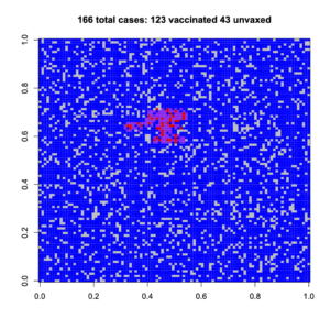
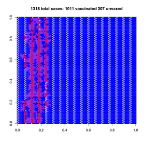
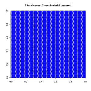
The model is a 100×100 grid, where people can only infect their neighbours (no-one accidentally flies to Wānaka or has a job as a truck driver). Vaccination reduces your risk of being infected, and also reduces your risk of passing on the infection. With a random 83% of the population vaccinated, the outbreaks can’t spread far (83% of the NZ population is about 95% of the 12+ population). Here are two random outbreaks. Blue is vaccinated, grey is unvaccinated; purple is vaccinated and infected, red is unvaccinated and infected
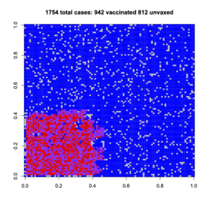
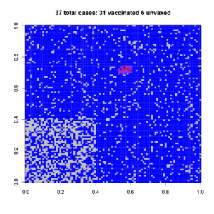
Now, suppose we have the same 83% vaccination on average, but there’s a high-risk group (lower left) who are less vaccinated and who cluster together. If we’re lucky, a random outbreak misses them; if we’re not, it hits them
Having a non-uniform spread of unvaccinated people increases the number of cases for them, and also for vaccinated people.
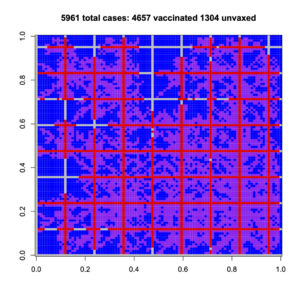
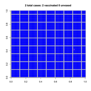
We can get more dramatic sorts of clustering, where a group of unvaccinated people are connected to each other and also across society. Again, if we’re lucky, the outbreak hits only vaccinated people; if we’re not lucky, it spread very widely and more vaccinated people are infected than with a uniform spread. Do you feel lucky?
And a more dramatic example, with criss-cross connections of unvaccinated people
These obviously aren’t realistic depictions of New Zealand society, which isn’t square or blue and has lots of long-distance connections. They are, though, depictions of the sort of impact that population structure is able to have on disease spread. These example all have the same overall, high, vaccination rate, but they have very different outbreaks.
It’s not enough to get good vaccine coverage on average. Every subgroup matters.
