Vaccine percentages
A few assorted issues:
First, the denominator questions — not the question of the actual population of NZ, which Henry Cooke is in charge of, but the eligibility and ethnicity questions.
Should we be quoting vaccination as a percentage of those eligible or as a percentage of the population? Yes, both. They answer two different important questions. There’s a question of epidemic dynamics: are we getting to a point where enough people are vaccinated for Delta to be controllable more easily? What’s relevant there is vaccination as a percentage of the population; kids still count as unvaccinated, even though they aren’t eligible. There’s also a social question: are we providing the right access, information, and incentives to get people vaccinated? What’s relevant there is vaccination as a percentage of those eligible.
Next, ethnicity. I’ve seen people asking how ethnicity is counted in the MoH reports. Most of the NZ government tries to count people according to all the ethnicities they identify with — you can be in multiple categories. As a result, the categories add up to more than 100% of the population. The Ministry of Health does something different. If you give them multiple ethnicities, they pick one. They prioritise: you’re Māori if that’s one of your ethnicities; you’re Pacific if that’s one of your ethnicities and Māori isn’t; you’re Asian if that’s one of your ethnicities and Māori and Pacific both aren’t, and so on. The advantage of this is that subgroups add up nicely: the number of vaccinations overall is the sum of the numbers in each ethnic group. The disadvantage is that you may not be in the group or groups you expect.
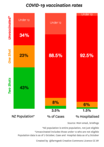
Finally, pictures like this (this one is from @farmgeek on Twitter)
This is aiming to show the protective effect of vaccines. It’s a lot better than just reporting the % vaccinated among cases or hospitalised cases, because it shows the denominator. The ratio of the red:green ratios in two bars is an estimate of one aspect of vaccine effectiveness; you can see it’s big.
It’s not a perfect estimate, for two reasons. The first is differences in exposure. If people who are unvaccinated are also more likely to be exposed, the vaccine will look more effective than it is; if people who are unvaccinated are less likely to be exposed the vaccine will look less effective than it is. Both of these are likely: vaccination and exposure is broadly higher in Auckland than in the rest of the country, but within Auckland vaccination is higher in areas where exposure is probably lower.
On top of any differences in exposure, a graph like this underestimates the impact of the vaccine because it misses out the reduction in unvaccinated cases due to the vaccine. Getting vaccinated protects you, but as the vaccination rates slowly rise, getting vaccinated also increasingly protects other people, regardless of their vaccination status. Measles is a good example here: vaccinated people are almost never hospitalised for measles, because the vaccine protects us, but very few unvaccinated people are hospitalised for measles because community vaccination levels slow the outbreaks down enough for testing and tracing to control them.
Thomas Lumley (@tslumley) is Professor of Biostatistics at the University of Auckland. His research interests include semiparametric models, survey sampling, statistical computing, foundations of statistics, and whatever methodological problems his medical collaborators come up with. He also blogs at Biased and Inefficient See all posts by Thomas Lumley »

About the chart as a tool to estimate vaccine effectiveness, there is a third (but not by importance) reason: it does not show percentages by age. Elderly people are the ones most affected by covid and hence hospitalization, so their un/vaccinated percentages (and their weight among the whole population) count more than in other ages.
Without disaggregating by age you can stumble into all sorts of trouble like Simpson’s paradox.
4 years ago