January 29, 2020
Briefly
- Via Alberto Cairo’s blog, a beautiful example of how to annotate a data graphic of time-use data, at the Financial Times
- If you happen to want data-visualisation themed coffee mugs, Martin Telefont has some
- The Geography of FM Radio (via Nathan Yau on Twitter): spatial patterns of US radio stations. Some types follow population density; others strikingly don’t.
- From Peter Ellis: how much effect does seeding have in a tennis tournament? It doesn’t seem to do a lot for the top player, but it really does increase the chance of the next few getting into the final rounds.
- A computer algorithm can do surprisingly well in answering questions about pictures just by knowing what answers are common for particular questions and without looking at the picture.
- “The data set covers just 300 patients, and only 38 of them gave birth prematurely”, nevertheless, a bunch of computer algorithms thought they could accurately predict preterm birth from electrical activity in the muscles of the uterus, before 37 weeks. The algorithms used some created data examples, intended to boost the effective sample size, which is a perfectly respectable technique. Using those created examples in estimating the final accuracy, on the other hand, can be a problem. [Research preprint]
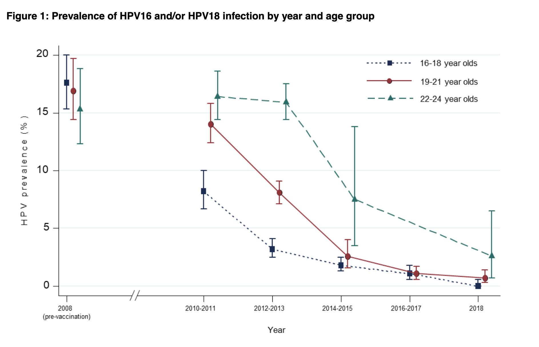
- HPV vaccination is preventing cancer-causing HPV infections: data from the UK (it’s also not currently increasing rates of other HPV strains) (PDF report)

Thomas Lumley (@tslumley) is Professor of Biostatistics at the University of Auckland. His research interests include semiparametric models, survey sampling, statistical computing, foundations of statistics, and whatever methodological problems his medical collaborators come up with. He also blogs at Biased and Inefficient See all posts by Thomas Lumley »