Graph of the week
From the Herald (via @aw_nz on Twitter)
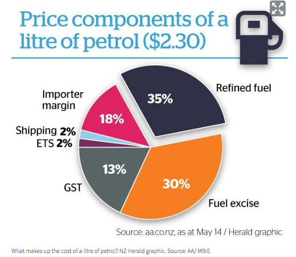
One of the features of pie charts is that it’s relatively hard to judge angles and compare segments. Still, if you get them wrong enough, people can tell. For example, the taxes — the grey and orange wedges — are clearly more than half the circle, but the numbers add to only 43%. Less dramatically, the 13% wedge for GST is larger than the 18% wedge for importer margin, and the 30% wedge for fuel excise is larger than the 35% wedge for refined fuel. You don’t have to be very cynical to wonder whether it’s a coincidence that the tax components are being exaggerated. [update: you don’t, but you’d probably be wrong — see comments]
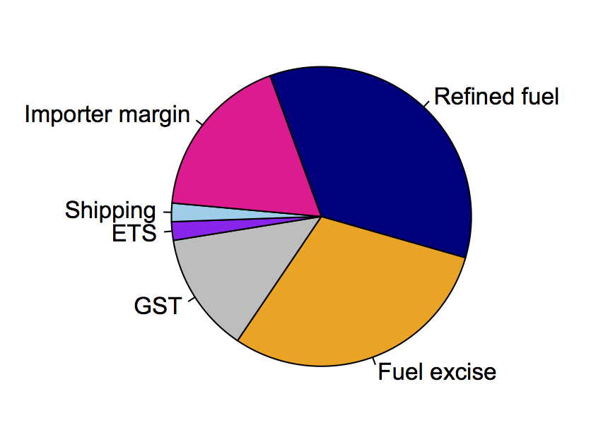
Here’s an accurate piechart, assuming the numbers are correct:
Thomas Lumley (@tslumley) is Professor of Biostatistics at the University of Auckland. His research interests include semiparametric models, survey sampling, statistical computing, foundations of statistics, and whatever methodological problems his medical collaborators come up with. He also blogs at Biased and Inefficient See all posts by Thomas Lumley »


They just mislabelled the 30 as 35 and 13 as 18, I think. And then disconnected the wrong segment.
7 years ago
That actually makes sense. I was wondering how they could have gotten that chart.
So the two main tax components and the two main non-tax components were just switched.
7 years ago
Maybe even the two 2%s! Labels/numbers accidentally in reverse order.
7 years ago
Yes, that fits. They’ve just put the labels and numbers in the opposite order to the wedges.
So it probably *is* just coincidence that it makes the tax component look bigger, although that might have helped with not noticing the error.
7 years ago
The chart also should make it clear it follows the Gull business model, which relies entirely on imported fuel. The other fuel companies get theirs from Marsden Pt ( but sometimes imported), so there is a further breakdown to crude cost and refinery margin.
7 years ago