Polls aren’t dead yet
There’s a new paper in the journal Nature Human Behaviour analysing a huge collection of election poll data: over 30,000 polls. The researchers’ conclusion is straightforward: polls have not become less accurate. Unfortunately, all the nice graphs are behind a paywall. Fortunately, the data isn’t, and I can draw you a nice graph of my own
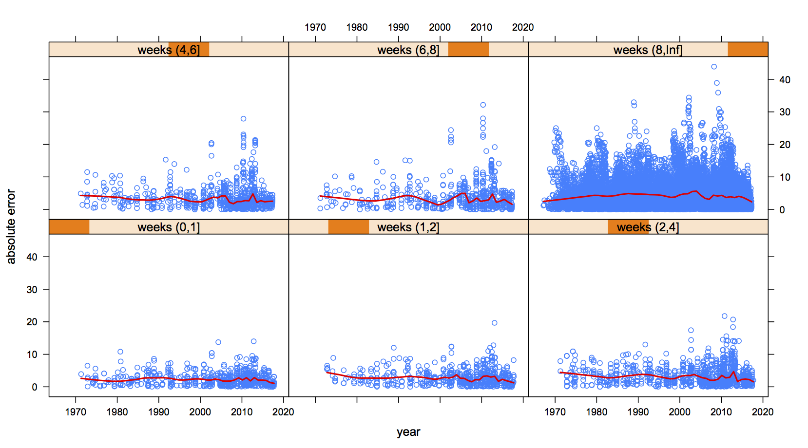
The graph shows all the poll results back to 1970, split up into panels by how many weeks before the election they were. I’m showing just one party per poll: the data have conveniently been coded so it’s a big party (eg Labour for NZ, Conservatives for UK). Each panel shows the error in the poll plotted against the year of the election; the red line is an average.
The red lines are basically flat. Despite cellphones, the internet, political polarisation, and millennials, average polling error hasn’t changed all that much over the past fifty years.