November 20, 2017
Briefly
- “Algorithmic ethics: lessons and limitations for leaders” from the London Business School
- “The Wired Brain: how not to talk about an AI-powered future” from Ines Montani
- “How neural networks build up their understanding of images” from Distill
- “Many pub and restaurant chains do this kind of thing a bit, but none does it with the ruthlessness of Wetherspoon, whose grand, cavernous spaces fill up each day thanks in large part to a menu that reads like several hundred carefully targeted microaggressions against the immediate community.” Graphics and data analysis from the Financial Times
- Maps of cycling to work in Melbourne. The inner north is flat and has nice wide streets suitable for adding bike lanes.
- “At 10am 14 November 2017 NZST, millions of people around the world suddenly had high blood pressure.” from John Pickering
- Keith Ng is joining the Herald as a data journalist!
- The US Supreme Court doesn’t like numbers ““When I read all that social science stuff and the computer stuff, I said, ‘Is there a way of reducing it to something that’s manageable?’” said Justice Breyer, who is nevertheless expected to vote with the court’s liberal bloc. It’s easy to imagine a situation where the answer for this and many other cases is, simply, “No.” The world is a complicated place.“
- Map of changes in tourist numbers in the South Island, from StatsNZ
- Austin Bradford Hill’s causality principles, explained and illustrated with XKCD cartoons, by Lucy D’Agostino McGowan
- “Next time you see some poll breathlessly claiming that 21 percent of Americans support executing anyone whose name starts with “G”, or that 18 percent of Millennials believe themselves to be the reincarnation of Kublai Khan, take it with a grain of salt. It’s a lot easier to give a stupid answer on a survey than to actually truly hold a nuts belief” from Noah Smith
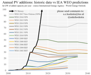
- Porcupine graph: annual projections by the International Energy Agency for rates of installation of new solar panels, from Auke Hoekstra

Thomas Lumley (@tslumley) is Professor of Biostatistics at the University of Auckland. His research interests include semiparametric models, survey sampling, statistical computing, foundations of statistics, and whatever methodological problems his medical collaborators come up with. He also blogs at Biased and Inefficient See all posts by Thomas Lumley »
Liked the Melbourne map of cycling to work. Unlike may of this type the I’ve seen as you scroll in and out it adjusts the magnitude icons. You get an interpretable view at whatever resolution.
7 years ago
The decision of the US College of Cardiology may be related to this
https://news.heart.org/heart-disease-death-rate-continues-to-drop/
Cant let the ‘worried well’ catch a break
7 years ago
It’s more likely to be related to the new randomised trial that showed bigger heart-disease reductions when blood pressure was controlled to below 120mmHg than to below 140mmHg
7 years ago
When there is so much syncope in the intensive treatment group, it makes me wonder whether the intensive treatment group changed their activity levels for fear of falls etc, so never put themselves at the same risk of MI as the other, more active, group.
7 years ago
They do say the trial particpants were “an age of at least 50 years, a systolic blood pressure of 130 to 180 mm Hg …… and an increased risk of cardiovascular events.”
So its not just 130 or over but other higher risks as well, unless they 75 or over.
Strangely the standard treatment group dose rate was reduced when they got between 130 and 135. After 1 year the mean for the higher treatment group was 121.4 and the standard treatment was 136.2.
7 years ago