Creativity and chartjunk
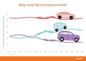
The StatsNZ twitter account has been tweeting creatively decorated graphs. The first one I noticed was

which prompted a discussion on Twitter about why the graph actually still worked well even though you’d normally want to avoid this sort of thing.
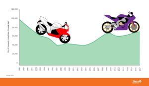
Then, a few days ago, I saw this one via Harkanwal Singh

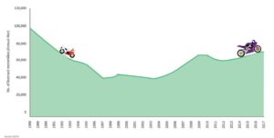
Unlike the cars, which worked as labels, the motorbikes don’t do anything except provide a distraction. They’re a bit better at a smaller size, where they reinforce the local trends in the graph, but I still don’t think they’re a net positive

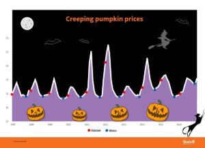
Then today (again via Harkanwal)

Yes, ok, I get that it’s a joke. But pumpkins prices rise at this time of year in New Zealand because it’s Spring. Halloween isn’t a big driver. And most of our pumpkins aren’t even orange (which is why Stuff has a story on alternative things to carve). And winter isn’t a single point in time. And the decoration distracts from the potentially-important observation that prices didn’t really drop last winter. And the vertical axis doesn’t say what the units are (average retail price per kilogram, it turns out).
And… just no.
Figure.NZ has the version you want if you’re after information.
Thomas Lumley (@tslumley) is Professor of Biostatistics at the University of Auckland. His research interests include semiparametric models, survey sampling, statistical computing, foundations of statistics, and whatever methodological problems his medical collaborators come up with. He also blogs at Biased and Inefficient See all posts by Thomas Lumley »