The polls
So, how did the polls do this time? First, the main result was predicted correctly: either side needs a coalition with NZ First.
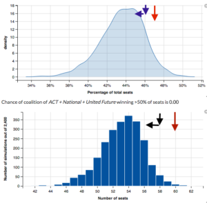
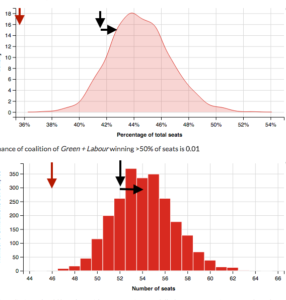
In more detail, here are the results from Peter Ellis’s forecasts from the page that lets you pick coalitions.
Each graph has three arrows. The red arrow shows the 2014 results. The blue/black arrow pointing down shows the current provisional count and the implied number of seats, and the horizontal arrow points to Graeme Edgeler’s estimate of what the special votes will do (not because he claims any higher knowledge, but because his estimates are on a web page and explain how he did it).
First, for National+ACT+UnitedFuture
Second, for Labour+Greens
The result is well within the uncertainty range of the predictions for Labour+Greens, and not bad for National. This isn’t just because NZ politics is easy to predict: the previous election’s results are much further away. In particular, Labour really did gain a lot more votes than could reasonably have been expected a few months ago.
Update: Yes, there’s a lot of uncertainty. And, yes, that does mean quoting opinion poll results to the nearest 0.1% is silly.
Thomas Lumley (@tslumley) is Professor of Biostatistics at the University of Auckland. His research interests include semiparametric models, survey sampling, statistical computing, foundations of statistics, and whatever methodological problems his medical collaborators come up with. He also blogs at Biased and Inefficient See all posts by Thomas Lumley »


Why, in human terms, is there a bi-modal graph for a National-Labour coalition?
And for a National-Labour-NZFirst-Māori coalition, with no chance of labour winning any Māori seats nor of ACT winning Epsom, there’s an obviously non-zero chance of exceeding 100%; does that represent overhang seats, or just shortcomings of the model?
8 years ago
There’s a bimodal graph for Nat/Labour because of uncertainty about the Greens getting over the threshold
8 years ago
The allocation of seats being potentially over 120 *is* due to possible overhang seats for the Māori Party — it goes away when you adjust the Māori seat probabilities to make Labour win them all.
The over-100% vote probability looks to be a visualisation artifact, rather than an MMP anomaly or a model limitation. That is, I think the model always predicts a total of 100%.
The seats display is just a bar chart, but the percentage display has been smoothed. The smoothing doesn’t respect the 100% constraint, because it smooths out the data symmetrically.
8 years ago