Do snake people hate our freedom?
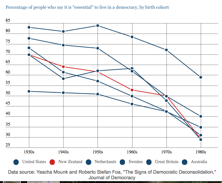
We had a Stat of the Week nomination for this graph from Stuff showing attitudes to democracy changing for people born more recently:
The complaint was that the non-NZ lines were indistinguishable. They do get pop-up descriptions on mouse-over, but the coloured circles in the legend are certainly not doing much work.
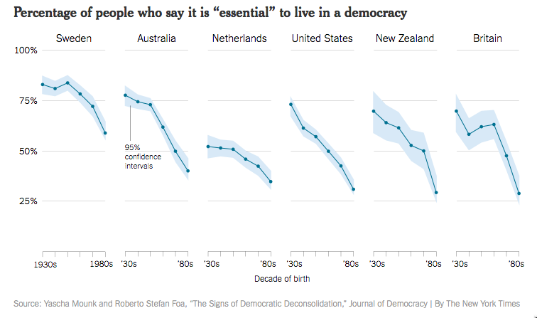
This is the original graph, from the New York Times:
The Times verison is more elegant and clearer, and also provides uncertainty intervals around the lines. On the other hand, the higher-than-wide panels are going to make any decrease look more dramatic.
There are two more important problems with the graph. The first is that it uses only the highest category, “Essential”, on a ten-point scale. A decrease in the proportion of people using the top rating could be due to the whole distribution moving down, but it could also just be a trend in people’s tendency to use the extreme values on a scale.
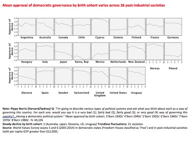
Here’s a related graph using other data, tweeted by (Prof) Pippa Norris
The trend looks weaker when using means on a four-point scale. It’s also less universal than the New York Times graph suggests.
There’s another problem, though. The source for the first graph: Yascha Mounk and Roberto Stefan Foa, “The Signs of Democratic Deconsolidation,” Journal of Democracy. The paper doesn’t exist yet at the journal’s website (or anywhere else that I’ve been able to find). According to Dr Mounk’s CV, it’s coming out in the first edition next year.
Part of the point of peer-reviewed publications is that they include the details that don’t make it into a media story. This is, potentially, significant research on an important topic. If we’re going to have a full-on panic about millennials and the end of democracy, we could at least wait a couple of months for the research to be published.
Thomas Lumley (@tslumley) is Professor of Biostatistics at the University of Auckland. His research interests include semiparametric models, survey sampling, statistical computing, foundations of statistics, and whatever methodological problems his medical collaborators come up with. He also blogs at Biased and Inefficient See all posts by Thomas Lumley »


More on that chart – https://www.washingtonpost.com/news/monkey-cage/wp/2016/12/05/that-viral-graph-about-millennials-declining-support-for-democracy-its-very-misleading/
8 years ago