November 9, 2016
Election graphics highlights (and lowlights)
(To be updated as they turn up)

(Nominated by James Green in comments: 538’s ‘winding path’)
Recommendations for sites to watch
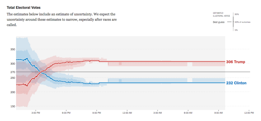
- The Upshot (New York Times) for serious
- Trumpocalypse Rating (The Spinoff, NZ) for, well, less serious
- Hand-painted electoral results map. (NPR on Facebook).
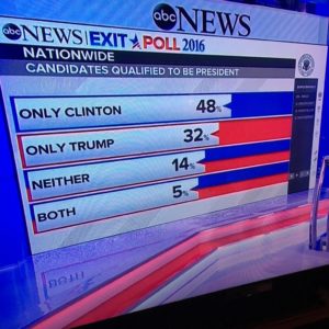
First, ABC News exit poll doesn’t seem to understand bar charts

Thomas Lumley (@tslumley) is Professor of Biostatistics at the University of Auckland. His research interests include semiparametric models, survey sampling, statistical computing, foundations of statistics, and whatever methodological problems his medical collaborators come up with. He also blogs at Biased and Inefficient See all posts by Thomas Lumley »

I know this thread is sort of over, but I’d like to nominate 538’s winding path as a graphic for good. By about 3pm NZDT, it was pretty clear that Clinton was doing poorly in a Florida, North Carolina, but also in a bunch that were supposed to be firmly on her side (Virginia, Wisconsin, Michigan), and provided one of the earliest indications that she was in serious trouble.
http://i2.wp.com/espnfivethirtyeight.files.wordpress.com/2016/11/snake-803pm.png?quality=90&strip=all&w=1150&ssl=1
8 years ago