Posts from August 2016 (44)

August 24, 2016

Currie Cup Predictions for Round 4

PredictGames4.html


Team Ratings for Round 4

The basic method is described on my Department home page.

Here are the team ratings prior to this week’s games, along with the ratings at the start of the season.

Current Rating Rating at Season Start Difference
Lions 9.40 9.69 -0.30
Western Province 4.40 6.46 -2.10
Sharks 1.50 -0.60 2.10
Blue Bulls 0.97 1.80 -0.80
Cheetahs 0.13 -3.42 3.50
Pumas -10.40 -8.62 -1.80
Cavaliers -11.08 -10.00 -1.10
Griquas -11.68 -12.45 0.80
Kings -14.68 -14.29 -0.40


Performance So Far

So far there have been 11 matches played, 6 of which were correctly predicted, a success rate of 54.5%. Here are the predictions for last week’s games.

Game Date Score Prediction Correct
1 Western Province vs. Cheetahs Aug 19 25 – 32 9.70 FALSE
2 Griquas vs. Lions Aug 19 30 – 24 -20.30 FALSE
3 Blue Bulls vs. Kings Aug 20 49 – 35 20.40 TRUE
4 Cavaliers vs. Sharks Aug 20 20 – 41 -7.50 TRUE


Predictions for Round 4

Here are the predictions for Round 4. The prediction is my estimated expected points difference with a positive margin being a win to the home team, and a negative margin a win to the away team.

Game Date Winner Prediction
1 Kings vs. Western Province Aug 26 Western Province -15.60
2 Pumas vs. Griquas Aug 26 Pumas 4.80
3 Lions vs. Cavaliers Aug 27 Lions 24.00
4 Sharks vs. Blue Bulls Aug 27 Sharks 4.00


August 23, 2016

So where did the word ‘statistics’ come from?

Yes, the book about the history of statistics has been written, in case you were wondering. A History of Statistics in New Zealand was published in 1999, with funding from the New Zealand Statistical Association and the Lotteries Commission of New Zealand. H S (Stan) Roberts edited the history, and wrote substantial sections. It’s now available for free download here – the usual caveats about attribution apply. And it opens by tracing the history and usage of the word statistics:

“Statistics”, like most words, is continually changing its meaning. In order to find the meaning of a word we tend to reach for a dictionary, but dictionaries do not so much “define” the meanings of words, but rather give their current usages, together with examples. Following are examples relating to statistics taken from the 1933 Oxford English Dictionary (13 Vols). Note that in each entry the date indicates the first usage found.

Statism: Subservience to political expediency in religious matters. 1609 – “Religion turned into Statisme will soon prooue Atheisme.”

Statist: One skilled in state affairs, one having political knowledge, power, or influence; a politician, statesman. Very common in 17th c. 1584 – “When he plais the Statist, wringing veri unlukkili some of Machiavels Avioxmes to serve his Purpos then indeed; then he tryumphes.”

Statistical: 1. Of, or pertaining to statistics, consisting or founded on collections of numerical facts, esp. with reference to economic, sanitary, and vital conditions. 1787 “The work (by Zimmerman) before us is properly statistical. It consists of different tables, containing a general comparative view of the forces, the government, the extent and population of the different kingdoms of Europe.” 2: Of a writer, etc: Dealing with statistics. 1787 – “Some respectable statistical writers.”

Statistician: One versed or engaged in collecting and tabulating statistics. 1825 – “The object of the statistician is to describe the condition of a particular country at a particular period.”

Statistics: In early use, that branch of political science, dealing with the collection, classification, and discussion of facts (especially of a numerical kind), bearing on the condition of a state or community. In recent use, the department of study that has for its object the collection and arrangement of numerical facts or data, whether relating to human affairs or to natural phenomena. 1787 – Zimmerman – “This science distinguished by the newly-coined name of Statistics, is become a favourite in Germany.”

Statistic: The earliest known occurrence of the word seems to be in the title of the satirical work “Microscopium Statisticum”, by Helenus Politanus, Frankfort (1672). Here the sense is prob. “pertaining to statists or to statecraft”.

The Concise Oxford Dictionary (1976) gives us two modern usages.

Statistics: 1. Numerical facts systematically collected 2: Science of collecting, classifying and using statistics. The first verse of a poem composed in 1799 by William Wordsworth, and entitled, “A Poet’s Epitaph”, successfully clarifies this difficult matter.

Art thou a Statist in the van
Of public conflicts trained and bred?
First learn to love one living man;
Then may’st thou think upon the dead.
 

August 22, 2016

Stat of the Week Competition: August 20 – 26 2016

Each week, we would like to invite readers of Stats Chat to submit nominations for our Stat of the Week competition and be in with the chance to win an iTunes voucher.

Here’s how it works:

  • Anyone may add a comment on this post to nominate their Stat of the Week candidate before midday Friday August 26 2016.
  • Statistics can be bad, exemplary or fascinating.
  • The statistic must be in the NZ media during the period of August 20 – 26 2016 inclusive.
  • Quote the statistic, when and where it was published and tell us why it should be our Stat of the Week.

Next Monday at midday we’ll announce the winner of this week’s Stat of the Week competition, and start a new one.

(more…)

Stat of the Week Competition Discussion: August 20 – 26 2016

If you’d like to comment on or debate any of this week’s Stat of the Week nominations, please do so below!

August 20, 2016

Briefly

  • Mining data from Lending Club.  And Matt Levine’s comments: Here are 50 data points about this loan. Do what you want….. And if there’s no field for “does this person have another LendingClub loan,” and if that data point would have been helpful, well, sometimes that happens.
  • It’s just gone Saturday in the US, so it is no longer National Potato Day, and it won’t be National Spumoni Day until Sunday. Nathan Yau has a graphic of the 214 days that are National <some food> Day.
  • Because genetic association studies are (or were) largely done in people of European ancestry, they can overpredict risks in everyone else. (NY Times). (The implication that this is also true of non-genetic research is, at least, exaggerated)

The statistical significance filter

Attention conservation notice: long and nerdy, but does have pictures.

You may have noticed that I often say about newsy research studies that they are are barely statistically significant or they found only weak evidence, but that I don’t say that about large-scale clinical trials. This isn’t (just) personal prejudice. There are two good reasons why any given evidence threshold is more likely to be met in lower-quality research — and while I’ll be talking in terms of p-values here, getting rid of them doesn’t solve this problem (it might solve other problems).  I’ll also be talking in terms of an effect being “real” or not, which is again an oversimplification but one that I don’t think affects the point I’m making.  Think of a “real” effect as one big enough to write a news story about.

evidence01

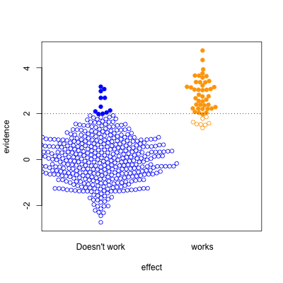
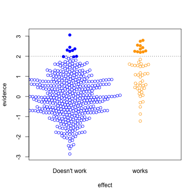
This graph shows possible results in statistical tests, for research where the effect of the thing you’re studying is real (orange) or not real (blue).  The solid circles are results that pass your statistical evidence threshold, in the direction you wanted to see — they’re press-releasable as well as publishable.

Only about half the ‘statistically significant’ results are real; the rest are false positives.

I’ve assumed the proportion of “real” effects is about 10%. That makes sense in a lot of medical and psychological research — arguably, it’s too optimistic.  I’ve also assumed the sample size is too small to reliably pick up plausible differences between blue and yellow — sadly, this is also realistic.

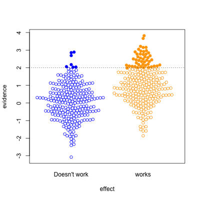
evidence02

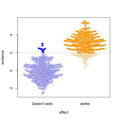
In the second graph, we’re looking at a setting where half the effects are real and half aren’t. Now, of the effects that pass the threshold, most are real.  On the other hand, there’s a lot of real effects that get missed.  This was the setting for a lot of clinical trials in the old days, when they were done in single hospitals or small groups.

evidence03

The third case is relatively implausible hypotheses — 10% true — but well-designed studies.  There are still the same number of false positives, but many more true positives.  A better-designed study means that positive results are more likely to be correct.

evidence04

Finally, the setting of well-conducted clinical trials intended to be definitive, the sort of studies done to get new drugs approved. About half the candidate treatments work as intended, and when they do, the results are likely to be positive.   For a well-designed test such as this, statistical significance is a reasonable guide to whether the effect is real.

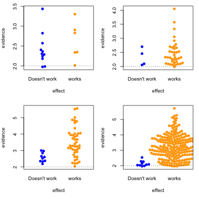
The problem is that the media only show a subset of the (exciting) solid circles, and typically don’t show the (boring) empty circles. So, what you see is

evidence05

where the columns are 10% and 50% proportion of studies having a true effect, and the top and bottom rows are under-sized and well-design studies.


Knowing the threshold for evidence isn’t enough: the prior plausibility matters, and the ability of the study to demonstrate effects matters. Apparent effects seen in small or poorly-designed studies are less likely to be true.

August 19, 2016

Has your life improved since 1966?

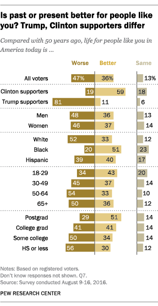
From Pew Research, is life better than 50 years ago for people like you?

3_1

The answers aren’t going to mean much about reality, more about the sort of people we are or want to think we are.  As Fred Clark puts it

If you ask those of us who are 18-53 years old for our opinions about what life was like before we either existed or have any memory, we’ll give you an answer. And that speculative, possibly even informed, opinion may mean something or other in the aggregate. Maybe it tells us something fuzzy about general optimism or pessimism. Or maybe something about the dismal state of history, social studies, civics and science education.

Or, for the people who do have memories of the mid-sixties…

Age 65-70: I peaked in high school. Go away, nerd, or I’ll give you a swirlie.

August 18, 2016

Post-truth data maps

The Herald has a story “New map compares breast sizes around the world”. They blame news.com.au as the immediate cause, but a very similar story at the Daily Mail actually links to where it got the map.  You might wonder how the data were collected (you might wonder why, too). The journalist did get as far as that:

The breast map doesn’t reveal how the cup sizes were measured, it’s fair to say tracking bra purchases per country would be an ideal – and maybe a little weird – approach.

Rigorously deidentified pie

footypie

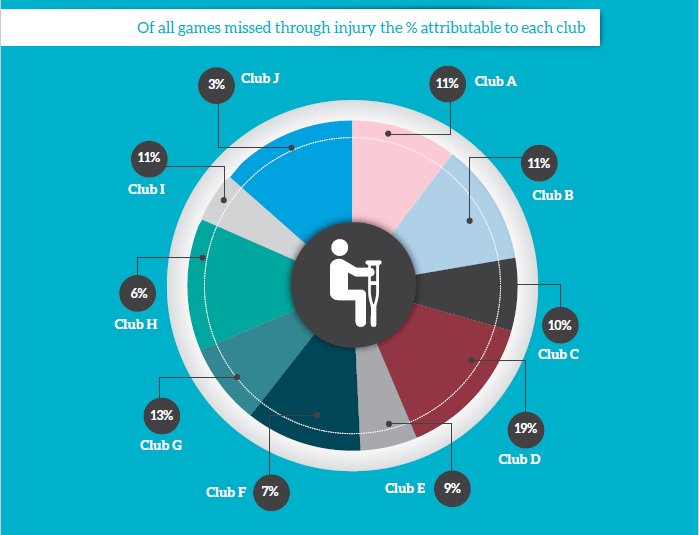
Via Dale Warburton on Twitter, this graph comes from page 7 of the 2016 A-League Injury Report (PDF) produced by Professional Footballers Australia — the players’ association for the round-ball game.  It seems to be a sensible and worthwhile document, except for this pie chart. They’ve replaced the club names with letters, presumably for confidentiality reasons. Which is fine. But the numbers written on the graph bear no obvious relationship to the sizes of the pie wedges.

It’s been a bad week for this sort of thing: a TV barchart that went viral this week had the same sort of problem.

August 17, 2016

Official statistics

There has been some controversy about changes to how unemployment is computed in the Household Labour Force Survey. As StatsNZ had explained, the changes would be back-dated to March 2007, to allow for comparisons.  However, from Stuff earlier this week:

In a media release Robertson, Labour’s finance spokesman, said National was “actively massaging official unemployment statistics” by changing the measure for joblessness to exclude those using websites, such as Seek or TradeMe.

Robertson was referring to the Household Labour Force Survey, due to be released on Wednesday, which he says would “almost certainly show a decrease in unemployment” as a result of the Government “manipulating official data to suit its own needs”.

Mr Robertson has since withdrawn this claim, and is now saying

“I accept the Chief Statistician’s assurances on the reason for the change in criteria but New Zealanders need to be aware that National Ministers have a track record of misusing and misrepresenting statistics.”

That’s a reasonable position — and some of the examples have appeared on StatsChat — but I don’t think the stories in the media have made it clear how serious the original accusation was (even if perhaps unintentionally).

Official statistics such as the unemployment estimates are politically sensitive, and it’s obvious why governments would want to change them. Argentina, famously, did this to their inflation estimates. As a result, no-one believed Argentinian economic data, which gets expensive when you’re trying to borrow money. For that reason, sensible countries structure their official statistics agencies to minimise political influence, and maximise independence.  New Zealand does have a first-world official statistics system — unlike many countries with similar economic resources — and it’s a valuable asset that can’t be taken for granted.

The system is set up so the Government shouldn’t have the ability to “actively massage” official unemployment statistics for minor political gain. If they did, well, ok, it was hyperbole when I said on Twitter ‘we’d need to go through StatsNZ with fire and the sword’, but the Government Statistician wouldn’t be the only one who’d need replacing.