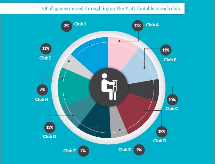
Rigorously deidentified pie
Via Dale Warburton on Twitter, this graph comes from page 7 of the 2016 A-League Injury Report (PDF) produced by Professional Footballers Australia — the players’ association for the round-ball game. It seems to be a sensible and worthwhile document, except for this pie chart. They’ve replaced the club names with letters, presumably for confidentiality reasons. Which is fine. But the numbers written on the graph bear no obvious relationship to the sizes of the pie wedges.
It’s been a bad week for this sort of thing: a TV barchart that went viral this week had the same sort of problem.
Thomas Lumley (@tslumley) is Professor of Biostatistics at the University of Auckland. His research interests include semiparametric models, survey sampling, statistical computing, foundations of statistics, and whatever methodological problems his medical collaborators come up with. He also blogs at Biased and Inefficient See all posts by Thomas Lumley »
