Posts from April 2016 (34)

April 29, 2016

Looking up the index


Q: Did you hear that Auckland housing affordability is better now than when the government came to office?

A: No. Surely not.

Q: That’s what Nick Smith says: listen, it’s at 4:38. Is it true?

A: Up to a point.

Q: Up to what point?

A:  As he says, the Massey University Housing Affordability Index for February 2016 is lower than it was for November 2008, for Auckland and everywhere else in the country. For Auckland it was 38.44 then and is 33.8 now.

Q: But The Spinoff says one of the people behind the Index says Nick Smith is wrong, that housing isn’t more affordable than it was then.

A: Indeed she does. That’s because housing isn’t more affordable.

Q: But you said the index was lower?

A: Yes, it is.

Q: And lower is supposed to be better?

A: Yes.

Q: But how can the Housing Affordability Index be lower when housing isn’t more affordable? What is the index?

A: If it’s the same as it was is 2006 (which would make sense) it’s median selling price multiplied by a weighted-average interest rate and divided by the mean individual weekly earnings.

Q: Can you translate that?

A: Roughly,  the number of weeks of average earnings you’d need to pay the first year’s interest on a 100% mortgage.

Q: So if it’s 34, and you’ve got two people making the average, it’s 17 weeks each out of 52 going to mortgage interest? About 32% of income?

A: That’s right, only you don’t get 100% mortgages, so it’s more like 26% of income. And there’s taxes and insurance and you actually pay off a bit of the principal even in the first year, so it’s more complicated. But it’s a simple summary of the interest cost.

Q: And that’s lower now than in November 2008?

A: So it seems. I wasn’t living in New Zealand then, but it looks like mortgage interest rates were near 9%. The combination of the increase in incomes and the fall in interest rates has been slightly more than the increase in house prices, even in Auckland.

Q: But what if rates go back up?

A: Then a lot of houses will retroactively become much less affordable.

Q: And what about saving for down payments? That’s what all the snake people have been complaining about, and low interest rates don’t help there.

A: Down payments don’t go into the affordability index

Q: But they go into actual affordability!

A: Which is presumably why the Minister was talking about the affordability index.
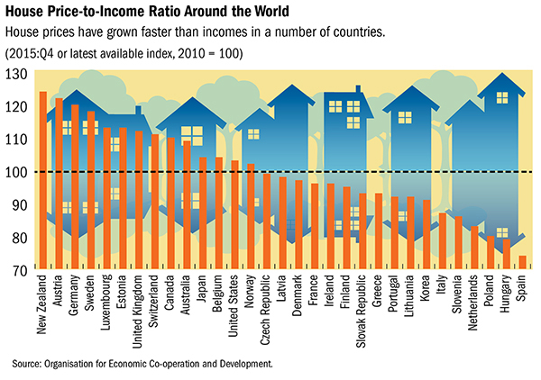
 

Bar chart of the week

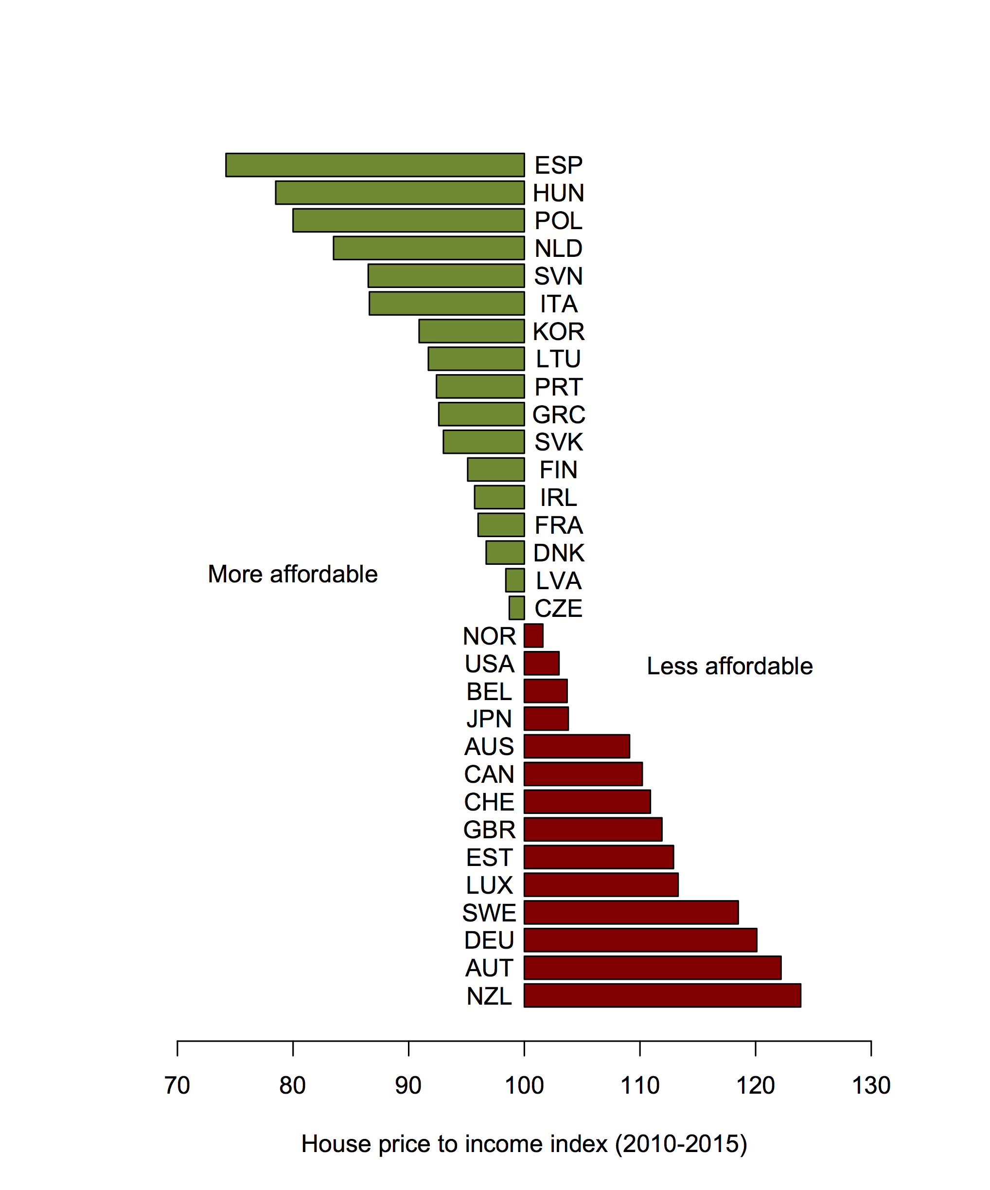
From the IMF, using OECD data, (via Sam Warburton)

chart2_

Bar charts should start at zero (and probably shouldn’t  have distracting house/arrow/tree reflections in the background), but this graph would look even worse if the y-axis went down to zero. The problem is that ‘zero’ isn’t 0 for this sort of measurement.  The index is the price:income ratio now, divided by the price:income ratio in 2010, multiplied by 100.  The “no change” value is 100, which suggests using that for the floor of the bars.  Making the bars wider relative to the spaces gives easier comparisons and makes the graph less busy.  The colour scheme isn’t ideal for dichromats, but it only reinforces the information, it’s not needed to interpret anything.


price2income

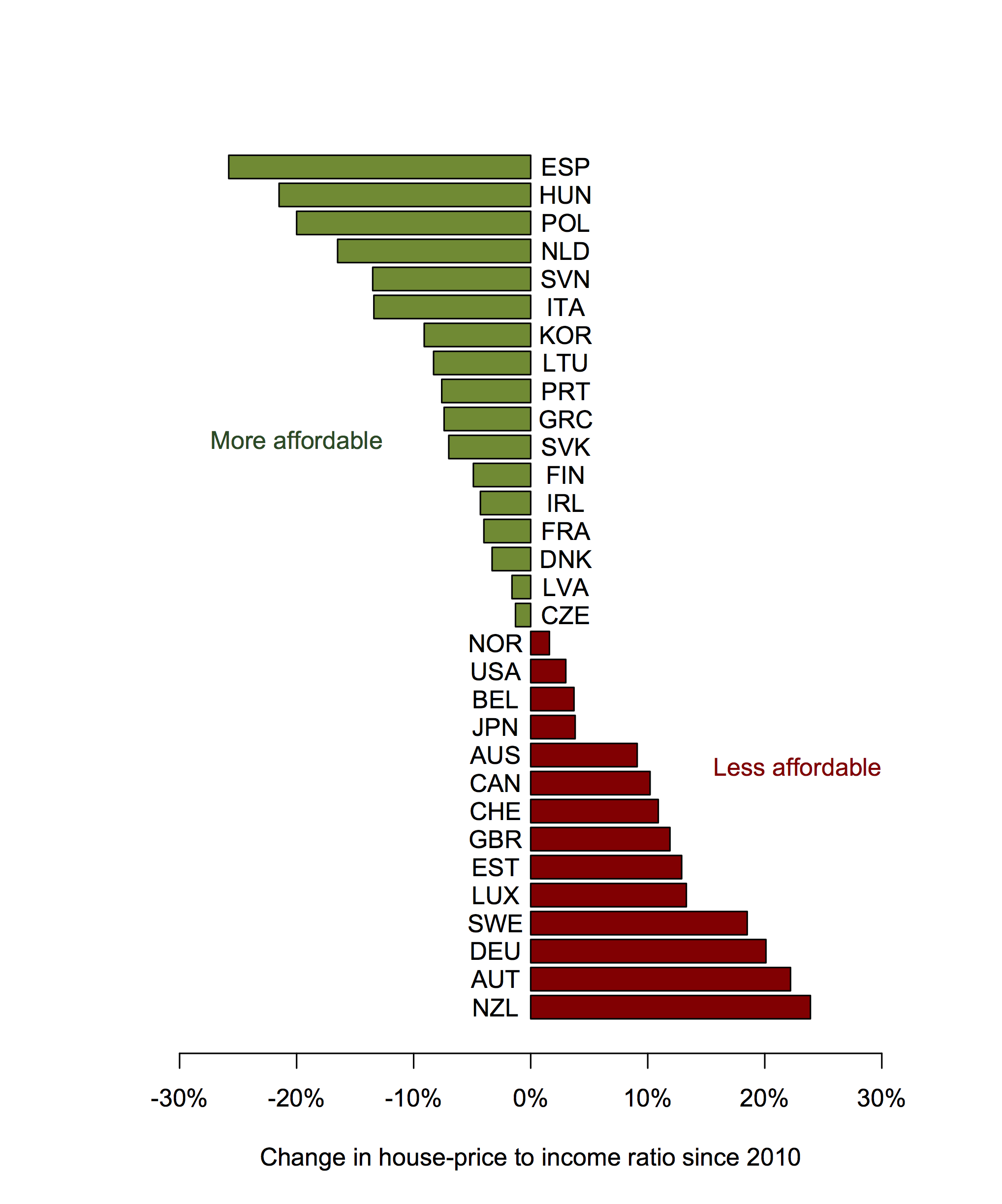
The next step, as Sam suggested on Twitter, would be to give up on the ‘index’, which is really economist jargon, and just describe the change in %.  He also suggesting putting the two labels in colour (which required some fiddling: for the text colour to look like the bar colour it has to actually be darker).

price2

One might also go back to the full names of the countries, but I quite like the abbreviations.


April 28, 2016

Walkability

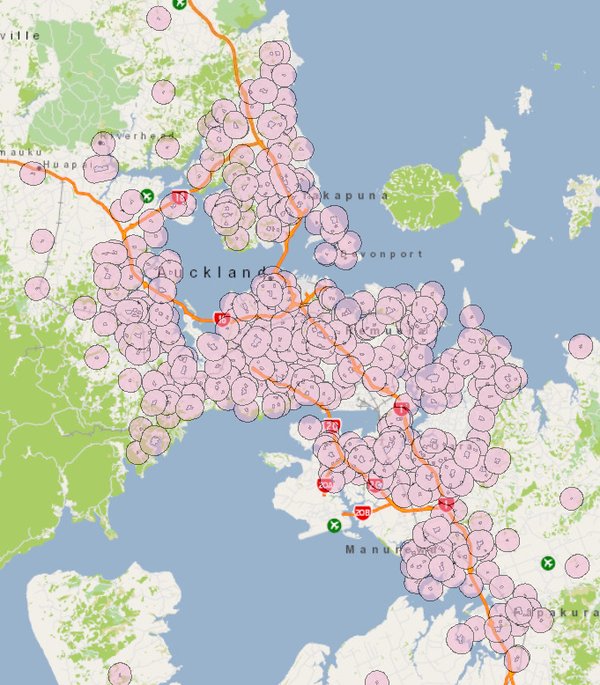
Most of Auckland is within walking distance of a school: there are over 500 schools in the 560 km2 of Auckland’s urban area. That’s usually regarded as a Good Thing, and Healthy. Auckland Transport’s “walking school bus” program takes advantage of it to get kids more active and to get cars off the roads. The coverage is pretty impressive: in this map by Stephen Davis, the circles show a 800m (half-mile, 2 km2 ) area around each school:

dense

However, as a story at Stuff notes,  if most everywhere in Auckland is close to a school, the schools are going to be close to other establishments.  With a school on most square kilometres of urban land, there will be shops in the square kilometre around most schools selling fast food, or junk food.

That’s going to be even more true in denser, more walkable cities elsewhere, from Amsterdam to New AmsterdamYork.  “Near schools” isn’t a thing in cities. To reduce the number of these shops near schools, you have to reduce them everywhere.

This isn’t to say that all restrictions on fast-food sales are unreasonable, but having lots of things in a relatively small area is hard to avoid in cities. It’s how cities work.

Marking beliefs to market

Back in August, I wrote

Trump’s lead isn’t sampling error. He has an eleven percentage point lead in the poll averages, with sampling error well under one percentage point. That’s better than the National Party has ever managed. It’s better than the Higgs Boson has ever managed.

Even so, no serious commentator thinks Trump will be the Republican candidate. It’s not out of the question that he’d run as an independent — that’s a question of individual psychology, and much harder to answer — but he isn’t going to win the Republican primaries.

Arguably that was true: no serious commentator, as far as I know, did think Trump would be the Republican candidate.  But he is going to win the Republican primaries, and the opinion polls haven’t been all that badly wrong about him — better than the experts.

Māori imprisonment statistics: not just age

Jarrod Gilbert had a piece in the Herald about prisons

Fifty per cent of the prison population is Maori. It’s a fact regularly cited in official documents, and from time to time it garners attention in the media. Given they make up 15 per cent of the population, it’s immediately clear that Maori incarceration is highly disproportionate, but it’s not until the numbers are given a greater examination that a more accurate perspective emerges.

The numbers seem dystopian, yet they very much reflect the realities of many Maori families and neighbourhoods.

to know what he was talking about, qualitatively. I mean, this isn’t David Brooks.

It turns out that while you can’t easily get data on ethnicity by age in the prison population, you can get data on age, and that this is enough to get a good idea of what’s going on, using what epidemiologists call “indirect standardisation”.

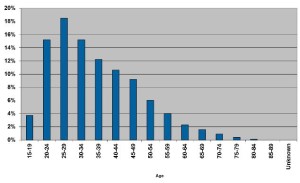
Actually, you can’t even easily get data on age, but you can get a graph of age:
ps_ages_3_16

and I resorted to software that reconstructs the numbers.

Next, I downloaded Māori population estimates by age and total population estimates by age from StatsNZ, for ages 15-84.  The definition of Māori won’t be exactly the same as in Dr Gilbert’s data. Also, the age groups aren’t quite right because we’d really like the age when the offence happened, not the current age.  The data still should be good enough to see how big the age bias is. In these age groups, 13.2% of the population is Māori by the StatsNZ population estimate definition.

We know what proportion of the prison population is in each age group, and we know what the population proportion of Māori is in each age group, so we can combine these to get the expected proportion of Māori in the prison population accounting for age differences. It’s 14.5%.  Now, 14.5% is higher than 13.2%, so the age-adjustment does make a difference, and in the expected direction, just not a very big difference.

We can also see what happens if we use the Māori population proportion from the next-younger five-year group, to allow for offences being committed further in the past. The expected proportion is then 15.3%, which again is higher than 13.2%, but not by very much. Accounting for age, it looks as though Māori are still more than three times as likely to be in prison as non-Māori.

You might then say there are lots of other variables to be looked at. But age is special.  If it turned out that Māori incarceration rates could be explained by poverty, that wouldn’t mean their treatment by society was fair, it would suggest that poverty was how it was unfair. If the rates could be explained by education, that wouldn’t mean their treatment by society was fair; it would suggest education was how it was unfair. But if the rates could be explained by age, that would suggest the system was fair. They can’t be.

April 27, 2016

Super 18 Predictions for Round 10

Team Ratings for Round 10

The basic method is described on my Department home page.

Here are the team ratings prior to this week’s games, along with the ratings at the start of the season.

Current Rating Rating at Season Start Difference
Crusaders 9.46 9.84 -0.40
Chiefs 6.79 2.68 4.10
Hurricanes 6.42 7.26 -0.80
Highlanders 5.50 6.80 -1.30
Waratahs 3.51 4.88 -1.40
Brumbies 2.41 3.15 -0.70
Lions 1.95 -1.80 3.80
Stormers 1.88 -0.62 2.50
Bulls -0.32 -0.74 0.40
Sharks -0.56 -1.64 1.10
Blues -3.92 -5.51 1.60
Rebels -5.24 -6.33 1.10
Cheetahs -6.33 -9.27 2.90
Jaguares -9.20 -10.00 0.80
Reds -9.72 -9.81 0.10
Force -11.01 -8.43 -2.60
Sunwolves -16.26 -10.00 -6.30
Kings -18.59 -13.66 -4.90


Performance So Far

So far there have been 70 matches played, 46 of which were correctly predicted, a success rate of 65.7%.
Here are the predictions for last week’s games.

Game Date Score Prediction Correct
1 Highlanders vs. Sharks Apr 22 14 – 15 11.60 FALSE
2 Rebels vs. Cheetahs Apr 22 36 – 14 2.80 TRUE
3 Sunwolves vs. Jaguares Apr 23 36 – 28 -4.60 FALSE
4 Hurricanes vs. Chiefs Apr 23 27 – 28 3.70 FALSE
5 Force vs. Waratahs Apr 23 13 – 49 -7.60 TRUE
6 Stormers vs. Reds Apr 23 40 – 22 15.30 TRUE
7 Kings vs. Lions Apr 23 10 – 45 -14.60 TRUE
8 Brumbies vs. Crusaders Apr 24 14 – 40 0.10 FALSE


Predictions for Round 10

Here are the predictions for Round 10. The prediction is my estimated expected points difference with a positive margin being a win to the home team, and a negative margin a win to the away team.

Game Date Winner Prediction
1 Chiefs vs. Sharks Apr 29 Chiefs 11.40
2 Force vs. Bulls Apr 29 Bulls -6.70
3 Highlanders vs. Brumbies Apr 30 Highlanders 7.10
4 Blues vs. Rebels Apr 30 Blues 5.30
5 Reds vs. Cheetahs Apr 30 Reds 0.60
6 Lions vs. Hurricanes Apr 30 Hurricanes -0.50
7 Stormers vs. Waratahs Apr 30 Stormers 2.40
8 Jaguares vs. Kings Apr 30 Jaguares 13.40


NRL Predictions for Round 9

Team Ratings for Round 9

The basic method is described on my Department home page.

Here are the team ratings prior to this week’s games, along with the ratings at the start of the season.

Current Rating Rating at Season Start Difference
Cowboys 12.93 10.29 2.60
Broncos 12.04 9.81 2.20
Storm 3.96 4.41 -0.50
Sharks 2.50 -1.06 3.60
Roosters 2.31 11.20 -8.90
Bulldogs 1.11 1.50 -0.40
Eels 1.04 -4.62 5.70
Panthers -0.10 -3.06 3.00
Raiders -0.12 -0.55 0.40
Sea Eagles -0.29 0.36 -0.70
Rabbitohs -0.35 -1.20 0.90
Dragons -2.46 -0.10 -2.40
Titans -4.75 -8.39 3.60
Warriors -6.70 -7.47 0.80
Wests Tigers -8.24 -4.06 -4.20
Knights -11.21 -5.41 -5.80


Performance So Far

So far there have been 64 matches played, 35 of which were correctly predicted, a success rate of 54.7%.
Here are the predictions for last week’s games.

Game Date Score Prediction Correct
1 Broncos vs. Rabbitohs Apr 22 30 – 8 14.30 TRUE
2 Bulldogs vs. Titans Apr 23 21 – 20 10.20 TRUE
3 Raiders vs. Wests Tigers Apr 23 60 – 6 4.60 TRUE
4 Cowboys vs. Eels Apr 23 32 – 16 14.70 TRUE
5 Sharks vs. Panthers Apr 24 20 – 18 6.30 TRUE
6 Knights vs. Sea Eagles Apr 25 10 – 26 -6.60 TRUE
7 Dragons vs. Roosters Apr 25 20 – 18 -5.90 FALSE
8 Storm vs. Warriors Apr 25 42 – 0 10.40 TRUE


Predictions for Round 9

Here are the predictions for Round 9. The prediction is my estimated expected points difference with a positive margin being a win to the home team, and a negative margin a win to the away team.

Game Date Winner Prediction
1 Rabbitohs vs. Wests Tigers Apr 28 Rabbitohs 7.90
2 Eels vs. Bulldogs Apr 29 Eels 2.90
3 Panthers vs. Raiders Apr 30 Panthers 0.00
4 Roosters vs. Knights Apr 30 Roosters 16.50
5 Sea Eagles vs. Cowboys Apr 30 Cowboys -10.20
6 Warriors vs. Dragons May 01 Dragons -0.20
7 Titans vs. Storm May 01 Storm -5.70
8 Sharks vs. Broncos May 01 Broncos -6.50


Not just an illusion

There’s a headline in the IndependentIf you think more celebrities are dying young this year, you’re wrong – it’s just a trick of the mind“. And, in a sense, Ben Chu is right. In a much more important sense, he’s wrong.

He argues that there are more celebrities at risk now, which there are. He says a lot of these celebrities are older than we realise, which they are. He says that the number of celebrity deaths this year is within the scope of random variation looking at recent times, which may well be the case. But I don’t think that’s the question.

Usually, I’m taking the other side of this point. When there’s an especially good or especially bad weekend for road crashes, I say that it’s likely just random variation, and not evidence for speeding tolerances or unsafe tourists or breath alcohol levels. That’s because usually the question is whether the underlying process is changing: are the roads getting safer or more dangerous.

This time there isn’t really a serious question of whether karma, global warming, or spiders from Mars are killing off celebrities.  We know it must be a combination of understandable trends and bad luck that’s responsible.  But there really have been more celebrities dying this year.   Prince is really dead. Bowie is really dead. Victoria Wood, Patty Duke, Ronnie Corbett, Alan Rickman, Harper Lee — 2016 has actually happened this way,  it hasn’t been (to steal a line from Daniel Davies) just a particularly inaccurate observation of the underlying population and mortality patterns.

April 25, 2016

Stat of the Week Competition: April 23 – 29 2016

Each week, we would like to invite readers of Stats Chat to submit nominations for our Stat of the Week competition and be in with the chance to win an iTunes voucher.

Here’s how it works:

  • Anyone may add a comment on this post to nominate their Stat of the Week candidate before midday Friday April 29 2016.
  • Statistics can be bad, exemplary or fascinating.
  • The statistic must be in the NZ media during the period of April 23 – 29 2016 inclusive.
  • Quote the statistic, when and where it was published and tell us why it should be our Stat of the Week.

Next Monday at midday we’ll announce the winner of this week’s Stat of the Week competition, and start a new one.

(more…)

Stat of the Week Competition Discussion: April 23 – 29 2016

If you’d like to comment on or debate any of this week’s Stat of the Week nominations, please do so below!