March 7, 2016
Redesign of a graphic
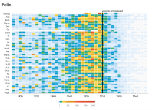
This graph, from the Wall Street Journal last year, was one of a series showing the impact of vaccination
Randall Olson looks at ways to redesign it to communicate the numbers more effectively.
Thomas Lumley (@tslumley) is Professor of Biostatistics at the University of Auckland. His research interests include semiparametric models, survey sampling, statistical computing, foundations of statistics, and whatever methodological problems his medical collaborators come up with. He also blogs at Biased and Inefficient See all posts by Thomas Lumley »

This is great stuff. As a social scientist I have also been interested in the decline in infectious diseases occurring before the introduction of effective vaccines. See the article below. peter
http://www.ncbi.nlm.nih.gov/pmc/articles/PMC1509028/pdf/amjph00012-0097.pdf
9 years ago
Yes, polio was pretty clearly controlled by the vaccine and nothing else, but other factors were important for some of the other diseases.
9 years ago
For a national newspaper, I think it’s good to have a state by state representation because people want to know what happened in their state, to people like them. But that’s not helped by displaying 51 places but only having 26 of them named … and I noticed because I wanted to see what Hawaii looked like after seeing Alaska.
It’s alphabetical which means people can sort of guess but it’s a bit hard in the middle where you can’t tell which line the name refers to.
Which brings me back to the Alaska/Hawaii issue … a more interesting display, rather than list down alphabetically, would be some sort of listing by geographical connection or lat/long. For an infectious disease, the geographical spread and waxes and wanes with time are (potentially) interesting.
9 years ago