December 17, 2015
Briefly
- Google visualisation of relative abundance of the chemical elements: in books, in the human body, in the earth’s crust, in the sun, in the sea.
- Beautiful minute-by-minute animation of data from the American Time Use Survey, from Flowing Data.
- “Polls Suggest Trump Will Win Between 8 Percent And 64 Percent Of The Vote”: on the actual predictive accuracy of polls this far in advance, from 538.
- A social-network analysis to find which European Union staff members are most worth influencing
-
Perfect example from @IpsosMORI of how changing the wording changes the result of a poll pic.twitter.com/XZVVSiDV0X
— Johnny Monro ن (@JohnnyMonro) December 16, 2015
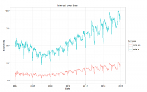
- Google trends for “data is” vs “data are”. The red line is people correctly treating ‘data’ as plural; the blue line is people correctly treating ‘data’ as a mass noun. (via David Smith)

Thomas Lumley (@tslumley) is Professor of Biostatistics at the University of Auckland. His research interests include semiparametric models, survey sampling, statistical computing, foundations of statistics, and whatever methodological problems his medical collaborators come up with. He also blogs at Biased and Inefficient See all posts by Thomas Lumley »
That’s quite a noticeable seasonal pattern in that search trend data. I wonder if that’s something particular to those phrases or if it’s more indicative of overall search volume.
9 years ago
It looks like it’s low at Christmas time and (northern hemisphere) summer vacation so it’s probably about search volumes.
The interesting thing to me is the trough in 20007.
9 years ago
The ordering of the popularity of the phrases data is/data are is reversed in the Ngram viewer. I suppose people feel they need to be more “proper” in books.
9 years ago