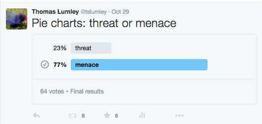
Pie charts “a menace”, study shows
StatsChat can reveal exclusive study results showing that pie charts are a menace to over 75% of us.
Although these round, delicious, data metaphors have been maligned in the past, this is the first research of its kind, based on newly-available survey technology.
Researchers used an online, multi-wave, respondent-driven sampling scheme to reach thousands of potential respondents. 77% of responses agreed that pie charts are a menace.
Aren’t these new Twitter polls wonderful?
Thomas Lumley (@tslumley) is Professor of Biostatistics at the University of Auckland. His research interests include semiparametric models, survey sampling, statistical computing, foundations of statistics, and whatever methodological problems his medical collaborators come up with. He also blogs at Biased and Inefficient See all posts by Thomas Lumley »

Ironically, the result of the survey can be meaningfully displayed as a pie chart.
9 years ago
We’re way ahead of you: truly a menace
9 years ago