Posts from March 2015 (48)

March 18, 2015

Men sell not such in any town

Q: Did you see diet soda isn’t healthier than the stuff with sugar?

A: What now?

Q: In Stuff: “If you thought diet soft drink was a healthy alternative to the regular, sugar-laden stuff, it might be time to reconsider.”

A: They didn’t compare diet soft drink to ‘the regular, sugar-laden stuff’.

Q: Oh. What did they do?

A: They compared people who drank a lot of diet soft drink to people who drank little or none, and found the people who drank a lot of it gained more weight.

Q: What did the other people drink?

A: The story doesn’t say. Nor does the research paper, except that it wasn’t ‘regular, sugar-laden’ soft drink, because that wasn’t consumed much in their study.

Q: So this is just looking at correlations. Could there have been other differences, on average, between the diet soft drink drinkers and the others?

A: Sure. For a start, there was a gender difference and an ethnicity difference. And BMI differences at the start of the study.

Q: Isn’t that a problem?

A: Up to a point. They tried to adjust these specific differences away, which will work at least to some extent. It’s other potential differences, eg in diet, that might be a problem.

Q: So the headline “What diet drinks do to your waistline” is a bit over the top?

A: Yes. Especially as this is a study only in people over 65, and there weren’t big differences in waistline at the start of the study, so it really doesn’t provide much information for younger people.

Q: Still, there’s some evidence diet soft drink is less healthy than, perhaps, water?

A: Some.

Q: Has anyone even claimed diet soft drink is healthier than water?

A: Yes — what’s more, based on a randomised trial. I think it’s fair to say there’s a degree of skepticism.

Q: Are there any randomised trials of diet vs sugary soft drinks, since that’s what the story claimed to be about?

A: Not quite. There was one trial in teenagers who drank a lot of sugar-based soft drinks. The treatment group got free diet drinks and intensive nagging for a year; the control group were left in peace.

Q: Did it work?

A: A bit. After one year the treatment group  had lower weight gain, by nearly 2kg on average, but the effect wore off after the free drinks + nagging ended. After two years, the two groups were basically the same.

Q: Aren’t dietary randomised trials depressing?

A: Sure are.

 

Briefly

  • Large-scale data cleaning: the US Social Security Administration has social security records but no death records for 6.5 million people over 112, ie, about 6.5 million more than the number of people over 112 in the world. Nearly 4000 of these people are trying to get jobs “During Calendar Years 2008 through 2011, employers made 4,024 E-Verify inquiries using 3,873 SSNs belonging to numberholders born before June 16, 1901.”
  • First FDA approval of a ‘biosimilar’ drug — the analogue of ‘generic’ for biologicals. Copying a biologic treatment  such as a protein hormone or an antibody is much harder than copying a small molecule (where the patent gives the necessary details), so the makers can charge more for it: in this case, only a 30% discount relative to the brand-name version. Biosimilars will be an important issue for Pharmac in the future: its second and third biggest medication expenses are for two biologicals.
  • Census at School (or, in this context, Tatauranga Ki Te Kura) was on Māori TV’s news programme Te Kāea yesterday, with StatsChat contributor Julie Middleton explaining.

censusatschool


NRL Predictions for Round 3

Team Ratings for Round 3

The basic method is described on my Department home page.

Here are the team ratings prior to this week’s games, along with the ratings at the start of the season.

Current Rating Rating at Season Start Difference
Rabbitohs 14.80 13.06 1.70
Roosters 10.85 9.09 1.80
Cowboys 6.80 9.52 -2.70
Panthers 5.32 3.69 1.60
Storm 4.46 4.36 0.10
Warriors 2.89 3.07 -0.20
Broncos 2.21 4.03 -1.80
Knights 1.26 -0.28 1.50
Bulldogs 1.10 0.21 0.90
Sea Eagles 0.48 2.68 -2.20
Dragons -3.83 -1.74 -2.10
Eels -5.58 -7.19 1.60
Raiders -7.33 -7.09 -0.20
Titans -10.51 -8.20 -2.30
Wests Tigers -10.76 -13.13 2.40
Sharks -10.82 -10.76 -0.10


Performance So Far

So far there have been 16 matches played, 10 of which were correctly predicted, a success rate of 62.5%.

Here are the predictions for last week’s games.

Game Date Score Prediction Correct
1 Bulldogs vs. Eels Mar 13 32 – 12 8.00 TRUE
2 Sharks vs. Broncos Mar 13 2 – 10 -10.40 TRUE
3 Cowboys vs. Knights Mar 14 14 – 16 10.30 FALSE
4 Panthers vs. Titans Mar 14 40 – 0 15.50 TRUE
5 Sea Eagles vs. Storm Mar 14 24 – 22 -1.50 FALSE
6 Rabbitohs vs. Roosters Mar 15 34 – 26 6.70 TRUE
7 Raiders vs. Warriors Mar 15 6 – 18 -5.20 TRUE
8 Wests Tigers vs. Dragons Mar 16 22 – 4 -7.40 FALSE


Predictions for Round 3

Here are the predictions for Round 3. The prediction is my estimated expected points difference with a positive margin being a win to the home team, and a negative margin a win to the away team.

Game Date Winner Prediction
1 Broncos vs. Cowboys Mar 20 Cowboys -1.60
2 Sea Eagles vs. Bulldogs Mar 20 Sea Eagles 2.40
3 Raiders vs. Dragons Mar 21 Dragons -0.50
4 Storm vs. Sharks Mar 21 Storm 18.30
5 Warriors vs. Eels Mar 21 Warriors 12.50
6 Rabbitohs vs. Wests Tigers Mar 22 Rabbitohs 28.60
7 Titans vs. Knights Mar 22 Knights -8.80
8 Roosters vs. Panthers Mar 23 Roosters 8.50


Super 15 Predictions for Round 6

Team Ratings for Round 6

The basic method is described on my Department home page.

Here are the team ratings prior to this week’s games, along with the ratings at the start of the season.

Current Rating Rating at Season Start Difference
Waratahs 7.89 10.00 -2.10
Crusaders 7.86 10.42 -2.60
Hurricanes 5.27 2.89 2.40
Brumbies 5.03 2.20 2.80
Chiefs 4.09 2.23 1.90
Sharks 2.89 3.91 -1.00
Bulls 2.81 2.88 -0.10
Stormers 2.70 1.68 1.00
Blues -0.07 1.44 -1.50
Highlanders -0.91 -2.54 1.60
Lions -4.36 -3.39 -1.00
Force -5.73 -4.67 -1.10
Cheetahs -6.12 -5.55 -0.60
Rebels -6.64 -9.53 2.90
Reds -7.72 -4.98 -2.70


Performance So Far

So far there have been 34 matches played, 21 of which were correctly predicted, a success rate of 61.8%.

Here are the predictions for last week’s games.

Game Date Score Prediction Correct
1 Hurricanes vs. Blues Mar 13 30 – 23 9.80 TRUE
2 Force vs. Rebels Mar 13 17 – 21 6.20 FALSE
3 Crusaders vs. Lions Mar 14 34 – 6 15.10 TRUE
4 Highlanders vs. Waratahs Mar 14 26 – 19 -5.90 FALSE
5 Reds vs. Brumbies Mar 14 0 – 29 -6.20 TRUE
6 Stormers vs. Chiefs Mar 14 19 – 28 4.80 FALSE
7 Cheetahs vs. Sharks Mar 14 10 – 27 -3.30 TRUE


Predictions for Round 6

Here are the predictions for Round 6. The prediction is my estimated expected points difference with a positive margin being a win to the home team, and a negative margin a win to the away team.

Game Date Winner Prediction
1 Highlanders vs. Hurricanes Mar 20 Hurricanes -2.20
2 Rebels vs. Lions Mar 20 Rebels 2.20
3 Crusaders vs. Cheetahs Mar 21 Crusaders 18.50
4 Bulls vs. Force Mar 21 Bulls 13.00
5 Sharks vs. Chiefs Mar 21 Sharks 3.30
6 Waratahs vs. Brumbies Mar 22 Waratahs 6.90


Awful graphs about interesting data


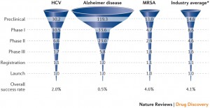
Today in “awful graphs about interesting data” we have this effort that I saw on Twitter, from a paper in one of the Nature Reviews journals.

nrd4570-f2

As with some other recent social media examples, the first problem is that the caption isn’t part of the image and so doesn’t get tweeted. The numbers are the average number of drug candidates at each stage of research to end up with one actual drug at the end. The percentage at the bottom is the reciprocal of the number at the top, multiplied by 60%.

A lot of news coverage of research is at the ‘preclinical’ stage, or is even earlier, at the stage of identifying a promising place to look.  Most of these never get anywhere. Sometimes you see coverage of a successful new cancer drug candidate in Phase I — first human studies. Most of these never get anywhere.  There’s also a lot of variation in how successful the ‘successes’ are: the new drugs for Hepatitis C (the first column) are a cure for many people; the new Alzheimer’s drugs just give a modest improvement in symptoms.  It looks as those drugs from MRSA (antibiotic-resistant Staph. aureus) are easier, but that’s because there aren’t many really novel preclinical candidates.

It’s an interesting table of numbers, but as a graph it’s pretty dreadful. The 3-d effect is purely decorative — it has nothing to do with the represntation of the numbers. Effectively, it’s a bar chart, except that the bars are aligned at the centre and have differently-shaped weird decorative bits at the ends, so they are harder to read.

At the top of the chart,  the width of the pale blue region where it crosses the dashed line is the actual data value. Towards the bottom of the chart even that fails, because the visual metaphor of a deformed funnel requires the ‘Launch’ bar to be noticeably narrower than the ‘Registration’ bar. If they’d gone with the more usual metaphor of a pipeline, the graph could have been less inaccurate.

In the end, it’s yet another illustration of two graphical principles. The first: no 3-d graphics. The second: if you have to write all the numbers on the graph, it’s a sign the graph isn’t doing its job.

March 17, 2015

Bonus problems

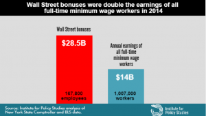
If you hadn’t seen this graph yet, you probably would have soon.

bonuses CAQYEF4UYAA5PqA

The claim “Wall Street bonus were double the earnings of all full-time minimum wage workers in 2014” was made by the Institute for Policy Studies (which is where I got the graph) and fact-checked by the Upshot blog at the New York Times, so you’d expect it to be true, or at least true-ish. It probably isn’t, because the claim being checked was missing an important word and is using an unfortunate definition of another word. One of the first hints of a problem is the number of minimum wage workers: about a million, or about 2/3 of one percent of the labour force.  Given the usual narrative about the US and minimum-wage jobs, you’d expect this fraction to be higher.

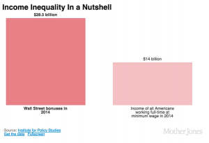
The missing word is “federal”. The Bureau of Labor Statistics reports data on people paid at or below the federal minimum wage of $7.25/hour, but 29 states have higher minimum wages so their minimum-wage workers aren’t counted in this analysis. In most of these states the minimum is still under $8/hr. As a result, the proportion of hourly workers earning no more than federal minimum wage ranges from 1.2% in Oregon to 7.2% in Tennessee (PDF).  The full report — and even the report infographic — say “federal minimum wage”, but the graph above doesn’t, and neither does the graph from Mother Jones magazine (it even omits the numbers of people)

On top of those getting state minimum wage we’re still short quite a lot of people, because “full-time” is defined by 35 or more hours per week at your principal job.  If you have multiple part-time jobs, even if you work 60 or 80 hours a week, you are counted as part-time and not included in the graph.

Matt Levine writes:

There are about 167,800 people getting the bonuses, and about 1.03 million getting full-time minimum wage, which means that ballpark Wall Street bonuses are 12 times minimum wage. If the average bonus is half of total comp, a ratio I just made up, then that means that “Wall Street” pays, on average, 24 times minimum wage, or like $174 an hour, pre-tax. This is obviously not very scientific but that number seems plausible.

That’s slightly less scientific than the graph, but as he says, is plausible. In fact, it’s not as bad as I would have guessed.

What’s particularly upsetting is that you don’t need to exaggerate or use sloppy figures on this topic. It’s not even that controversial. Lots of people, even technocratic pro-growth economists, will tell you the US minimum wage is too low.  Lots of people will argue that Wall St extracts more money from the economy than it provides in actual value, with much better arguments than this.

By now you might think to check carefully that the original bar chart is at least drawn correctly.  It’s not. The blue bar is more than half the height of the red bar, not less than half.

March 16, 2015

Stat of the Week Winner: March 7 – 13 2015

Thanks to Graeme Edgeler for winning our latest Stat of the Week competition and for his excellent explanation:

Statistic: “Māori adults have the highest levels of trust in the police, the health system & the courts. The lowest in the media”

Source: Tweet from Stats NZ

The statistic is written in a way that suggests Māori adults have the highest level of trust in the police etc., that is higher levels of trust than anyone else has in the police.

What the report actually shows is that the police etc. are the institutions in which Māori adults place the most trust as among institutions. It says nothing about whether Māori adults have more trust in them than anyone else. Anyone reading the tweet would think they did, but that was not even assessed.

It should be stat of the week, because, even if its not the most egregious stat this week, that fact that it is from Statistics New Zealand makes it worse.

Congratulations Graeme!

Maps, colours, and locations

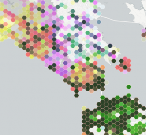
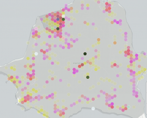
This is part of a social media map, of photographs taken in public places in the San Francisco Bay Area

bayarea

The colours are trying to indicate three social media sites: Instagram is yellow, Flickr is magenta, Twitter is cyan.

Encoding three variables with colour this way doesn’t allow you to easily read off differences, but you can see clusters and then think about how to decode them into data. The dark green areas are saturated with photos.  Light green urban areas have Instagram and Twitter, but not much Flickr.  Pink and orange areas lack Twitter — mostly these track cellphone coverage and population density, but not entirely.  The pink area in the center of the map is spectacular landscape without many people; the orange blob on the right is the popular Angel Island park.

Zooming in on Angel Island shows something interesting: there are a few blobs with high density across all three social media systems. The two at the top are easily explained: the visitor centre and the only place on the island that sells food. The very dense blob in the middle of the island, and the slightly less dense one below it are a bit strange. They don’t seem to correspond to any plausible features.

angelisland

My guess is that these are a phenomenon we’ve seen before, of locations being mapped to the center of some region if they can’t be specified precisely.

Automated data tends to be messy, and making serious use of it means finding out the ways it lies to you. Wayne Dobson doesn’t have your cellphone, and there isn’t a uniquely Twitter-worthy bush in the middle of Angel Island.


Stat of the Week Competition: March 14 – 20 2015

Each week, we would like to invite readers of Stats Chat to submit nominations for our Stat of the Week competition and be in with the chance to win an iTunes voucher.

Here’s how it works:

  • Anyone may add a comment on this post to nominate their Stat of the Week candidate before midday Friday March 20 2015.
  • Statistics can be bad, exemplary or fascinating.
  • The statistic must be in the NZ media during the period of March 14 – 20 2015 inclusive.
  • Quote the statistic, when and where it was published and tell us why it should be our Stat of the Week.

Next Monday at midday we’ll announce the winner of this week’s Stat of the Week competition, and start a new one.

(more…)

Stat of the Week Competition Discussion: March 14 – 20 2015

If you’d like to comment on or debate any of this week’s Stat of the Week nominations, please do so below!