March 23, 2015
Cricket visualisations
- From Dylan Cleaver and Harkanwal Singh at the Herald, an interactive graphic for exploring comparisons between players over the history of one-day internationals.
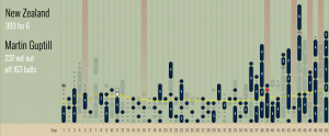
- From the Herald Data blog, or with interactive versions at his website, a visualisation by Michael Lascarides of how each innings progressed. Mostly this is for whole teams,but here’s Martin Guptill’s double century against the West Indies
Thomas Lumley (@tslumley) is Professor of Biostatistics at the University of Auckland. His research interests include semiparametric models, survey sampling, statistical computing, foundations of statistics, and whatever methodological problems his medical collaborators come up with. He also blogs at Biased and Inefficient See all posts by Thomas Lumley »
